
Below, we explain three assumption tests that we ran based on our assumption map’s insights. See the explanation of how we chose each test in our previous blog post here.
For these tests, we opted to use Google Forms to be able to scale and get more data while requiring minimum time or effort from participants. We recruited students at Stanford to fill out the forms, as they match our target population for our intervention. A potential issue here is that not all students may be inclined to decrease their spending, so we sent the form to people who we already knew had this goal, or sent it to larger groups with a message that we’re looking for people who do want to budget and/or decrease spending to fill it out. Using forms was especially helpful considering how busy students are at this time of the school year–it was an asynchronous way to get data from 20+ students within a single day. However, lack of debriefing or follow-up limits the amount of insights beyond the raw data.
Test #1: Quick Insights
We believe that users prefer quick, digestible insights over detailed breakdowns.
This is critical, as we should be aware of what layouts are engaging to users and empowers them, not overwhelms them.
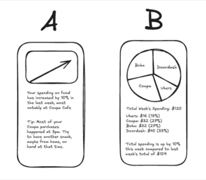
To verify this, we will create two mockups: Version A, a one-sentence spending summary with a visual trend indicator, and Version B, a detailed category breakdown with a pie chart or table. We’ll then show both versions to participants.
Test cost: low
Data reliability: medium (are only giving two quick mockups, when another layout may be preferred)
And measure which format they prefer and would be more likely to check regularly.
Time required: Less than one minute.
We are right if most users prefer Version A. If responses are mixed, a hybrid approach (quick insights with an option to expand into details) might be more effective.
Results for Quick Insights Test

We believed that users prefer quick, digestible insights over detailed breakdowns
We observed that a large majority of users actually preferred Version B over Version A. One user stated that they thought the pie chart made the information “more readable” as compared to the text summary.
Data reliability: medium; it is somewhat unclear if other visualizations would be even more preferable to users or if the line graph contained some information (like the pie chart) that the results would have differed.
From what we learned users seem to prefer visual representations of insights in order to process information and mostly ignored the information from the accompanying text which Version A relies more heavily on.
Therefore, we will prioritize visual representations of spending data when designing our tool and give more text based insights only when users wish to learn more in high detail unsuitable for visualization.
Test #2: Social Accountability
We believe that a social accountability feature (group savings challenges, shared goals) could be added to increase engagement.
This is critical, as this helps determine if our solution should be group-focused or not.
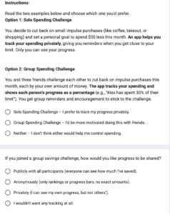
To verify, we will present two options: (1) a solo savings goal, where users track progress privately, and (2) a group savings challenge, where friends set a shared goal and see each other’s progress.
Test cost: low
Data reliability: medium (theory may differ from practice)
And measure which option feels more motivating to participants (1 or 2), whether they would join a challenge, and if public tracking would encourage or discourage them.
Time required: Less than one minute.
We are right if most prefer the group feature. If responses vary, adding optional privacy settings or low-pressure challenges might be necessary. To further validate, we can run a social media poll or prototype a basic challenge feature to measure real engagement.
Results for Social Accountability Test

We believed that a social accountability feature (group savings challenges, shared goals) could be used to increase engagement.
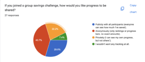
We observed that people had mixed feelings about solo vs shared features. There was about a 50/50 split between group or solo spending challenges, and a variety of responses to how users would prefer data to be saved and visualized. Interestingly, many people liked the idea of anonymous but publicly visible progress.
Data reliability: Moderately High. While we can’t guarantee that people can exactly predict how they would react to a social vs solo focused application without putting it in front of them, people likely have experiences with solo, shared, and anonymous based social applications and have some sense of what they prefer.
From what we learned that group or shared social features should be either an opt in feature, or used with anonymity.
Therefore, we will design a tool that has optional social accountability features, potentially with an anonymous option, which would allow users to benefit from social accountability while maintaining some privacy.
Test #3: Automation
We believe that our target population would use a financial tool if it required minimal effort and fit into existing routines.
This is moderately critical, as this assumption addresses the problem of activation energy and friction. However, given the scope of this project, we are not sure if features like bank integration are feasible.
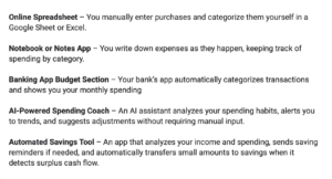
To verify that, we will present solutions from our comparative research according to the manual → automatic scale (tools that require manual data entry vs. tools that automatically aggregate data and show insights) and ask users to review the solutions, and rank which ones they’d use.
Test cost: low
Data reliability: medium (theory may differ from practice)
And measure which level of automation is most desirable among participants and whether minimal effort leads to higher usability and adoption.
Time required: Less than one minute.
We are right if the highly automated tools are ranked higher than manual tools.
Results for Automation Test
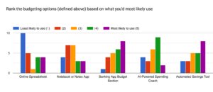
We believed that our target population would use a financial tool if it required minimal effort and fit into existing routines.
We observed a variety of preferences for the level of automation of a budgeting tool. However, we generally saw higher preferences for the options that involve some sort of automation, with the vast majority 4s and 5s given to the three tools with the highest automation levels.
Data reliability: Moderate, given there are more options out there and we relied on short quick descriptions, not images or prototypes.
From what we learned that some level of automation is key, but our target population does not necessarily desire a fully automated tool. Fully manual is the least popular option.
Therefore, we will design a tool that incorporates automation to reduce effort while still allowing users some control over their budgeting. We will explore hybrid solutions that provide automated insights and tracking but allow for user customization and manual adjustments when desired.


