
Wireflows

For Shame Shawn to succeed in habit formation, he requires structured commitments and social cues from friends. Thus, we structured the onboarding process to immediately allow users like Shawn to personalize their experience (tailoring their own structured commitment) and connect with friends early on. Since Shame Shawn only stretches when external pressure is applied, we also quickly ask for notification permissions to provide socially-driven stretching cues through reminders from friends who have completed their stretches. The wireflow was made this way because it prioritizes social motivation, habit formation, and personalization/customization. By incorporating leaderboards, social encouragement (friends), and structured routines (like reminders), the app ensures that users like Shawn are more likely to stay consistent with stretching and turn it into a daily habit.
Sketchy Screens

Our team created Sketchy Screens for the Start/Welcome Screen, the Home Page/Leaderboard Screen, and the Add Friends/Contacts Screen. The FigJam above, which you can explore here, shows our team taking turns critiquing one another’s work. screen. These critiques improved our designs in the following ways:
Welcome Screen
Pre-Critiques

Post-Critiques
With regard to the earth design, one of my teammate notes that they “like this option better as it centers around stretching with friends.” This effectively plays on Shame Shawn’s need for social cues from friends, cementing the earth design as the design to move forward with. Further, this teammate notes that they “love how personalized it is to [the] Stretchy app theme and brand—casual and welcoming.” While Shame Shawn relies on external pressure to complete tasks, we know that the reason he struggles to form habits from this pressure is because extrinsic motivations dwindle in the long run. Thus, this “casual and welcoming” design is conducive to our branding, which helps users like Shame Shawn by bringing them in through their extrinsic motivations but keeping them by transforming their motivation into an intrinsic one.
All teammates note that the “giant buttons make [the] next step super clear!” and that making them small makes them “hard to find.” Hence, I moved forward with the large sign up/in buttons to best convey the call to action of this screen: create an account or login if you have one.
Finally, a teammate noted that the original earth design was “less clear [about] what the app is about… since the title does not clearly communicate it.” This was what was strong about the non-earth design screens, for “Stretchy” was front and center, inviting users to “join” them and “start stretching.” Therefore, I combined these designs by changing the text to “Join Stretchy and Friends,” improving the clarity. Moreover, I incorporated Stretchy as the character that will hold up the sign in/up button and as the character that will remain on the center of the globe. This is also conducive to our brand as it symbolizes that “Stretchy” (our app name and mascot) brings friends together around the world through stretching—a wholesome and ultimately intrinsically motivating stretching experience.
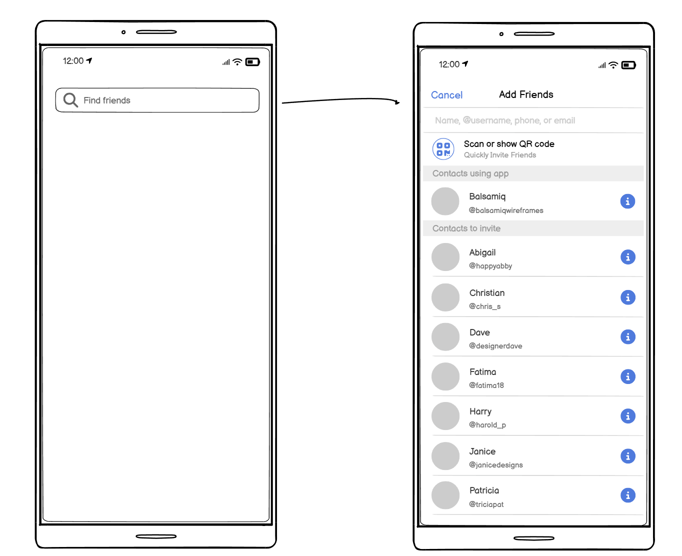
Invite Friends/Contacts Screen
Pre-Critiques
Post-Critiques
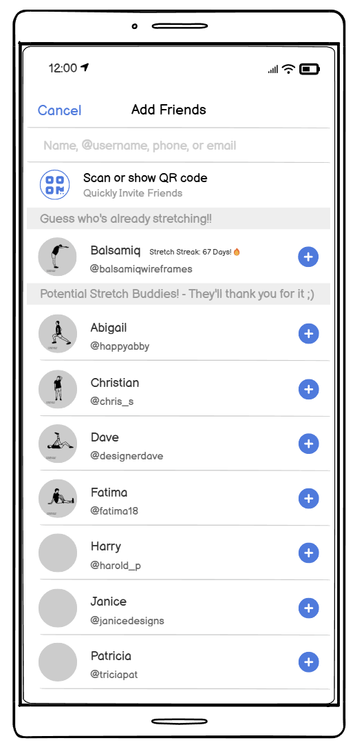
We’ve updated the friend-adding flow based on the teams suggestion, replacing the “i” symbol with one that implies “adding.” To enhance personality, we’ve incorporated stretching elements into grey profiles, section headers, and profile images. The “Contacts to invite” section now has engaging labels like “Potential Stretch Buddies! – They’ll thank you for it ;)” or “Guess who’s already stretching!!” instead of the generic “Contacts using app.” These changes create a livelier, funnier, and more approachable atmosphere. As a final touch, we’ve added a feature displaying an existing friend’s current or highest stretch streak, reinforcing our social motivation emphasis.
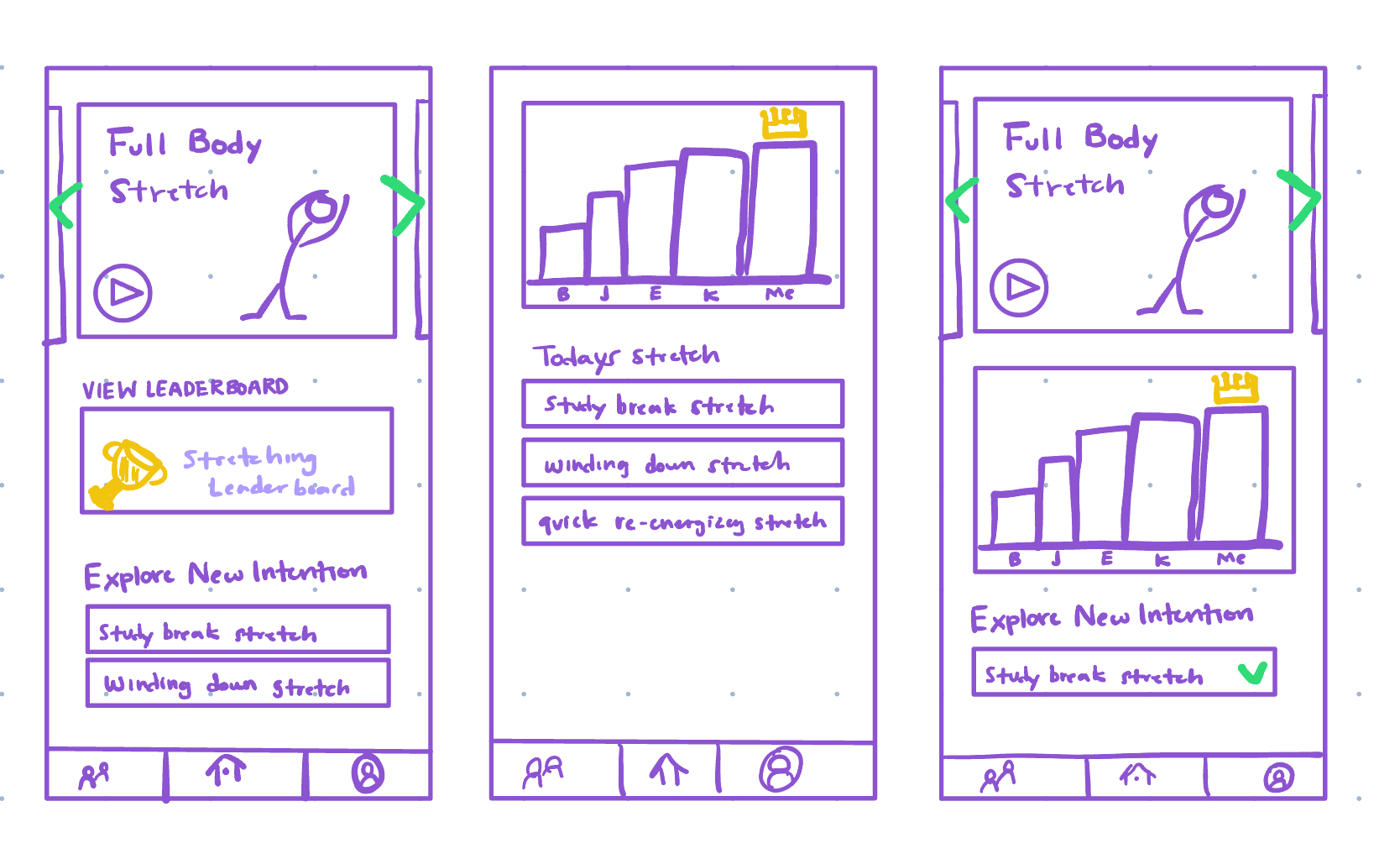
Home Page/Leaderboard Screen
Pre-Critiques
Post-Critiques
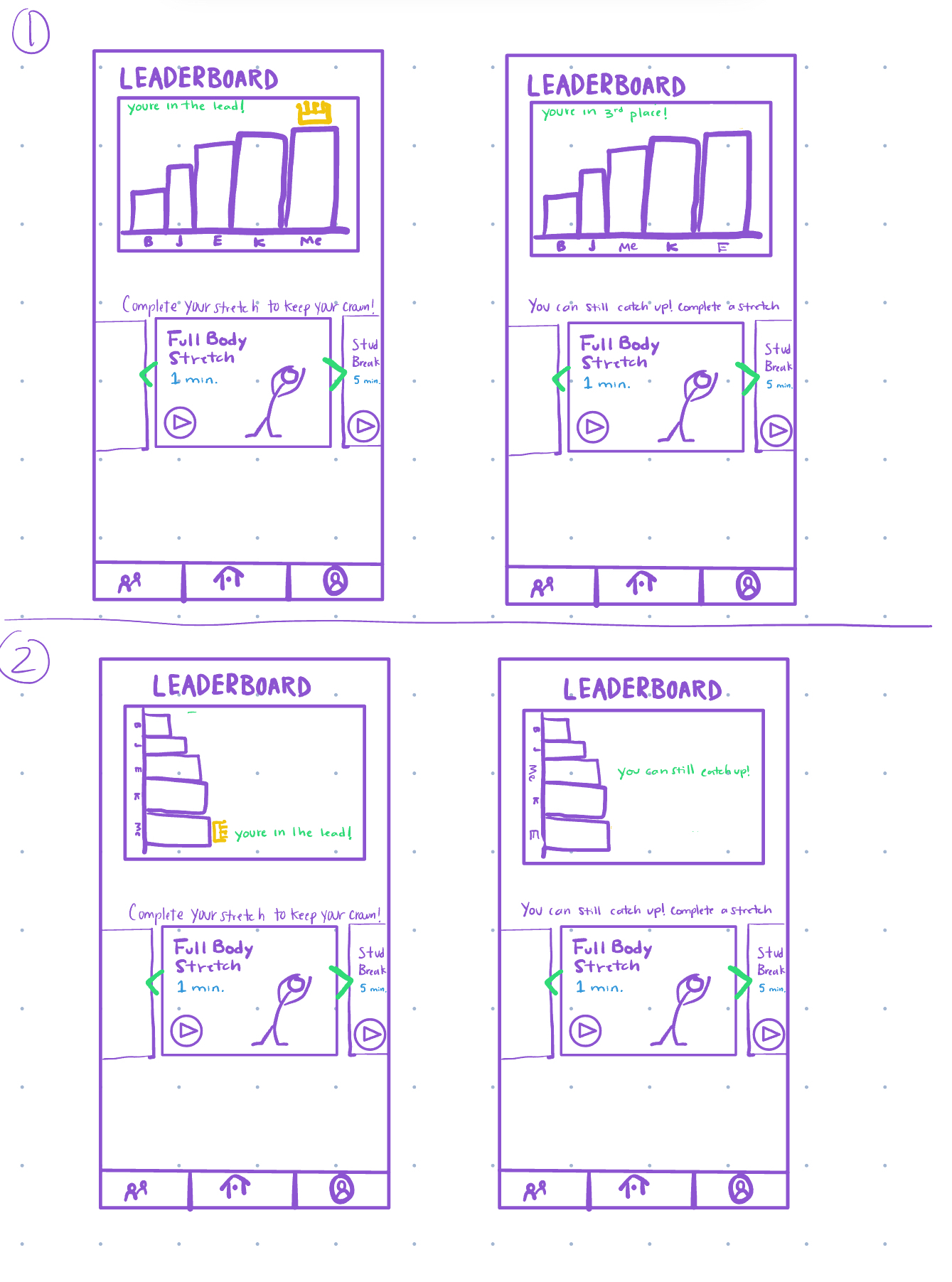 For my final sketch, I prioritized showcasing the leaderboard and a quick encouraging call to action to get the user to complete a stretch. My original sketch tried to encourage the user to do their sketches, but as a teammate mentioned, the screens had alot going on that it was a bit difficult to determine what the user was supposed to do. I restructured the homepage sketch such that the leaderboard is now at the top and depending on the users position in the leaderboard, they get a message that will encourage them to continue stretching or to stretch to catch up. In both cases, the screens focus on emphasizing social forces to drive a user like Shame Shawn to complete their stretch.


