
1. Introduction
As part of Stanford’s CS247B: Design for Behavior Change, Team Mockingbird (Nils Forstall, Emma Morris, Houston Taylor, and Alison Rogers) set out to study the social interactions of new graduates to help build stronger friendships by building stronger habits. This report details our 10-week process conducted from January – March, 2025, where we conducted a baseline study and intervention study as well as designing, developing, and testing a prototype of our solution: Tend.
This report is broken down into six main sections:
- Introduction
- Baseline Study
- Intervention Study
- Interaction Design
- Conclusion
- Appendix
In each of sections 2, 3, and 4, you will find a detailed breakdown of each step of our process.
2. Baseline Study
We began our design process by conducting a baseline study. The goal of this study was to understand how our target demographic, new graduates, currently engage with their friendships both online and in-person. The aim of this study was to uncover their naturally occurring pain points, tensions, contradictions, and needs.
Overview
The Mockingbird study focused on the socialization patterns of those who have recently left the undergraduate college environment. All members of our target demographic are facing a stage in their life where executive functioning skills are required and tested in new ways; for many people in our target demographic (except those attending graduate school), this is their first time in an environment not dominated by school social dynamics, where classes, school clubs, and dorm environments dominate many of the socialization habits. In addition to that, many people who have just left the college environment live further away from their friends than they are used to, whether that is because they moved or because their friends did. The key question we were aiming to answer were:
- How do people who have just left undergraduate college keep in touch with their friends from before that transition?
- What role does digital communication play in the socialization pattern of our target demographic?
- How do members of our target demographic meet and form friendships with people in new environments?
- How does socialization fit into the lives of people who have been granted more independence as a young adult than they have ever had before?
The purpose of this baseline study was to establish the existing habits of this user population as it pertains to both in-person and digital socialization to discover the key needs and pain points.
Participant Recruitment
Our participants were recruited via text message, Instagram DMs, and snowball recruiting from other participants. Participants were asked to fill out a pre-screen survey that filtered out those who had moved out over 12 months ago, those with particularly strong social connections, and those who still live in dorms or with family.
Study Methodology
Our study consisted of three stages: 1) pre-study interviews 2) a diary study and 3) post-study interviews. The stages are described below.
1) Pre-Study Interviews: During this phase, participants met with members of the Mockingbird research team for 20-30 minute interviews. During these interviews, participants were asked to describe their current socialization patterns, any existing tools used, and their current pain points. The pre-study interviews allowed us to gather key qualitative data about how our target demographic feels about their social habits, when they feel successful, and what being unsuccessful looks and feels like for them.
2) Diary Study: The diary study took place over four days (January 20 – 23, 2025 for some participants and January 21 – 24, 2025 for the remaining participants). Participants were asked to fill out a diary twice a day – once in the morning and once at night. There was an optional mid-day diary entry that participants could also fill out, and participants would receive pings by 10am and 8pm in their respective time zones if they had not filled out either the morning or evening diary entries. The morning diary entry would describe socialization plans for the day, and the evening diary entry would reflect on what happened that day. The diary-study gave us quantitative data about the perceived quality of interactions on a 1-10 scale, as well as the method of these interactions. The diary entry also gave us qualitative data about how socialization patterns affected the overall well-being of our participants.
3) Post-Study Interviews: In the final phase of our study, participants who completed the diary met with a member of the Mockingbird team a second time for a 20-30 minute conversation on their experience. Similar to the pre-study interviews, we gathered qualitative data about our participant’s thoughts and feelings about the study: any new patterns discovered, what tracking interactions felt like for them, and a reflection on successes and failures over the past few days.
Raw Data ⇾ Grounded Theory
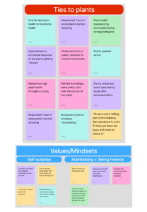
After conducting our baseline study with 11 new graduates, we processed each interview and diary to create a grounded theory synthesis. Information was synthesized using post-it notes, which were then coded to pull out themes, trends, and contradictions. To view our raw data and synthesis process in more detail, please see this FigJam. Data for each of the participants is color-coded and sorted on the left. Five grounded theories that emerged from this synthesis are detailed below.
Please note that there are two additional grounded theories included in the appendix of this report. They were removed from this section to prioritize the most relevant grounded theories from our synthesis, though still provide valuable insights into our users’ perspectives.
Grounded Theory 1: Post-grads want to maintain friendships, but reaching out takes effort
Many participants want to keep their friendships strong but find that reaching out requires more effort than they expect. Without the convenience of shared spaces and casual encounters, keeping up with friends requires more effort, intentionality, and planning.
Evidence:
Energy, anxiety, and proximity were key themes throughout our user interviews. We have listed out our sub-theories and the supporting evidence below.
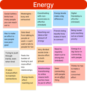
Subtheory: The emotional and cognitive burden of initiating contact discourages people from reaching out.
- Example: Wants to stop waiting for the ‘perfect moment’ to reach out.
- Example: “Reaching out is stressful but worth it.”
- Example: “Reaching out takes a fair amount of energy.”
- Example: Thinks he has to make a more concerted effort.
Question: What social tools can reduce the cognitive burden of initiating interactions?
Subtheory: Proximity made friendship easy in college, but distance now requires active effort.
- Example: “In-person friendship is easy because of proximity. Now, distance requires more intentionality.
- Example: “Has to make an effort to see people now post-grad.”
- Example: “Distance requires more intentionality and effort.”
- Example: “No longer get shared experiences as easily post-grad; living separate lives.”
Question: How can post-grads adapt to the absence of casual run-ins? What mechanisms can help maintain connection in their absence?
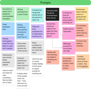
Subtheory: External reminders serve as prompts for reaching out.
- Example: “Prompted by things that remind her of the person to reach out.”
- Example: “Seeing people reminds you to respond (proximity).”
- Example: “Flips through memories in downtime and reaches out to people she thinks about.”
- Example: “Likes to reach out when he sees something that reminds him of them.”
- Example: “Texts when something reminds her of the person.”
Question: Can external cues be designed to support social maintenance?
Contradictions and Tensions
Our interviewees clearly feel a strong dissatisfaction with how they engage with their friendships now that they have left the undergraduate college environment. Interestingly, their stress over maintaining their friendships effectively enough actually prevents them from reaching out instead of motivating them. This is a key point of exploration for us to work with moving forward.
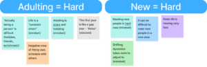
Grounded Theory 2: The shift from structured to self-managed socialization is difficult
In college, social life is embedded in daily routines (school, clubs, extracurriculars,etc.), but after graduation, maintaining connections requires deliberate planning.
Evidence:
Work/life balance came up often in our interviews. Users tied this concept to issues of stress, scheduling, and flexibility. We have listed out our sub-theories and the supporting evidence below.

Subtheory: Post-grad life lacks the automatic social opportunities of college.
- Example: “Less opportunity to take advantage of times you’re already with people.”
- Example: “No longer get shared experiences as easily post-grad; living separate lives.”
- Example: “Days are much less regimented now.”
- Example: “College didn’t feel like maintaining friendships.”
Question: How can post-grads recreate structured social opportunities?
Subtheory: Without built-in routines, friendships require intentional scheduling.
- Example: “Planned interactions are better in the long run; spontaneous interactions are spikes.”
- Example: “Scheduling calls can take weeks to happen because it will be long – commitment.”
- Example: “Took a risk to graduate early—now has to put more effort into relationships.”
Question: What tools or habits help post-grads maintain social consistency?
Subtheory: The transition from spontaneity to planning is a challenge.
- Example: “Spontaneous is good but hard to get.”
- Example: “Planning hangouts makes it more difficult.”
- Example: “Used when2meet to schedule a call – no one answered (embarrassed).”
Question: What are effective ways to make social planning feel more natural?
Contradictions and Tensions
The core tension we discovered here is how our interviewees react to the sudden shift from the flexible nature of a college social environment to the structure of being in the workforce. Making time is a strong difficulty we can work to help our users overcome.
Grounded Theory 3: Digital interactions create both connection and disconnection
Post-grads rely on digital communication to maintain friendships, but it does not always feel satisfying.
Evidence
The quality of interactions came up frequently. Our subtheories and evidence are below.

Subtheory: Texting is the default mode but lacks emotional depth.
- Example: “Text gets little info across.”
- Example: “Sending a quick text did not always feel like connecting.”
Question: How can digital communication tools be adapted to better support emotional connection?
Subtheory: Video calls feel high-pressure and time-consuming.
- Example: “Calling feels high pressure and will take dedicated time (belief).”
- Example: “Calling is too time-consuming.”
Question: What design solutions could make video calls feel less burdensome?
Subtheory: Passive digital interactions (e.g., sharing media) help maintain connection.
- Example: “Uses IG ‘close friends’ story – wants more delineation options (like Snapchat).”
- Example: “Sending media (TikToks) helps her feel more connected.”
Question: What role do passive digital interactions play in friendship maintenance?
Contradictions and Tensions
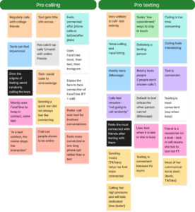
Despite wanting higher quality interactions, users also expressed that methods they associate with higher quality (phone calls, FaceTime, etc.) are more stressful. We need to find a way to bridge the gap for our users so that they can make memories in low-stakes ways and on their own terms.
Additionally, we had users on either side of the debate on whether phone calls are helpful or stressful. Some users even expressed thoughts on both sides of the argument. This key contradiction highlights the need for user flexibility: there is no one-size-fits-all for every new grad’s life post-college, and the same thing that works for one user’s schedule may not even work for that user a week later, much less a completely different user.
Grounded Theory 4: New life responsibilities make social maintenance harder
Work, errands, and personal obligations compete with social priorities.
Evidence
Our subtheories and evidence are below.
Subtheory: Work and exhaustion make reaching out feel like another task.
- Example: “Work and busy life makes reaching out take more effort.”
- Example: “Weeknights – busy and exhausted.”
Question: How can people integrate social connection into busy schedules?

Subtheory: Time differences and unpredictable schedules create barriers.
- Example: “Time difference is a barrier to connection.”
- Example: “Works 3 jobs -> inconsistent/non-traditional schedule.”
Question: What solutions can help long-distance friends stay connected despite conflicting schedules?
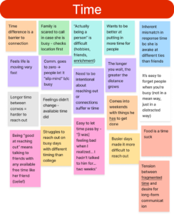
Subtheory: People want to prioritize friendships but struggle to act.
- Example: “Wants to be better at putting in more time for people.”
- Example: “Recognized grind culture at work is getting in the way of social connections.”
Question: How can post-grads reframe socializing as a necessity rather than an optional task?
Contradictions and Tensions
Scheduling is a huge concern for our users. While users enjoyed the unpredictability of college life, users express a strong distaste for the unpredictability of adult life. Current unpredictability leaves them feeling lost and disconnected. In our design work, we need to help users feel in control and present.
Grounded Theory 5: Social expectations and anxieties influence reaching out
Fears of rejection, social norms, and anxiety affect how and when people connect.
Evidence
Our sub-theories and evidence are listed below.
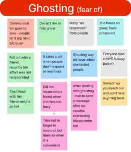
Subtheory: Fear of being a bother prevents many from reaching out.
- Example: “Being a bother is a worry that prevents reaching out.”
- Example: “Sometimes you reach out and don’t hear anything back.”
Question: How can people be reassured that their friends want to hear from them?
Subtheory: Overthinking interactions leads to inaction.
- Example: “Anxiety can be a barrier (overthinking).”
- Example: “Overthinking hurts connection.”
Question: What strategies can help people reach out without overanalyzing the situation?
Subtheory: Social norms discourage spontaneous communication.
- Example: “Calls feel intrusive – ‘not going to call randomly.’”
- Example: “Social expectation that people don’t want to be called – burden on others.”
Question: How do shifting social norms impact communication habits?
Contradictions and Tensions:
Our interviewees mentioned that they felt worried other people would be bothered by being reached out to, despite multiple participants highlighting how spontaneous interactions had a positive impact on their own lives. There is a strong double-standard here between what our users think is okay for other people to do versus themselves. It is important to address this moving forward to increase our users’ confidence levels.
System Models
After pulling out our grounded theories, we created system maps to further digest our user perspectives. Our system maps are both listed below. If you would like to explore our maps, please feel free to view this FigJam.
System Model 1: Feedback Loops
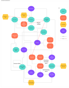
This first model captures a detailed look at the causes, effects and emergent loops of our participants’ behavior. The feedback loops make it clear that both communicating and the lack of communication are self-sustaining. The failure to reach out is promoted by either guilt or lack of motivation/perception of higher effort necessary to reach out. One especially revealing piece of this model is the importance of seeing something that reminds you of a friend, which seems to be one of the few ways to make the leap from the down-ward, no connection spiral to being connected.
System Model 2: Iceberg
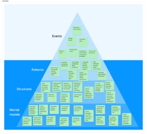
This iceberg model re-emphasizes how actions of texting or not give way to cycles of connection and disconnection. The structural level exposes how the shift from college’s built-in community to dispersed adult life fundamentally changes how friendship maintenance works. Perhaps most telling are the mental models, which show a web of conflicting beliefs about friendship—that it should be effortless yet requires work, that everyone else is doing better while believing they too are struggling, that real connection requires energy while exhaustion is normalized. These underlying assumptions create a gap between how recent graduates believe friendship “should” work and the realistic demands of maintaining connection after college.
Key Takeaways:
In both of our system models, we noticed that guilt and momentum are key contributing factors to whether or not people in our target user demographic reach out. In the presence of guilt and absence of momentum, our users freeze and refrain from interacting with people at all. In viewing these system maps, we decided to focus on targeting these two elements, hoping to make friendships easier to stay on top of and, at the same time, feel lower stakes and more carefree. Our hope is that changing these two factors will empower our users and increase their confidence in their own friendship-maintaining abilities.
Secondary Research
To accompany our user research, we also conducted a survey of existing research and solutions to understand the current state of our domain. This consisted of two parts: a literature review and a comparative analysis.
Literature Review: Post-Grads Connecting with Friends
One of the biggest challenges post graduates face is staying connected with friends after leaving the structured social environment of college. Without dorms, dining halls, and spontaneous run-ins, friendships require more effort to maintain. Research shows that 73% of graduates rely mostly on digital communication to keep in touch, but maintaining strong relationships can still be difficult (Rice et al., 2017). Our analysis of existing studies and social connection apps reveals key trends in how post-grads stay connected, the struggles they face, and potential solutions.
Key Research Findings
How Communication Changes After College
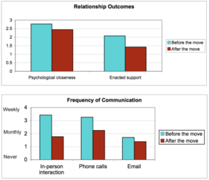
Keeping in Touch by Technology, 2008 – Figure 1: Changes over time for pre-move friendships
- Moving away reduces how often friends talk by 50%, yet many still feel emotionally close to their friendships (Keeping in Touch by Technology, 2008).
- Most post-grads juggle 4-5 different apps to stay in touch, which can be overwhelming (Digital Intimacy, 2023).
- Only about one-third of post-grads continue communicating as much as they did in college after six months (Transition to Adulthood, 2014).
These findings suggest that while friendships can remain strong, the frequency of communication drops significantly due to new responsibilities, different time zones, and fewer shared experiences.
What Actually Works for Staying in Touch
- Quick check-ins work better than long scheduled calls, with 89% of people preferring this approach (Smart Contact Reminder, 2025).
- Reminders increase outreach by 42%, showing that small nudges help people keep in touch.
- Apps that focus on shared activities, like Strava (fitness tracking) or Meetup (events), see 40% better engagement than those that rely solely on messaging.
This suggests that casual, low-effort ways to stay connected are more effective than trying to schedule long conversations.
Comparative Analysis
We examined eight different apps as part of our comparative analysis. The eight apps are listed below, as well as a brief description of each app:
- Smart Contact Reminder: Allows users to log their connections and prompts them to log connections when notifications come in from those contacts.
- CommuniqAI: Lets its users schedule messages to automatically send to contacts to get in touch.
- Houseparty: Allowed users to connect spontaneously with friends through drop-in video calls, featuring built-in games.
- Strava: A fitness tracking app designed for runners, cyclists, and athletes to record workouts, analyze performance, and connect with a social community.
- Meetup: Connects people through in-person and virtual group events based on shared interests.
- Airbuds: A social music-sharing app that allows users to see what their friends are listening to in real time.
- Locket: Allows users to add photos that will automatically appear as widgets on their friend’s phones.
- BeReal: Sends a notification to its users at the same time around the globe, after which users have two minutes to post a picture of what they are doing from both their front and back camera.
We examined the features, strengths, and weaknesses of each app, pulling out common themes as we went. In addition to data about the app itself, we also looked into public responses to each app (e.g. news articles, blog posts, and social media conversations surrounding each app) to understand user reactions and gain a deeper understanding of how these apps functioned in the real world.
Core Themes
Passive vs. Active Communication
- Apps like Airbuds and BeReal make staying in touch effortless by allowing users to passively share updates without the pressure of responding.
- In contrast, apps like Smart Contact Reminder and CommuniqAI send structured reminders to encourage people to reach out (Comparative Analysis, 2025).
- The ideal solution would combine both passive and active communication. Thus, allowing for easy, ongoing connection without making it feel like another task.
Asynchronous vs. Synchronous Interaction
- 67% of post-grads prefer messaging whenever they have time instead of scheduling calls (Distant Friends Study, 2014).
- Apps like Ping and SocialPing tried to solve this by allowing users to signal availability instead of demanding immediate responses.
- Meanwhile, real-time apps like Houseparty struggled because they required everyone to be online at the same time, which isn’t practical for post-grads with busy schedules.
The Role of Shared Activities
- Some apps, like Strava, show that sharing experiences can be more engaging than just messaging.
- Users are 65% more likely to stay active on an app that offers multiple ways to connect through messaging, shared activities, and passive updates.
Common Weaknesses
- Privacy concerns were a common issue across the apps we compared – users do not want their online lives tracked.
- Too specific: apps like Airbuds, Strava, and Meetup are criticized for their niche communities and/or lack of flexibility in interaction.
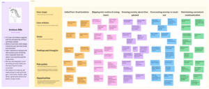
A Visual Take
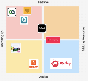
While researching our competitors, we created a 2×2 grid to categorize applications based on two key dimensions: “Catching Up” vs. “Making Memories” and “Active” vs. “Passive.” The Active-to-Passive axis represents the level of effort or activation energy required for users to benefit from the app. The Catching Up-to-Making Memories axis distinguishes between apps that facilitate maintaining existing relationships versus those that foster shared experiences and new memories.
We selected these dimensions based on insights from our baseline study, where users expressed that both the effort required to maintain relationships and the depth of social interaction were significant pain points. Understanding these factors helps us explore how different apps align with user behaviors, preferences, and needs.
Trends & Insights
Through our analysis, we observed a clear trend toward passive interaction and maintaining contact rather than actively making new memories. Many of the apps in our study require little user effort, relying on automation or passive reminders rather than direct engagement.
- Passive apps dominate the market. Apps like Locket and Airbuds require minimal user input, embedding themselves into daily routines as widgets or background tools for passive engagement. Similarly, Smart Contact Reminder and CommuniqAI automate interactions, reducing the need for users to take initiative in maintaining relationships.
- Few apps emphasize making memories. The majority of social apps focus on maintaining existing connections rather than fostering new, meaningful shared experiences. Meetup stands out as an outlier, encouraging in-person gatherings and active participation, but most other apps do not actively facilitate memory-making.
- Stronger interactions require more effort. We found a strong correlation between the quality of interaction and the activation energy required; the more meaningful the engagement, the higher the effort needed from users. Apps positioned in the lower-right quadrant (high activation, high memory-making) tend to demand real-time participation, which can be a barrier for users seeking lower-effort ways to maintain friendships.
2×2 Takeaways
The 2×2 map reinforces the trend we observed in our comparative analysis: while passive reminders help maintain friendships, very few apps actively support memory-making in a low-effort way. Our analysis revealed that most existing solutions, such as Smart Contact Reminder and CommuniqAI, focus on structured reminders for staying in touch, whereas passive apps like Locket and Airbuds allow effortless connection but lack deeper engagement. Surprisingly, Meetup is the only strong outlier in actively encouraging shared experiences, yet it requires high activation energy, making it less accessible for users seeking a low-effort way to strengthen friendships.
This highlights a major gap in the upper-right quadrant (“Making Memories” + “Passive”), where no app currently enables users to create meaningful memories without significant effort. The success of Strava and Meetup in fostering engagement through shared activities suggests that adding low-barrier, passive ways to create new experiences could fill this gap. Based on these insights, we focused on developing a solution that blends passive engagement with rich, memory-building interactions, offering a truly satisfying and low-stress way to maintain friendships.
Implications for Ideation
What People Want in a Friendship Tool
- Casual updates are used 2x more than formal check-ins.
- Apps that integrate into existing habits (rather than forcing new behaviors) perform 3x better in long-term engagement.
- People want both planned and random ways to check in (structured reminders increase communication by 47% but shouldn’t feel robotic).
What This Means for Designing a Solution
- Mix automatic reminders with real connection: lightweight nudges help, but users should have control.
- Offer multiple ways to stay in touch: messaging, shared experiences, and passive updates.
- Let people respond when they have time: asynchronous features make it easier for post-grads with busy schedules.
- Make staying in touch feel effortless: low-pressure updates (like BeReal or Airbuds) keep friendships alive without forcing constant messaging.
Research Takeaways
Our research clearly shows that post-grads want low-effort, natural ways to stay connected without making friendships feel like another obligation. By combining passive social updates, structured reminders, and shared activities, a tool designed for post-grads can help them maintain meaningful friendships even as their lives become busier and more spread out.
Proto-Personas and Journey Maps
As the last part of our synthesis, we aggregated proto-personas and journey maps based on our findings from our interviews and baseline studies. These aggregations formed the foundation of our future work with our intervention study and interaction design.
Busy Beatrice
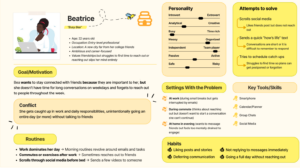
We developed the Busy Beatrice (or Bea) persona based on the many participants we found who viewed their new adult lives as too hectic and busy to reach out to friends. Our participants shared details about how their work schedules don’t align with their friends’, how the constant churn of chores gets in the way, and how highly time-intensive mediums such as phone calls are overwhelming. This was a core painpoint in multiple interviews, so creating Bea was especially important for us.
Bea is 22 years old, a recent graduate, and just starting her career. She values her friendships but often finds that entire days go by without her realizing she hasn’t spoken to anyone outside of work. It’s not that she doesn’t care—it’s that time keeps slipping away, and her friends are also navigating similar post-graduation challenges. In our research, we heard multiple times that new professionals don’t intentionally ignore their friends— instead, maintaining friendships becomes difficult when everyone is juggling work, life, and adjusting to new routines. Bea is one of those people, and her journey reveals key pain points in how people keep up with friendships in their busiest seasons.
You can view Busy Bea’s journey in more detail at this FigJam link.
Key Takeaways from Bea’s Journey
- It’s not about forgetting, it’s about time slipping away. Bea intends to text back but is constantly sidetracked by work, social media, and exhaustion.
- Low-effort social engagement fills the gap, but not completely. Bea likes posts, watches stories, and reacts to messages, but those interactions don’t replace real conversations.
- Friendships require effort, but the effort feels like another task. At the end of a long day, even sending a text can feel like work, making it easy to delay interactions.
Proximity Paul

Another common theme in our interviews was the increased distance that post-grads experienced with their friends after moving away. As many of our participants are living alone or with only a handful of roommates, the shift from a dorm environment to a young adult lifestyle has been jarring. We noticed increased feelings if isolation across these participants, and thought creating this persona was key to understanding the needs of our users.
Proximity Paul is a recent college graduate struggling to maintain the deep friendships he built in school now that he lives far away from his friends. In college, social interactions were effortless—running into friends at the dining hall, walking to class together, or studying in the same spaces. However, after graduation, those spontaneous moments have disappeared, and staying in touch requires intentional effort. Paul wants to stay connected but often feels uncertain about reaching out. He wonders if his friends are just as busy or if they even think about him the way he thinks about them.
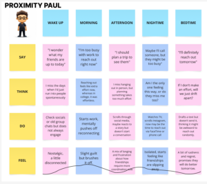
Key Takeaways from Paul’s Journey:
- Paul needs a system or habit that helps him maintain strong connections without it feeling like work. When a social interaction does occur, Paul is instantly reminded of how much these relationships mean to him, but he will still put off texting and calling for days, always with the promise that he’ll do better tomorrow (which he rarely does).
- Digital interactions, like liking posts or reacting to stories, feel passive and unfulfilling.
- Paul’s biggest pain points include the loss of spontaneity, the fear of one-sided effort, and the difficulty of scheduling meaningful interactions across different time zones and life commitments.
Anxious Allie
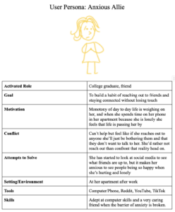
Our last proto-persona is based on the running theme we noticed of those who felt anxiety surrounding reaching out. This pattern emerged in our interviews, particularly exemplified by quotes like “I always second-guess myself, like, ‘Am I bothering them?’” and “The longer we don’t talk, the bigger that whole thing becomes.” Despite multiple participants asserting that “everyone wants to do better”, we found tension in the fact that our participants seemed worried they’d be wrong for doing better themselves. We decided that this needed to be expanded on to learn more.
Anxious Allie is a 23-year-old software engineer whose main activated role is that she is a friend and family member. She misses her college friends and feels lonely, but she has not reached out to them because in the absence of something specific to talk to them about, she worries that she’ll be seen as a bother. She browses social media at times, but rarely instigates any conversation or interactions on those platforms, and her daily routine is particularly mundane: get up, go to work, go to the gym, come home, doomscroll, sleep.
You can view Allie in more detail at this FigJam link.
Key Insights from Allie’s Journey:
- Physical disconnection feeds into anxiety about reaching out, making it harder to break out of isolated routines.
- Anxiety about reaching out creates a cycle – the longer it goes, the harder it is to break. Users need help finding the immense energy and will to do so.
- Even once a habit of reaching out is established, there is still anxiety over the work that maintaining that relationship requires that needs to be addressed. The work of a solution should not stop at simply reaching out.
Moving Forward
Having completed our baseline study, we planned to develop an intervention study that touched on the key pain points we uncovered: conflicting schedules, anxiety, and the difference between maintaining friendships versus simply being friends. Our baseline study helped us reveal our goal: to uncover effective ways to change the habits of our target demographic as we move toward designing an app that will make long lasting, positive changes in the social lives of our new graduates.
3. Intervention Study
With the findings from our baseline study, we shifted to focusing on how we could effect change in our user population. To do this, we worked on developing an intervention study to examine how our target demographic would respond to some of our ideas. After examining our assumptions through assumption mapping and testing, we developed an intervention study to figure out how we could best design for our user population. From there, we identified key insights that shaped our solution: a plant-based widget designed to encourage meaningful interactions.
Assumption Mapping
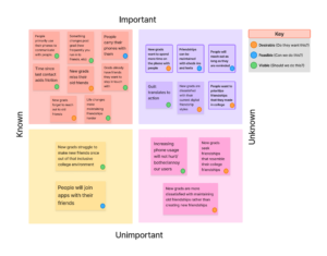
We began by developing an assumption map to highlight key factors influencing post-grad friendships and how our plant-based widget can help maintain them. You can access the Figma link for our assumption map here.
Through generating this map, we discovered that most of our unknown assumptions were in the “desirability” category – a key thing we needed to uncover was how our users wanted a solution to look, if they even wanted one at all. Many of our knowns came from the grounded theories we developed in our baseline study synthesis. As we developed our assumption map, we also questioned the values we wanted our app to focus on. As we thought about the distinction between “making memories” and “catching up (as highlighted in our comparative analysis map), we shifted some of our assumptions to “unimportant” – we wanted to focus on strengthening existing connections, not on making new friendships.
We ultimately decided to test two desirability assumptions and two feasibility assumptions. These tests would be examining the effectiveness of our prompting, the effectiveness of our approach to friendships, and whether or not our approach of “making memories” matches what our users want – all critical to determining whether we should move forward with our current path.
Assumption Tests & Reports
We set out to test four assumptions:
- New grads want to spend more time on the phone with people
- People will text or call friends if reminded to do so
- People want to maintain the friendships they made in college
- Friendships can be maintained via phone call/text check-ins
Test #1: Phone Desirability
Our first assumption test followed the design below:
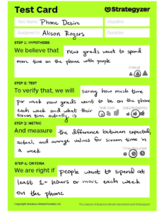
We reached out to six college recent graduates through text and snowball recruiting due to their proximity to our target demographic. While not all of them have moved out in the last year, many of them have moved out in the last two years. Those who had moved out over a year ago were all non-Stanford graduates, which we wanted to ensure we included in our sampling. Our participants reported the following:
| Participant | Amount of time spent on the phone/texting friends (per week) | Amount of time wished (per week) | Desired change (per week) |
| 1 | 4 hours | 6 hours | +2 hours |
| 2 | 7.5 hours | 6.5 hours | -1 hour |
| 3 | 10 hours | 10 hours | +0 hours |
| 4 | 4 hours | 4 hours | +0 hours |
| 5 | 3 hours | 3 hours | +0 hours |
| 6 | 5 hours | 5 hours | +0 hours |
Some participants also replied with qualitative data about their time spent: “I just started a long-distance friendship, and it’s going very well” and “I relatively meet my goal for communication time. If anything I want to spend more in person time with friends.”
Key Takeaways:
Our assumption here was incorrect, as our mean desired change was 10 minutes and our median response was no change. We learned that new grads don’t crave more time spent on digital conversations. This will shift our focus away from increasing time spent and more towards increasing quality of digital interactions.
Test #2: Reminder Feasibility
Our second assumption test followed the design below:
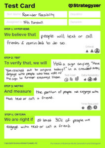
To assess whether reminders are an effective method to encourage people to reach out to their friends, we created a sign that said “Have you reached out to anyone today?” and held walking around white plaza and Tressider, areas populated by many Stanford students. If we noticed someone college aged looking at the sign on foot and without headphones in, we directly engaged them and asked if they had reached out to anyone. These participants were picked because they most closely resembled our target audience of recent graduates while being reachable and (at least presumably) open to interaction.
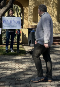
Regardless of their answer, we encouraged them to immediately reach out to more friends and loved ones. Here are the raw responses:
- “I’m good thank you”
- “I have…I will”
- “I have”
- “I have….I will”
- “Not yet”
- “I’ll text my mom right now” (immediate action)
- “I’ll text them right now too” (immediate action)
- “Texting my sister now” (immediate action)
- “Okay”
- “Not yet”
- “I should…I will”
- “I have”
- “No I haven’t but that’s a good idea…I will”
- Ignored with eye contact
- “I have…no”
- “I have…no thanks”
- “I haven’t…yeah yeah I’m going to”
- “I have…sure I will again” (did it immediately)
- “Nah not yet…sure I’ll do it”
Key Takeaways:
In general, the vast majority of people did not take action, although most said that they had already reached out and many promised to take action. However, there is no way for us to know whether they actually took action and the unique social situation of being accosted by a stranger with a sign is likely to impact their promises. We learned that mere reminders are likely not enough to get people to take action to reach out to their friends. For our approach moving forward, we realized we needed to explore more alternatives to sparking action, including both reminders and also other forms of encouragement.
Test #3: Maintaining College Friendships
Our third assumption test followed the design below:
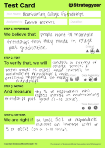
To explore the importance of maintaining college friendships post-graduation, we conducted a survey with 14 recent graduates, asking them to rate their interest in staying connected on a scale of 1-10. I recruited participants through direct outreach and social media, targeting individuals at a transitional stage where friendships may be impacted by career shifts and distance. The results showed that 100% of respondents rated their interest as 6 or above, with 78.6% rating it at 9 or 10, confirming that maintaining friendships is a high priority for most graduates.

Key Takeaways:
This test suggested a strong emotional and social attachment to college friendships, highlighting the need for tools or strategies to help facilitate ongoing connections. A follow-up study could explore the specific challenges graduates face in staying connected and identify the most effective ways to maintain these relationships. We learned that the vast majority of students strongly value maintaining their college friendships post-graduation, suggesting a high social attachments to those relationships. Moving forward, we will explore strategies to help new graduates keep in touch with college friendships, as we have evidence that this is a salient goal (and pain point) for our user population.
Test #4: Digital vs Mixed Interaction for Maintaining Friendships
Our fourth assumption test followed the design below:
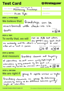
We had two people in Group A and two in Group B
- Group A: Clemson new grad from South Carolina working as an engineer and co-term from Washington studying economics
- Clemson grad was chosen because he is a new grad who is experiencing long-distance friendships due to relocation. He has a mix of new friends from work and old friends from school and his best friend lives in Colorado, giving insight into how text-based check-ins work for distant friendships.
- Co-term was chosen because she is about to transition into post-grad life and has friends who already have, so she is somewhat familiar with long-distance friendships.
- Group B: Stanford senior from Los Angeles studying psychology and Stanford graduate from Florida who studied human biology
- Stanford senior was chosen because she is highly comfortable with texting and maintaining digital friendships, so it would be interesting to see if FaceTiming and such adds value.
- Stanford grad was chosen because she has the opposite behavior to the senior and tends to be passive about digital communication. I thought it would be interesting to see if asking them to reach out changed the behavior of someone who normally does not.
We called each of them or asked them to participate in person and explained their role, having them reach out to a friend in the designated manner and text us how they felt after their day’s interactions, answering the following short questions for each:
- How much time did you spend interacting with this person?
- (For text only) Was this time consecutive?
- How satisfied did the interaction make you feel (1-5)?
Here were some of the responses we gathered:
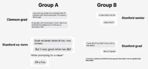
Key Takeaways:
We learned that Strong bonds were much more important to our users than weaker ones, making medium less important. As we move forward in our solution, it is important for us to keep in mind what interactions our users want to maintain and strengthen, rather than trying to push for interactions that our users are not interested in. In particular, we will focus on helping people interact with closer friendships.
Storyboards
After our assumption testing, we storyboarded three possible interventions to specifically target our findings that our users a) would reach out to friends if reminded, b) are worried about quality of interactions rather than sheer quantity, and c) that occasionally, guilt can translate into action. We came up with three main ideas and created a storyboard for each one.
Idea #1: Daily puzzles for distant friends
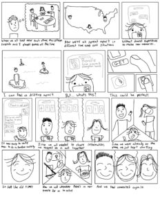
Our core idea here was to provide an easy way for long-distance friends to have an activity that went a step beyond just catching up. By giving them a shared goal, we could help friends find a sense of accomplishment that texting and calling alone does not provide, as well as possibly building confidence in reaching out for other things.
Idea #2: Ping alert reminder
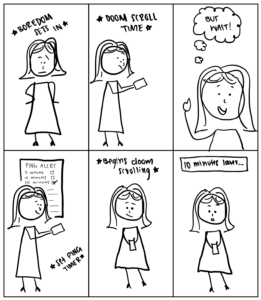
This solution idea aimed to help post-graduates maintain connections by nudging them toward meaningful interactions rather than passive online consumption. The system integrates seamlessly into existing phone habits, triggering during periods of excessive scrolling to encourage users to redirect their online time toward social engagement. This targeted our users’ desires to not spend more time on their phones while also reducing the time they spent mindlessly scrolling, which came up in our baseline study as well.
Idea #3: Passive depiction of friendship through plants
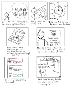
This solution seeks to represent friendships through plant-based visualizations on a phone’s home screen widget. Users select plants to represent specific friends, with each plant’s watering needs corresponding to their desired frequency of connection with that friend. The widget passively displays how long it’s been since the last interaction. Plants begin to wilt and dry up when too much time has passed without contact, while recent connections make the plant appear healthy and vibrant. This would provide users an ambient awareness of their friendships that can serve as passive reminders to reach out, allowing for user flexibility and encouraging stronger connections with already close friends.
Selected Idea: Plants
Ultimately, we decided to move forwards with idea #3, depicting friendships through plants. We felt that this solution tied together the need for flexibility we found in our baseline study while leveraging the small power of guilt we uncovered in our assumption testing. Puzzling would require more time spent online and may cause undue stress if the puzzles do not go well, and reminders and pings are prone to being ignored, as we also found in our assumption testing. Regardless, the plant depiction does not come without its concerns, such as worries over causing anxiety over “wilting” friendships and lacking a way to address the quality of interactions. We chose to address these concerns in our intervention study.
Intervention Study Design
We developed an intervention study to specifically test the effect our plant depiction idea had on the wellbeing of our users. Our intervention study was conducted from February 17 – 21, 2025, with each of our five participants completing their diaries over four consecutive days within that time frame.
Before the study began, each participant submitted the names of three friendships they would like to track through our study and what kind of plant they would like to represent that friendship as (cactus for low-maintenance, flower for medium-maintenance, or herb for high-maintenance).During the study, each participant would fill out a nightly diary to log their interactions with each friend; the following morning, each participant would receive a ping with their plants’ statuses for that day.
The study was successful overall. We saw significant results on how our participants affected friendships, though we found that the guilt aspect of our intervention came across slightly too strong. You can view some of our synthesis at this FigJam, and we have distilled our key insights below in more detail. While key insights have been distilled below, if you would like to view our raw data, you may find it in our appendix. For privacy, all data has been anonymized.
Key Insights
Key Insight #1: The plant metaphor really worked.
All of our participants tied friendship health to plant health, finding the plants to be a direct representation of what their plants looked like. This connection was extremely strong for four out of our five participants and strong enough for our fifth participant. As we hoped, the plant metaphor led people to consider the quality and frequency of interactions, as well as providing some salient insights for participants about their friendship dynamics.
Key Insight #2: The visual representation of friendships can cause stress. 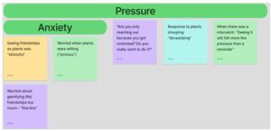
The same four participants who tied the plants extremely strongly to friendships reported more stress tied to the plants throughout the intervention study. This brought up concerns of “gamifying” and obligation, as well as contributing to a negative effect on wellbeing.
Key Insight #3: The salience and sensitivity of the plants contributes to this stress.

Our participants mentioned many ways in which passivity would help mitigate this stress. This ties into our eventual goal – to implement the plants as a widget rather than as a constant stream of push notifications. While users appreciated notifications prompting their own input about friendships, they did not enjoy constant reminders about their plant statuses. Tied into this theme was also concerns about frequency, with the daily updates being overwhelming to many participants – two of them specifically mentioned that updates on a weekly basis would be more approachable for them.
Key Insight #4: Users crave modularity in frequency and method.

Two users found reminders during busy periods of their lives to be helpful; three found them to be stressful. Additionally, three users mentioned that there were slight mismatches between how the intervention functioned and how they view their friendships. Friendships are deeply personal to each user, and there is no one-size fits all approach.
Solution Changes
In our solution moving forward, we want to introduce more modularity in plant selection by allowing users to have more input into the plant maintenance plans and the ability to change what plants friends are represented by. We are also eager to shift towards our final idea of using widgets to create more passive reminders rather than in-your-face notifications that can stress out users. We will still keep interaction logging as a part of our solution, as our users found manual logging to be a helpful tool for internal reflection. To limit the amount of work that this adds to our users and to further minimize the stress and overwhelming nature of our solution that our users reported on, we will limit the total number of friendships that users can track.
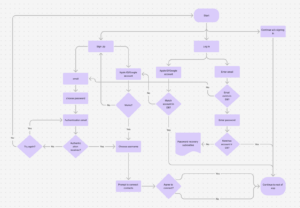
System Paths

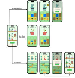
After our intervention study, we worked on creating system maps to see how different users would engage with our solution. We mapped out at what points our users (drawn from our personas detailed in the baseline study section) would enter and exit the app, as well as what they might do within the app depending on their individual needs and motivations. You can find our Figma link here.
The system paths revealed a few key aspects about our intended solution. Overall, our solution relies heavily on a strong setup and harnessing that initial energy and motivation the user has when they download the app. The setup flow will be similar for all users, although people invited to plants created by friends won’t have to go through the plant setup in the same way.
We discovered that when we have personas such as Anxious Ally, who is not just socially anxious but also resistant about giving her data to any old app, it’s crucial to have a way to use the app that doesn’t involve offering your personal information, which is why her path diverges when creating plants. Ally adds plants one at a time with any plant she chooses, whereas Forgetful Frank and Proximity Paul add plants by importing their contacts. This option is particularly helpful to Frank, who can’t always remember who he wants to keep in touch with.
Another important path divergence to notice is the difference in reactions to seeing a plant widget. Ally and Paul are satisfied with their interactions, giving them reassurance about their friendships. Frank, on the other hand, is reminded of a friendship he has forgotten to reach out to recently, and the view of his plant prompts him to reach out and subsequently log his interaction. All of these reactions to the widget serve the distinct goals of our users, whether that is reassurance or reminding.
One of the most crucial insights we gathered from this exercise revolved around how and when the user adds the widget to their home screen. This is a crucial aspect of the app because our solution clearly doesn’t work without it, but it’s also awkward to add in the onboarding flow because it forces the user to exit the system. In building this system map, we decided the best solution would be to prompt the user to add a widget right after they have added their first friend. That way, they exit the app when the widget will be providing real value.
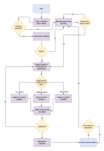
Story Maps
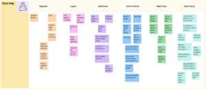
To make this story path, we chose one of our personas that interacted with every part of the app (from signup to plant creation to using the widget) to the as much of the app’s functionality as possible. In doing so, we realized there were a few spots where the user could take different, parallel paths (such as signing up through Apple ID or using an email username/password) and decided to include both paths in the story map for completeness. You can view this in higher resolution at this .
When looking towards our MVP, we asked ourselves what’s the most we can lose while still providing maximal benefit? We identified checking the plants as the core of the app that we must not lose–this is what will motivate the user to reach out to friends. This means that the user has to be able to add plants and check on them. Additionally, in order to be effective and encourage active reflection, we needed to provide the users a way to log their interactions, which would affect the plants.
We realized that registering/logging in was not at all necessary, so we cut it out completely from our prototype. Finally, we concluded that while adding a friend within the app to care for a plant together would be a nice touch, it was not a make-or-break feature, so for the MVP, we decided to lose it.
MVP Features
Here is a storymap representing the reduced necessary features for our MVP:
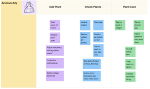
The final list of features and details is as follows:
- Add plant flow
- Enter name of friend
- Choose plant type
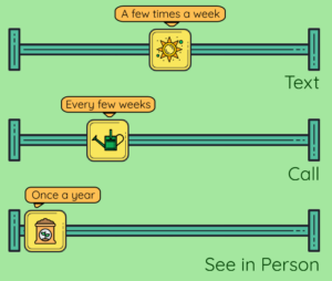
- Adjust frequency of goals for calling/texting
- Customize notifications
- Add plant to widget
- Check plants
- Garden widget
- Visualize whether you’ve met goals based on state of plants
- Plant care
- Select option to water/resoil/give sun to plant
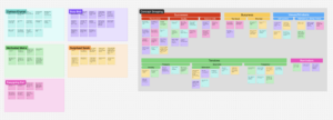
Bubble Map
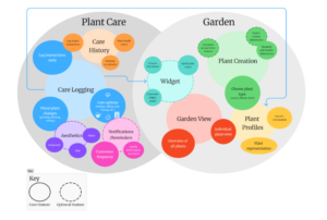
Finally, we created a bubble map to show how our users, their goals, and our features interact with each other. To create the bubble map, we began with listing the core mechanics of the app and using these MVP features as a foundation. From there, we grouped related tasks and elements into the two main areas you see above: Plant Care and Garden; these groups reflect the two major flows that users go through to use the app. From there, we branched into subcategories like Care Logging and Plant Creation, further breaking them down and adding more detail. Color-coding and size variation were used to group related features and indicate importance/frequency of use, respectively. Dashed outlines indicate optional features. You can access our bubble map via this Figma link.
Key Insights
From the bubble mapping process, we found a few key insights and want to keep the following in mind as we develop our final product:
- Prioritization: Core features like care logging take higher precedence than smaller circles or optional features
- Interconnectedness: Mapping features highlights the elements that need to be more connected, like Widgets and Plant Profiles needing care information
- User Flow: Structuring features showed how uers naturally engage with the app, moving from creating a friendship/plant → maintaining it → reflecting on it
Moving Forward
Our assumption tests, intervention study, and subsequent solution refinement led us to a solution that could help our users find passive reminders and flexibility in their social interactions, specifically targeted towards close friendships. We wrapped up this part of our process with a core understanding of the potential stress our solution could add to our users, many conversations on how we could minimize this consequence, and a core list of the features we wanted to include as we proceeded to our next step: interaction design.
4. Interaction Design
Having further developed iterated on our solution, we now needed to translate this into an actual app. This section details the process from sketches to a clickable Figma prototype, linked at the end of this section.
Wireflows & Sketchy Screens
The first step in our interaction design process was to create wireflows of our interactions and sketch out rough drafts of what our screens would look like. Each of our sketchy screens went through a round of critiques, which are detailed below. For higher resolution, you can find our wire flows on Figma here.
Wireflow 1: Signing Up
This wireflow primarily captures the initial onboarding (signing up) process that will be the first thing the users encounter. Since all of our personas are young post grads who are both familiar with technology and are weary of having too many different accounts/passwords, it’s important for us to give them options to avoid doing so. The option to use Google or AppleID to sign up gives them a quick and easy option so that they don’t have to remember an extra password and username combination.
More important, however, is our inclusion of the option to continue to the app without signing up. The most important features of our app will still be accessible without an account–the user can track their friendships manually and have plants continue to passively represent their interactions. This will help some of our personas, such as Anxious Allie, rest easy because she knows her data isn’t being collected. However, the option to sign up and connect contacts helps people like Busy Bea because they won’t have to take the time to manually log interactions.
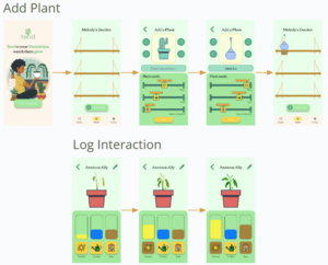
Wireflow 2: Adding a Plant
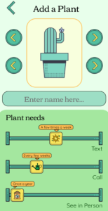
This wireflow illustrates the process of adding a new plant, which symbolizes a friendship in the app. The user is guided through different steps, starting with importing contacts or manually entering a unique name. This ensures that each friendship is distinct and identifiable within the app. A key feature of this flow is the ability to select a plant type based on the desired level of contact with a friend. Low-contact friendships are represented by cacti, medium-contact by herbs, and high-contact by flowers. This visual metaphor helps users intuitively categorize their relationships while reinforcing the app’s theme of maintaining connections.
Additionally, the inclusion of a pot selection step adds an extra layer of personalization, making each plant feel unique to the user. Once confirmed, the plant is added to the collection, where users can track their interactions and be reminded to reach out when needed. This structure makes the process both engaging and meaningful, helping users nurture their relationships in a way that feels natural and rewarding.
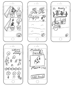
Sketchy Screen 1: Adding a Plant
Original sketchy screens by Emma

Critiques
- A little unclear what the plant at the center top of the first screen is
- Generally would prefer a more environmental/garden feel (see Full Plant Overview) and to add from there
- “Frequency” is unclear
- Does the user type in natural language? Dropdown menu?
- What does “frequency” actually apply to?
- Maybe we want the user to be able to specify frequencies for calling, texting, and seeing each other in person
- Plant options should have frequency imbedded in them (with option for further customization)
- Would be nice to see plants a little bigger
- Plant should be bigger and easier to see
- Maybe add further customization with choosing a pot.
- Can make the “add to widget” option more immersive by showing the widget
- Could try to keep some more language in theme (eg, “Plant!” Instead of “Add”)
Edited version

Justification
The edited version improves clarity by making plant options larger and incorporating frequency selection within them. The interface now has a more immersive garden theme, making the interaction feel more natural and engaging. Additionally, the wording aligns better with the overall theme (e.g., using “Plant!” instead of “Add”).
Sketchy Screen 2: Full Plant Overview
Original sketchy screens by Houston
Critiques
- On the first and second screen, maybe we could try a similar display where the shelves/ garden are centered and not cut off by the screen
- Unclear the purpose of the shovel icon, maybe keep the shovel and label it with a word under “remove” or something
- Too many details on screen 3, taking away from the goal of displaying the plants (with the window)
- I like the “hi/ welcome back” feature
- On the fourth screen, not clear what the circled numbers are representing/ if it is a button or not
- On the 5th screen, I think the (4/6) should be displayed differently and not next to the persons name as it may be confusing to users
Edited version

Justification
The changes enhance visual organization by centering the shelves/garden for a more balanced display. Labels were added to ambiguous icons (e.g., the shovel) to improve usability. The updated version simplifies the interface, removing excessive details that distracted from the main goal of showcasing the plants.
Sketchy Screen 3: Single Plant Care
Original sketchy screens by Nils

Critiques
- The alert is distracting on the first screen
- The most common buttons on the first screen are further from the bottom of the screen (inconvenient for users)
- Second screen, unsure what the buttons do
- Third screen, missing name. Also, “goal” looks like “good”
- On the fourth screen, ways to input interactions is not obvious
- Fourth screen, could reduce friction by adding a button for the user to do the desired goal (in this case, calling)
- The friend’s picture is a nice touch – it might be nice to have that on other screens as well
- Fifth screen: confusing to see plant pot with level indicators like a thermometer
- All screens: unclear how to get out of this view
Edited version

Justification
The revised version improves usability by repositioning common buttons closer to the bottom for easier access. It also reduces ambiguity by clearly labeling buttons and including a friend’s picture across multiple screens for consistency. The interaction flow was refined by adding a button to quickly initiate the desired action (e.g., calling a friend), reducing user friction.
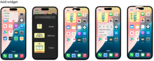
Sketchy Screen 4: Adding a Widget
Original sketchy screens by Alison

Critiques
- It would be nice to be able to see different widget sizes and what they may look like
- What happens when a user taps the widget? Does it open a specific plant’s view or are there quick actions?
- It could be cool to create groups of plants to display if there are bigger widgets
- There could be automatic groups with people you log the most interaction with
- There is no easy way to tell a plant’s health based on the screens
Edited version

Justification
The update introduces different widget sizes and clarifies their functionality, ensuring users understand what happens when they tap a widget. It also incorporates the ability to group plants dynamically, making the widget more informative and relevant to user interactions. The revised version offers better visual cues to indicate plant health.
Mood Boards & Style Tiles
With a rough idea of what our app layout would look like, our next step was to begin to stylize our app. We created a moodboard and a style tile to guide our design decisions moving forward.
Moodboard

Justification
Our mood board is inspired by nature and the feeling of calmness that plants bring. We wanted to create a design that feels welcoming and peaceful, using greenery to represent growth, connection, and care. The soft, natural colors and plant elements make the space feel inviting and refreshing, like a place where friendships can thrive. The goal is to capture the feeling of being in a cozy, relaxing environment; somewhere that encourages people to connect in a natural and stress-free way.
Style Tile
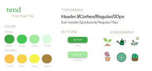
For our style tile, we focused on bright colors and friendly icons that promote a sense of growth, joy, and comfort. We also selected a font that felt structured but not rigid, enjoying the approachable and modern feeling that the font affords. We also took note of certain accessibility features, including ensuring that our color contrast levels meet WCAG standards and including a serif font based on easier text readability.
Initial Prototype
Our original flows focused on adding a plant and seeing the effects of caring for a plant by logging interactions, using our style tile as a guide for the design process in the choice of color, using icons with bold outlines when possible, and the fonts we chose.
Overview
After selecting our style, we created a clickable Figma prototype of our app. Note that this is the same file as our final prototype, as we improved on the original design.
Usability Study
Overview
With a clickable prototype in hand, we developed a user study to test our app’s workflows and overall impressions on users. Our user study was conducted on March 11th, 2025 with classmates from CS247B. During this user study, we asked participants to create a new plant, log an interaction, and look through their garden to find plants that need attention. Some of our key questions included:
- How easy or difficult was it to add a plant?
- Did [current task] update in a way that made sense to you?
- What do you think the app is encouraging you to do?
- Would you use this app in real life? Why or why not?
- Do you have any suggestions to improve the app?
Note: for a thorough breakdown of our usability study script, you can access our document via the link in our appendix.
Feedback Breakdown
Here is a list of the core issues brought up by our users during the study:
- Difficulty remembering different goals for each plant
- Difficulty connecting plant care with goals
- Uncertainty whether actions were successfully logged
- Difficult-to-read fonts on labels for sliders
- Low contrast on buttons
- Difficulty identifying plants that need attention at a glance
- Unclear how different plants correspond to different interaction needs.
- “Enter name here” field unclear – users thought maybe they were supposed to add their own name
- Users speculated that they might have a hard time understanding/seeing how a plant grew over time.
- Settings page didn’t seem relevant.
- Worry that users might forget to update a plant after interacting with friends
While we have many plans listed above, our overall feedback from our users was very encouraging
for our proof of concept. Users expressed delight, surprise, and joy when customizing their plants, and had strong positive reactions to logging plant care and seeing health improve. We realized that our next steps should focus on increasing clarity for our users – adding status indicators, including tooltips with helpful information, and increasing font visibility. We left our user study with an understanding that our concept resonates strongly with users and fine-tuning will be our focus from here.
Final Prototype
You can go through our main flow’s interactions by viewing this clickable prototype or look at our Figma in more detail via this wireframe. We have also created a demo video, which you can find at this video link. Our main flows are adding a plant, checking a plant’s health, and logging an interaction with a plant with the additional ability to add a widget, and you can see each flow below.
Our user feedback mainly focused on the lack of visual clarity in the state of a plant and aesthetic difficulties with the app. As such, we focused our visual changes on adding more clarity for the user as they go through the app, such as the new tooltip for plant types, indicators of low plant health, and animations when caring for a plant. Below we show a before and after comparison and justification for all of the major changes we made to our original design.
| Original | Issue | Redesign |
Originally, the indicators for the plants level of sun, water, and fertilizer were abstract and didn’t connect directly to the users goal |
Difficulty remembering different goals for each plantDifficulty connecting plant care with goals | 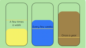
This redesign includes markers showing the user what their goal is for each aspect of plant care, directly connecting what they do with how the plants look. |
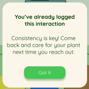
Previously, the meter for the action the user logged would increase as soon as the user tapped the button to log their change, but the button background color would look darker and still be interactable, which confused users. The icon would stay the same color |
Uncertainty whether actions were successfully logged | 
We made many changes. Now the icon dims with the background, more clearly conveying that the button is disabled. Additionally, when a button is pressed, an animation of that icon coming in from the right hand side over the plant more clearly communicates that this plant is being given what it needs. If this causes the plant to grow, the plant will do so at the end of the animation, communicating causality. Finally, if the user tries to log an interaction again by tapping on the disabled button, a modal appears letting them know why they can’t log it again.
|
Originally, the buttons with white text had low contrast and the labels on the sliders were too small |
Difficult-to-read fonts on labels for slidersLow contrast on buttons | 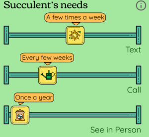
We changed the primary button color to a darker green to improve contrast and increased the side of the slider labels. |
Originally we just relied on the wilting of the plant to communicate the need for care. |
Difficulty identifying plants that need attention at a glance | 
Now we added an icon corresponding to the plant’s most crucial need |
Previously, changing between different types of plants would change the sliders’ initial values, but there was no further explanation of this change. |
Unclear how different plants correspond to different interaction needs. | 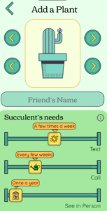
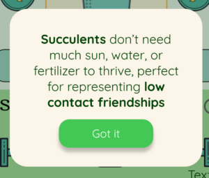
We made two key changes to connect the type of plant with the plant needs. First, instead of reading “plant needs” at the top of the section with the sliders, we had it automatically adjust to the type of plant currently selected (succulents, flowers, or herbs). We also added an ⓘ which brings up a modal explaining that type of plant’s needs and how it connects to representing friendships.
|
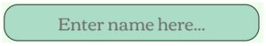
The prompt to input their friend’s name read “Enter name here…” |
“Enter name here” field unclear – users thought maybe they were supposed to add their own name |
With the additional implementation of the widget flow, we wanted users to have control over the size and look of their widgets. Future iterations would have more customization options for widget backgrounds and widget plant selections in-app, but the main flow currently includes the main flow of adding a widget to the home screen which automatically populates with the plants the user interacts with most often. If a user wants more clarity in the status of a plant, they can optionally toggle health indicators on or off, and these plants would have the same low health indicators as their in-app counterparts.
5. Conclusion
Through our work this quarter, we have deeply explored the social habits of new graduates through a baseline study and an intervention study, ultimately landing on tend, an app designed to encourage friendship maintenance through using passive display of pants as friendships. Our usability testing led to improvements of our prototype, though more testing is required in the future to examine the effectiveness of our revisions. Eventually, a higher fidelity prototype of tend could be implemented to fully test the widget functionality on actual smartphones, opening the door for further user testing over longer periods of time to return to the goals of our intervention study to examine the effects of our solution on wellbeing.
6. Appendix
Baseline Study – Raw Data
Our raw data for our intervention study can be found in this Google Drive folder. For privacy reasons, all data has been cleaned and anonymized to remove any identifying information.
Baseline Study – Grounded Theory 6: New friendships form in structured environments post-grad
Participants rely on structured social settings to meet new people.
Evidence:
Our sub-theories and evidence are below:
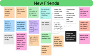
Subtheory: The workplace becomes a primary social space.
- Example: “New hires at company become friends.”
- Example: “Vast majority of local social circle are from work.”
Question: How can workplaces better facilitate friendships?
Subtheory: New social groups form through organized activities.
- Example: “Meets new people through social events in his new town.”
- Example: “Makes new connections through activities (ex. church group).”
Question: What structured activities best support meaningful social connections?
Subtheory: Post-grads struggle to make friends outside structured settings.
- Example: “Not sure how to go about meeting new people yet – ‘I haven’t had to make a lot of friends for a while.’”
- Example: “Meeting new people is hard now (mindset).”
Question: How can post-grads form organic friendships outside of structured settings?
Contradictions and Tensions
Despite being surrounded by people their age, our interviewees still felt unsatisfied with their social lives. There is a strong need in our user group for strengthening of pre-existing connections.
Baseline Study – Grounded Theory 7: Friendships change post-grad, requiring new strategies for connection
Friendships evolve after college, requiring active effort and adaptation. (See Energy under Grounded Theory 1.)
Evidence
Our sub-theories and evidence are below:
Subtheory: Post-grad friendships require intentional effort to maintain.
- Example: “Need to regularly reach out to strong ties (mindset).”
- Example: “Relationships transitioning to online means both parties have to put in effort.”
Question: How do post-grad friendships redefine what it means to be ‘close’?
Subtheory: Some friendships fade due to lack of shared experiences.
- Example: “Misses the shared experience aspect from college.”
- Example: “Felt a little fomo seeing people hang out at school.”
Question: What can help maintain friendships when shared experiences decrease?
Subtheory: Maintaining friendships requires balancing effort and flexibility.
- Example: “Okay with fading in/out of contact.”
- Example: “Longer time between convos = harder to reach out.”
Question: How can post-grads create friendships that are both flexible and meaningful?
Contradictions and Tensions
Our interviewees feel a strong dissonance in their friendships from college now that they have moved away. However, this dissonance is less strong for some – the fading in/out of contact is something that some interviewees leaned into while others expressed distaste for. Our interviewees have distinctly different expectations and preferences; moving forward, we need to design with this flexibility in mind to match an individual’s expectation of a friendship and not our own expectations.
Interaction Design – Usability Script
Our usability script can be found at this Google Document.


