
Amazon’s checkout flow is built entirely around efficiency. Returning users rarely need to re-enter information, as addresses, payment methods, and preferences are saved and automatically surfaced. The one-click purchase feature reduces the decision process to a single step, and the layout minimizes scrolling, distractions, and cognitive effort. Amazon’s approach reflects a clear priority: reducing cart abandonment and maximizing completed transactions. Even related product recommendations are placed to the side, where they won’t disrupt momentum. The design is optimized for conversion rate, where every second saved translates to higher likely sales.
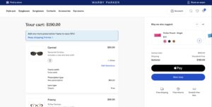
Warby Parker’s checkout experience emphasizes clarity and reassurance. Customers can check out as guests, which reduces initial frictions to platform use/purchase. They can also review product details with clear visuals, and see transparent return and warranty policies at each step. Messaging such as “Free returns” and “Home Try-On” builds trust and reduces hesitation, especially important for one-time purchases where fit and style matter. Warby Parker also subtly nudges users toward higher-value carts through product bundling, accessory suggestions, and reminders that multiple frames can be tried risk-free. The flow balances convenience with confidence-building, supporting a strategy focused on increasing average order value and long-term satisfaction rather than sheer speed.
Patagonia’s checkout reinforces the company’s environmental mission at every stage. Text and visuals highlight responsible sourcing, repair programs, and the brand’s “1% for the Planet” commitment. This values-oriented approach deliberately slows the process down, not through inefficiency, but through reflection. Customers are reminded that their purchase contributes to a broader purpose. This strengthens emotional connection and brand loyalty, key drivers of customer lifetime value. Even post-purchase communications, such as invitations to repair or recycle products, extend the relationship beyond a single transaction.

Overall, these examples illustrate how design choices directly reinforce business objectives. Amazon’s checkout process contains significantly less friction than many other everyday shopping experiences, encouraging continuous use of the platform. Warby Parker’s website empowers customers throughout the purchase process and encourages them to add accessories alongside the main purchase. Meanwhile, Patagonia emphasizes a customer relationship based on impact and shared values.


