
Looking at the different landing pages of these platforms makes you really think about how they automatically guide us to what we’re looking for and potentially, more interestingly, how they decide what we want before we do (or they make us feel like we are making a decision when in reality we aren’t). What’s striking is how differently Netflix, YouTube, and Airbnb each view helping you find what you came for.
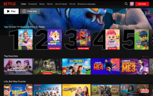
Firstly, Netflix clearly doesn’t want you to do search but rather it wants you to stay in their platform. Everything about the interface is built around engagement time ranging from the thumbnails that autoplay, the ‘Because you watched…’ rows, and all the potential scrolling. It’s a recommendation engine that quietly learns your taste and keeps you inside its world. Since it has a subscription-based business model, for them the more time spent = more perceived value and thus the lower churn. Thus, the goal of their design is to maximize immersion and establish frictionless watching.
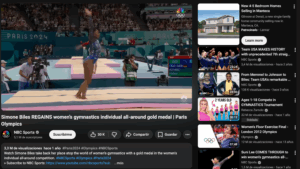
Then, we have Youtube, which starts with search but ends with ‘serendipity’. You look up one video and three hours later you’re watching something only either completely different or at most slighlty related, all with the algorithm behind at work. YouTube optimizes for continuation, because every additional minute means more ads shown.
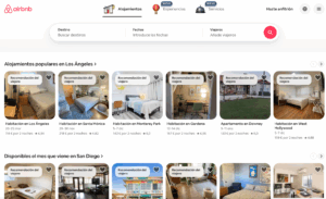
Finally, Airbnb feels completely different, with a clearly filter-heavy browsing with location, price, amenities, vibe adjusted so that you don’t end up scrolling indefinitely like the other platforms. Airbnb’s goal is clear and they want you to book. Rather than entertainment and time, they want bookings, transactions and commitment.
Thus, through the different landing pages, you can see how Netflix wants your time, Youtube wants your attention and Airbnb wants your booking.


