
Wireflow
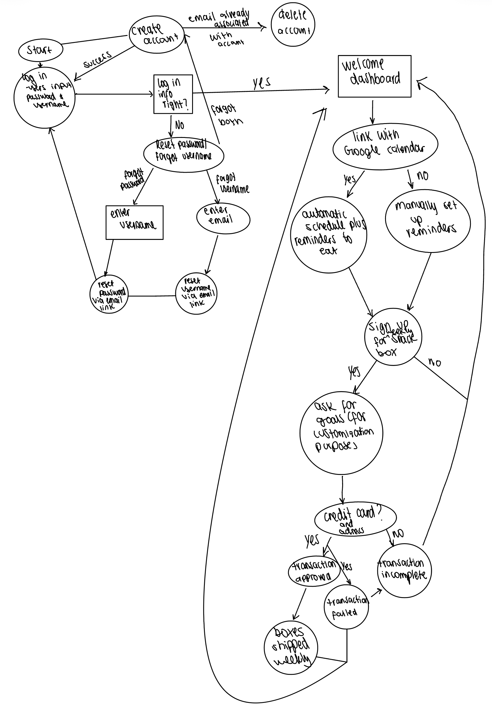
This figure illustrates the overall user workflow for Busy Bites, an eating-habit support app designed for users with busy schedules. The flow begins in the upper-left corner with account creation and login, including recovery paths for forgotten usernames or passwords. Once logged in, users arrive at a welcome dashboard where they can choose to link their Google Calendar for automatic meal-time reminders. They can also choose to manually enter their calendar or setup meal time reminders. Users may then opt into a subscription by signing up for a snack box, provide consent for customization, and complete payment details. Depending on the transaction outcome, the process either proceeds to weekly box deliveries or returns the user to resolve incomplete or failed transactions, capturing the full end-to-end experience from onboarding to ongoing use.
Sketchy Screens
Kehan’s Designs
Based on the style tiles we created, I went for a soft but colorful palette with aesthetic buttons and patterns.
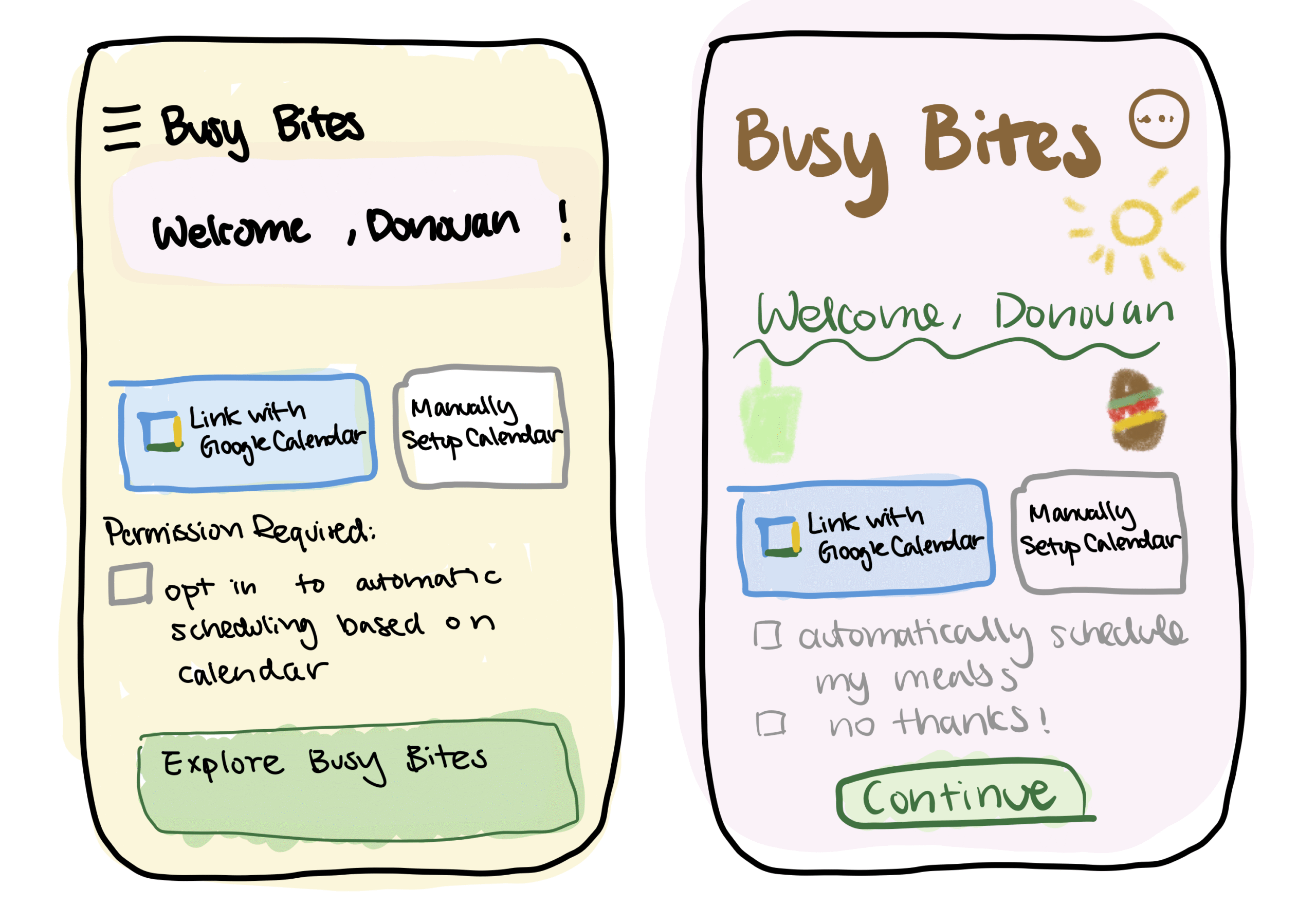
Here are two designs for the “link to calendar” part of the wireflow. The the buttons and tick box text are more common like those in other APPs, with more regular fonts as well. The second design goes for a more niche aesthetic, such that texts are not perfectly aligned but more artistic and floating around. There should also be clipart of snacks/food in a color pencil/crayon style. The second design is more game-like while the first design is probably easier to implement and use for a user.
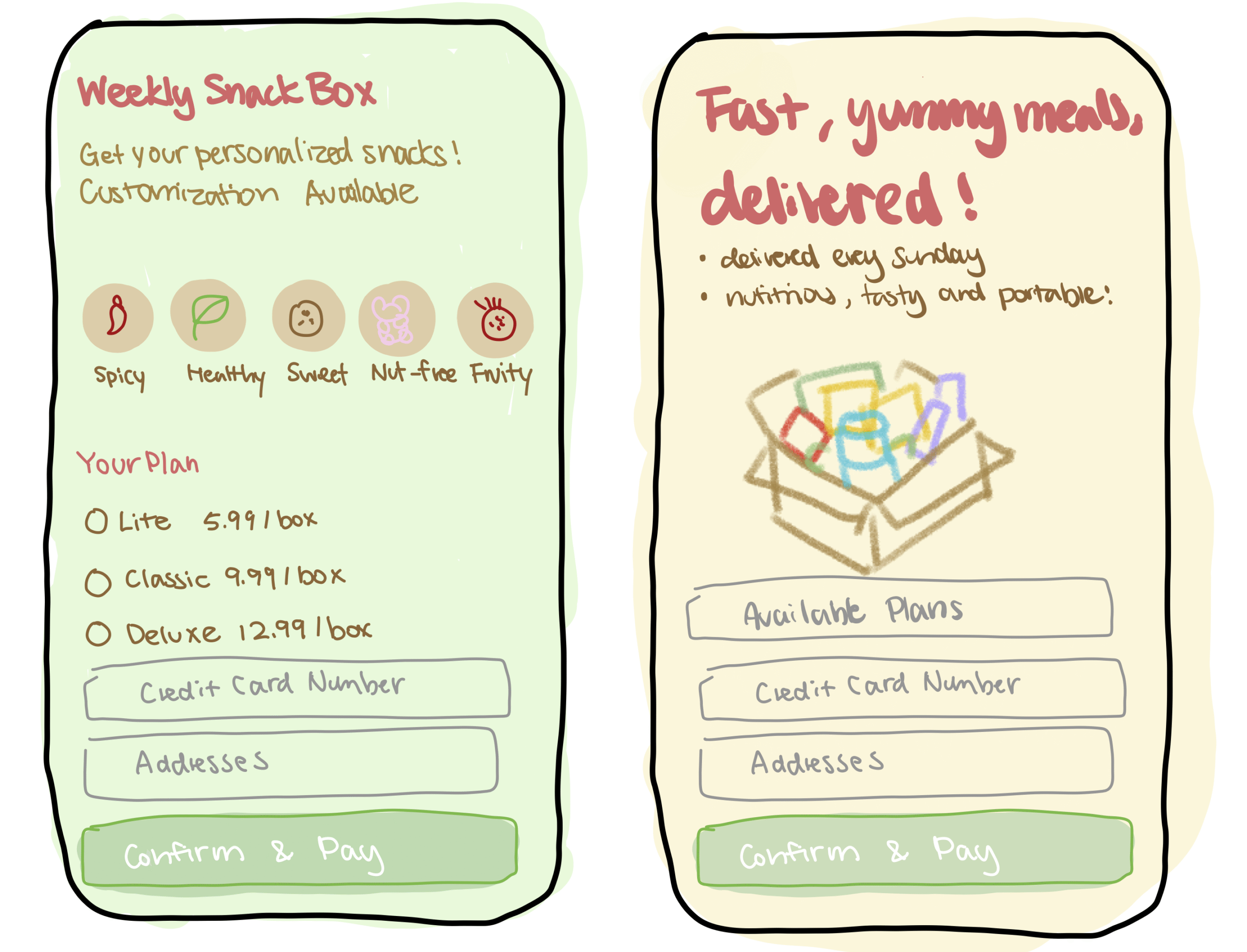
Here are two designs for the “weekly subscription” UI. In the first design, I used more abstract buttons to illustrate different snack themes. In the second, there would be a clipart for what the box will actually look like. The first one is more mysterious and should make the user curious about the content. However it might make users hesitant as well not seeing examples of what they will receive, which is an advantage of the second design. Overall, the first design is more aesthetic and abstract, the second design is more concrete.
Critiques for Kehan:
Nicole: I like how intuitive and visually appealing and scannable your sketches are! The pricing tiers are simple and easy to compare. A critique I have is that on the “weekly snack box” sketch, there seems to be too many decisions at once. This could lead to a cognitive overload, so I think breaking down each step/decision (one per screen) would make it feel less overwhelming for users.
Tyler: I really enjoyed the colorful visual for the sketch. This allows me to see the functionalities at a deeper level, such as the “weekly snack box.” This visual lets people quickly understand a core part of the app. One suggestion is that the opt in should happen prior to users registering, so putting it in the landing might be a bit inconsistent.
Juan: I really like the intuitive aspect of how these sketches were designed. I can really tell that you put significant thought behind what the user experience was going to be at each step of the way. I’d say a small suggestion is echoing what Tyler said. I think we should have the opt in before the user is registered, to really ensure informed and thorough consent of the user’s privacy.
Nicole’s Designs:
In this version of our app, I wanted to take a more softer, intuitive, direct aesthetic. I wanted to create a standard mobile layout with clearly defined, boxed sections, centered headers, consistent padding, and conventional button placement. The calendar sync screen uses recognizable “Connect” buttons for Google and Outlook Calendars, and in each step, I tried to mirror a logical and linear progression. These sketchy screens are created using balsalmiq.
Critiques for Nicole:
Kehan: I like the very cohesive theme! It clearly looks like one APP. I think the buttons are all very reasonable and the interface would be very easy to navigate. I guess the one area I see for improvement is making it more aesthetically pleasing/motivating for the users. e.g. All buttons are blue, should we make some more blue/pop-out more than others so the user would be more inclined to clicking it?
Juan: I really like the cohesiveness of the entire design. I could really tell that each frame was part of a greater design theme, which I really liked. I think maybe one small suggestion could be making the colors a bit more appealing, since we want to make eating fun. Also, going off from our mood board, perhaps including a little bit more pastel colors would make the user experience more appealing.
Tyler: Wow, the sketches look really polished, which makes the flow intuitive to follow along. The elements all look consistent and users should be able to navigate (even on paper) what the app should be going. One suggestion is that it would be more cohesive if the syncs for calendar are either in settings or the main page.
Tyler’s Designs:
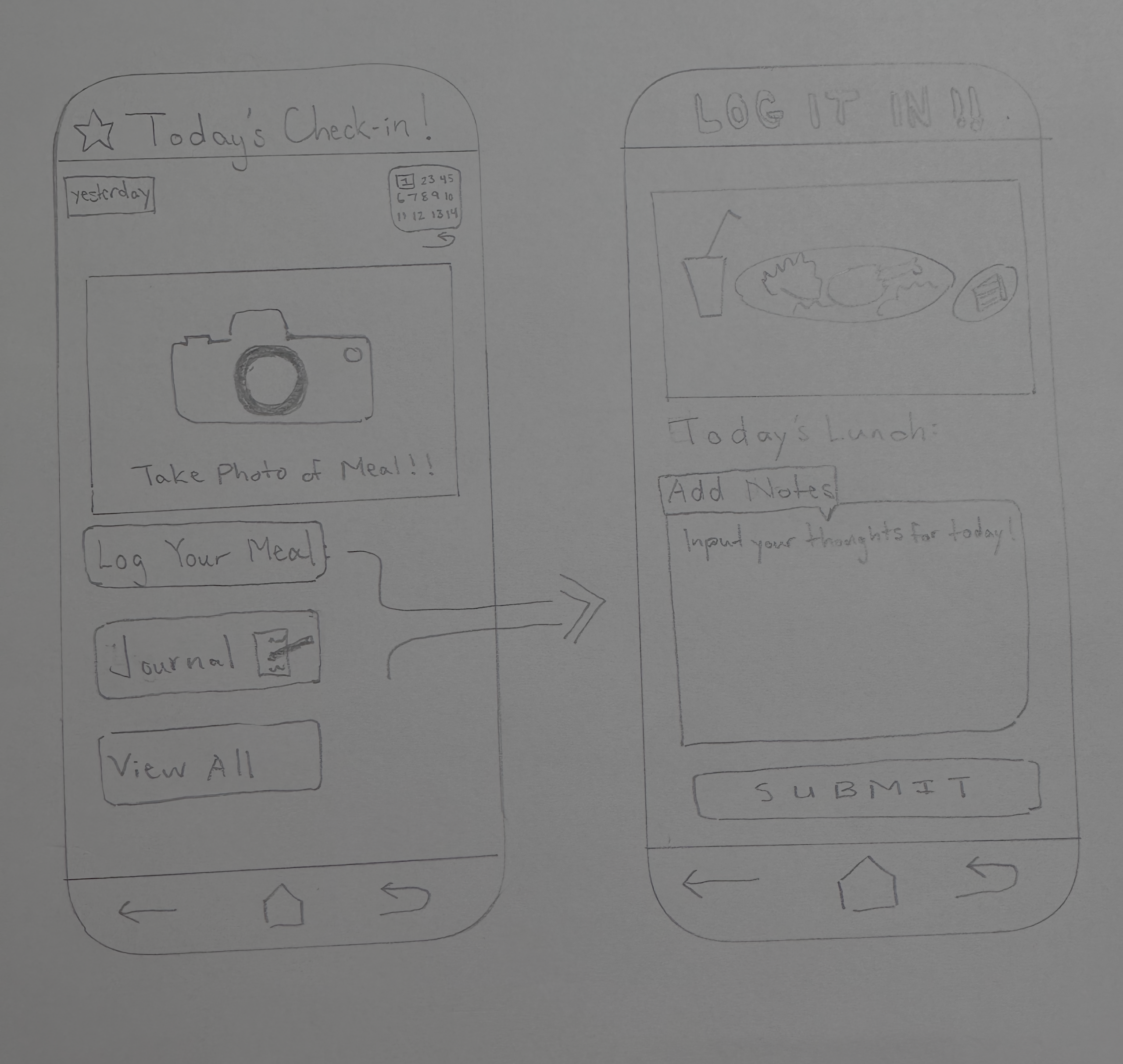
Within this particular section of the app, the main focus is to showcase a core functionality of our app. At the heart of the experience is the Daily Log, designed to help you build a better relationship with food. Beyond simply snapping a photo of your meal, you can check in with yourself by recording your hunger levels and how you feel. In addition, users are able to use the calendar toggle to look back at your journey, see your past entries, and track your consistency with a quick glance.
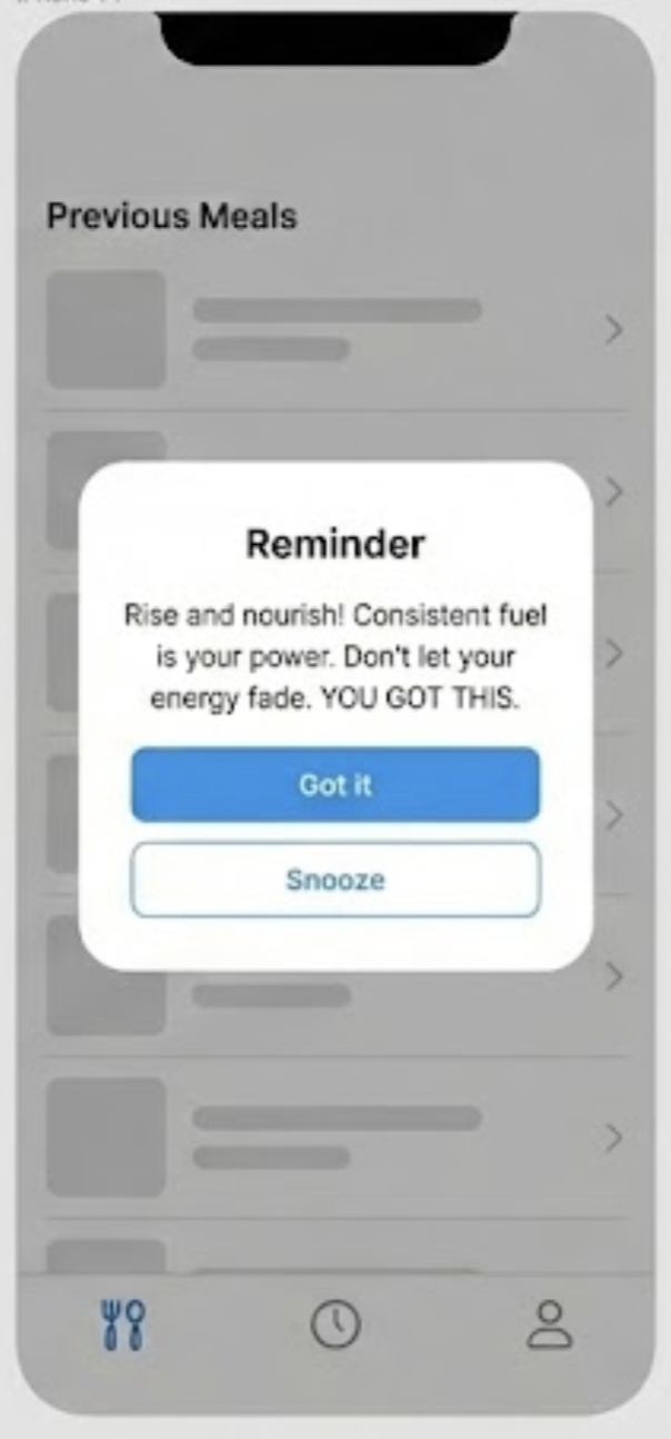
This feature triggers automated re-engagement prompts based on user inactivity. When a specific time threshold is reached without a meal entry or check-in, the system pushes a motivational quote to help give the user an immediate incentive to return to the app and resume their routine.
Critiques for Tyler:
Kehan: This is so cute… I would actually want to use that UI. It’s aesthetically pleasing and also feels easy to navigate, e.g. can click to see previous journal and calendar. I wonder what the button in the right-bottom corner is for, I feel like the functionality of that is not very clear.
Nicole: I like how the camera icon makes the primacy action of photo logging very clear! There’s a clear flow from photo to notes to submitting the image, and it all feels/looks very intuitive. A critique I have is that I think “LOG IT IN!!” tone-wise can feel intense and slightly chaotic compared to the calmer check-in screen. It creates tone inconsistency.
Juan: I really like your artistic capabilities. I’m always blown away by your capacity to really draw very clearly and beautifully. A slight piece of feedback would be to maybe not capitalize “log it in”, since we really want to make the user feel very comfortable and nice. Toning that a little bit more could create a more heart-warming tone.
Juan Pablo’s Designs
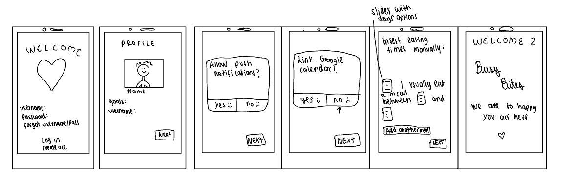
These several sketchy screens show the user experience, starting from when they create their account to when they first choose their goals along their meal times. This is really the onboarding of the user experience of our healthy eating habits app, BusyBytes.
Critiques for Juan Pablo:
Kehan: the smiley and sad faces next to the “yes/no” choices are so cute! And not just cute they definitely will motivate the user to choose “yes”. I also really like the welcome screen 2 it feels very sweet with “we’re happy you are here”. I do think the insert meal times manually screen could be a bit more organized but that might just be limited by the size of the screen because it’s hand drawn.
Tyler: I really enjoyed the “personal” aspect of the app which makes it a more welcoming place for users to sign up and use the app, such as the “ We are happy you are here” screen. One suggestion I would have is perhaps changing the sliders to that of an user input text box, so it takes up less real-estate on the screen.
Nicole: Your sketchy sketch is really cute and feels warm and inviting! One critique I have is to remove the smiley and sad faces from the “yes” and “no” option so it doesn’t influence our users in a way where they should feel bad if they picked no.


