
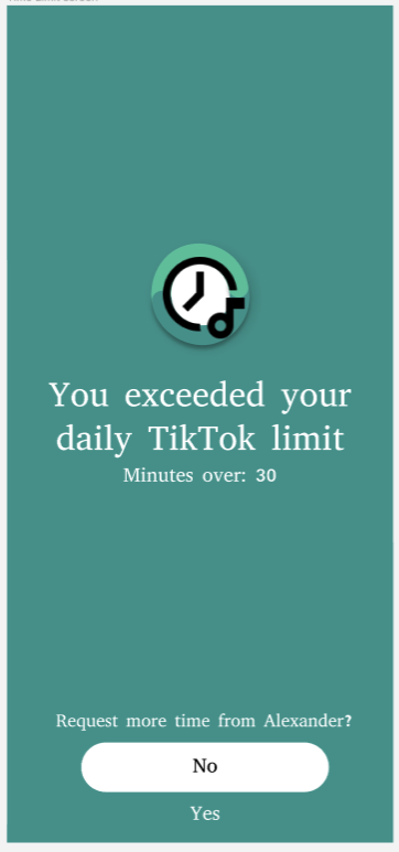
Issue 1: When prompted with the option to ask their friends for more time on TikTok (extension request), they didn’t know how much more time they were requesting, or whether they even had the choice to select how much more time.
Severity: Severe
Fix: Each extension request will be 15 minutes. We will make this clear on the “Ask for extension” time, so users understand that they are asking for 15 minutes extensions.
Issue 2: When prompted to “Add a friend,” users were unsure if this meant that they could only add one friend and they would be unable to add more friends or change their friend to other friends.
Severity: Moderate
Fix: We will update the add friend screen so it is clear you can only add one friend, and you are fixed on that friend once they are chosen – no option for adding more friends/changing them.
Issue 3: Some of our testers were confused if the process of adding a friend was one that they would need to repeat every time they logged in.
Severity: Severe
Fix: Overall, our onboarding process doesn’t have very much description, explaining how each of these decisions during the onboarding affects their daily usage of the app. Therefore, we can easily fix this by clarifying how the friend addition process would be a one-time setup through textual description, this would easily fix this design confusion.
Issue 4: At the home screen, users were confused why the friend’s name was at the top rather than their own.
Severity: Severe
Fix: We can add a header/label clarifying that this is your chosen friend rather than simply displaying the friend name.
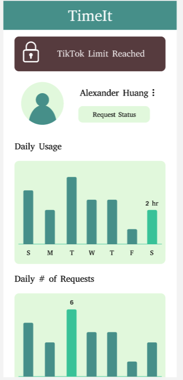
Issue 5: On the home screen of the app, our users see two bar charts: one showing screentime and one showing requests. These metrics have different units, so it is unclear why they are presented on the same type of bar chart graph.
Severity: MODERATE
Fix: To fix this, we will keep the overall screen time as the bar chart that it currently is and we will change the number of requests to be a line graph mapping requests throughout the week.
Issue 6: Users didn’t know when to log in with the Facebook, Google, and Apple login buttons/ if they had to log in again through each of these avenues after pressing login/create an account.
Severity: Trivial
Fix: Add Facebook, google, apple login buttons on the login/create an account screen on the first page of the onboarding.
Issue 7: Daily time limit screen was hard to navigate since users weren’t sure whether to click the “Tap to Edit” instruction at the top and also wanted an easier option to set the same time limit for everyday.
Severity: Moderate
Fix: Get rid of the question mark symbol next to “Tap to Edit” to avoid confusion/add an “all of the above” option to set the same time limit everyday.


