
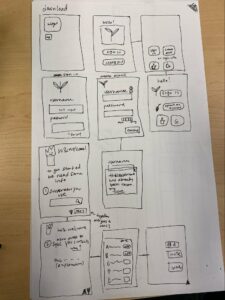
Tiffany: I did the login and first time set-up page. There are multiple iterations of the first welcome screen. I tested out different layouts with smaller or larger tiles to depict the importance we wanted to weigh for signing on or creating a local account, or signing on via Google or Apple. In addition, I wanted to test different layouts for account creation when verifying that a username is available or a password is strong enough. There is also the setting up information about the user (what type of sunscreen one uses, and setting up their social privacy settings and adding or inviting friends)
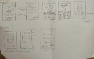
Michelle: I created the flow for the plant customization page when first setting up a profile. Upon first creating a profile, the app will first ask for some information such as username, password, etc. Tiffany’s flow goes more into detail about the logistics we will ask through our app. After the logistics portion is finished, the user will go through a few screens to customize their plant. I created tabs for the user to customize their plant type, color, and facial expression.
I also created a few iterations of the welcome screen for when the user first opens the app. I experimented with the placement of the app name, sign up/log in buttons, and an image of the plant in the back.
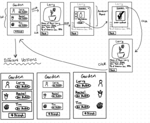
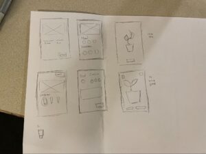
Kayla: I created a sketchy sketch of the flow for a user clicking on one of their friend’s plants. The first page shows a list of all of their friends and their associated plants. Once clicked on a friend it will bring the user to another screen that will display more information about their friend’s plant. The user will be able to see the name of the plant, type of sunscreen their friend uses, their skin type as well as percentage of sunscreen use. The user can also have the option of buying the sunscreen if they are interested. They can do this by clicking on the sunscreen which will take them to an Amazon pop up screen and this is where they can order that particular sunscreen. Once they are done purchasing they can click the x button on the right corner which will take them back to their friend page and then back to the garden screen.
I also created different versions of the garden screen. One is with little screen space and the screen in the middle is with a lot of screen space. The last one I rearranged the profile picture on the right side and the ‘see profile’ button and the name to the left side.
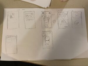
Kaitlyn: I sketched the flow for a user noticing their plant wilting and logging their sunscreen usage. The first two screens in the first image explore different ways that a widget might look– there might be a smaller widget showing just the user’s plant (and the weather in the background), along with a larger widget that shows the user’s friends’ plants as well– this way, users can more easily notice if their friend’s plants are wilting, even without going into the app itself. The next two screens are the plant screen– this shows the plant and its status (if it’s wilting, healthy, etc), along with the weather in the background. This is so that users could see the weather in the app itself without needing to go back to the weather application. In addition, it might help in prompting users to put on sunscreen (if they see it is sunny in the app background, they would be more motivated to wear sunscreen and protect their plant). The condition of the plant would be reliant on the user’s sunscreen habits– if it was sunny out and the user hadn’t worn sunscreen in a while, the plant would be wilting or burning. However, if the user puts on sunscreen, the plant will appear happy (and wear sunglasses).
I explored several different iterations for the log screen– initially,the log screen was more of a form that users had to fill out, but there was a critique that it would be too much friction for users. A second option we explored was to just have the log screen just be a big check button with an option to add a photo for verification. In the second image, I explored 4 more options for other things to include in the log page, like which sunscreen the user wore on that particular day, or their mood that day.
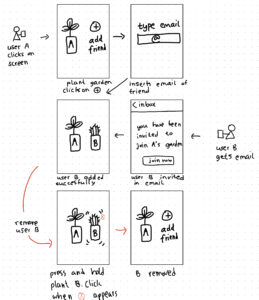
Labib: I created a sketch for users to add or remove their friends for their digital garden. First, I did the flow for adding a friend. The first screen has a + tab clicking which prompts the second screen which asks for an e-mail address of the friend. From then I did the sketch for the friend who gets an e-mail which a link to download and thereby be added as a friend. In the last two sketches, I drew the flow for removing a friend from the virtual garden. I thought this was an important step to give users the ability to curate their garden as the invited friend could no longer be welcome in their garden due to a variety of reasons including that they became inactive or inconsistent.
I considered different ways of adding and removing friend plants. Instead of e-mail, I considered AirDrop but then abandoned the idea because of non-iOS users but more importantly to not be bound by proximity. I also thought that e-mail addresses were less personal to many than phone numbers. For the removing friend flow, I opted for the wiggling effect with a ‘X’ button that many are familiar with.


