If the images are not clear enough, please open images in new tab, zoom, or refer to our FigJam link.
WireFlow 1: Reminder Flow

Justification: Our interviews revealed that many people who pick skin recognize their behavior as a problem and have effective interventions, but they often forget to apply them at the right time. To address this, we included a reminder feature to ensure they consistently use their interventions. The reminder is designed so that time itself serves as a trigger. Additionally, the reminder only goes away after active engagement with the reminder. We want to avoid users passively recognizing or ignoring the reminder.
WireFlow 2: Shortcut Creation
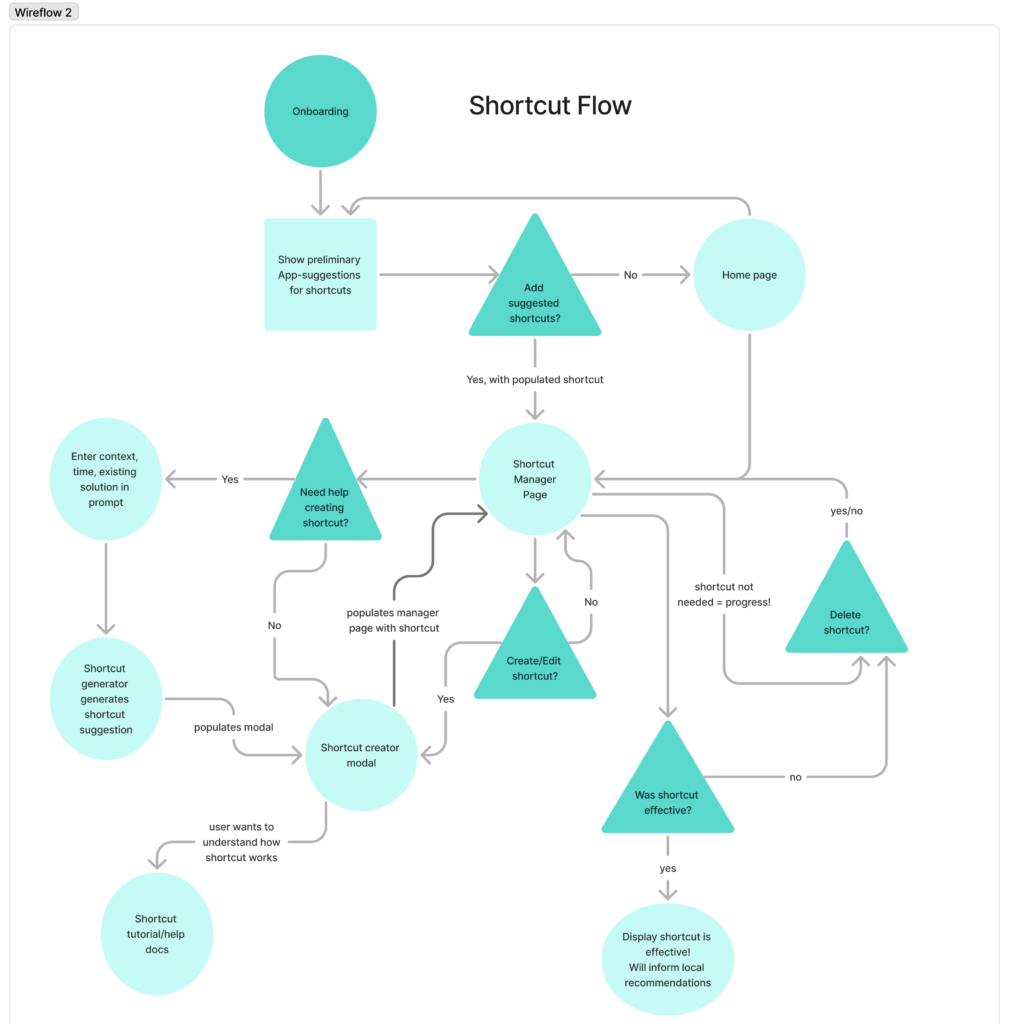
Justification: we know based on our personas that skin-picking sessions are closely tied to locations and times like in the car, at home, in the morning before going to work, after returning to work, etc. Our personas know best when they are more prone to pick; so, we give them the agency to choose when they want to integrate their intervention on their mobile device by creating shortcuts. If the user is unsure how to create an effective shortcut, we give them recommendations for shortcut intervention based on what we learn from the user and general examples. For example, if the user tells us that they are more prone to skin-pick after using a certain social media, we can suggest shortcuts that intervene before using social media.
WireFlow 3: Intervention

Justification: We know that particular events will trigger one of three different interventions (tapping, meditation, or free-writing) depending on the environment and the preferences of the user. Different users may prefer different users at different times. The three interventions chosen were informed by our preliminary research and interviews (necessity to occupy hands, stress-relief through meditation, and stress-relief through free-writing. In the current implementation, I ask the user if they want to change the intervention or the environmental cues to help them personalize their experience.
Sketchy Screens + Critique
Hunter’s Sketchy Screens
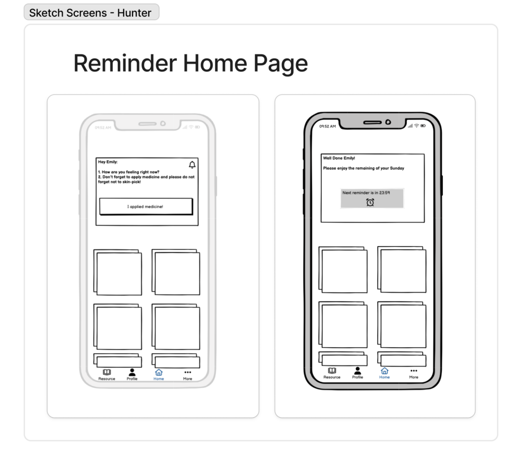
Critique Comments:
- Icon: Is this bell icon just to add visual flair or is it a button?
- Personal: This notification feels personal which I like. A friendly casual reminder to apply the solution.
- I like how encouraging the messages are! The use of their name requires that we make a profile creator/profile creation flow, so that is something certainly to discuss
- Reminder Content: “please do not forget not to skin-pick” maybe not the most helpful reminder (?) It’s hard for people to “remember not to skin-pick” since it’s very compulsive
- Engagement: What if they didn’t apply medicine? Does the reminder just stay in the app? Maybe notifications could pop up if they didn’t click this
- Ambiguity: What are the boxes below the reminder?
- Are these supposed to be shortcuts? What are these?
- Nav Bar: I like the resource page in the nav bar, makes it easily accessible
Suggested Changes:
- Revise the reminder text content so that it is helpful to the user (and engaging enough that they don’t ignore the reminder)
- Think about how user will engage with reminder rather than passively acknowledge
- Need to discuss further what will go on the homepage below the reminder
Star’s Sketchy Screens

Critique:
- Shortcut Iteration: I liked the iterations you made to your screen! It looks much more manageable to have the shortcuts in this layout. It looks much less overwhelming! I think the least amount of info on the screen the better!
- Info Button: What does this route to?
- Shortcut Nickname: I love the addition of the nickname aspect
- Shortcut Goal Text Field: I’m not sure if they need to remind themselves of their own goal. I think whittling down to the essential info would be better.
- Shortcut Apps Carousel: Instead of a scroller like this, it would make more sense for them to click something that expands to a list view on the page
- Categorization/Nicknames: Does this imply that you can scroll through all current and past interventions that were/are categorized under “At Work” ? I would probably make this smaller and it put it with the rest of Goal and Reminder Text if this is for each individual reminder
- Shortcut App Icons: what does shortcut apps do? How is it different to the shortcuts? [confusion on how apps work with shortcuts]
- Progress Chart: I don’t think it’s necessary to add the stars. They will know if they like an approach or not. I also think the graph may intimidate or make users feel bad.
Suggested Changes:
- Go with a version of the 2nd iteration of the “Your Shortcuts” page
- Decide which information is essential (text fields) when creating new shortcuts
- Decide categorization of shortcuts (by time, by context?)
- Debate whether and how to show progress of interventions
Asher’s Sketchy Screens

Critique:
- Notification Content: I think the message could be more personalized, maybe the user knows which intervention the notification will take them to “Want to try X?”
- Notification Layout: Yes should be on the right hand side [visual hierarchy, using layout/color to differentiate buttons]
- Engagement: I like the idea of having the user respond to the prompt, more active engagement
- Title: A title here would help the user know where they are at
- Game: The idea for a tapping game is fun. I wonder if we could play with the visuals to make it visually stimulating. Kind of like the cookie tapping game
Suggested Changes:
- Potentially make the notification message more personalized
- Have more visual hierarchy (titles, text, description) when user is taken to an intervention
- Contemplate how we are differentiating from existing stimulus games
Rebecca’s Sketchy Screens

Critique:
- Nav bar: intuitive layout, maybe better to include icons rather than words
- Mindfulness: what does mindfulness entail?
- Profile: There’s a profile nav bar button, what profile is this? We had discussed not collecting any data for profile setup, so this might not be the best descriptor
- Resource library: good setup, and I like the infinite sideways scroll for each section. Is it possible to include info for each section? Just to have some more elaboration on what the type of resource is for and how it could be helpful
- Color: does the color of each section mean anything or is it just there for differentiation? Should we consider a color scheme?
Suggested Changes:
- More built out information available
- Decide if we want information on each section in the resource library tab, or if we should only expand on it in the section itself
- Include descriptions of the resources themselves once user clicks into a section
- Include filters and search bars for finding in-person and online communities and resources
WireFlows Figma Link: https://www.figma.com/board/g1BJBp5HUJ7rVNK8Z900Ts/Wireflow-for-CS-247?node-id=0-1&t=8N2SDFbfmN2SipNY-1