
Assumption Map
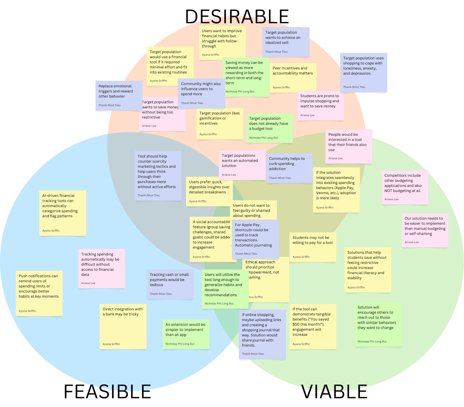
Our assumption map revealed nuances in how people think about their spending habits and their desire to become more mindful consumers. We observed various assumptions about who struggles most with impulse purchases, what motivates people to track their spending, preferred alternative behaviors to impulsive buying, and what features would actually help them pause before purchases. Through our discussions, we identified key uncertainties around how people want to interact with spending controls – particularly the balance between gentle nudges and firm restrictions. Some assumptions evolved into more specific questions, like whether users prefer real-time spending alerts or daily summaries, and if social comparison features help or hinder financial mindfulness.
We chose to test the following key assumptions:
Assumption: Users prefer quick, digestible insights over detailed breakdowns
- Potential Test: We can conduct a simple A/B preference test. We’ll create two mockups: Version A, a one-sentence spending summary with a visual trend indicator, and Version B, a detailed category breakdown with a pie chart or table. We’ll then show both versions to students and ask which format they prefer, which feels more useful, and which they would check regularly. If most users prefer Version A, this supports the assumption that quick insights are more engaging. If responses are mixed, a hybrid approach (quick insights with an option to expand into details) might be more effective.
Assumption: Target population would use a financial tool if it required minimal effort and fit into existing routines
- Potential Test: We can present solutions from our comparative research according to the manual -> automatic scale and ask users to review the solutions, and rank which ones they’d use. After ranking, we’ll ask why they chose their top option and what would make them consider a lower-ranked option. This test will reveal which level of automation is most desirable and whether minimal effort leads to higher usability and adoption. If the highly automated tool is ranked highest, then our assumption is correct.
Assumption: A social accountability feature (group savings challenges, shared goals) could be added to increase engagement
- Potential Test: We can conduct a preference test. We’ll present two options: (1) a solo savings goal, where users track progress privately, and (2) a group savings challenge, where friends set a shared goal and see each other’s progress. We’ll ask which option feels more motivating, whether they would join a challenge, and if public tracking would encourage or discourage them. If most prefer the group feature, this supports the assumption that social accountability boosts engagement. If responses vary, adding optional privacy settings or low-pressure challenges might be necessary. To further validate, we can run a social media poll or prototype a basic challenge feature to measure real engagement.
For these tests, we opted to use Google Forms to be able to scale and get more data while requiring minimum time or effort from participants. We recruited students at Stanford to fill out the forms, as they match our target population for our intervention. A potential issue here is that not all students may be inclined to decrease their spending, so we sent the form to people who we already knew had this goal, or sent it to larger groups with a message that we’re looking for people who do want to budget and/or decrease spending to fill it out. Using forms was especially helpful considering how busy students are at this time of the school year–it was an asynchronous way to get data from 20+ students within a single day. However, lack of debriefing or follow-up limits the amount of insights beyond the raw data.
Assumption Tests
Test #1: Quick Insights

We believe that users prefer quick, digestible insights over detailed breakdowns.
This is critical, as we should be aware of what layouts are engaging to users and empowers them, not overwhelms them.
To verify this, we will create two mockups: Version A, a one-sentence spending summary with a visual trend indicator, and Version B, a detailed category breakdown with a pie chart or table. We’ll then show both versions to participants.
Test cost: low
Data reliability: medium (are only giving two quick mockups, when another layout may be preferred)
And measure which format they prefer and would be more likely to check regularly.
Time required: Less than one minute
We are right if most users prefer Version A. If responses are mixed, a hybrid approach (quick insights with an option to expand into details) might be more effective.
Results for Quick Insights Test
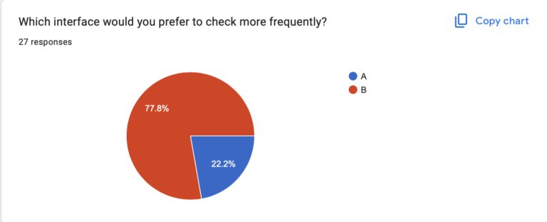
We believed that users prefer quick, digestible insights over detailed breakdowns
We observed that a large majority of users actually preferred Version B over Version A. One user stated that they thought the pie chart made the information “more readable” as compared to the text summary.
Data reliability: medium; it is somewhat unclear if other visualizations would be even more preferable to users or if the line graph contained some information (like the pie chart) that the results would have differed.
From what we learned users seem to prefer visual representations of insights in order to process information and mostly ignored the information from the accompanying text which Version A relies more heavily on.
Therefore, we will prioritize visual representations of spending data when designing our tool and give more text based insights only when users wish to learn more in high detail unsuitable for visualization.
Test #2: Social Accountability

We believe that a social accountability feature (group savings challenges, shared goals) could be added to increase engagement.
This is critical, as this helps determine if our solution should be group-focused or not.
To verify, we will present two options: (1) a solo savings goal, where users track progress privately, and (2) a group savings challenge, where friends set a shared goal and see each other’s progress.
Test cost: low
Data reliability: medium (theory may differ from practice)
And measure which option feels more motivating to participants (1 or 2), whether they would join a challenge, and if public tracking would encourage or discourage them.
Time required: Less than one minute.
We are right if most prefer the group feature. If responses vary, adding optional privacy settings or low-pressure challenges might be necessary. To further validate, we can run a social media poll or prototype a basic challenge feature to measure real engagement.
Results for Social Accountability Test

We believed that a social accountability feature (group savings challenges, shared goals) could be used to increase engagement.
We observed that people had mixed feelings about solo vs shared features. There was about a 50/50 split between group or solo spending challenges, and a variety of responses to how users would prefer data to be saved and visualized. Interestingly, many people liked the idea of anonymous but publicly visible progress.
Data reliability: Moderately High. While we can’t guarantee that people can exactly predict how they would react to a social vs solo focused application without putting it in front of them, people likely have experiences with solo, shared, and anonymous based social applications and have some sense of what they prefer.
From what we learned that group or shared social features should be either an opt in feature, or used with anonymity.
Therefore, we will design a tool that has optional social accountability features, potentially with an anonymous option, which would allow users to benefit from social accountability while maintaining some privacy.
Test #3: Automation
We believe that our target population would use a financial tool if it required minimal effort and fit into existing routines.
This is moderately critical, as this assumption addresses the problem of activation energy and friction. However, given the scope of this project, we are not sure if features like bank integration are feasible.
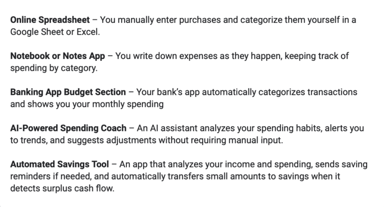
To verify that, we will present solutions from our comparative research according to the manual → automatic scale (tools that require manual data entry vs. tools that automatically aggregate data and show insights) and ask users to review the solutions, and rank which ones they’d use.
Test cost: low
Data reliability: medium (theory may differ from practice)
And measure which level of automation is most desirable among participants and whether minimal effort leads to higher usability and adoption.
Time required: Less than one minute.
We are right if the highly automated tools are ranked higher than manual tools.
Results for Automation Test

We believed that our target population would use a financial tool if it required minimal effort and fit into existing routines.
We observed a variety of preferences for the level of automation of a budgeting tool. However, we generally saw higher preferences for the options that involve some sort of automation, with the vast majority 4s and 5s given to the three tools with the highest automation levels.
Data reliability: Moderate, given there are more options out there and we relied on short quick descriptions, not images or prototypes.
From what we learned that some level of automation is key, but our target population does not necessarily desire a fully automated tool. Fully manual is the least popular option.
Therefore, we will design a tool that incorporates automation to reduce effort while still allowing users some control over their budgeting. We will explore hybrid solutions that provide automated insights and tracking but allow for user customization and manual adjustments when desired.
Intervention Study
Shopping itself—the browsing, selecting, and anticipation of receiving an item—was a major part of the enjoyment. Many impulse shoppers didn’t just seek the end product but were drawn to the experience of shopping itself. This led to our intervention: if we could simulate the rewarding aspects of shopping without an actual purchase, we might be able to reduce unnecessary spending. This intervention is designed to introduce a structured, engaging alternative to impulse shopping that still satisfies the desire for discovery, selection, and anticipation.
To stimulate this, we asked the participants to create a Pinterest board with a prompt that we sent out each day. Below are the prompts we used:
- Create a board of things you’d like to see at your favorite fictional character’s wedding.
- Create a board to envision your dream work environment—your workspace, the decor, location, anything!
- Create a board to plan your ultimate “reset day” – Everything you’d do to recharge physically and mentally.
- Make a playlist-inspired board—Choose a favorite song, album, or artist and make a visual mood board that represents its vibe🎶
We had 7 participants complete the entirety of the intervention study. Compared to our baseline study, the average age of our participants were older, with the average at 33 years old. Our oldest participant was 48. These participants would buy impulsively multiple times a week and almost half had frequent regrets about their purchases afterwards. All of them indicated that they were actively trying to cut back their purchases.
On average, participants spent 15 minutes per day completing the task. At most, one participant made an impulse purchase per day, a significantly lower frequency than they reported in the pre-study survey.
Overall, participants found the prompts fun, engaging, and reflective.
- Fictional Character’s Wedding: Some struggled to pick a character but still enjoyed it. A few reconsidered their views on weddings, while aro/ace participants found the perspective interesting. There was some confusion about whether to focus on decor or gifts.
- Dream Work Environment: Many enjoyed visualizing their ideal workspace, with some reflecting on past jobs or even considering career changes.
- Ultimate Reset Day: Participants liked exploring ways to recharge. Some noted the influence of consumerism in self-care aesthetics, while others were compelled to take real actions, like booking a spa day.
- Playlist-Inspired Board: Easy to engage with, especially while listening to music. Some found it nostalgic, while others enjoyed translating sound into visuals.
From this study, we learned the following:
Comparison to Shopping Experience
- Many participants noted that Pinterest felt similar to online shopping due to the “hunting” and “curation” aspects, but it lacked the final purchasing action and gratification of acquiring an item.
- Some felt satisfied because it helped scratch the “discovery” itch without spending money.
- Others found it less engaging than shopping, as it did not provide the emotional security or anticipation of an actual purchase.
- Key Insight: Satisfaction from curating boards can be a healthy substitute for the immediate gratification of buying items, though it may not fully replace the need for emotional validation associated with shopping.
Impact on impulse shopping
- The intervention had mixed effects on impulse purchases. Some participants reduced their shopping urges, while others found certain prompts (like “Reset Day”) to be triggering and led to unexpected purchases of personal care and wellness products.
- Browsing time on shopping sites decreased for some participants, as Pinterest offered an alternative dopamine release through “hunting” for images. Others saw no change because their shopping habits were already regulated.
- Overall spending was about what participants expected or lower than expected, though some felt tempted by algorithm-driven suggestions on Pinterest.
- Key Insight: The type of content in the prompts plays a significant role in either reducing or encouraging shopping urges.
New Insights on Shopping Habits
- Several participants realized their shopping habits were deeply emotional, often linked to childhood experiences, self-identity, or anxiety relief.
- Some recognized that shopping was a solution to boredom or stress, and that the process of curating a Pinterest board mimicked the rabbit-hole effect of online shopping.
- A few found that certain prompts (in particular “Reset Day”) inadvertently encouraged shopping by exposing them to personal care and wellness product imagery.
- Key Insight: Pinterest highlighted the emotional and habitual nature of shopping, offering a clearer understanding of why participants shop, even if they don’t need or want the items.
Engagement with the Intervention
- Seeing others’ boards had little impact for most participants.
- Being featured in daily emails increased engagement for some, while others felt mild disappointment if their board wasn’t included.
- Key Insight: The sense of social validation (e.g., board features) can increase motivation and participation, but the lack of it doesn’t significantly harm engagement.
Likelihood of Continued Use
- Some participants would continue using Pinterest in this way as a “safer” alternative to shopping.
- Others felt it did not fully replace the emotional gratification of shopping and might fall back into shopping habits once the study ended.
- Key Insight: Sustained use depends on how well the activity provides emotional satisfaction and prevents the urge to buy, highlighting the need for continued engagement and mindful use.
Possible Improvements
- Avoid prompts that are heavily linked to consumer products (e.g., personal care, fashion) to minimize shopping triggers.
- Introduce reflection questions after each board to help users analyze whether their shopping urges were emotional or practical.
- Consider prompts that align with real-life needs but encourage mindful decision-making rather than impulse curation.
- Key Insights:
- Mindfulness-based or creative prompts that encourage reflection on purchases and deeper emotional understanding can be more effective in curbing impulse shopping.
- Provide a range of prompt options so participants can select what resonates with them most. This ensures higher engagement and relevance to their individual needs and preferences.
- A well-structured onboarding process can help participants avoid harmful themes and focus on prompts that encourage creativity, rather than ones that trigger impulse buying (e.g., fashion, personal care products).
- Introduce a reflective step where participants can think about their emotional state after completing a board. This step can help them process their feelings and reduce the likelihood of future impulsive purchases.
One of the biggest takeaways from feedback was ensuring the app doesn’t function like Pinterest, which could inadvertently encourage shopping rather than prevent it. Here is how our app aims to be different:
- Unlike Pinterest, users do not endlessly browse or collect items indefinitely—they must complete a board before exploring others’ boards.
- The focus is on intentional selection rather than infinite scrolling, helping users engage without mindlessly saving products.
- Reflection elements ensure that the experience is about mindfulness rather than accumulation.
To simulate the full user experience without requiring backend development, our Figma prototype will be hardcoded with objects and prompts, ensuring smooth interactions for testing. This approach allows us to validate core functionality without needing live data or random generation.
Pre-set prompts and items: Instead of dynamically generating prompts, we will hardcode three daily prompts that users can select from. Similarly, we will provide a fixed set of items for users to add to their boards.
Premade boards: To fully simulate the experience, we will manually create previous boards so that testers can explore shared boards immediately after completing their own. This allows us to test the explore feature in a realistic way.
Clickable interactions: Users will:
- Select a prompt from a fixed set.
- Tap items to add them to their board (simulated by swapping components in Figma).
- Submit their board and reflect on their selections (using pre-set response options).
- Browse other users’ pre-created boards to engage in exploration.
- Fixed navigation and screens: Instead of building a complex system, we will link key interactions manually.
- If a user has not created a board today → They must create one before accessing others.
- If they have already created a board → They can explore previous boards immediately.
System Paths
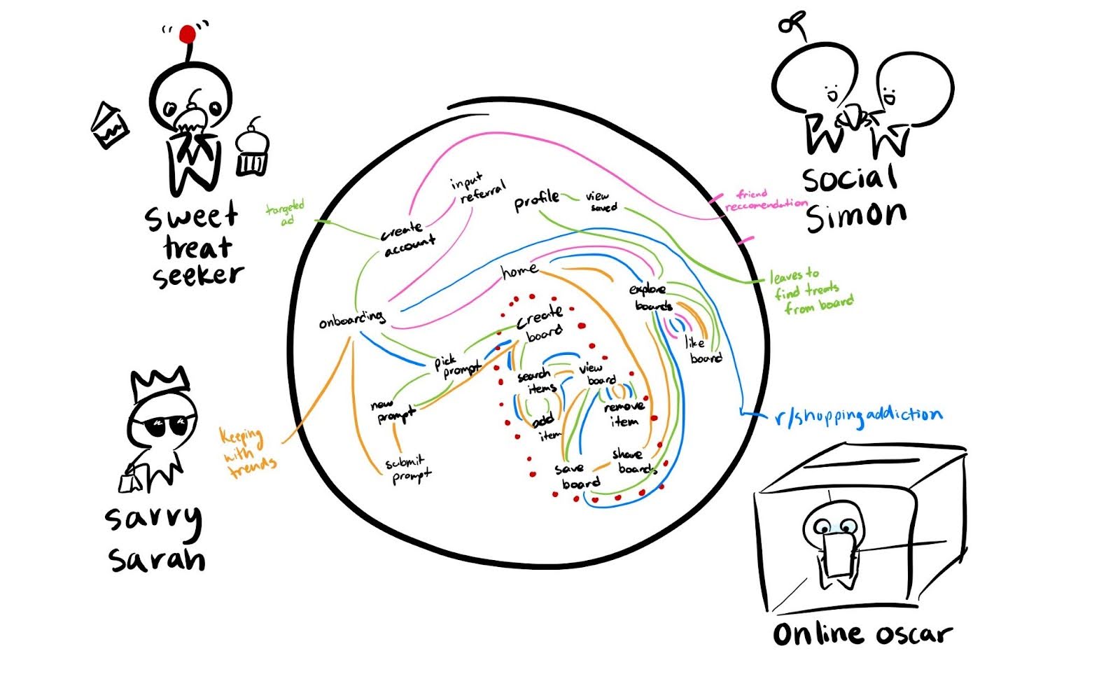
Using our personas that we developed during the baseline study, we began to envision how our solution would be implemented with a number of different paths users would take to go through our application. As opposed to the linear system we planned to implement for our final clickable prototype, this diagram was meant to capture the complexity of the overall system with all of the paths a user might take as well as features that would be a part of the final system but not essential to the MVP.
A number of insights were revealed about which areas of our application would be essential to the experience when creating the MVP.
- Most of the personas will end up going through the board creation process so this will be where we implement the majority of our features.
- Social Simon may only use the application to explore other users’ boards. This may be counterproductive to our intended behavioral change as noted in the intervention study so this supports the limitation of only being able to explore other users’ boards after creating your own.
- Sweet treat seekers may end up leaving after seeing images of snacks they are interested in which supports our conclusion in the intervention study to use a curated selection of items that will not trigger certain spending habits.
- Having a central “home” page where users can access the board creation, explore other boards, and visit their profile looks to be mostly unnecessary as evident by the connections being able to continue uninterrupted and with fewer screens if we directly have users be on any of these three given screens at a time.
Since we developed this diagram during the intervention study, a few important features are missing from this diagram. Most importantly, an additional screen right before saving the board that includes a reflection portion which many users requested during the intervention study. Many users also performed on their own in the form of the daily survey so making this step explicit in the design of our application will add an additional reminder to emphasize the mindfulness aspect of our design.
Story Maps

We first developed our story map using general conventions for app design, envisioning a sign-up process, onboarding flow, creation, and sharing process.
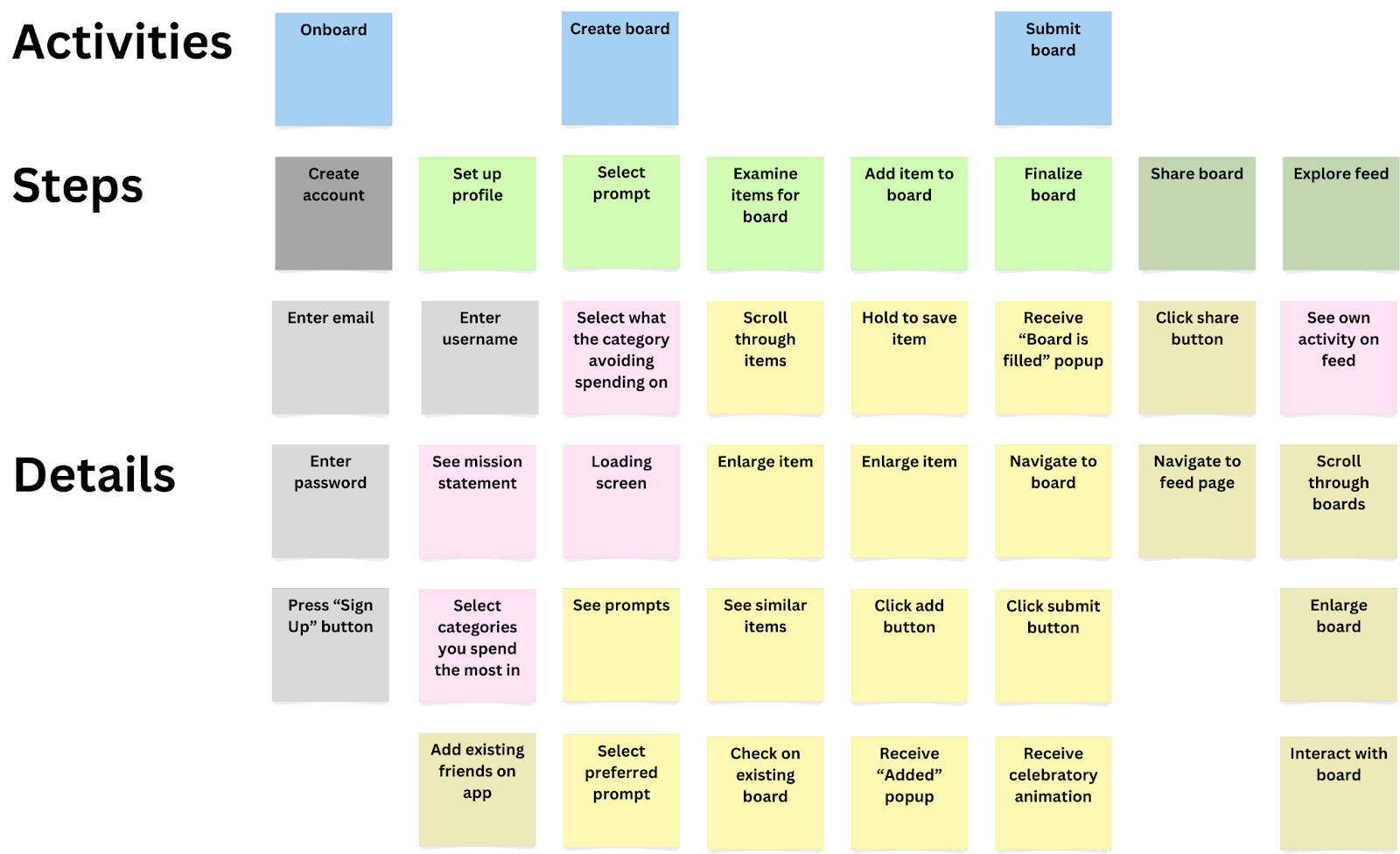
We then revised our story maps based on insights from our system paths and further analysis. From our system paths, we concluded that account creation/setup was unnecessary for using the main feature of the app, board creation. We greyed out these steps on our revised story map. As a result, we also dimmed the post-its that had to do with social features, as they would rely on account creation. We consider these features additive but secondary to the core board creation function. Looking at the story map as a whole, we also realized that there was little that distinguished our app from other social media curation platforms, so we added in several steps that emphasized the goal of reducing impulse shopping. These steps are highlighted in pink post-its. The additional steps included a page that walked users through our mission statement, allowed users to select categories of spending they had the most trouble with (ex: food) to curate proper prompts, and social features that would add an accountability/social proof aspect to the app.
MVP Features
Using the story map, we concluded that the following features would be essential to convey our solution as an MVP:
- Spending habit profile creation: Here we have the chance to provide onboarding as well to help guide users through creating a board
- Prompt selection: This is the main step in the board creation process and acts as both a chance to choose a prompt the user feels strongly about as well as a relatively simple feature to implement
- Item examination: Users will feel more connected to each item as well as take more time to look at them rather than quickly rushing through. It also promotes the feeling of exploration.
- Board creation: Being able to save their items and see them all together as a culmination of their work is an essential step in our system.
Bubble Map
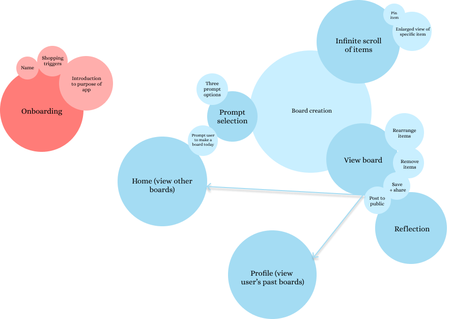
The size of each bubble in our map represents the time spent on each screen/task, while darker colors highlight primary screens and lighter colors indicate actions/features within those screens.
The app can function without full onboarding, but personalization matters.
While the app is technically usable without an extensive onboarding process, as the onboarding flow is detached from the main flow, these personalization features play a crucial role in framing how users interact with the app. Personalization helps prevent relapse into impulse shopping habits by aligning the experience with the user’s goals and shopping tendencies.
Users will engage with both board creation and board exploration—but in different ways.
We provide two distinct ways to explore items without purchasing them:
- Creating your own board (active engagement)
- Scrolling through others’ boards (passive engagement)
Some users may gravitate toward curating their own selections, while others may enjoy browsing through what others have created. Paying attention to both ensures the app remains engaging for different usage styles.
Encouraging board exploration is key, so we should provide a clear path from board creation to viewing others.
To maximize engagement and discovery, users should be prompted to explore other boards immediately after finishing their own. The direct link (arrow in the bubble map) between these two actions helps reinforce an ongoing cycle of interaction, making the app more immersive.
Prompt selection should be quick and seamless to drive engagement.
Since the actual “shopping” experience (browsing and board creation) is the core of the app, prompt selection should be streamlined to encourage users to move forward without friction. Making prompt selection intuitive and fast will increase the likelihood that users reach the board creation flow, which is the most valuable part of their interaction.
Key takeaways from bubble map:
- Minimize onboarding friction while retaining personalization.
- Ensure seamless navigation from board creation → board exploration.
- Make prompt selection effortless so users quickly reach the engaging parts of the app.
- Balance user preference for curation vs. discovery by supporting both equally.


