Mood Boards
Kehan
I designed this style to feel gentle, cozy, and human, more like a sticker journal or a cafe table than a productivity or health app. The soft pastel colors, hand-drawn illustrations, and small everyday foods (like toast, coffee, and snacks) are intentional: they frame eating as a comforting, familiar part of daily life rather than a task to optimize or a goal to fail. The journaling and planner elements add light structure without feeling rigid, which helps normalize imperfect days and makes reminders feel motivational and sweet rather than demanding.
I think this style works especially well for a food reminder app because it reduces guilt and resistance. Instead of pressuring users or highlighting what they’ve missed, it offers warm, friendly nudges that feel supportive and achievable. By emphasizing small moments of care over performance or tracking, the app can build emotional trust and long-term habits. It should allow users to respond to reminders because they feel cared for, not because they feel judged.
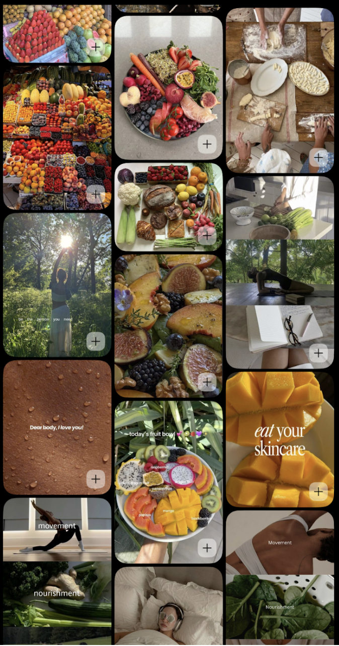
Nicole
I wanted my mood board to blend food as comfort + routine as support + wellness as calm/aesthetic. I wanted our moodboard for our platform to read as approachable, student-friendly, and habit-building, rather than clinical or judgmental. I included food imagery and widget style photos because they instantly communicate what the product is about (food decisions) without needing words. I personally like playful, sticker-like visuals and here, they signal an app that’s low-pressure and friendly. I want our platform to come off more as a daily companion than a strict tracker. The variety of images of snacks/drinks reinforces a realistic student lifestyle, not an aspirational “perfect health” aesthetic. I added scheduling layouts/calendar photos because I wanted to anchor our app moldboard in structure/routine. The repeated grid patterns visually translate to our promise as a product, which is to help busy people organize their day and make eating easier. The decorative calendar style/scrapbook vibe keeps planning from feeling corporate and more like personal journaling, which would feel more comforting to the user. These images bring in warmth, comfort, nostalgia, and communicate a tone of gentle guidance.
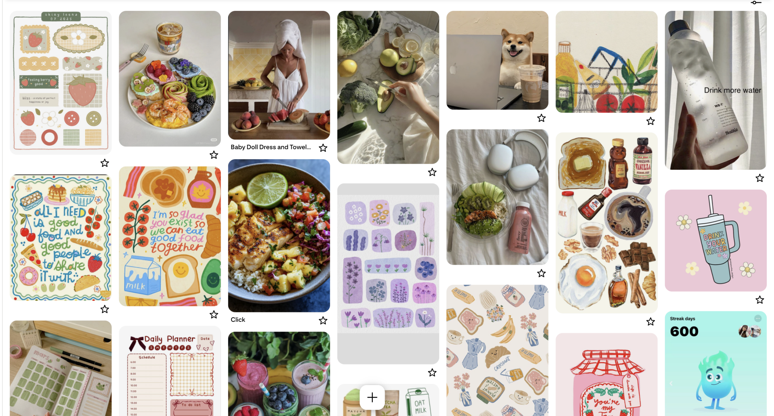
Tyler
I created this moodboard to capture the core idea of our app, which is supporting consistent eating for busy people. I chose realistic food imagery like fruits, snacks, and simple meals to show that consistency comes from accessibility, not perfection. These visuals reflect a brand that encourages small, achievable actions rather than idealized wellness standards.
I also included clocks and time-related elements to emphasize that the main barrier to eating consistently is time. Many users skip meals because they lose track of time or feel overwhelmed, not because they lack motivation. Pairing food with time reinforces our focus on routines and directly connects to our MVP features like calendar syncing and well-timed reminders.
Motivation also shows up in a light, playful way to communicate encouragement without pressure. This supports the tone we want for the app, which is supportive and enjoyable rather than nagging. Finally, I combined photography with illustrations to make the brand feel human and approachable, especially for our targeted audience. Overall, the mood board represents a brand centered on consistency, support, and real-life behavior.
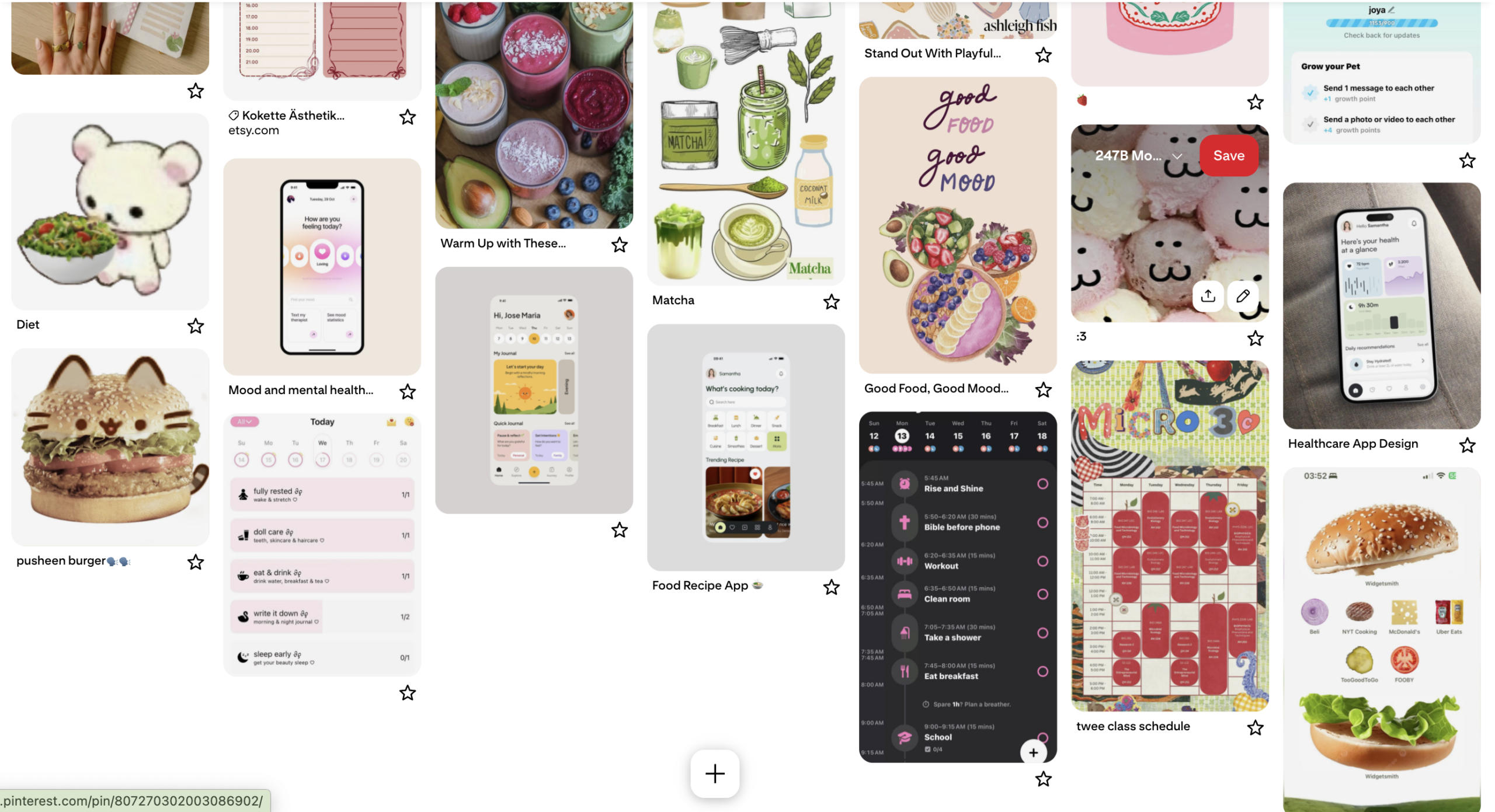
Juan Pablo
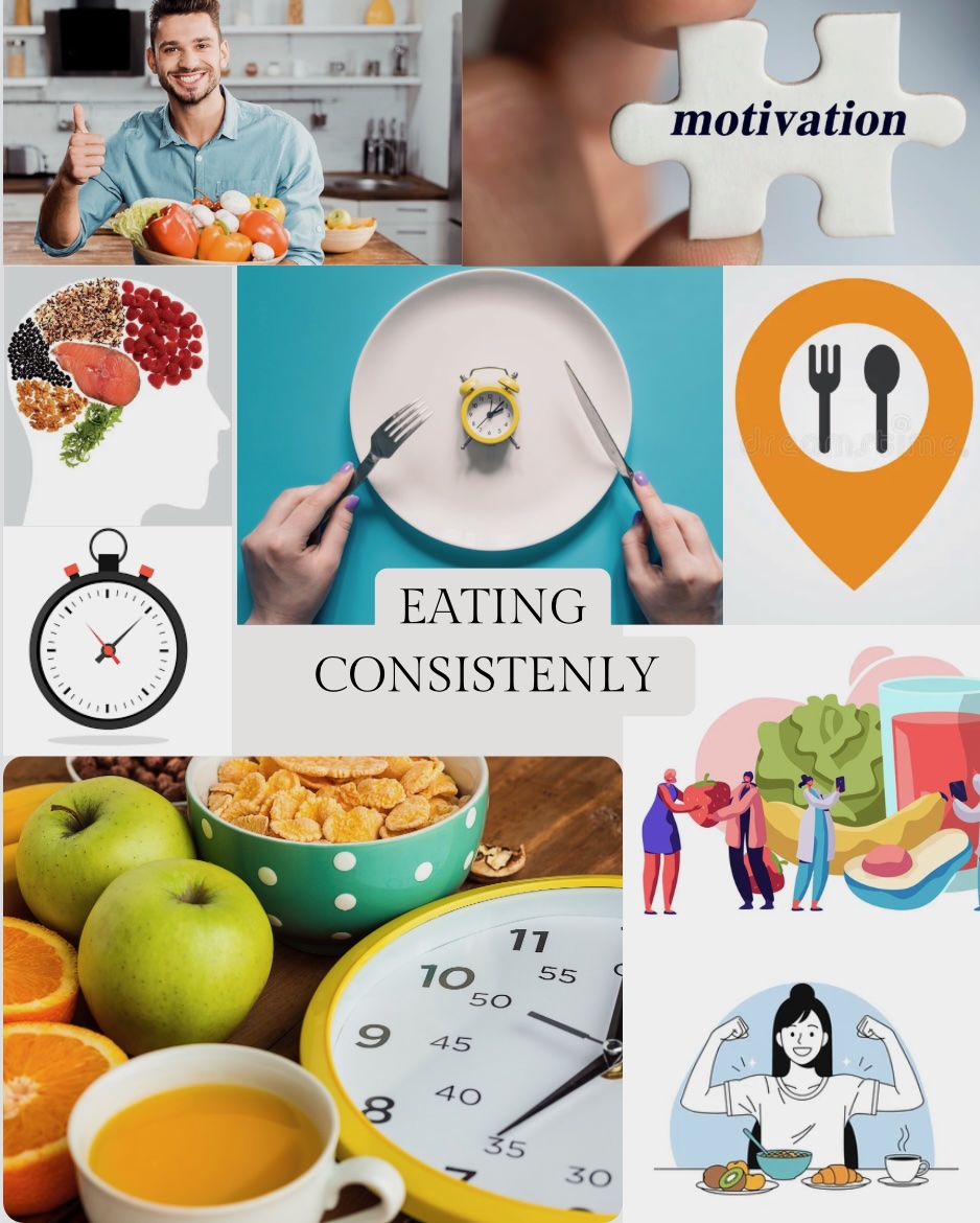
I created this mood board in such a way that it emphasized the healthy aspect of our project. As a result, I decided to use vibrant, eye-catching colors so that the user could associate healthy with bright and a sense of being alive. In particular, I also wanted to include a few elements beyond just food nourishment, such as intellectual nourishment, as seen by the small written notebook, as well as a few exercises in sunlight. This is to really present our app in such a way that it is a part of a cohesive system that encourages the user to live a healthy lifestyle.
We’re a tool that empowers them to live that lifestyle and exist within a bigger ecosystem for healthy, empowering living. Further, I chose this mood board with stuff besides food, since we want to not only sell eating consistently and healthily for the sake of it, but rather show what the user gains by doing that. That is a sense that you are doing the right thing for you, you are taking care of yourself. As such, we’re trying to sell a feeling of empowerment really.
Combined Mood Board
We designed this style as a blend of our original cozy, journaling aesthetic with our teammate’s more polished, app-forward designs, creating something that feels both emotionally warm and practically supportive. The visual language combines soft pastels, playful illustrations, and comforting food imagery with clearer UI structure, mood tracking, and habit cues. Cute characters, hand-drawn food, and gentle affirmations coexist with calendars, schedules, and progress indicators, which helps the experience feel approachable without becoming chaotic. Overall, it maintains a sense of warmth and personality while still signaling that the app is reliable and thoughtfully designed.
We think this combined style works especially well for a food reminder app because it balances care with clarity. The softness and whimsy reduce guilt and defensiveness around eating, while the more structured elements make reminders feel intentional and useful rather than vague or dismissible. By connecting food with mood, routine, and everyday life and presenting all of it in a friendly, non-clinical way, we aim to encourage users to engage consistently.
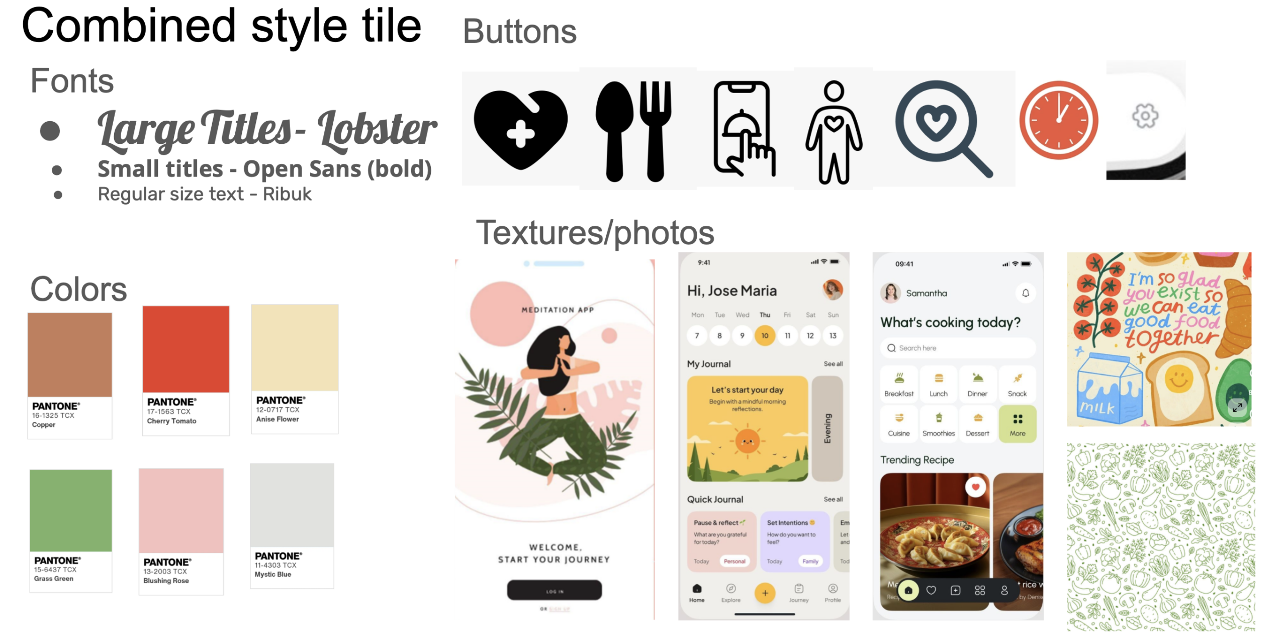
Style Tiles
All of our Style tiles can be found here . We did individual ones as well as a combined tile.
Here is our combined style tile.