
Henry Greenman, Emily Hsu, Athena Shiravi, Zoya Garg, Isabelle Levent
Moodboard
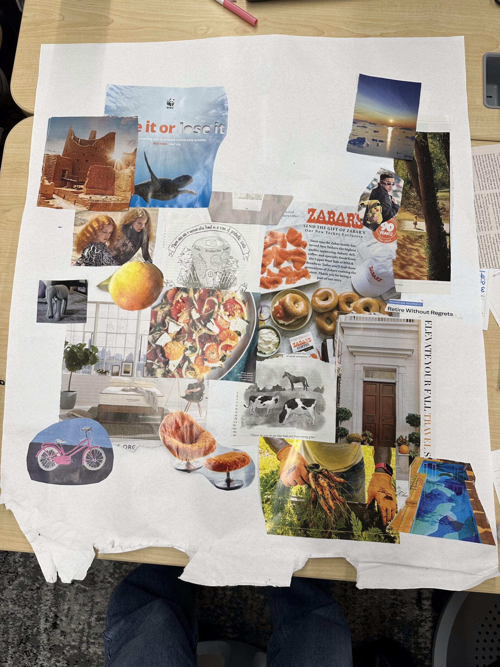
For our moodboard, we focused on channeling an upbeat and warm energy through a combination of orange (as the primary color) and blue (as the secondary color). We also brought in accents of pink. Many of the cutouts feature the outdoors and sunlight in different forms: sun rays, sun reflections on water, natural light from windows, sunsets, sun through leaves. Moreover, we used a health-conscious theme, picking foods like bagels and fruit salads that channel our brand’s city, Los Angeles.
Style Tile

Our style choices reflect our product’s mission to integrate sunlight exposure into daily habits in a low-friction way. We wanted the UI to feel warm, so we chose EB Garamond, and Helvetica Bold keeps things modern. We chose this color palette (golden yellow, sky blue, earthy burgundy, soft coral, pale mint) because it’s earthy to create an aura of calm, grounded energy. The icons we chose are to emphasize habit formation, but also positivity so people continue to feel encouraged. We hope people feel invited to bring sunlight into their routines.


