Checkout flows are designed to reflect what a company values most. Amazon, Warby Parker, and Patagonia each approach checkout differently, depending on whether they care more about speed, confidence, or brand alignment.
Amazon prioritizes speed above all else. After adding an item to your cart and logging in, you’re taken to a single page with your shipping address, payment method, and order review all stacked together. There’s as little friction as possible to get people used to the routine of going to Amazon to buy whatever comes to mind with minimal effort.
Warby Parker slows things down on purpose. It starts by suggesting a quiz to help you choose the right glasses. When you check out, you can continue as a guest or log in with Apple or Google. From there, it walks you through each step, page by page: shipping, delivery speed, payment, and finally order review. It’s a longer flow, but it builds trust and lets users feel more confident in their purchase. That makes sense for a higher-consideration product like eyewear, where returns are expensive and a good fit is key.
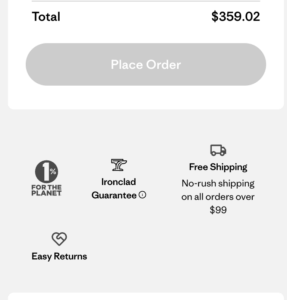
Patagonia uses checkout to reinforce its brand values. After adding an item to your bag, you see options for Apple Pay, PayPal, and Venmo. If you choose manual checkout, you’re asked for an email first. The checkout flow is simple, much like Amazon’s, but Patagonia inserts reminders of what it stands for. “1% for the planet,” “Ironclad guarantee,” and “free shipping” are right under the button to confirm your order. It’s less about pushing conversion and more about reminding you why you shop there in the first place.