
Amazon (speed-optimized → conversion rate).
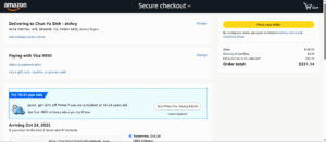
Amazon’s checkout reduces time-to-purchase: address, payment, and shipping choices are collapsed into clear sections; and most people have inputted this already, resulting in a one-click-purchase with the button buy now. The design priority is momentum, which lifts conversion by minimizing decisions and fields. As seen in the photo, after clicking Buy now, you can click place your order, realizing one-click-purchase.
Warby Parker (confidence-building → average order value).
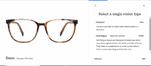
Warby Parker’s flow emphasizes clarity and reassurance—progress indicators for selecting different details for the glasses. This confidence-building lowers cart anxiety and supports higher-consideration adds(prescriptions, lens upgrades), nudging average order value up. The selection takes a few minutes to decide.
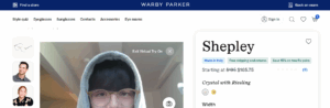
Another part of confidence building is through the virtual try on to ensure that the user likes it.
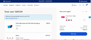
After selecting all fields, you will arrive at the check out page, as below, where after clicking, you will be guided to the sign in page(and there is no guest mode). I think some account might be lost at this point but since people already clicked through all the details selection, there is a sunk cost, which pushes the user to create an account and proceed with checkout.
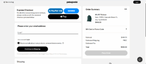
Patagonia (values-aligned → customer lifetime value).
Patagonia’s checkout blends pragmatic speed(express pay options: One click through Apple Pay or Paypal) with brand trust: a simple, minimal form and payment choices that feel secure and transparent.

The continuity with Patagonia’s ethos(buy well, keep longer) helps retain customers whose loyalty is value-driven—especially on the sustainability side to fuel for stronger Customer Lifetime value over time.
These design choices help determine the revenue metrics. If you live on volume, optimize for speed; if you sell considered bundles, optimize for confidence; if you trade on mission and trust, make the purchase feel like an extension of those values.


