
Moodboards
Team Members: Anjali, Dorien, Ellington, Ji Hong, Karson
Individual Moodboards:
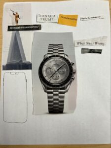
Moodboard by Karson
The vision of this mood board was to display what the app is about. The large watch in the middle signifies the importance of time and in our case, screen time. I also tried to display political figures and gave other hints about what the app is about. “What went wrong” signifies feelings that a user might feel if they lose and advanced collaboration hints at what’s important to win. I believe this fits the right mood for our prototype because it gives a bit of the main different parts of the app.
Overall the team liked the balance of different objects and words used. One thing that the team thought could be improved is adding more material to the mood board. I also agree that adding more material would’ve helped better illustrate the mood trying to be portrayed.
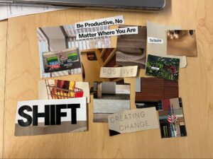
Moodboard by Ji Hong
For my board, I decided that neutral colors were the way to go because, for an app that is centered on focusing and trying to stop distractions, users might want to feel calm and collected while they are on it–with some small panic due to some of our features. I have lots of big words about change, positive change, shift, and overall productivity and those topics are part of the core meaning of our app–to change or shift your focus for the better. Some downside of my mood board is the lack of some color. I do believe by adding some sort of “pop,” can indicate the more detrimental effects of the app since we do have an element for that.
The team really liked the worlds I chose and some of the imagery I added that correlates a lot to our application. They do agree with my critiques on it–especially the one about color where having someone pop color would really bring the overall vibe to life.
Combined Moodboard:
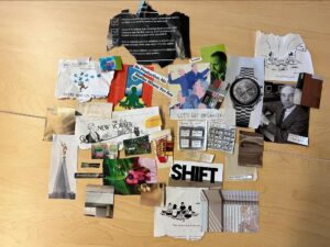
(combine board by Ji Hong, Karson, Dorien, Ellington)
Justification:
For our combined mood board, we decided to pool our snippets together since even though we were creating our own images of what we thought our application feel like, they all seemed to gravitate towards one general feeling or color tonality. Lots of neutral colors and black-white-grey tones were used to depict feelings of calm and simplicity but at the same time, the pop of colors brings in the excitement factor that comes with using our app. The excitement factor could also be interpreted as a competition or risk part where you compete with friends or study by yourself and have the chance of losing money to the opposing party. We chose bold words that correlated to our application like shift, organize, productive, etc. The political imagery also serves as a reminder that our app is driven by people’s trust/distrust, like/dislike of the political parties in the US. Other emotions shown are frustration, confusion, and ponder as that is what we want our app to feel like when users are using it. It gives them a way to feel motivated–by scorching them at the same time if they fail. We decided to combine our ideas together since each member made similar decisions when it came to the overall aesthetics of the board.
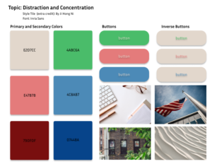
Integrated Style Tile:

Justification: We chose to integrate reds and blues in our final style tile to represent a balance between the most popular political parties. This ensures that our app does not seem to take the side of any party and can remain neutral as people donate their money. We also employed two shades of purple to represent a combination of the two parties (since purple is a combination of red and blue). Purple is also known as a calming color; given that anxiety and other mental health issues are correlated with digital technology overuse, we felt it would be an appropriate color choice for our app. The tan color provides a nice neutral color as necessary.
Extra Credit (Individual Style Tiles):
(Individual Style Tile by Ji Hong Ni)
Justification: For my individual style tile, I decided to follow what I had on my mood board and used beige colors to represent the calm aspect of things and the green color as what “spices” up this focus app. The red and blue refer to party colors–as our app is politically based, I chose colors that were in that range but also muted so the overall tone will still fit the color palette. I added some buttons, images, and fonts that I think would go well with the app.
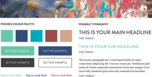
(Individual Style Tile by Karson Lippert)
Justification: For my individual style tile, I decided to choose a number of different colors that give off a feeling of calm and relaxing but also professional. My thought process was creating an app that looked professional and organized would help users to feel comfortable enough to enter in these competitions with their money on the line. There are additionally some buttons that could be used that would match the overall color scheme. One concern I do have though is that these colors aren’t vibrant enough and it may be hard to attract the users’ eyes to specific parts of the screen at first glance.

(Individual Style Tile by Anjali Sukhavasi)
Justification: I chose cool colors for their calming effect, given that digital technology overuse is correlated with poor mental health. The buttons are also in these colors – the primary button in a bolder color than the secondary button to draw attention to the primary button. This would be useful for us to nudge the user towards pushing one button rather than the other. I chose a font similar to Times New Roman – brisk and sharp. The font is commonly associated with “submitting papers” and “official work” and I thought using this font rather than a more graphic font would help users be more focused when using the app.
Individual Style Tile – Dorien Simon Below
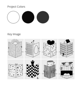
Justification: I want the app to be simple and not flashy. The point of the app is to keep people off their phone so I don’t want anything colorful to keep them more engaged and attached to something. I really like the basic illustrations for the NYT so I grabbed an image from the magazine and used that as inspo for my color palette.


