
A checkout page is more to a customer than just the exit point of a service; it can mirror what a brand values most. Amazon, Warby Parker, and Patagonia show three different business priorities through their checkout page designs: speed, confidence, and value alignment, respectively.
Amazon: Speed Optimization for Conversion
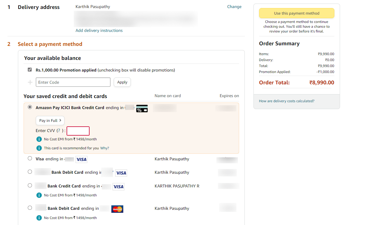
Amazon’s checkout eliminates friction: saved addresses, one-click purchasing, and upfront delivery dates reduce cognitive effort. Everything on the screen reinforces instant gratification for the user. This is how Amazon optimizes for conversion rate: the faster you check out, the less time you have to second-guess.
Warby Parker: Confidence-Building for Trial

Warby Parker’s “Home Try-On” checkout emphasizes reassurance over efficiency. The clear progress (“4 frames to go!”) and free-return messaging shrink risk perception, boosting the average value of orders through multi-frame trials. By leading with trust and transparency, Warby Parker turns hesitation into exploration.
Patagonia: Value Alignment for Loyalty
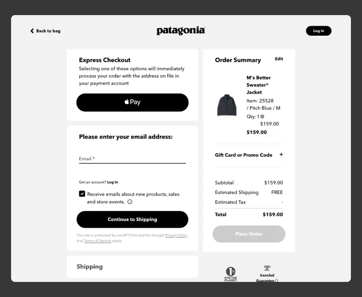
Patagonia’s checkout feels calm and very intentional: clean hierarchy and ethical guarantees. This places environmental responsibility, a core value of the company, at the forefront of the checkout page. This deliberate friction builds a customer’s lifetime value, converting one-time buyers into advocates aligned with its mission.
Conclusion
Each company optimizes the same checkout process differently: Amazon races to get things done, Warby Parker provides you with reassurance, and Patagonia invites you into its value system and ethos.
Design choices don’t just shape user experience; they engineer the type of relationship a brand wants with its users.


