Mood Boards:
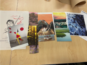
Kaitlyn’s mood board: I wanted to express the passage of time during the day using the 3 big images here– we had discussed how the app might show the sun in the background (it would be brighter when the sun is out, and darker when the sun is down). I also tried to convey a sense of tranquility using the plants and nature imagery– we don’t want users to be stressed while using our product.
Labib’s mood board: I wanted to pick photos of flowers and people—that evoke both social and asocial elements. I believe this is the right fit for our project because some tasks of the idea are social (viewing friends’ activities) whereas some are individual (setting up profile, daily input) which is why there are photos of individuals as well as a group dinner to represent a congregation. 
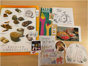
Tiffany’s mood board: I decided to incorporate food into my moodboard because food reminds people of home, of community, and creates a sense of comfort and trust with other people. I also like the thin line weight and sketch styles of cartoons from the New Yorker. It keeps it simple but also conveys meaning and playfulness. I think that these fit into our prototype well because our prototype also needs to convey community buy-in and excitement, but also still have some level of professionalism to cater to adults.
Kayla’s mood board: For my mood board I wanted to find bright and colorful images. When I think of sunscreen and plants I think of bright yellows, greens and vibrant photos. The theme of my board is yellow which you see from the banana, the Geico picture and the women wearing yellow in the right corner. I think this would work great with the prototype because since we are using plants to signify if a user put on sunscreen or not I think it should definitely show vibrant ‘happy’ colors. 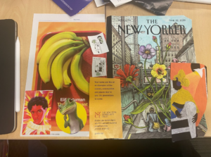
Michelle’s mood board (digital–was sick so attended class virtually this day): Since I didn’t have magazines to cut out of, I decided to experiment with color combinations in my mood boards. One mood board focuses on blues and citrus-y colors–I wanted to evoke the sensation of going to the beach, somewhere where you’d always wear sunscreen. I also wanted to give a refreshing touch to it. The other mood board focuses on greens and pinks–I wanted to play around with leafy and floral vibes, since we are using plants for our app.


Single synthesized moodboard:
The top-right represents different times of the day which is something we wanted to incorporate in our widget/app. We wanted to have some flowers and colors to represent our digital garden. Some of the fruits have human faces, a feature we wanted our plants to have in order to represent mood (which would be related to their adherence to their sunscreen habits). We also had some pictures of humans to remind us of the different kinds of personas we are solving for.

Style tile:
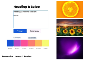
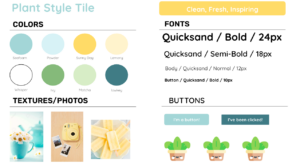
We decided on the following style tile below as a team. We wanted our app to give the feel of the sun, since we wanted to focus around sunscreen, but we also wanted to make sure our color palettes work well with plants (greenery). We chose two yellows to move forward with, and we incorporated blues in there too to make sure the user feels inspired and refreshed when using our app. The blues also represent the sky, which pairs well with the yellow. We paired this with the greens we plan to color our plants with to make sure they all pair well together.
Extra credit:
Each of our team members did a style tile of their own! All the style tiles can be found in high resolution at the Google slides link here. They are also screenshotted below:
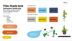
Tiffany’s style tile:
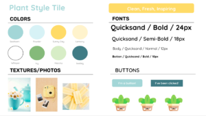
Kayla’s style tile:

Michelle’s style tile:
Kaitlyn’s style tile:

Labib’s style tile: