
Wireflows
We include below wireflows for our application focused on helping users mitigate impulse spending through AI-assisted financial reflection and spending awareness.
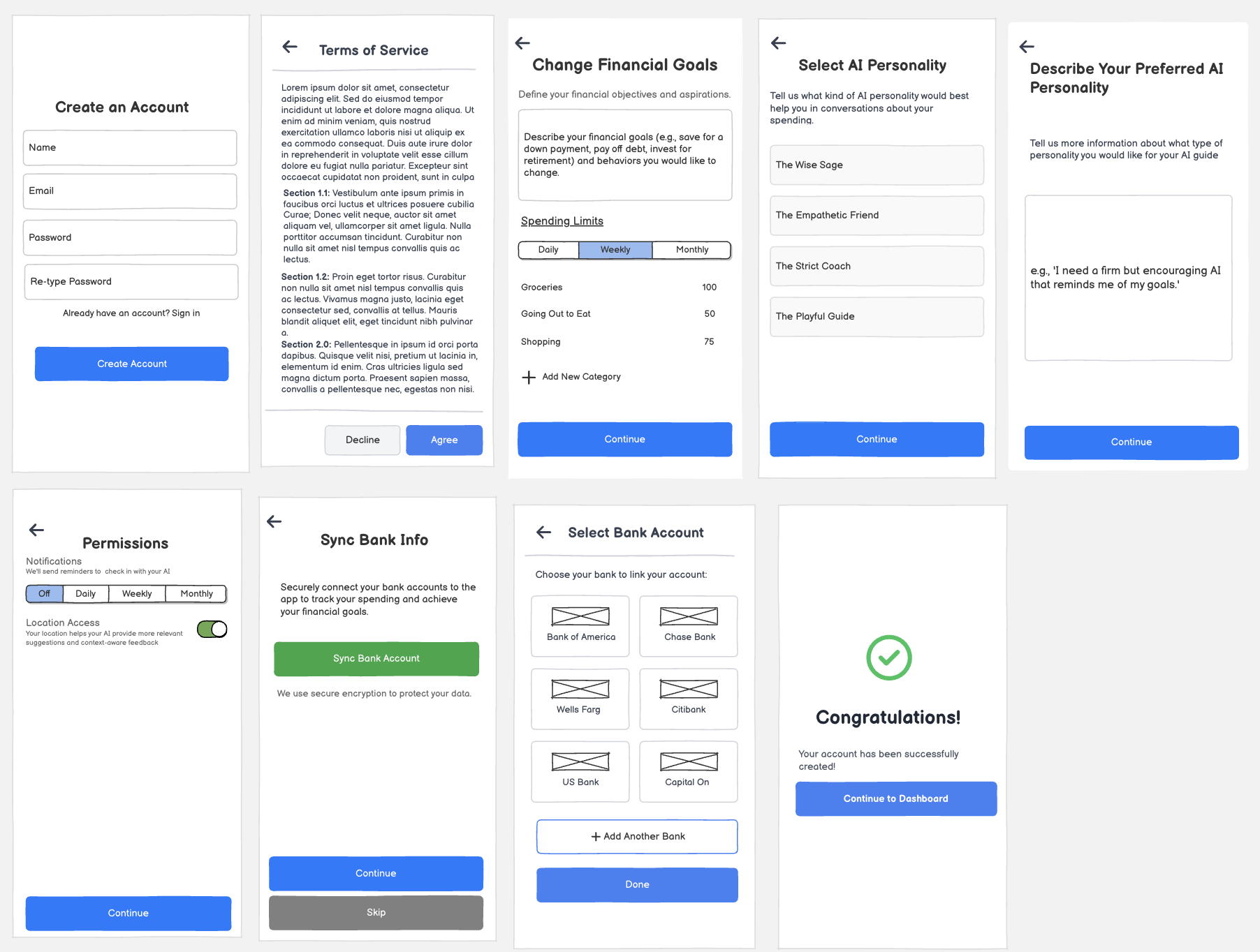
Key Interaction 1: Sign-in / Sign-Up
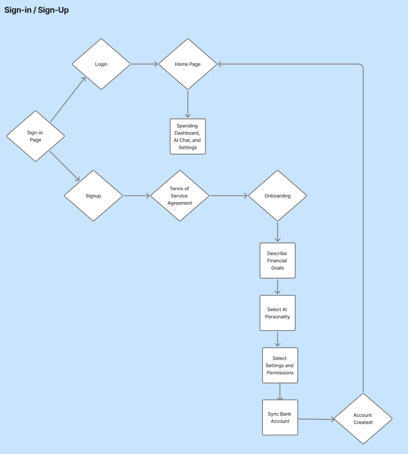
This figure demonstrates the user flow for signing into and creating an account for our application, supporting both returning users and new users. The users begins by either signing back in or creating creating an account. If they are a returning user, signing in will bring them the home page where they can access a spending dashboard, the AI Chat, and settings. If they are signing up for the application, they must first review and accept our terms of service. From they, they onboard to the application by describing their financial goals, selecting a personality for their AI conversation partner, setting their settings, and syncing their bank account. Finally, their account is created!
Key Interaction 2: Notifications and Reflection with AI
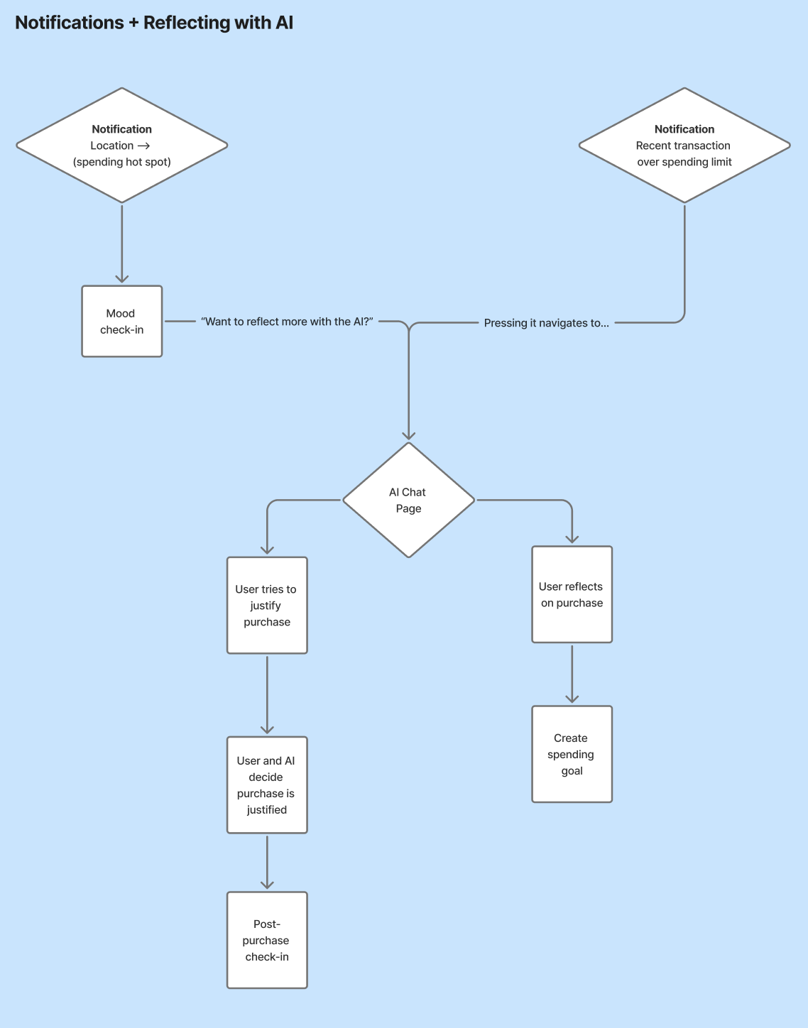
This figure demonstrates the user flow for notifications and reflection with AI within our application. This flow begins by a user receiving a notification triggered by a being in a spending hot spot (which prompts a mood check-in) or by a recent transaction that places them over a spending limit. From there, they are navigated to an AI Chat page. Within the chat, users either work with the AI to discuss whether the purchase was justified or reflect on their purchase and create a spending goal.
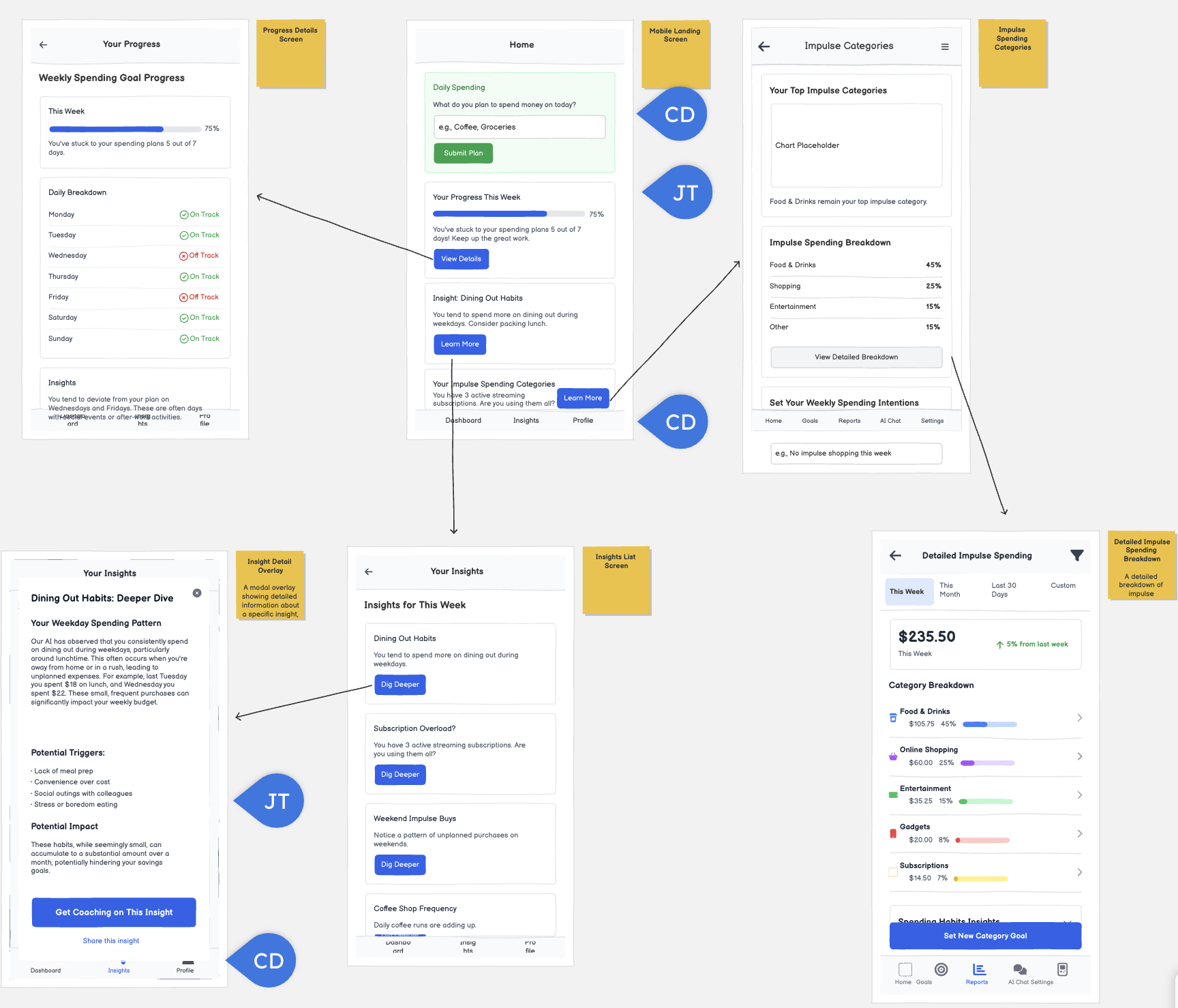
Key Interaction 3: Home Page
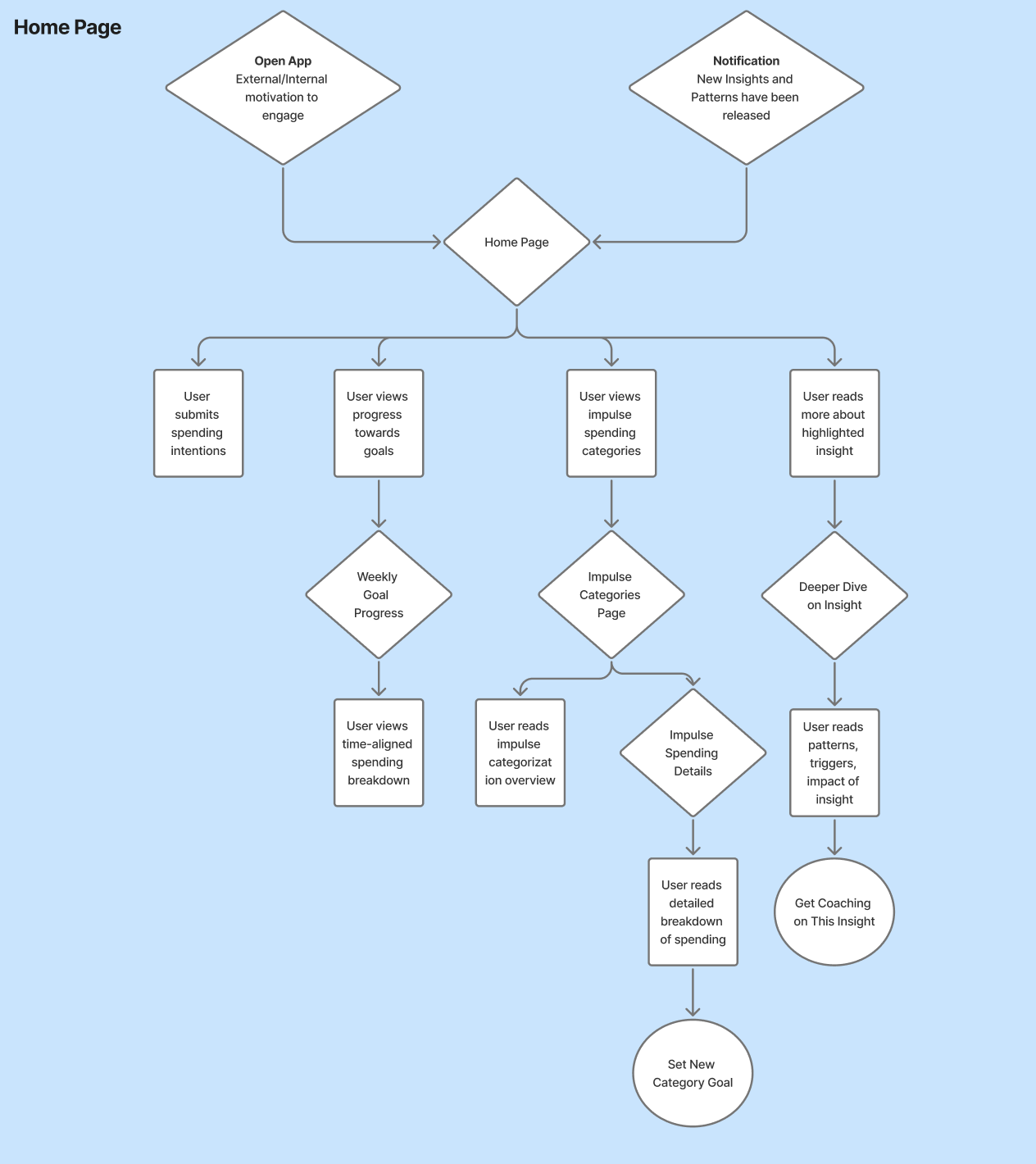
This figure demonstrates the user flow for navigating the homepage/landing dashboard. This flow begins by a user either receiving a notification about new information being available or by opening the app of their own volition. From there, they have the option to either submit a new spending intention, view progress towards their goals, read more about their impulse spending categorization, or read more about the highlighted insight. If they choose the second option (progress), they’ll review a time-aligned spending breakdown based on their preferred goal timeline. If they choose the third (categories), they’ll received a detailed, numerical categorization of what they’re spending money on and that relation to their goals and have the choice to set a new category goal. Finally, if they choose the last option (highlighted insight), they’ll read a deeper dive on the insight featured on the homepage and have the option to either receive coaching on this insight from the AI or share this insight.
Justification in the context of Personas
These features within these wireflows were inspired by our personas. For the Reactive Rewarder persona, who is susceptible to situation and emotional spending cues, we incorporated contextual notifications to help disrupt their reactive spending habits. For the Guilt-Driven Impulse Buyer persona, the incorporation of tracking spending and reflective conversations can provide them with constructive insights that help them feel more empowered and in control of their purchases as opposed to guilt.
Sketchy Screens
Cyan’s Screens
Before
Team Critiques
Bennie:
- could also be interesting to have people list their current financial hang-ups, help identify behaviors they want to get rid of (ex. spending too much on coffee, more than I usually expect when I’m out with friends, too much online at night)
- I get that this is supposed to align with the personas we created, but we should consider providing traits and letting people choose/add in order to build a personality (ex. kind, tough, fair, funny, sweet, mean, cold, bold, empathetic, older sister, bestie, etc.)
- Considering how apps typically handle this with Apple products, we could make this an “Enable Location Access” button and then the Apple standard for this flow would pop up.
Elijah:
- Name can be first in order
- Maybe this screen should appear before the next one so they kind of have some sense of the personality type of AI and then can put in additional preferences
Jasmine:
- We should have a confirm pwd and maybe name should be before pwd
- I think this should be like a form with more input fields (goal type (saving, spending limit), amount)
- Would be good to see how other apps do this: do we need account number? the bank login?
After
Justification for changes:
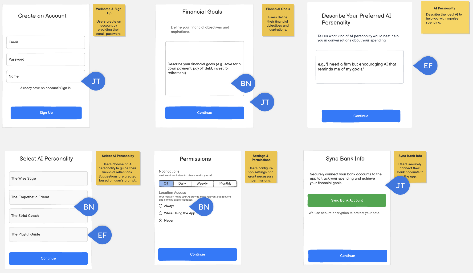
Screen 1
- Re: “We should have a confirm pwd and maybe name should be before pwd” I added a place for users to re-type their password before creating their account, and made name first
- Changed “Sign-in” to “Create Account” for clarity to users that they are creating their account
Screen 2
- Added a terms of service to give users clarity on what agreeing to use this application entails in terms of privacy.
Screen 3
- Re: “I think this should be like a form with more input fields (goal type (saving, spending limit), amount)” Aligned with this screen with the settings screen, which included these additional fields
- Re: “could also be interesting to have people list their current financial hang-ups, help identify behaviors they want to get rid of (ex. spending too much on coffee, more than I usually expect when I’m out with friends, too much online at night)” Added further description to describing financial goals prompt for users to describe behaviors they’d want to change
Screens 4 and 5
- Re: “Maybe this screen should appear before the next one so they kind of have some sense of the personality type of AI and then can put in additional preferences” Moved the Select AI personality screen before the describe your preferred personality screen
Screen 6
- Re: “Considering how apps typically handle this with Apple products, we could make this an “Enable Location Access” button and then the Apple standard for this flow would pop up.” Changed Location access to a toggle
Screens 7 and 8
- Re: “Would be good to see how other apps do this: do we need account number? the bank login?” Aligned these screens with design patterns of other applications that take in bank information for more smoother onboarding
Screen 9
- Added a congratulations page so users feel a sense of accomplishment after creating their account
Elijah’s Screens
Before
Team Critiques
Bennie
- could be interesting to consider custom lengths of time or select days of the week/times in the day
- maybe we should evaluate limits to number of unplanned purchases rather than $$ spending limits; focuses intervention on impulse spending, not overspending
- Love this! If someone wanted to add a new bank, maybe we could make that flow easier to find.
Cyan
- Perhaps we should add a sign out and/or delete account option somewhere? Maybe something to change password too.
- Maybe add a description beneath “Select AI Personality Type” similar to the one above
- Maybe we can add some back buttons to the top of each of these screens
Jasmine
- How would you get to this screen? Also what other options would be possible. We should see a description.
- It is unclear what the option selection vs the input box does
After

Justification for changes:
Screen 1: Streamlined Settings Overview
- I’ve refined the initial settings page by introducing a dedicated “Account Settings” section. This change clearly separates personal profile management from other application settings, enhancing clarity and organization. All options now follow a consistent format for improved user experience.
Screen 2: Enhanced AI Personality Configuration
- To provide better guidance, I’ve added example text within the input area, clarifying the expected input for describing the AI personality. Additionally, a descriptive text has been included for “Select AI Personality Type,” helping users understand the distinction between the two AI configuration options.
Screen 5: Comprehensive Account Management
- This screen now offers users greater control over their account. They can upload a profile picture, modify their name and email, change their password, sign out, and even delete their account. The password change, sign out, and account deletion options were previously unavailable, consolidating all critical account management functions in one accessible location.
All Screens: Improved Navigation
- To ensure seamless user flow, a back button has been added to all screens. This allows users to easily return to the previous page and navigate back to the dashboard as needed, significantly improving overall usability.
Bennie’s Screens
Before
Team Critiques
Cyan
- Somewhere on the homepage, we should probably add an option to chat with the AI. Whether its a tab or another subsection on the dashboard.
- Not sure if its hidden here, but it could be nice for their to be icons next to each of the tabs on the bottom / for the options to be consistent across each page.
- Based on Elijah’s screens, would it make more sense for this tab to be called settings (as opposed to profile?
Jasmine
- I think it would be better to have a pie chart or more visual bar charts rather than a progress bar.
- We should add the charts here as well so it is not just text
After
Justification for changes:
All Screens
- Re: “Based on Elijah’s screens, would it make more sense for this tab to be called settings (as opposed to profile?”
- Replaced ‘Profile’ in the navbar with ‘Settings’ + standardized navbar across screens
Screen 1
- Re: “Somewhere on the homepage, we should probably add an option to chat with the AI. Whether its a tab or another subsection on the dashboard.”
- I added a chat button in the same line at the top of the screen to provide a space for users to navigate towards the AI coach.
- Re: “I think it would be better to have a pie chart or more visual bar charts rather than a progress bar.”
- Made a pie chart that displays the progress towards expressed goals in replacement of the horizontal progress bar
- Re: “Not sure if its hidden here, but it could be nice for their to be icons next to each of the tabs on the bottom / for the options to be consistent across each page.”
- Added icons into the navbar
Screen 3
- Reframed main metrics to include number of unplanned purchases alongside total amount spent
Screen 5
- Re: “We should add the charts here as well so it is not just text”
- Condensed details into bullet points and charts to make walls of text more digestible
Jasmine’s Screens
Before
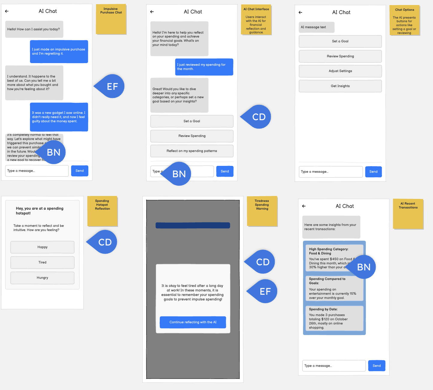
Team Critiques
Bennie
- Good that this doesn’t give directions and instead coaches/helps the user talk through the decision
- not entirely relevant to the assignment, but we should start thinking about what a navbar might look like in this product
- Is this a standard 3, or is there a possibility for more/less? Wondering what the >3 chat might look like
- Maybe it could be emojis/mini reactions
Cyan
- What would a user do if they didn’t want to do any of these goal? Perhaps something that could be made clearer
- It is a bit unclear how we get to this screen / what prompts it to appear
- If they are feeling something other than what is listed, maybe we can consider adding another option that allows users to write in an emotion. Or perhaps expanding what can be selected here a bit.
Elijah
- chat might also mention returning it since its online
- maybe another button to review impulse purchases from this month
- maybe it could be a slider with mood and energy level sliders
After
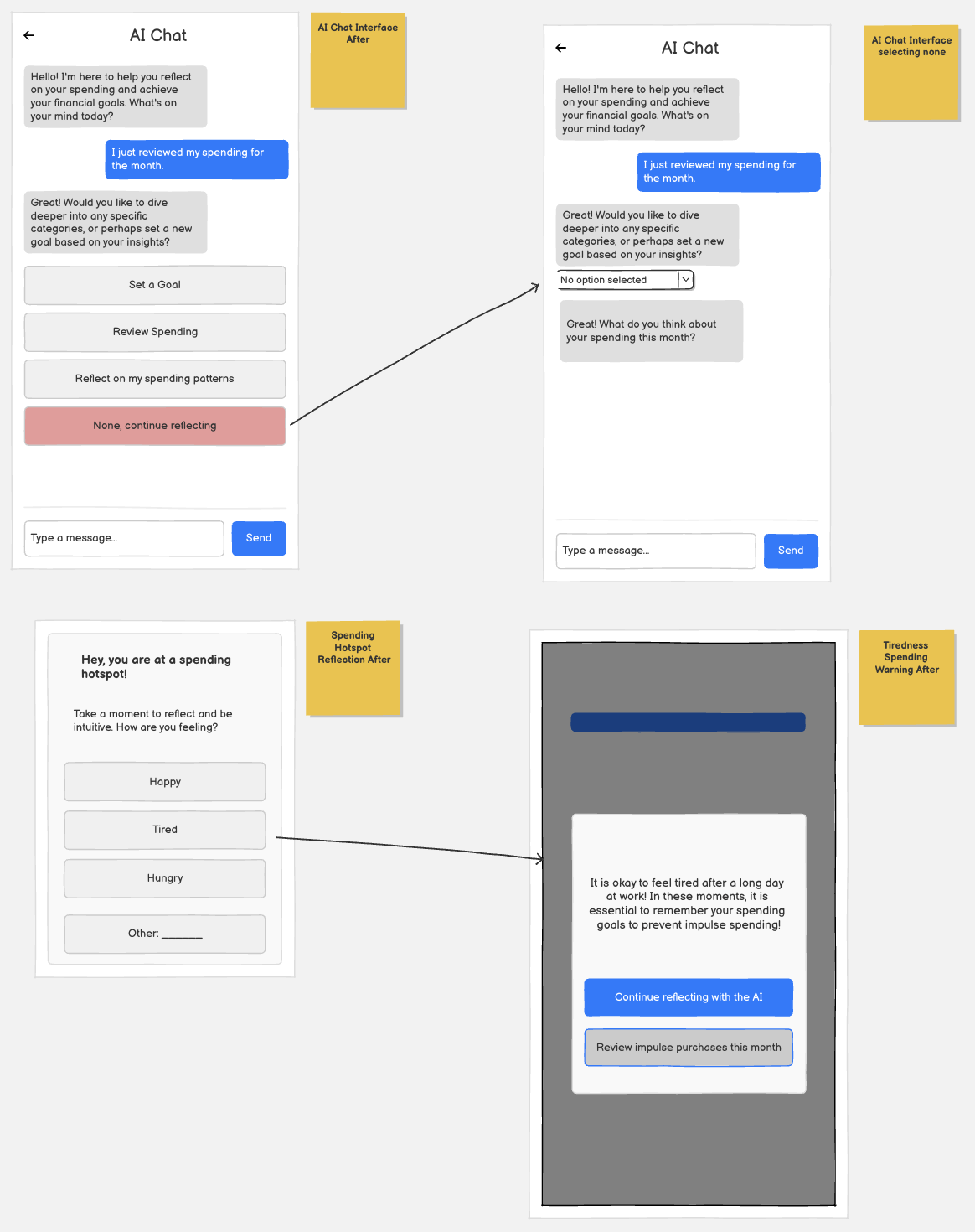
Justification for changes:
Screen 1
- Re: “What would a user do if they didn’t want to do any of these goes? Perhaps something that could be made clearer”
- I added a “None, continue reflecting” option within the selection screen. If a user does not resonate with the predefined options, they can still proceed without feeling constrained. This ensures the reflection flow remains inclusive while maintaining engagement.
- Screen 2
- After the user selects an option, the predefined options collapse, and the AI responds directly with a reflection-based follow-up question. Hiding the options creates a more conversational, chat-like experience and reinforces that the AI is dynamically responding to the user’s input.
Screen 3
- Re: “If they are feeling something other than what is listed, maybe we can consider adding another option that allows users to write in an emotion. Or perhaps expanding what can be selected here a bit.”
- Added an option to write their own emotion
Screen 4
- Re: “It is a bit unclear how we get to this screen / what prompts it to appear”
- I added a visual arrow between screens to clearly indicate that selecting an emotion triggers the follow-up message.
- Re: “maybe another button to review impulse purchases from this month”
- I added a button allowing users to review their impulse purchases from the current month.


