
Henry Greenman, Isabelle Levent, Athena Shiravi, Emily Hsu, Zoya Garg
Wireflows
FigJam Board: Link

Sign-up

Set-up habit

Check in
One of our main personas is a busy, graduate/ post-graduate who spends a lot of time working indoors and on a school schedule, unable to completely control their own environment.
When our user, “Dylan,” downloads the app, he signs up, enables location, and links his Apple Watch. We assume that he has an apple watch and is technologically proficient. Tracking health data is not foreign to him.
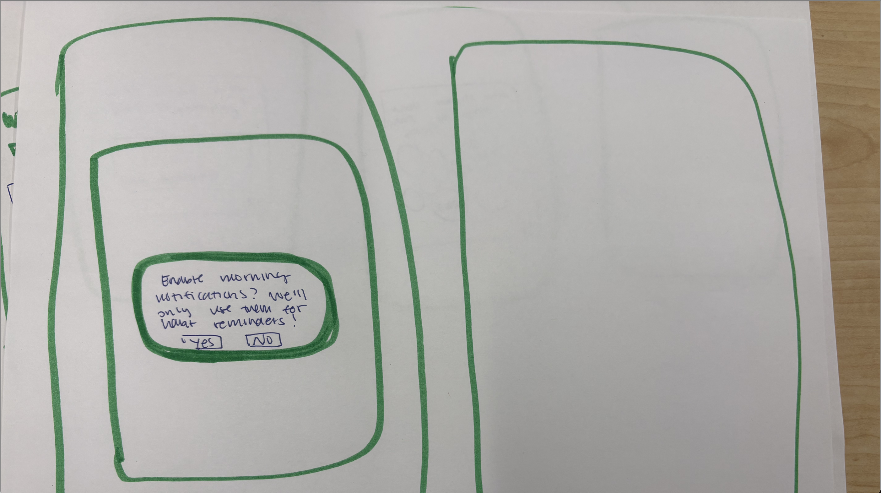
After signing up, he has to select his habits and a wakeup time to enable morning notifications. These will be used to personalize his notification and chain his habits (usual morning habit + being in the sun). Morning notifications assume that Dylan is a student or working professional who has to rise in the morning (vs. being a night owl who sleeps late and may therefore get less morning sun exposure).
When the sun goes down, Dylan receives a notification to check-in on his daily sun exposure. He answers a few questions about his sun exposure, which allows him to track his energy and sleep over time. Nicole, another one of our personas, cares a lot about her physical health. Tracking the correlation between sun exposure and sleep is important to her.
Finally, a user is able to update any of their personal information or habits via the profile portion of the app.
Sketchy Screens
Sketchy Screens Images (Old): Link
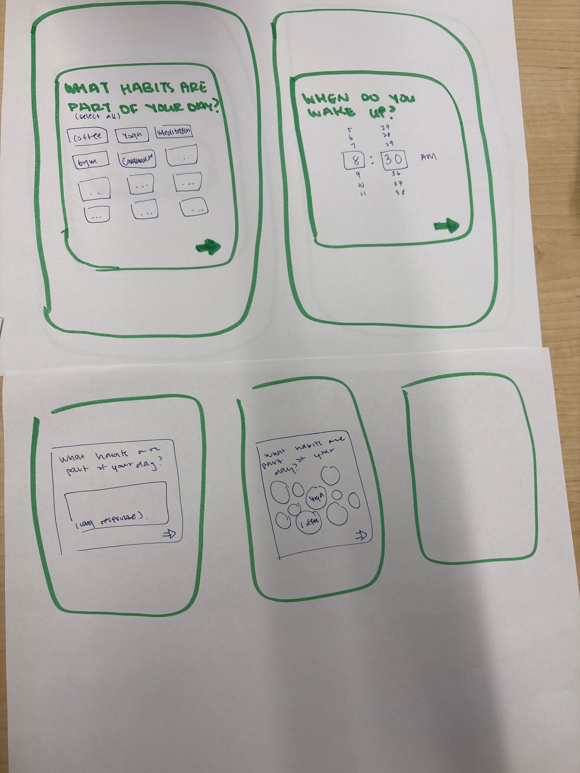
Sketches done by Isabelle. Habit questionnaire feedback:
- The screens might be one too many onboarding steps for the user, who just wants to see results as quickly as possible (Christina’s point about more time for onboarding == more users leaving).
- The open ended question format may overwhelm users (I experience this a lot)
- Can we make a super basic information survey they can then enrich with other data points?
In response, we…
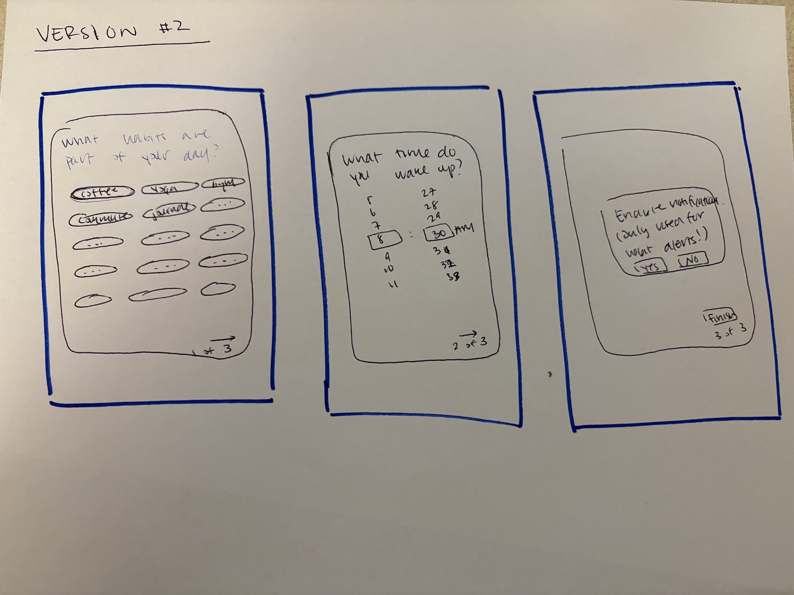
- Decided to go with the selection option for the habit question instead of the open-ended long form box. This also makes the answer easier to parse on the back-end.
- Realized that all three questions are required, but added a marker at the bottom of the screen (1 out of 3, 2 out of 3, etc) to help users track where they are in the questionnaire, so that they don’t exit out of the survey when there are only a few steps left.
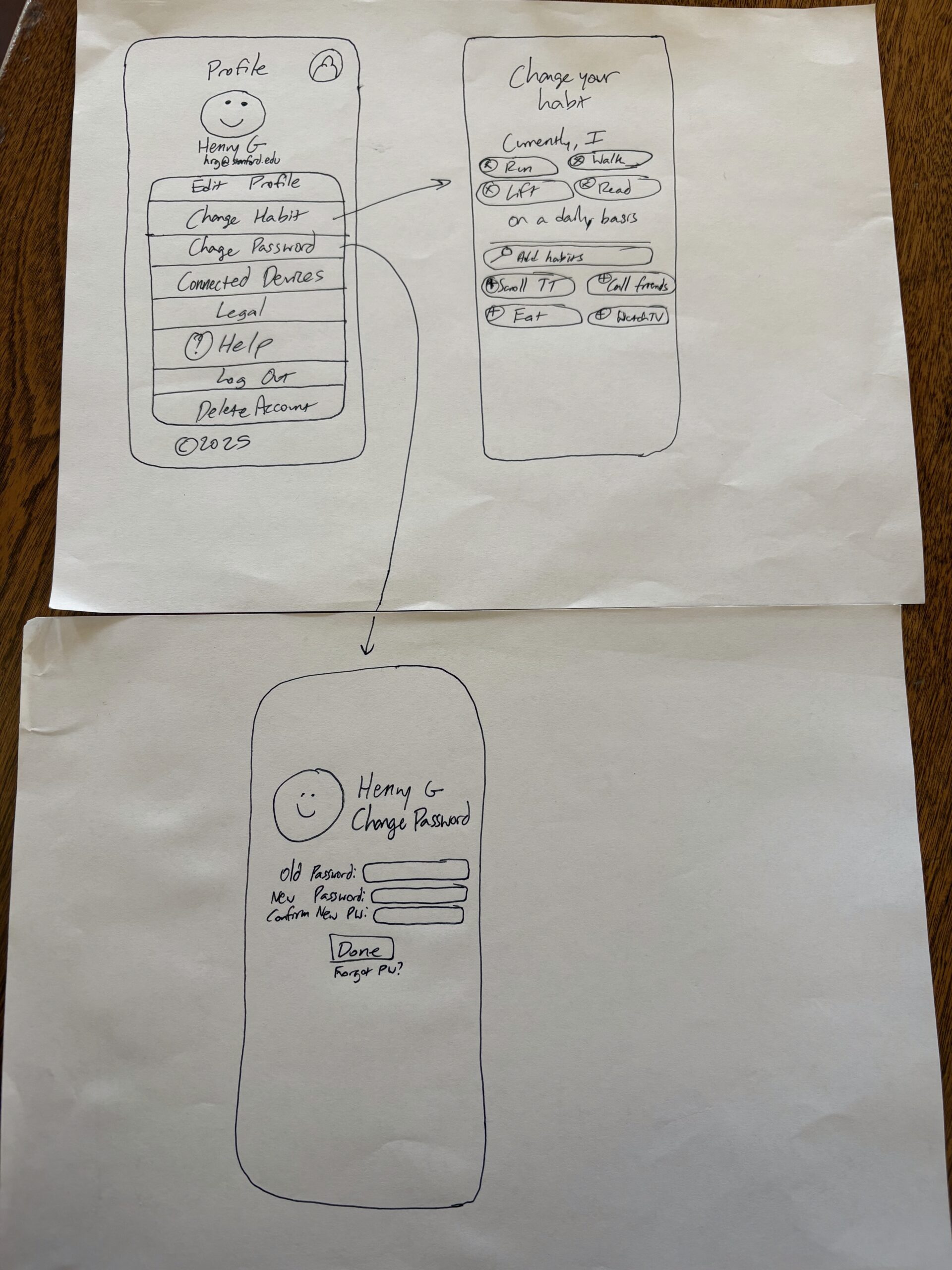
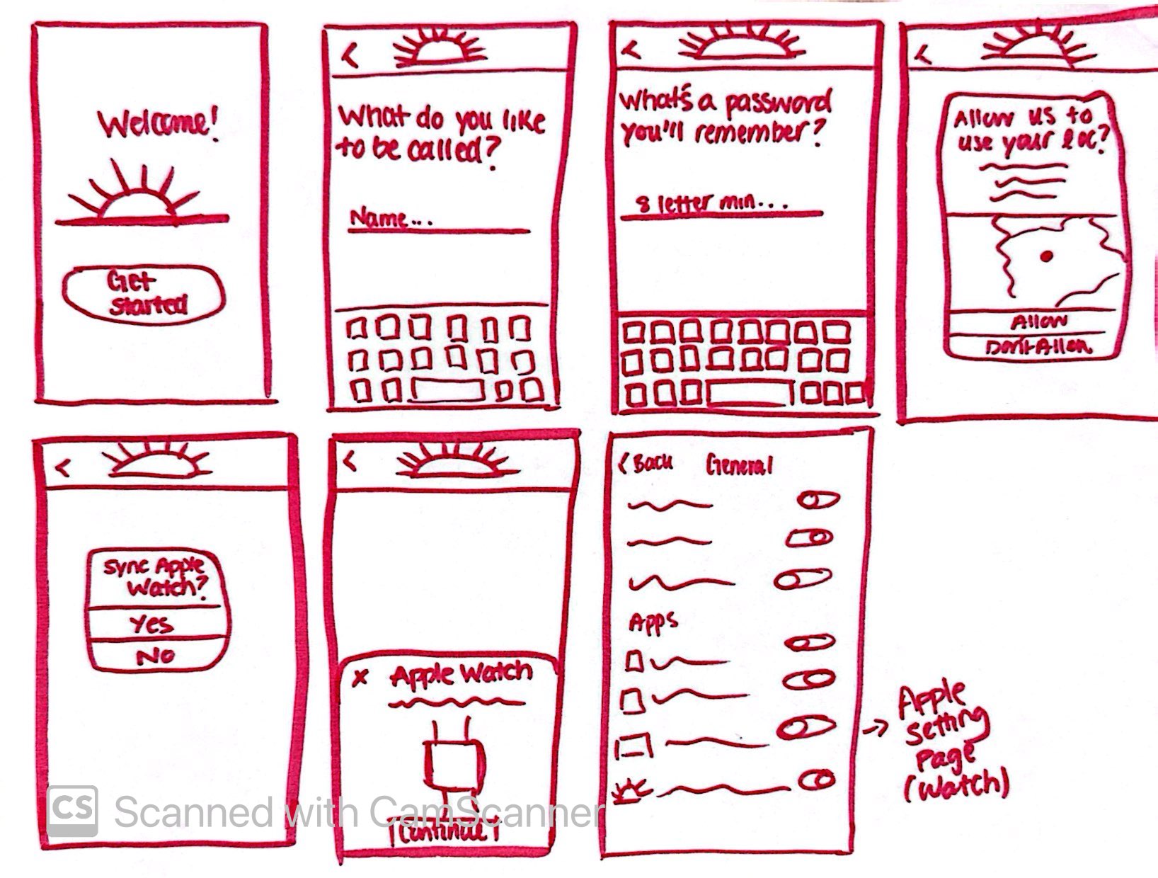
Sketches done by Henry. Settings feedback:
- Profile icon on the top left seems a little redundant because we’re already on the profile page, would consider indicating an exit route like a back button to go back to the home screen and same applies to all the screens
- I really like the way you add / change habits, the bubble design looks really good!
- For the change password screen, I think it could just be change password at the top without the name and picture because those aren’t very necessary for changing your password


In response, we…
- Decided to add a back button for ease of access between settings and profile pages.
- Removed the redundant profile logo in order to minimize confusion and excessive UI components.
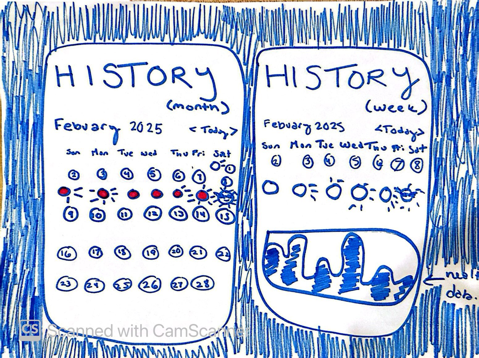
Sketches done by Zoya. The left screen is her original sketch and the right is her updated version. Home Screen & History (Post-Check-In) Feedback:
- On the left screen, having a full month of calendar dates could be overwhelming for users.
- Additionally, the drawn illustration of the sun rays to represent daily exposure could be confusing.
In response, we…
- Used a bar chart
- Limited number of days from a month to a week

Sketches done by Emily. Check-in feedback:
- Currently, there are no exit paths for the check-in flow. What does this look like with skip options or just being able to x out of the flow?
- What if I opened the app in the evening but not at the exact time ”check in” notification time? What is the check-in pop up / module on the Home Screen?
- I like the character you developed for the energy levels and sleeping! I think we should use those throughout our flows.

In response, we…
- Added an exit path for the check-in flow in case the user wants to leave or go back
- The check-in screen will be the default home screen if the user still hasn’t checked in for the day
- Decided to go with the first variation with a character in the middle of the circle to create more emotional connection with the user
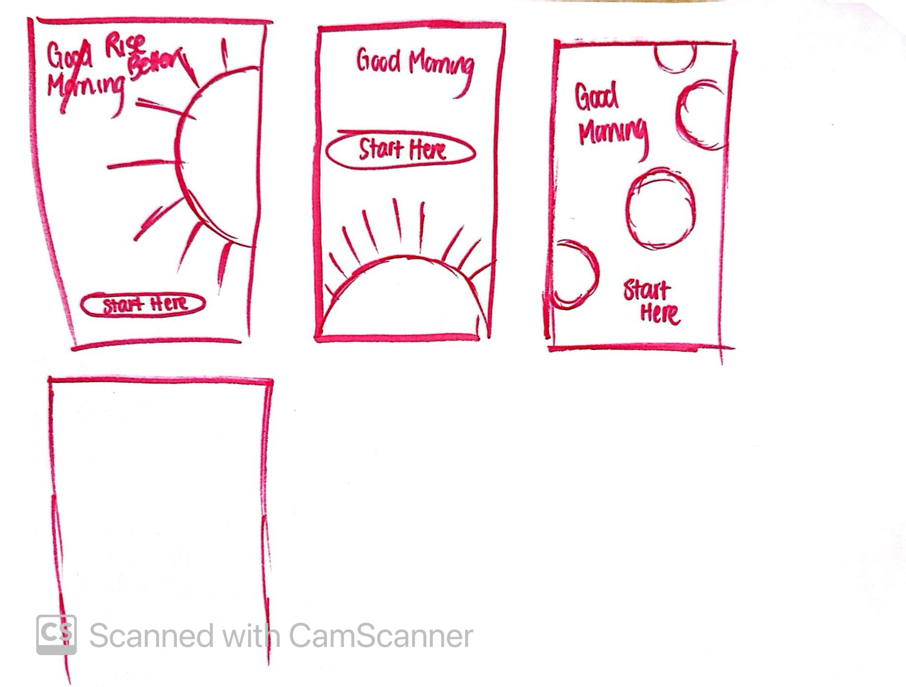
Sketches done by Athena. Onboarding feedback:
- The onboarding flow is clear, but it might have one too many steps—users may get impatient before reaching the main functionality. Perhaps we can combine the name and password screens?
- The home page is SO excellent, not notes
- Apple Watch sync is great, but it’s not clear how a user should connect it, we might need some apple symbols
In response, we…
- Made the design and onboarding more minimal


