
Below, our original doc
https://docs.google.com/document/d/106Jxm7jkafiLBV5yS4QqVgig00mzXk8SqFUban9ZUZE/edit?usp=sharing
Wireflows
Activity Summary and Trend Analysis
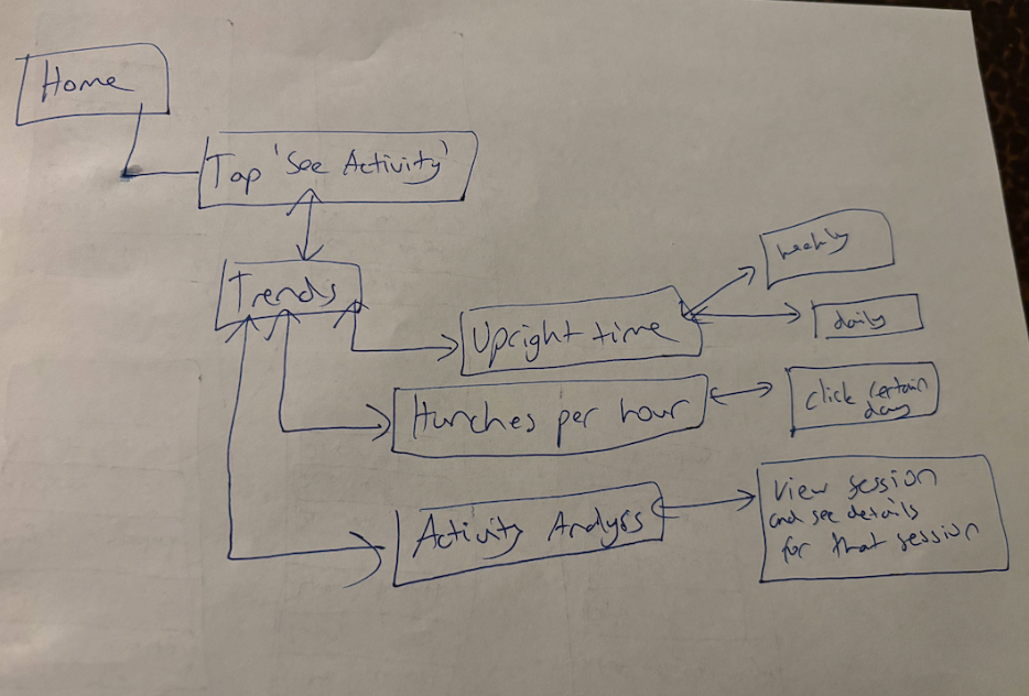
This wireflow starts at Home, where tapping “See Activity” brings you to a Trends hub that branches into three views: Upright Time, Hunches per Hour, and Activity Analysis. The single entry point keeps things low-friction for a student checking in between study sessions, and the weekly/daily toggle on Upright Time lets you zoom out to track habit-building over the semester or zoom in to see how you’re holding up the day of an exam. Hunches per hour with the ability to click a specific day is especially useful because posture tends to tank during crunch time, so you can actually pinpoint which deadline wrecked you. Activity Analysis is the deepest layer, two taps away, which is intentional, since a stressed student isn’t going there mid-grind but might during a slower moment to review session details and reflect.
Setup Wireflow
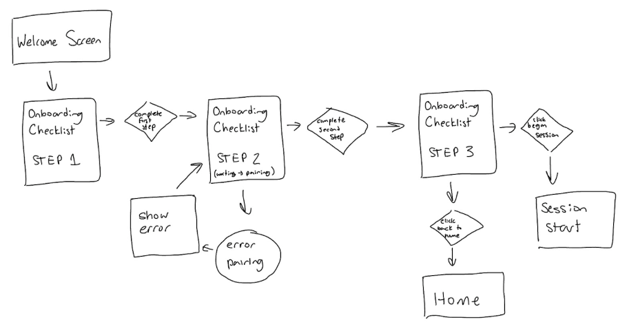
The setup phase starts with a welcome screen right when the user opens the app for the very first time. Next, it walks the user through a checklist of steps needed for onboarding. Specifically, at step 2, which is pairing hunchie, technical errors can occur because you are connecting via bluetooth to a physical device. Therefore, there is error handling with a message asking you to try again at this step. After the user completes the full setup at step 3, they have the option to start a session right away or go back to the home page.
Session Wireflow

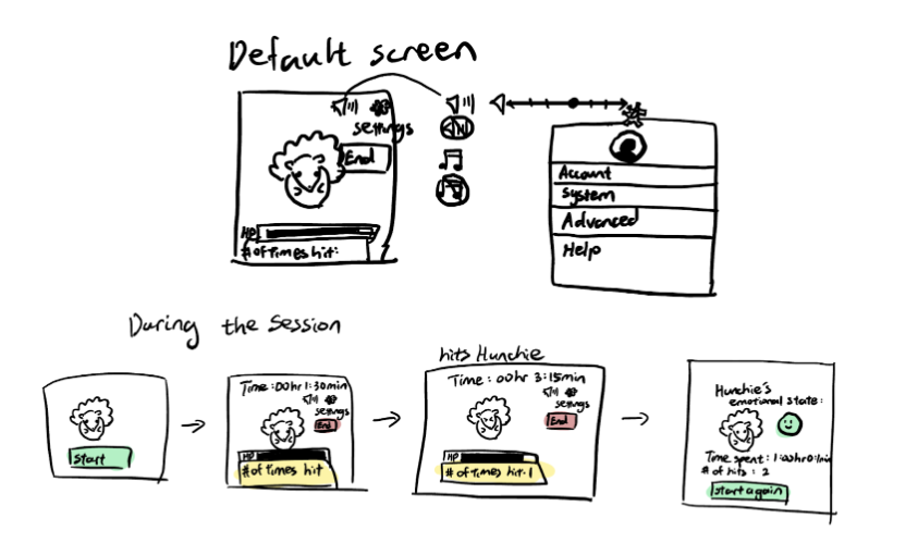
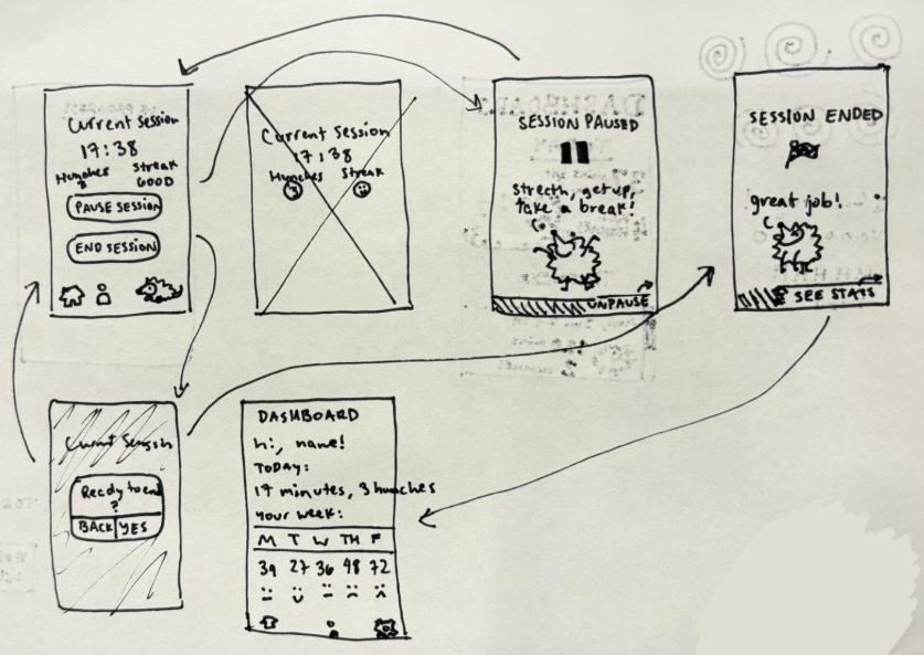
This wireflow describes the actions through the process of recording a session with Hunchie. To record a session, a user begins from their home screen and selects/decides that they want to start. After the app verifies the connection between Hunchie and that Hunchie is working properly, it asks once more if the user is ready/OK to begin. As a session is ongoing, it goes through a loop that utilizes feedback from the user touching Hunchie or Hunchie detecting touch, keeping track and reflecting this change in the UI (with number of hits/slouches). During the session, the user can also either pause or end the session. Once the session has been stopped, the app will lead the user to their stats for that session.
Sketchy Screens
Lucy’s Sketchy Screen (Onboarding):
Heather’s Sketchy Screen (Set-up tutorial):
Nikki’s Sketchy Screen (Session in Progress):
Ginelle’s Sketchy Screen (Session Ending and Dashboard):
Edited Sketchy Screens
Lucy’s Edited Sketchy Screen
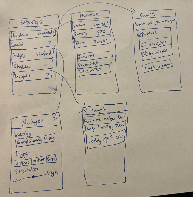
I streamlined the settings so it feels calm, intentional, and easy to scan instead of form-heavy or overwhelming, which is what the feedback mentioned. Each row now shows the current state (like “Connected,” “Standard,” or “Daily + Weekly”) so you understand everything at a glance without tapping into five submenus. I removed unnecessary headers and visual clutter, leaned into whitespace, and made each screen focus on one clear type of decision: device, goals, nudges, or insights. It feels more premium and thoughtful, and less like a technical dashboard.
Heather’s Edited Sketchy Screen
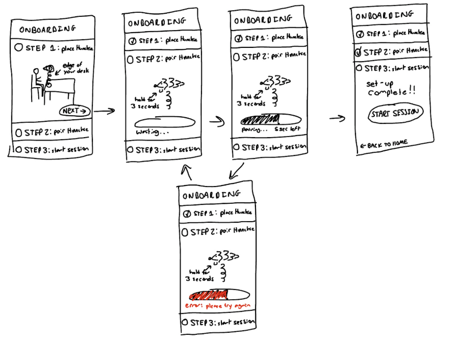
After receiving group feedback to make the flow feel easier and faster by showing all the steps on just one screen, I modified my flow to have the user go through a checklist where each step expands as the user needs to complete it. This helps the user to know exactly what needs to be done at the start and see how simple and quick the set-up will be. I also adjusted the start session button to be much larger than the home button on the final step since we want to encourage our users to try it out right away.
Nikki’s Edited Sketchy Screen
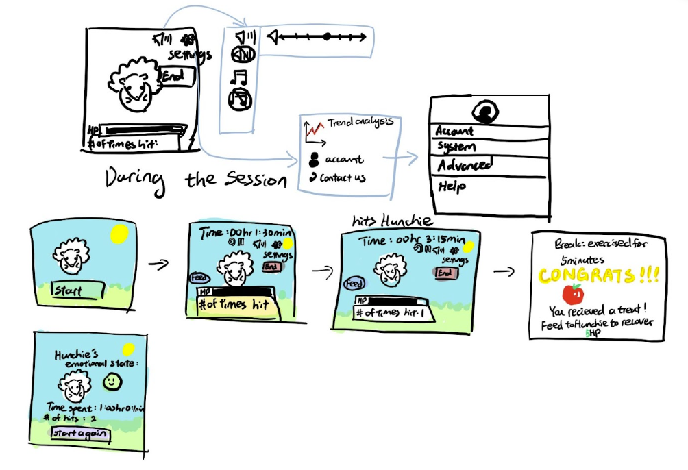
Following my team’s feedback, I added the “pause”,“restart”, and “feed” icons to the session screen. When applicable, I also added expanded menu options for when the user clicks on a specific icon. To enhance the app’s serene atmosphere, I introduced a peaceful meadow background featuring Hunchie. Finally, I incorporated a gamification aspect where when the user takes a productive break, they can earn treats to feed Hunchie, which helps restore some of its lost health points.
Ginelle’s Edited Sketchy Screen
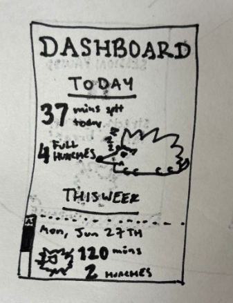
Feedback from the team indicated that while the flow of the ongoing session screens were good, the dashboard was slightly underdeveloped in comparison to the rest of the sketchy screens, so I decided to focus on the dashboard for this revision. Using visual elements of hierarchy, I divided the new dashboard into two, “TODAY” and “THIS WEEK.” Assuming this is the screen that we see after ending a session, we’d focus on giving the user stats on their recently finished session, then give the option to scroll through the past week. For the TODAY section, for importantly, I highlighted the length of the sessions, the number of times the user touched Hunchie/or that Hunchie detected slouching (which I called “hunches”). Beside that, a larger visual of Hunchie with a clear depiction of its resulting mood. In this screen, for example, Hunchie’s sleepy and not distraught with the user’s performance for the session.


