Moodboard
For our mood board, we decided we wanted a chic and trendy ‘I have my life together’ vibe, but considering our audience is towards young people struggling to achieve their goals, we also wanted to make the app more fun, relatable, and visually engaging. To this end we chose artsy, aesthetically pleasing images, but also a few funky, quirky little creatures, which you can see in our moodboard (thank you Amy for the rat doodle cutout donation). We also wanted to give off a calming, encouraging, and sincere feeling, so we tried to avoid chaotic or threatening feelings in our images and instead chose pictures of positive things like nature, food, art, etc. We feel that our moodboard shows our brand because it feels artsy and visually appealing, but also a little imperfect in an intentional and relatable way.
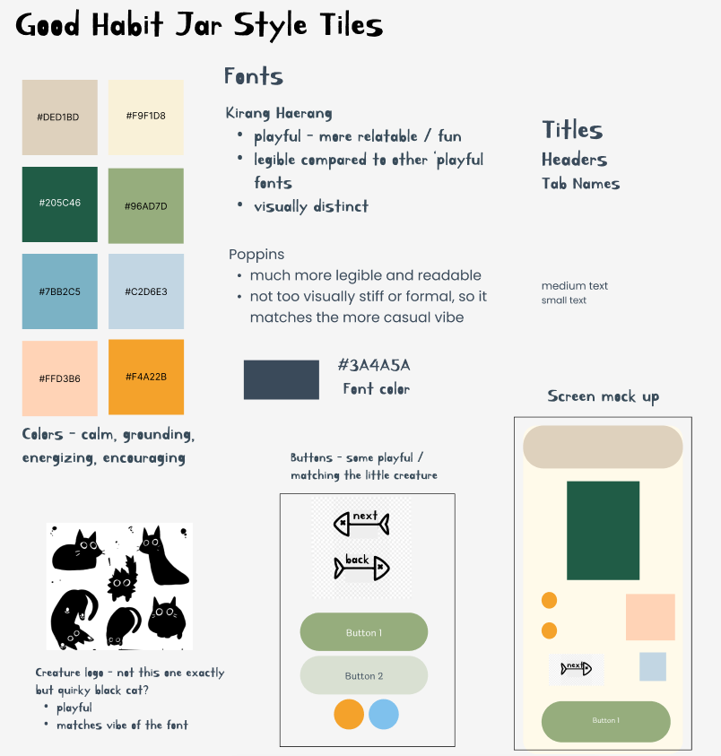
Style Tile
We chose our color palette by leaning into colors reflected on our mood board and through the feeling the colors gave off. For example, the greens and blues as energizing but calming, earthy lighter tones to be grounding but not suffocating, and a bright orange-yellow accent to pique attention.
We included a cute/funky mascot to make our brand unique and create a feeling of playfulness, as we don’t want to become a punitive app. Along with this, we included a couple on-theme fishbone buttons. We noticed that many apps have a very minimalist, professional, clean style, and we wanted to be intentionally on-the-verge-of-cluttered and not-minimalist by using our mascot and cat-themed buttons. Their purpose is to differentiate ourselves from other apps and make a sense of connection with the user.
We chose a playful font to match our mascot and buttons, which will act as our font for titles due to its difficulty to read at small sizes, and a cleaner font for smaller texts or descriptions.