by Greg Kalman, Austin Konig, Ananya Navale, Shuman Wang, Jasmine Xu
Wireflows
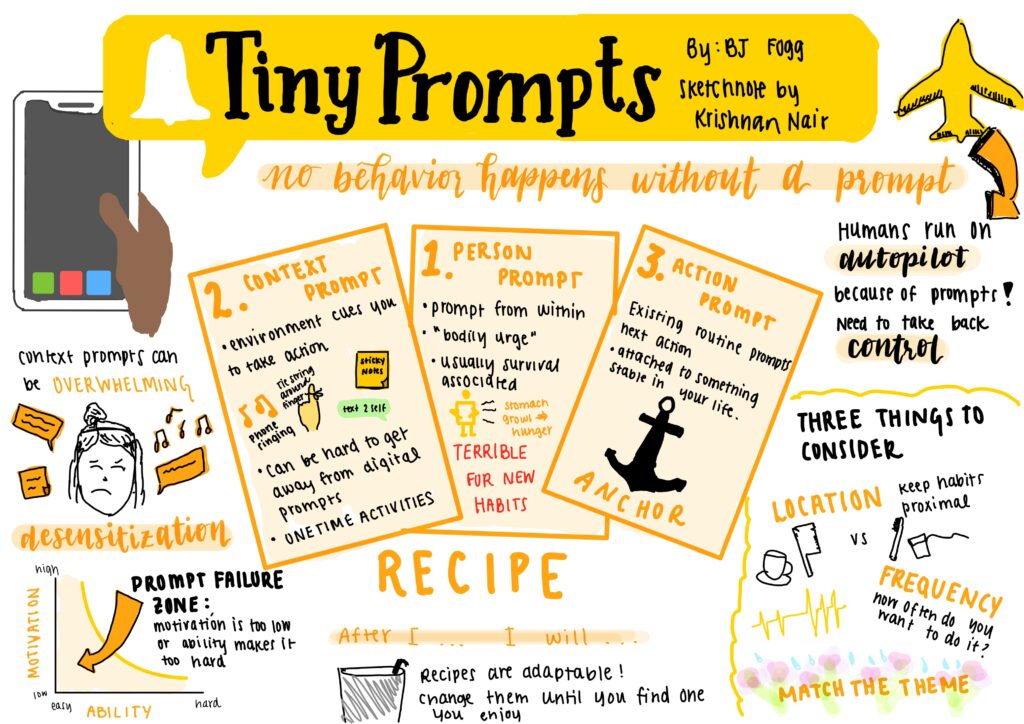
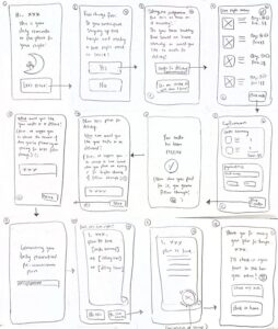
This wireflow depicts the potential user flow for someone like the “Midnight Oil Fueler” persona, someone who just wants to get something ordered, and eat at their leisure later in the day. No social obligations, no mindless consumption, just eating for fuel. They might want to know the nutritional value of the foods they browse, so the flow accounts for that. They might want to consult a chatbot to discuss how they’re feeling – in the moment, considering their thoughts about having a late night, they might feel overwhelmed and want to talk to somebody, anybody. They might want to avoid having to make decisions, so they turn to the chatbot to help inform their snacking decisions.
Later on, when they have the time to eat and reflect on the day, they can think back to the pledge they made, the experience they had eating what was chosen (by them or suggested by the chatbot), and whether it felt supportive or disruptive. The diagram provides for this task flow as well. At each step is a decision made with intent – it represents a solid, tried-and-true (for the most part) purchase flow with the addition of emotional and physical feedback.
Sketchy Screens
Preliminary Sketches & Team Critiques
Greg
Task Flow: Pre-ordering for one person
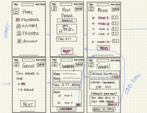
I’m a big fan of the hierarchy of the home & summary page! It catches my eye immediately for a quick order and doesn’t overwhelm the user with too much info at once. For tab (2), I’d suggest adding a larger calendar and potentially a time window (i.e. Google Calendar) where the user can block a schedule for delivery (like 3:30-5:00pm). Slide (2) can use more precise directions for a successful order, like a pindrop location or instructions. Lastly, I’m a tad confused by the text below ‘change your mind’ on the last slide; maybe this can be simplified to two components for visual hierarchy reasons (i.e. edit, cancel). ~ Austin
This layout is very thought provoking! I like how straightforward the funnel is here, keeping the user on track and having them start committing to the process in advance of selecting their food. I’m curious about the first page by itself, and what that would look like for the user. Is that the view if the hamburger menu icon is selected (as in a side menu that pops in from the left) or is that the home view? Overall, I also believe the flow could be a bit less step-by-step and encourage more discovery – this can make it look more engaging and welcoming as well! Also +1 to Jasmine’s note about the “Back” button. ~ Ananya
This flow is super easy to follow, it is very clear and the process of “summary–confirm–order details” is satisfying. I also like that the core inputs (address, date, time) are upfront and simple, so a tired student could still finish it without thinking too hard. I think the “Home” screen feels like a side menu turned into a full page, so the navigation could be cleaner (either make it a real home dashboard or make it a real drawer, not both). ~ Shuman
I really like the simplicity of the flow and the thoughtful use of color to highlight key elements. The inclusion of a “Back” button is also a nice implementation of H3: User Control and Freedom, giving users an easy way to revise their choices. From a design system perspective, though, it might feel more intuitive to place the button in the top-left corner, where users typically expect backward navigation. I also wonder whether introducing a clearer funnel or wizard-style flow could help guide users step by step — for example, separating time, location, and order details across individual screens. This might reduce cognitive load and prevent the interface from feeling overwhelming. ~ Jasmine
Austin
Task Flow: Structuring a group pre-order
I especially appreciate how detailed this flow is. The flow is intuitive, and the screens show a good beginning visual hierarchy that doesn’t leave me with any questions. Importantly, this flow combines a lot of features like date/time windows and friends list that are integral to our project, so that’s awesome. I think maybe I would like to see some more complicated flows between the screens, i.e. if the order needs to be edited, where does the user go? This might require a few more screens but the bones are great so it shouldn’t take too long. ~ Greg
I like this flow, it really does feel like a group order that includes everyone, especially with that delivery window and the friend order status list! A couple things to note: try to perhaps find a more recognizable layout for the top bar icons that feel intuitive for a user – while cart and notifications do go in the top right (you’re right), it feels a bit strange to put the profile/user settings icon in the top left to compensate, since most user icons sit in the top right as well. There’s a lot of stuff in that corner! Maybe take a look at other food purchase apps to see how they balance these. Also try to find a stable place for an action button like “Back”, it seems to be in a couple different places on different screens. I’m curious about the “What’s your appetite” question on the first screen – what is that referring to? And what are those options that the user can select from? The third screen is really the heart of this flow, and it looks great! ~ Ananya
This flow is really easy to read at a glance, and the arrows make the story super clear from choosing “Single/Group, Address/Time, Friends/Menu, Summary, and finally Done”. I also love the color-coding: orange for mode and actions, green for friend/selection, and red for costs. It makes the priorities instantly obvious. One small improvement: on the Address screen, it might be smoother to offer “Dorm / Default address” as a quick pick first. This is already strong and very usable. ~ Shuman
Great use of detail and color — the flow feels very comprehensive overall. I also like the consistent placement of the profile, notifications, and cart icons in the top panel, which aligns well with H4: Consistency and Standards. The summary and confirmation message at the end is another strong touch, supporting H6: Recognition Rather Than Recall by helping users easily review their choices. One area to potentially improve is the use of white space. Some pages feel slightly crowded, which can make the interface seem overwhelming and may conflict with H8: Aesthetic and Minimalist Design. You might consider breaking some of the information into separate steps and using a wizard-style flow with a clear “Next” button to guide users progressively through the process. ~ Jasmine
Ananya
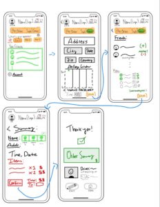
Task Flow: Submitting a log entry for the previous night’s food
I really like the visual hierarchy and the general layout of the screens in this flow. The bottom menu bar is super intuitive and is something the rest of us glossed over, so kudos for including! I really like the simplicity and annotations included in your flow. The final screen is especially awesome and I like the way it combines a lot of our features, especially the data visualization. One thing I’m wondering about is whether or not the middle screen should function as a diary with paragraph entries or a drop-down menu with preset items (and likely a box for other that itself could be a paragraph entry). I like the use of paragraphs for their customizability, but I wonder if the longer time needed to log the experience could affect retention. ~ Greg
I really enjoy the minimalistic approach to the home screen’s history/recommendation feed. All of my following suggestions really come down to improving the font style and placement to improve UX. First, slide (1) should help the user access the order page with as little friction as possible; some type of search function or re-order page would help the user recall past meals beyond just going to the ‘food tracker’. Slide (2) could best benefit from scaled rating (‘on a scale from 1 to 5…’) OR references to specific meals (‘how much did you enjoy X?’). Finally, slide (3) feels like its incorporates many metrics of eating all-at-once, and could be broken down into smaller taps. For example, you can first show the user the last week of their eating habits, then provide the option to show overall history (a good reference for this would be Apple’s Screen Time, showing gradual metrics to not overwhelm the user). ~ Austin
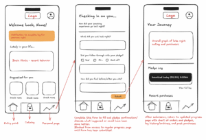
The “Welcome back – check-in form – updated journey” loop is super clear, and it feels like a real habit-tracker instead of a one-time survey. I also like the gentle, friendly tone (“checking in on you…”) plus the bottom nav, it makes the app feel structured and easy to return to. I think the “blocked until you submit” idea might feel a bit like the app is scolding people, so I’d add a “Skip for now / Save draft” option to keep it supportive. ~ Shuman
Love the home page and the bottom navigation panel — it feels intuitive and easy to orient around. I also really like the idea of the journey log and visualizing overall trends in graph form; that seems like a strong way to support reflection and progress tracking. The visual design overall is great too, with good hierarchy and sufficient white space that keeps things from feeling cluttered. One small point of confusion for me is the pledge log on the last screen. I wonder if it could be explained a bit more clearly, as it’s not immediately obvious what it represents or how users are expected to interact with it. Adding a short descriptor, tooltip, or onboarding cue might help make its purpose more intuitive, and would help it align better with H10: help and documentation. ~ Jasmine
Shuman
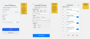
Task Flow: Logging in/signing up for the app and setting user preferences

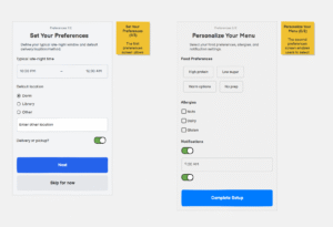
These are awesome screens and the functions inside of them are extremely self-explanatory! I think maybe the slider for the “delivery or pickup” choice might be wrong– instead we could use a selection method like with the “default location” section. I would also add a custom allergy section to make sure that users are able to feel included and that they have every bit of autonomy necessary to safely order their food. ~ Greg
The flow of this sketch is perfect for entering the home screen and ordering ‘at-a-glance’, which should be common for those who know their preferences very well. For tab (2), I’d suggest adding more real estate to the ‘create account’ button and include from type of back button in the top-left corner to account for user error (i.e. someone logging in when they don’t have an account). Next, slide (3) does not incorporate an emphasis on required fields like it does optional fields. Red-bolded sections (i.e. ‘Email’) would help prevent users from being frustrated that they cannot enter the next page without filling out what’s necessary. An asterisk could even suit well, if you’d like a more minimalistic approach. ~ Austin
This setup flow is super functional and to-the-point, which is really nice and avoids any sort of confusion users might have! I wonder if you could try lowering the flow barriers a little and bring some of the “brand personality” into this entry flow itself? You could also think of a little demo walkthrough that shows new users what the app offers, and why they should partake in the experience. I like the “personalize your menu” screen, that would really help with something like a “Suggested for you” area of food options on the home screen, that would hopefully entice people to get more food! ~ Ananya
This looks super great — very clear and easy to follow. I also noticed the “delivery or pickup” choice, which Greg mentioned might actually be an error, so that may be worth double-checking. Another suggestion could be setting a default location that automatically detects and saves the user’s current location to streamline the experience. Additionally, including an “Other” option for food preferences and allergies could better align with H3: User Control and Freedom, allowing users to specify needs that don’t fit predefined categories. Overall, really nice work though! ~ Jasmine
Jasmine
Task Flow: Pre-ordering for one person
I find these to be super readable and their functions really clear. I especially like how detailed everything is without the screens themselves feeling stifling or overly complicated. One thing I’m curious about is whether or not we need screens 2 and 3, as the user likely already knows that they will be staying up late/needing a snack. I also looove the message on screen 6 that has the subtle guilt trip– I think that’s a nice way to nudge without manipulating. ~ Greg
I really appreciate the conversational intro to the app in this mockup; it makes it feel like you have a nutrition consultant rather than a traditional delivery hotspot. To make sure the user isn’t too overwhelmed by the text, I’d suggest breaking it up even further, where the user taps to see each additional sentence between slides (1) thru (3). Next, quantifying totals in one section is very important for slide (4); I’d suggest a final total or quantity at the bottom of the page so that they won’t have to triple-check whether or not they added some item in their order. Lastly, the ‘stamp of approval’ design may have some bottlenecks for regular or extreme users, who are just trying to re-order a favorite item. I’d suggest some more along the lines of an order summary, followed by a visual of the delivery window, and maybe a pinpoint delivery location (i.e. where the delivery driver would drop off food).~ Austin
“Love the very simplistic nature of each screen. That being said, several wordy-looking screens in the pipeline seem to lengthen it a bit past necessity… There should be a nice balance, I feel, between the mental undertaking of the commitment to avoiding junk food at night and the practicality of the operation. This should be represented in the actual user flow as well, where perhaps not every screen is focused on a separate question. Also, ordering and checkout is a very straightforward flow that many users (especially college students) are familiar with—based on this, I think it would make most sense to group the delivery details and item cart in the same single checkout screen. This would help with shortening the number of screens—remember, this is supposed to be quick and easy. As minimal friction as possible! Great personality all throughout though, I think this should definitely be maintained.” ~ Ananya
The design is warm and non-judgy which is perfect for late-night eating, and the choices feel humane. I also love that you included an alternative path (“order” vs “make at home”) and the little “commitment of stamp” moment, it makes the plan feel real. As there are a lot of screens, so I think perhaps merge a couple steps and add a simple progress indicator so users feel more convenient. ~ Shuman
Post-Critique Sketches & Justifications
Greg
Key changes: Incorporating feedback from Shuman, Ananya, Jasmine, and Austin, I:
- removed the hamburger menu from the first screen to clarify the directory/flow
- moved BACK button to top left for convention continuity
- changed headers from generic “Home,” etc. to more warm “Welcome back,” “Who’s this order for,” etc.
- added small $ symbol in menu directory
- decluttered the box below “changed your mind” for visual clarity
- reorganized the second screen’s calendar input to a Google Cal-style day page for easier range input (i.e. 9:45-10:45 pm instead of H:MM input).
Austin
Based on the feedback, I added a clear order-editing flow, standardized top bar navigation and Back button placement, introduced a structured step-by-step progression, added quick-select address options, and replaced “What’s your appetite?” with a favorites/search section. I also reduced screen density while maintaining the visual hierarchy, color-coding, delivery window, and friend order status features. Overall, this flow provides only essential details to each stage of an order (i.e. group feature, menu, tracking order, etc.).
Ananya

This was a tough flow to envision and configure to be more engaging and less deterring for users. Based on Shuman’s notes, I added the ability to save a draft of the current ongoing log to avoid giving the impression of barring the user from the visibility of their own progress; to compromise, I still maintained that the form would be the first visible page when the progress tab is opened. From Greg’s notes, I attempted to make the form itself more engaging, with fewer long response questions, but still pull out sufficient information for the user to reflect on their experience – to do so, I created different formats of questions that would make them quick to respond to as well as synthesizing and informative in the backend. From Austin’s notes, instead of a dump of quantitative information that is very objective, I envisioned taking the results from the log entry and passing them to AI in the back to generate a playlist or select a “Song of the Day” based on the emotions, foods, and thoughts expressed. I also made this a space for users to interact with their friends via pat-on-the-back posts, celebrating any progress (not just the overall completion of tasks). Based on Jasmine’s notes, I reconfigured the Pledge History to be a separate link to a new screen that would function as an archive of log entries.
Shuman
Based on the feedback, I revised the onboarding to reduce friction while making key choices and constraints clearer. I added a “Quick Tour” entry point to bring more brand personality into the first screen and help new users understand the value before committing. To prevent user error and form frustration, I strengthened navigation (clear back path), increased the visual emphasis of the main “Create Account” action, and marked required fields more explicitly (e.g., red/asterisk-style emphasis). I also replaced the potentially confusing “delivery vs. pickup” slider with a clearer selection-style control that matches how “default location” is chosen. Finally, I expanded user control and inclusivity by adding “Other” and custom allergy inputs, plus cleaner notification controls, aligning better with H3 (User Control and Freedom) and making the experience feel safer and more personalized.
Jasmine

The main theme across the feedback was simplifying the user flow — specifically reducing the number of screens and minimizing text density so the experience feels quick, intuitive, and low-friction. To address this, I consolidated several steps by combining the confirmation, delivery time, and location details into a single checkout screen. This keeps the flow efficient while still preserving clarity. To balance personality with usability, I also made some of the longer explanatory text collapsible so users can expand it if they want additional context without feeling overwhelmed upfront. I also strengthened visual hierarchy to emphasize the most important information and guide attention more intentionally.
Additional refinements included adding a progress bar (as suggested by Shuman) to improve orientation and reduce cognitive load, and including a visible quantity total in the order summary (per Austin’s suggestion) so users don’t need to double-check their selections.