
Wireflows

Our persona is an impulse shopper who enjoys the activity of shopping itself (browsing, discovering, and anticipating purchases) rather than just the act of acquiring new items. The wireflow is designed to replicate this enjoyment while reducing actual spending, using structured decision-making and social engagement as an alternative to impulse purchases.
Restricting access until the user creates a board
- If the user hasn’t created a board today, they cannot view others’ boards.
- Justification: This encourages active participation rather than passive scrolling. By requiring the user to engage with prompts first, we ensure they are immersed in the browsing process in a way that mimics shopping but without actual purchases.
Prompt selection and exploration
- Users are given a daily set of prompts and must choose one before proceeding.
- They then scroll through items, clicking to add them to their board.
Justification: Impulse shoppers tend to browse randomly and impulsively; by structuring their exploration around a daily prompt, we introduce a controlled and goal-oriented way to shop. This makes the experience feel engaging while subtly shifting behavior away from unplanned, emotion-driven purchases. We also found in our intervention study that some prompts led participants to reflect on different parts of their lives (relationships, work, etc.).
Board completion
- Once finished, users decide whether to share their board publicly or keep it private.
- Justification: Giving users the option to share their boards in a community setting adds an element of social validation and external engagement, similar to how people share their shopping hauls. This reinforces the enjoyment of curating items without needing to own them.
Exploring others’ boards
- After creating their own board, users gain the ability to browse and engage with (for MVP, just liking) boards made by others.
- Justification: Instead of continuing to browse e-commerce sites and potentially making purchases, users can still satisfy their shopping curiosity by exploring others’ selections, experiencing the joy of discovery without financial consequences.
Looping back
- Users can create a new board at any time, re-entering the selection process and further reinforcing structured decision-making.
- Justification: The replayability factor ensures that users can return to the app daily for a fresh experience, reducing the desire to shop elsewhere while building a habit of engaging with alternatives to impulse purchasing. By allowing them to create multiple boards instead of just one, we aren’t imposing limits on the user.
Sketchy Screens
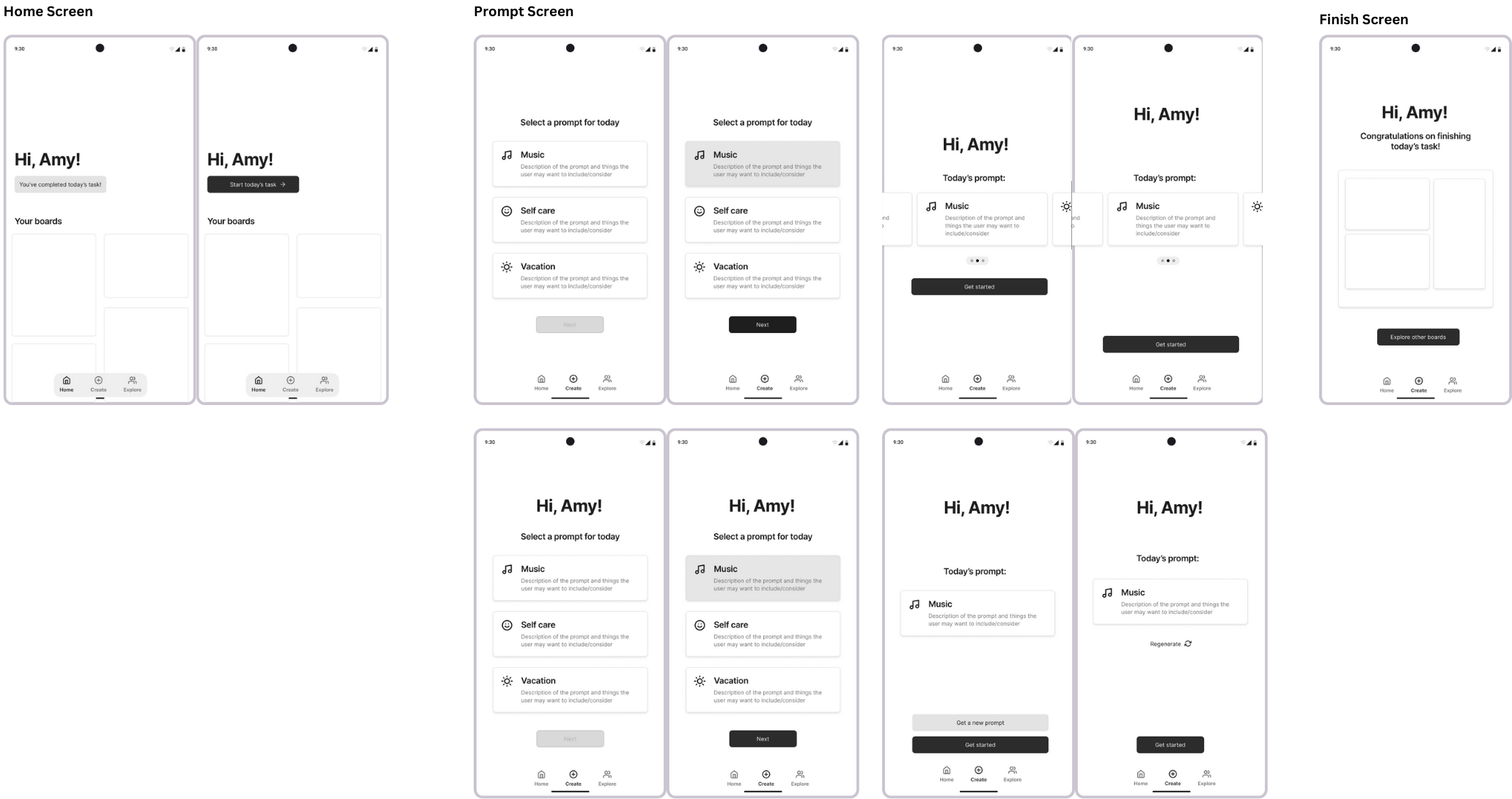
Ayana (Prompt Selection, Home Screen, Board Finished)
Team Feedback
- Liked having options for each prompt
- Worried that regenerating infinitely would lead to decision fatigue
- “Hi, User” addition makes the screen much more friendly
- Liked having all prompts on one screen
Revised Screens

Changes made
- Went with the three cards option with the “Hi” text. We decided that having predefined prompts may work better and regenerating prompts may be overwhelming and difficult (what if the user wants to go back to a prompt that was generated earlier?).
- We also decided that we don’t want to limit the user to one prompt per day in case they want to do more, so one of the screens I created is no longer needed (the “create” page when the user completed a board for the day)
- Adjusted the navbar to be
- Home: Feed of other users’ boards (accessible once the user completes a board for the day, otherwise it prompts the user to create one)
- Create: Where prompt selection and the “shopping”” experience happens
- Profile: Contains the user’s previous boards
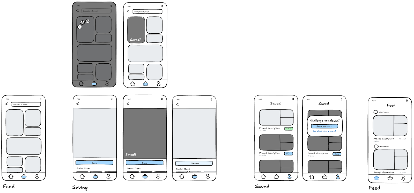
Ariane (Shopping Feed, Saving Items, Saved Boards, Social Feed)
Team Feedback
- Liked having greyed out items to indicate saved images
- Adding space to include the names of the users’ boards
- Changing “save” to “add to board”
- Liked expanded view of the item
- Liked quick context menu when holding down
Revised Screens

Changes made
- Making it more clear where your cart exists on your profile screen
- Making submit button larger for your unsubmitted carts
- Classifying home screen boards by prompt and allowing users to submit titles
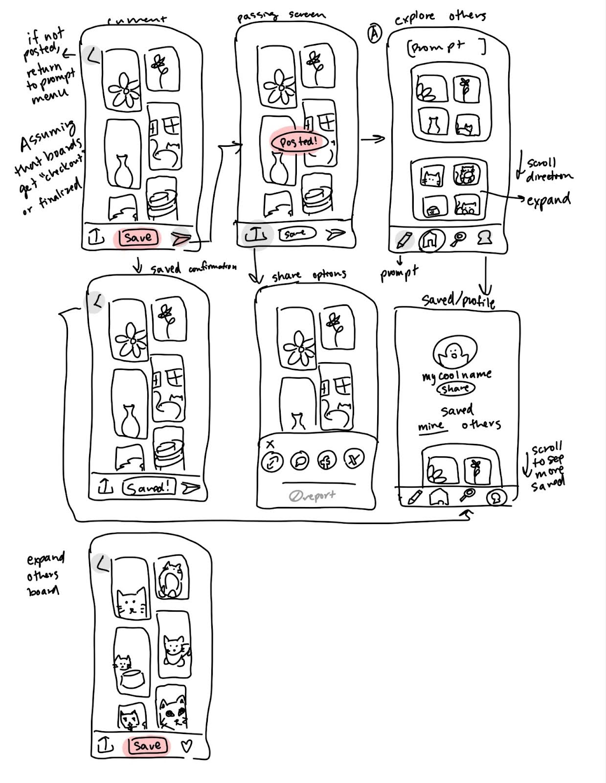
Thanh (Explore Boards, Saved Boards, Save/Share)

Team Feedback
- Liked having similar scrolling for exploring and viewing saved boards
- Scrolling vertically feels more natural
- Exploring more locations for a like button and where to display
- Adding some indicator of if a board has been shared
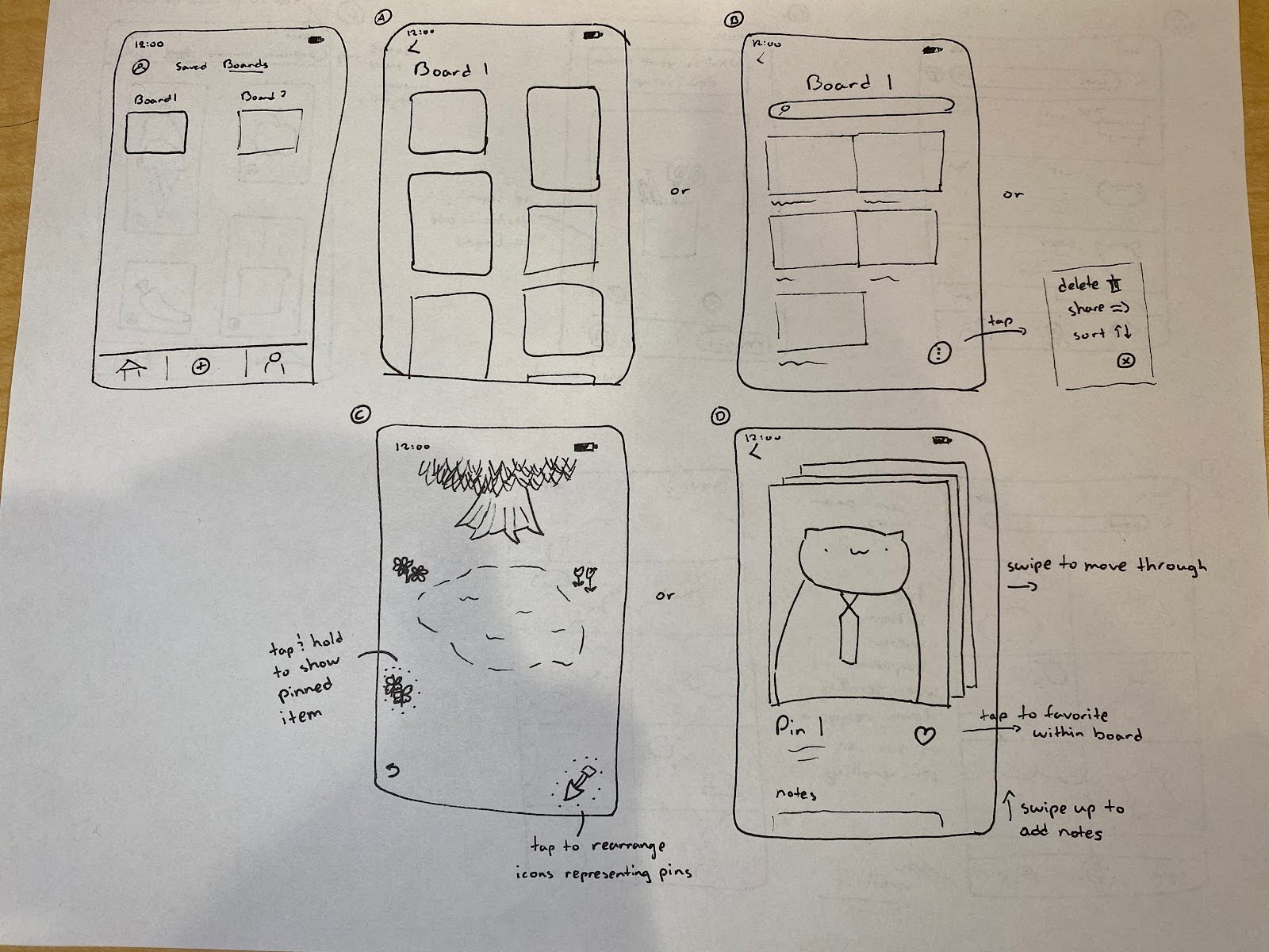
Nicholas (Saved Boards, Shop Feed)

Team Feedback
- Board A probably most effective for MVP
- Board B may remove feeling of a “hunt”
- Board C is pleasing but infeasible
- Swiping through boards in D seems fun but potentially infeasible
- Liked Adding different categories to swipe through when shopping


Comments
Comments are closed.