
Amazon
The checkout flow for Amazon is so optimized for speed that Amazon provides an alternative, faster flow for users to circumvent adding to cart and just buy NOW. Users can choose to add product to cart and checkout from there. This checkout screen is crammed, but allows users to view/change all details (i.e. delivery method, delivery address, payment, etc.), making it the easiest possible to click “Order”. It’s evident that Amazon’s business model prioritizes number of purchases made.
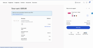
Warby Parker
The UI/UX of Warby Parker’s checkout flow is beautifully designed. Unlike Amazon, Warby Parker encourages users to take their time in their purchase because they prioritize customer satisfaction. After all, glasses are a highly personal product that customers buy once. Warby Parker invests a stack of ~5 screens that prompts the customer to choose various features i.e. prescription type, progressives type, lens type, lens material, and lens cleaning kit). The added friction of the longer user flow comes with the benefit of a more detailed and thoughtful way of purchasing. If users are satisfied by their product, they will once again return to Warby Parker for their next pair of glasses!
Patagonia
All throughout their website, including the checkout pages, Patagonia makes sure that its customers know who they are buying from. Patagonia proudly posts badges such as “1% for the Planet” (Patagonia’s pledge to donate 1% of profits back) and “IronClad Guarentee,” (Patagonia’s philosophy of prioritizing durability to minimize waste) with pop ups that customers can click on to learn more. Even the loading animation is of Patagonia’s mountain logo. Every element constantly reminds users that their purchase is helping the Earth, is sustainable, and that they can feel good about it — thus bolstering lifetime value of each customer via loyalty and satisfaction.