
Checkout flow designs per company
Amazon (Speed-optimized checkout)
Amazon’s checkout experience captures the speed of which the company prides itself on for its customers – a “prime”, speedy shopping experience that ensures customers get the items they want delivered as early as the next day. To eliminate friction and move customers from the cart to placing the order, Amazon uses auto-filled information (shipping address, default paying method, etc.) to allow customers to complete a purchase without information review (such as with the “Buy Now” option to skip viewing cart). Manual entry of information is further replaced with multi-select options to select past payment methods, addresses, and even payment profiles. Reduced steps in the checkout experience leads to higher conversion rates for Amazon as customers desire the “prime” experience for a quick checkout and delivery, which adds to increased purchase frequency (such as monthly scheduled deliveries) driven by this expectation.

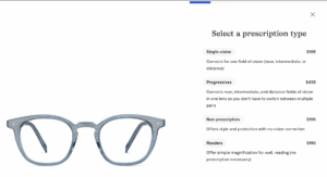
Warby Parker (Confidence-building checkout)
As an eyewear brand, Warby Parker’s business priority will be to ensure their customer is confident that the glasses they chose are the right ones (fit, prescription, style). Returning and fixing glasses takes time, and their target customers will have a longer time frame between purchases. Since the first checkout counts, Warby Parker will optimize for average order value. The design elements to ensure a confident checkout exist before a user even adds to cart, with virtual glasses try ons and a guided, step-by-step selection process that breaks down each “purchase” into different glasses components (prescription type → progressives type → lens type → lens material → optional lens cleaning kit).

Patagonia (Values-aligned checkout)
Patagonia’s brand is built on environmental commitments and thoughtfulness, which is embedded in their checkout process and especially the UI. For each item in the catalog, extra product information is shown regarding the environmental value of the purchase, and this commitment is branded and reiterated in the checkout screen as seen in the image below. The checkout experience is visually minimalistic and segmented, with larger font and “Shipping” and “Payments” collapsed below until the user clicks on “Continue to Shipping”, to represent an intentional purchase relative to its brand and avoid persuasion tactics that could lead to overconsumption. Patagonia will optimize for customer lifetime value and loyalty, driven by brand trust.

