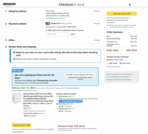
Amazon → “speed first” → conversion rate.
This page is flat and linear because speed reduces drop-off, meaning more visitors finish paying. You see address → payment → “Place your order” with minimal choices and CTAs always visible because fewer decisions mean fewer abandons, meaning a higher conversion rate.
Warby Parker → “confidence first” → average order value.
This gate asks you to continue with Google/Apple or as guest because lowering sign-in friction builds trust, meaning you’ll proceed to select lenses and add-ons. The clear, calm form and help cues exist because eyewear has uncertainty, meaning customers feel safe adding coatings or upgrades that lift AOV.
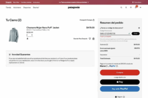
Patagonia → “values + ease first” → customer lifetime value.
This layout shows Express Checkout options (Apple Pay, PayPal) and a clean order summary because paying fast and transparently supports a no-nonsense brand, meaning the purchase reinforces trust you’ll remember next time (CLV). Their help pages emphasize straightforward payments/returns because reducing post-purchase friction sustains loyalty, meaning more repeat orders.