CS 247B: Design for Behavior Change
Team 15: Mindful Movements
Amantina Rossi, Uma Phatak, Nadia Wan Rosli, Melody Fuentes, Rui Ying
Mindful Movements: Usability Report
During our usability test, we identified some issues with our current prototype. We label them with severity ratings and discuss if and how we will address them. We have also included images of the screens we are thinking of editing.
Issue 1

On the “When” screen, the two buttons that say “Sync My Calendar” and “Let Me Decide” are confusingly labeled: it is not clear what “syncing” the calendar actually does, and how it is different from “Let Me Decide” (both buttons denote user decisions.)
Severity: Severe
Will we address: Yes
How: We will rename the buttons on this screen and/or add little “tooltips” so that users know how the smart reminders work. We may add text to the entire screen, or a new page. Also, we will have a screen that shows users the calendar that the smart reminders created for them (a confirmation screen after syncing.)
Issue 2
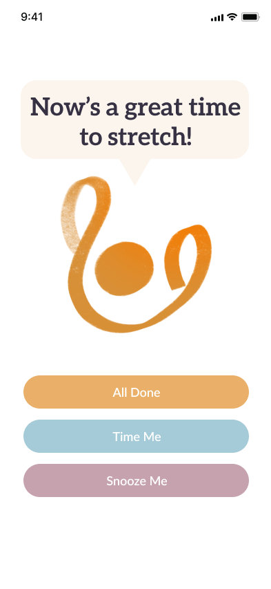
On the “Complete a Movement” screen, the three buttons that say “All Done”, “Time Me”, and “Snooze Me” are confusingly labeled: it is not clear why we have three options (what is the justification behind having a timer?). We need to give more info on what each of the three buttons does.
- Severity: Severe
- Will we address: Yes
- How: We may add tooltips or and more descriptive wording + icons to the buttons.
Issue 3

On the “Complete a Movement” screen, it is not clear what “All Done” means, because we never specified to the user what stretch is being done, and how long it should be done for. More structure is desired
- Severity: Moderate
- Will we address: Maybe
- How: We will consider adding more explicit movement suggestions to the page, and adding a suggestion to how long the movement should be. However, in our intervention study, we found that some users enjoy the flexibility of no suggestions. So, we may not address this.
Issue 4
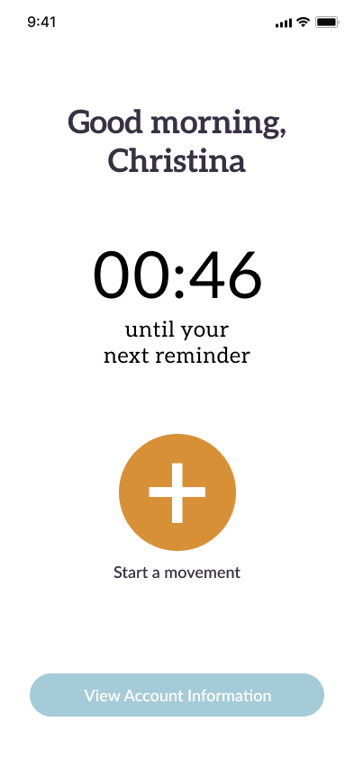
On the “Home Screen”, the label to go to Settings and Profile – “View Account Information” – is confusing, because it does not feel like the user set up an “Account”.
- Severity: Moderate
- Will we address: Yes
- How: We will change the button into more of a navigation bar with 3 distinct sections: Home, Profile, and Settings.
Issue 5

On the Account page, it is confusing why there are three different edit buttons.
- Severity: Moderate
- Will we address: Yes
- How: We will separate the settings page from the profile page.
Issue 6

The number on the home screen is confusing; is it seconds or minutes?
- Severity: Trivial
- Will we address: Yes
- How: We will change the format to make hours and minutes more clear (and exclude seconds).
Issue 7

The start button on the home screen looks like an add button, which is confusing with how it relates to starting a movement.
- Severity: Trivial
- Will we address: Yes
- How: We will change the icon to look more like one that connotes starting a movement.

