Welcome back. Today we’re focused on sketching our application’s core tabs and interfaces 🙂
Shift helps users reduce impulsive online spending by intercepting them at the point of browsing, encouraging introspection on the emotional needs driving their shopping intent, and then refocusing them towards a more fulfilling substitute activity.
In the following sections, we’ll walk you through seven sketchy screens and the reasoning behind our design decisions.
🪜But first…general tab architecture
Before we got sketching, we revisited our architecture diagram to concretize where different screens would live in a mobile app (now that we know we’re working with mobile vs. browser).
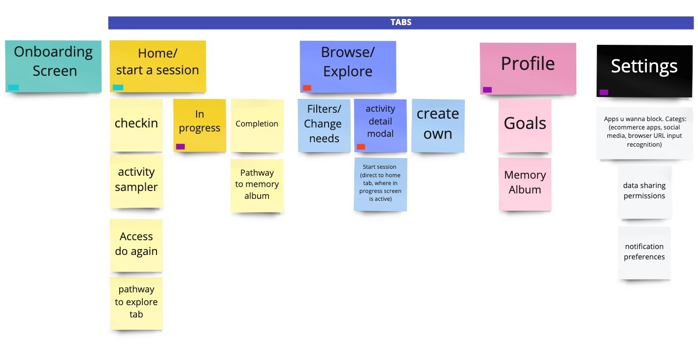
Figure 1 – Overview of Shift’s core tabs and comprised interfaces
We drew the following screens:
- Onboarding screen (just one though!)
- Landing screen / “Home” tab
- Activity-in-progress screen
- Browse tab
- Activity detail modal/screen
- Profile tab
- Settings tab
🎬 1: An Onboarding Screen
Where users customize their app experience by sharing what they’re here for
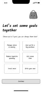
Figure 2 – Setting personal goals in onboarding by Nicole
During onboarding, users are asked to prioritize 3 personal goals that might relate to their interpersonal relationships, finances, or general well-being. They can also write in their own goals that might be specific to more salient goals (e.g., saving up for a concert in one month), which could add additional urgency and motivation for engagement
Design decisions snapshot
- Prioritizing goal-setting to position as a “lifestyle companion” versus just a utility app: when users have invested effort in a task in anticipation of future benefit, it increases perceived value (see Investment Loops). Having personal goals that remind you to curb your online shopping is the logical step for Shift to go from being a feed of activities to a lifestyle companion.
- We plan to use photography imagery on the options to evoke emotional connection to the goals
- The mascot reinforces Shift’s intent to be a user’s cheerleader and confidante
☀️ 2: Home Tab
Where users introspect and are recommended a bite-sized selection of “most relevant” activity substitutes
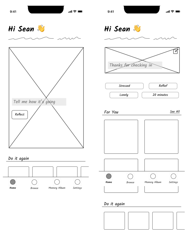
Figure 3 – Home Tab by Nicole
This is where users land when they first open the app (i.e., redirected from a push notification); it is where users introspect on their current needs and identify why they started to browse. After completing the prompts, a curated selection of activities appear under For You, with tags pulled from the prompts above
Design decisions snapshot
- Because users made it this far already by tapping on the notification, we want to continue to support them in making that behavior change, which we’ll do so with inviting photography imagery and quick access to activities
- This tab has everything the user needs to get an activity started, and nothing more–keeping it simple, friendly, and with minimal barriers to begin
- “For You” activity sampler is meant to help users avoid decision fatigue by surfacing a small “sampler” of the most relevant activities
🌎 3: Browse Tab
Where users who’re unsatisfied with the limited activity recommendations in the home tab flow can explore more context-relevant activities
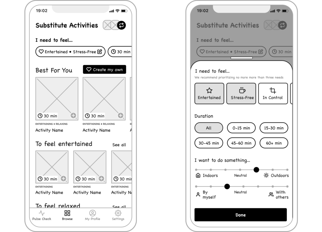
Figure 4 – Browse Tab by Elsie
Users can come here to browse a larger collection of activities than the activity sampler from the home tab flow or to save activities that interest them for later. They can click on the filter pills to recalibrate their emotional needs and time constraints to view the most relevant activities, or click on the top right mini-cluster to repeat activities they’ve done in the past.
Design decisions snapshot
- Chunking activities into thematic rows to aid information processing: as a high volume of options can make the task of choosing an activity harder (Hick’s Law)
- Activity cards are image-based to increase motivation to pursue them: because when our visual senses are engaged, we’re more likely to create an emotional connection with the product we’re using
- Most-relevant activity rows come first and take up the most visual real estate: activities in the “Best For You” row are estimated to have the highest pursuit propensity
- Varied visuals of filter parameters to decrease the perceived amount of effort required to calibrate them: Calibrating filters require a series of user decisions, which can get mentally exhausting. To combat this, we reduced the perception of redundant, dreary tasks by varying the look of options within each filter parameter.
🧩 4: Activity Detail Screen
More intricate activity details, where users learn more about the activity and how it may help you before you dive in
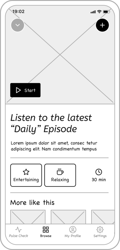
Figure 5 – Activity Detail Screen by Elsie
This activity detail screen (or modal) opens when users click on any activity tile. The user can click the “down” chevron on the top left to close the modal or the (+) icon on the top right to add it to their “My List” (aka Favorites).
Design decisions snapshot
- Showcase activity imagery front and center to appeal to users’ visual senses
- Thematic highlights provides guidance on what needs this activity satisfies
- More like this helps a user discover similar activities if this particular one is not ~the one~
⏳5: In Progress
After committing to a substitute activity, users are reminded of their progress with a timer and fun animation.
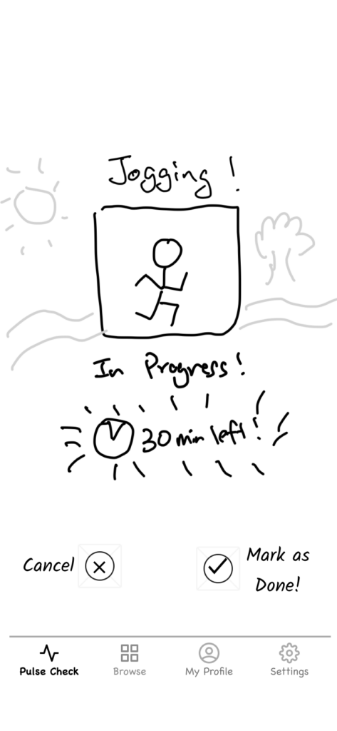
Figure 6 – In-Progress Screen by Sean
Design decisions snapshot
- After users commit to an activity, the home page is replaced with a large, animated icon that represents the activity. The background is low-opacity to draw attention to the subject in the icon.
- This screen is designed to be minimalistic to reduce distractions and remind the user of their commitment and their progress
- The icon is animated (e.g., the subject also jogs) to promote an emotional connection with the figure and encourages users to continue with the activity
- The timer shows a countdown of the amount of time left and encourages the user to finish
- If the user changes their mind about the activity or want to end early, they can choose to “cancel” or “Mark as Done,” which will bring them back to the original home screen.
⚙️ 6: Settings
Centralized place to tweak app settings
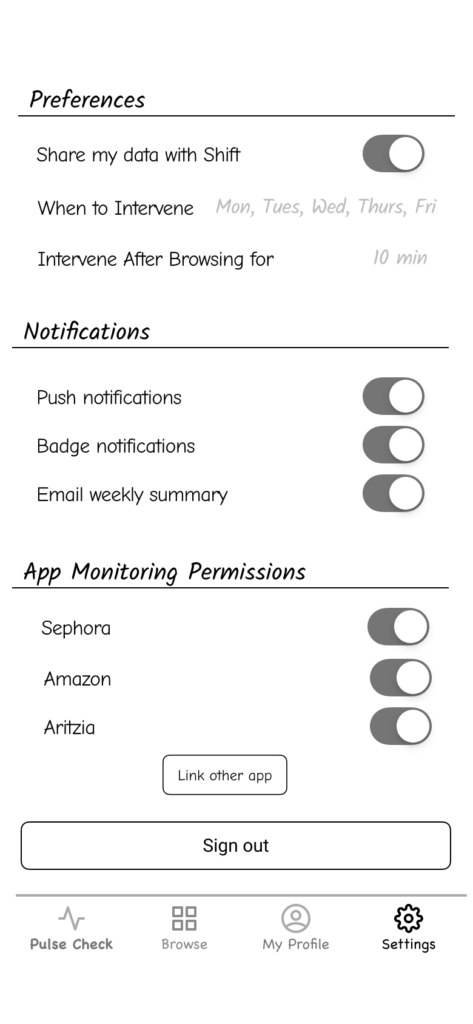
Figure 7 – Settings Tab by Sean
Design decisions snapshot
- Users can change settings related to the Shift app, such as data sharing, intervention parameters, and notifications
- In order to detect when the user starts to online shop, our app needs permission to monitor shopping apps on the user’s phone. The user may select which apps they allow Shift to monitor.
😄 7: Profile
Where users can review their goals and past achievements
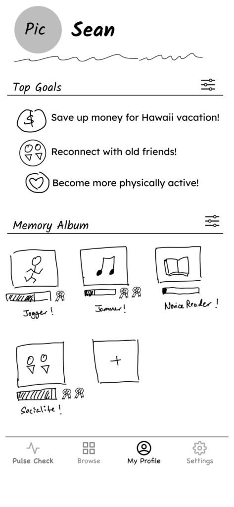
Figure 8 – Profile Tab by Sean
Design decisions snapshot
- The profile page reminds users of their goals and achievements, giving them a sense of identity
- Users can view and update their financial, social, and/or personal goals – drawing on motivations to reduce online shopping and doing alternative activities
- The memory album shows a record of the user’s past achievements. Upon successfully completing activities, our app shows progress towards identity-oriented badges (e.g., “You are a socialite”), designed to help users extract intrinsic rewards from the experience.