
Moodboard #1

For this mood board, I aimed to find images of people in the outdoors. These photos ended up having more earthy colors such as green/yellows, and browns. The two of the main figures facing the viewer are also smiling and walking around in nature which was something I wanted to find in relation to our app. In addition, I included a black and white form of a person in the top right corner to showcase what stress or anxiety could look like to show a transformation of a person’s mood from being indoors and potentially improving their mood by going outdoors.
Moodboard #2

In this moodboard, I tried to capture a positive and playful energy. Yellow is a strong and reoccurring color because it creates warmth, feels inviting, and is associated with happiness. The image of the person in the middle contrasts the black and white, realistic photo with the colorful, poppy drawings on top. It shows that fun can be had even in situations where you wouldn’t expect it. Lastly, I included the smiling animals because they represented our application’s connection to nature in a goofy and abstract way. Overall, I think this aesthetic for the application would help users feel safe when playing and being silly in their photos, but it may also lead users to not take the behavior change messaging seriously.
Moodboard #3
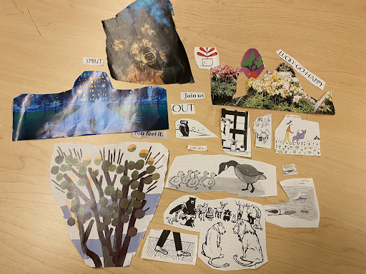
I was looking for the calm and reflective side of exploring outdoors in this moodboard. Blues and monotone grays are present to indicate peacefulness and introspection, but they are accompanied with important splashes of warm colors such as yellows to indicate happiness and positivity rather than gloom. The image with two small silhouettes shows people walking down a wide path and similarly, the bottom image shows walking steps; I included these to add movement and represent the traveling journey part of finding this tranquil mindfulness, representing our application’s goals. There are also many images of nature as well as community, to highlight the social aspects and invitations of going outside.
Team Moodboard
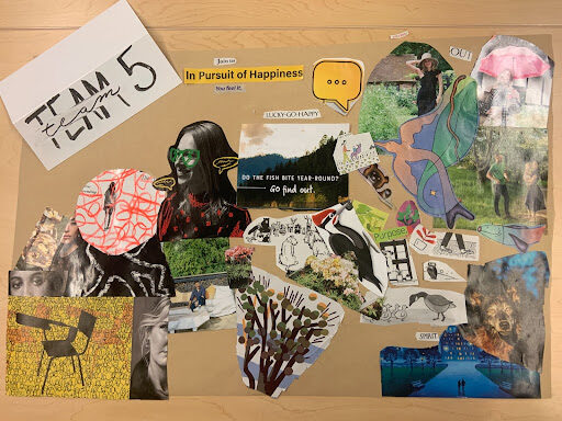
To create our final moodboard, we tried to synthesize our individual ideas while prioritizing the ideas that we thought would most appeal to our target audience (college students and young professionals). Our moodboard shows the starting mindset of our audience (bottom left) transitioning into our vision for our solution (top right). This approach to moodboarding helped us figure out how we want to present our solution in addition to how we don’t want to present our solution.
The starting mindset conveys a dark and gloomy energy through the expressionless faces and the overuse of the color black. These are qualities we want to distance our solution from. The top right features much more vibrant colors including green, pink, blue, and yellow. Representing how we want our users to feel using our solution, these colors are lively and energetic. Another key characteristic of our vision is the incorporation of natural elements from plants to animals. We chose this kind of imagery because nature is often associated with people’s perception of “the outdoors”. We believe using natural imagery can remind users of what is waiting for them when they go outside!
Style Tile


