
Note: Some of our diagrams here processed quite blurry here for some reason so if you would like a second reference for diagrams with better quality here is a link to our working doc as well.
Assumption Map & Tests

Our assumption map was an important step in better understanding the problem that we were trying to solve. The most important points of consideration lie in the top right corner at the intersection between important and unknown. Some important trends that we identified in this map are as follows:
Key Insights:
- Because we are dealing with a population of people who frequently avoid their responsibilities, it is important that our product does not feel like an extra task for the user.
- These students will need to have some genuine desire to improve their habits for this product to be successful
- More research needs to be done on existing products in this space to figure out what aspects of these tools users like and don’t like
- Students may have a diverse range of responses to social pressure – this aspect is definitely not a one size fits all.
Given this analysis we decided to test these assumptions:
Assumption #1: Using our product will not feel like an additional task to the user

To test this assumption we created a questionnaire and sent it to as many of our friends as we could. Here is a link to the screener https://docs.google.com/forms/d/e/1FAIpQLSd_ymi4PRkmCZzCBvhnv8fDtEDSPcGVHygLGiC46JpgsaFX_Q/viewform
Questionnaire rationale
In testing our assumption we wanted to understand a few different things about how people currently deal with procrastination. We wanted to find:
- The role social pressure plays in procrastination
- The types of interventions that people prefer
- How much data people would be comfortable sharing
- What people currently do to combat procrastination
Together, these topics could help us better understand how we might make a tool that is both easy to use and something that the user actually wants in their life.
Participants:
- College students. This demographic is exactly who we are primarily designing for so it worked out well
Learning Card

Results:
- We found that the majority of our participants appreciated some form of social accountability
- Users would prefer some form of control over their privacy. Giving users the option to select which information of theirs is available for others is a popular choice.
- Similarly, productivity groups could strike a balance between complete privacy and sharing with friends.
- Our users seemed to have prior experience with a variety of productivity tools that are not much more involved than ours is intended to be. Therefore, we feel confident about our assumption and do not believe that our tool will become an additional task. It may instead serve as an alternative or replacement for existing tools.
Assumption #2: College students would enjoy tools that force them to address their procrastination habits

To test this assumption we performed a competitive analysis where we had participants explore the websites of 4 of our competitors. The competitors were:
- Focus keeper – a pomodoro timer app
- GoalsWon – App that sets people up with personalized accountability coaches to achieve their personal and professional goals
- Griply – All-in-one productivity app designed to help users set and achieve their goals by integrating goal setting, habit tracking, and task management into a single platform.
- Forest – productivity app that helps users stay productive by planting virtual trees that grow during work sessions.
Procedure: We gave participants 5 minutes to explore the website and get a feel for the different products before giving them the opportunit asking them these questions:
- Would you use this app? Why or why not?
- Have you had any experience with similar products before? What are your thoughts?
- What do you like/dislike about this product?
Participants: We interviewed 3 college students with varying levels of procrastination
One of our participants checking out Forest’s website:


This learning card displays an aggregated response from our 3 participants.
Key Findings:
- Games are engaging (from Forest) This was helpful in pushing us towards focusing on healthy competition by trying to gamify productivity.
- Alternative formats for to do list other than checking boxes is interesting
- Seeing progress in real time is helpful (ex. 80% of goal achieved). This inspired us to encourage users through progress updates that reflect the work they have put in towards a task even if it is not all the way done.
- Hiring a procrastination “coach” feels too extreme.
- Simple UI that is easy to use and understand is huge. This further encouraged us to focus on simplicity when designing our app
Intervention Study
How Did Your Intervention Study Go?
Our intervention study went well, successfully testing whether peer accountability influences task completion among college students. We explored how providing updates ISabout a friend’s progress could serve as a motivational nudge without creating unhealthy competition. Overall, participants responded positively to the updates, with some reporting that knowing their friend was making progress encouraged them to start or continue their own tasks.
What Did You Learn?
One of the key insights from our study was that while participants found the updates helpful, the lack of a clear reference point made it difficult to assess their own progress in comparison. For example, being told that their friend had completed 40% of their tasks was somewhat vague because participants didn’t necessarily know what percentage of their own tasks were done. This highlighted the need for a more structured way to display progress, such as a point system or progress bar, rather than relying solely on raw percentages.
Additionally, we observed that framing and frequency of updates mattered. Some participants found the updates motivating, while others felt they needed more context to make them actionable. This suggests that flexibility in how progress updates are delivered could improve engagement.
How Was the Study Conducted?
The study was conducted through text messaging, where we paired participants with a friend and sent updates about their partner’s task completion. Each participant was asked to share their daily tasks in the morning, and throughout the day, they received periodic updates about their friend’s progress (e.g., “Just so you know, [Friend’s Name] has completed 40% of their tasks today!”).
Each team member facilitated communication between a different pair of friends. Our goal was to make the updates feel supportive rather than competitive, reinforcing motivation through social accountability rather than pressure.
Who Was Recruited?
We recruited our own friends for this study, ensuring that participants were paired with someone they already felt comfortable with. This was important for maintaining a positive and non-toxic accountability dynamic. Since the study relied on self-reported progress, recruiting friends helped ensure honesty and engagement.
Key Questions Being Addressed
- Does receiving progress updates about a peer increase task completion?
- How does peer accountability affect motivation without introducing unhealthy competition?
- What level of detail is needed in progress updates to make them most effective?
- Would a clearer tracking system (e.g., a point system, leaderboard, or progress bar) make the intervention more impactful?
- Does pairing people with friends improve engagement compared to more impersonal productivity tools?
Key Insights From the Study
Our study revealed that while peer updates can be a motivating factor, they often lack the necessary context to be truly effective. Simply knowing a friend’s progress—such as being told they have completed 40% of their tasks—was not always actionable without a clear way to compare it to one’s own progress. Additionally, the way updates were framed played a significant role in how they were received. Some participants preferred encouragement-based messages rather than straightforward numerical updates, suggesting that the tone and delivery of progress notifications impact their motivational effect. Lastly, we found that a more structured tracking system could improve the intervention’s effectiveness. A visual progress bar or point system could provide clearer feedback, making it easier for participants to assess their own progress in relation to their peers.
How Does This Change Your Solution Design?
These insights highlight the need to refine how progress updates are communicated in our solution. Instead of simply reporting percentages, incorporating a progress tracker would allow users to see their own completion rate alongside their friend’s, giving them a more tangible sense of where they stand. Additionally, introducing a point system could make comparisons more intuitive and engaging, offering a more structured way to measure progress. To ensure that the updates remain motivating rather than overwhelming, we could also implement customizable notifications, allowing users to choose how and when they receive updates. By integrating these features, our solution would become more engaging, actionable, and effective in helping students combat procrastination in a supportive and non-pressuring way.
System Paths

The process for the system path began with Last-Minute Larry. We utilized Larry’s persona to walk through our product’s lifecycle, which gave us insight into how our system would function. Additionally, it helped narrow down the major features needed for our MVP. The most important insight gained from this experience was: How do we get procrastinators to join our app? We realized that all our user personas would have been invited. This prompted us to reduce friction for onboarding by allowing users to sign up with just their phone number. Similarly, we wanted to prioritize a way to suggest friends and emphasize adding friends for our clickable prototype.
Story Maps and MVP Features
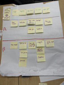
During this process, we envisioned what life must be like for Last Minute Larry. Rushed. Stressful. Busy. So when thinking about the intervention platform, we wanted the quickest and most engaging sequence of sets to guide a rushing user to complete enough tasks to enable intervention. In the image above you’ll see an A category and B category.
Features listed in the A category are our priority for implementation in our MVP. These are features we believe are crucial to the user experience of our app, and maximize the usage we intend. Other features in the B category will likely be introduced in future iterations.
In a detailed explanation of our story map for a user like Last Minute Larry, we’ll detail the Our story map is as follows:
- Login: With a simple phone number and text verification Last Minute Larry’s account can be created and/or signed into. No need for an email, email verification, username, password, 2FA, etc… This quick and easy login is intended to keep the Last Minute Larry’s of our world engaged.
- MVP: This stage of the process will remain the same for our MVP. We don’t intend to add more and we believe it’s sufficient enough to refrain from making it less.
- Registration: Understanding that asking for too much information at the time of a quick account creation might deter a user like a Last Minute, we decided to limit this stage of the process to simple Enabling app access to the phone. With access to notification and contexts, the app could remind Last Minute Larry to connect with friends and add more information to his profile.
- MVP: We identify obtaining access to notifications as the most crucial feature at this stage. In our intervention study, we saw the effectiveness of reminders in helping people remain focused and on track with finishing up tasks. Furthermore, this process will only require the user to press “Allow” or “Don’t Allow.” Future integrations could enable users to create unique usernames, passwords to bypass phone verification in the future, and additional data permissions.
- Adding Friends: After the account is created and access to the phone is permitted, we want to direct Larry to a page to add Friends. This direct transition enables Larry to select which of his peers he wants to enjoy the app with, and encourages him to continue using the app while inviting new people to join. This is the first of many experiences of social pressure this app will use to motivate Last Minute Larry to be productive.
- MVP: For our MVP, we won’t have a Page we direct users to, to see who is on the platform. Being that the beginning stages of our platform and design will be void of users, we will direct the user (like Last Minute Larry) to share an invitation link to people he could imagine using the app with. Future iterations will have specific page of users Active on the platform you have in your contacts: similar to how BeReal, TikTok, and Snapchat use personal phone contacts to connect users with likely friends.
- Set Goals: After friends are added, we want to direct the user to the set goals page. By allowing them to quickly set goals we hope to hit the ground running and get users like Last Minute Larry to begin thinking about and working towards various tasks and/or goals that he would like to complete and whatever time frame he’d like to complete. This process makes it very easy for Larry to begin thinking about areas of which he wants to be more productive in and things that he would like to accomplish.
- MVP: We understand that choice paralysis could be detrimental to obtaining users onto a platform. Understanding that Last Minute Larry would turn away from what would seem like a lot of work, our goal for the MVP is the minimize the amount of information we ask users when adding tasks, while maintaining enough information to remain relevant and useful. In our case, we decided that visually showing and requesting Importance of task, Category of task, Notifications preferences for tasks would be unnecessary for our MVP needs.
- Update Goals: After the goals are set, we imagine a user like Last Minute Larry wouldn’t interact with the app until they are notified by the app, and/or asked to provide an update on their goals. To make this process as quick and fast as possible, as we ask of Last Minute Larry is to check a box to mark tasks as complete. From there, the app will update his progress and send motivating messages to both Larry and his friends.
- MVP: Although our final iterations of design include a progression bar that helps to gamify the experience, our MVP will not include this. Our intention with the MVP is to ensure that users like Last Minute Larry find the process of setting and updating goals as easy and quick as possible. Once we can prove that the flow of our products work well to engage the user in the basic functions, we’ll implement the gamification features.
Bubble Map

Our process began with listing all major MVP features and organizing them into a bubble map. The larger bubbles represented the most important features, helping us visualize our priorities for WeDo. By comparing the sizes and connections between bubbles, we identified core functionalities that aligned with our vision. This exercise helped us clarify which features were essential for our MVP and which could be secondary additions. The visual layout also helped us communicate our ideas more effectively within the team. Additionally, organizing our features this way helped us see which features could be grouped together. Overall, our bubble map gave us insight into which features to prioritize and what they had in common.


