Synthesized Moodboard
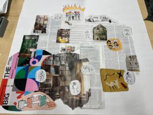
Our synthesized moodboard is one that we made during class, in which we each picked apart our own scraps from a set of magazines, cut them or tore them out, and placed them in the middle. Once we were all done with collecting our scraps, we glued them together. However, there are a couple key observations that make this moodboard so unique to each and every one of us, along with how it ties together our previous sketches and ideas together. The very first factor of the moodboard were, surprisingly, the magazines that we prioritized, which were mainly artistic yet bold, somewhat text heavy pieces primarily from the New Yorker. One group member focused on using the text itself as an artistic backdrop that symbolized the antique feeling of reading, another cut out bold images with blazing colors and cartoon sketches, and a third member focused on realistic photos that captured the essence of a calming evening ready to be snuggled into as an ideal reading location. Yet, when synthesizing the moodboard, we decided to keep equal pieces of all of our disparate scraps when glueing them together, and that’s because we all agreed on the harmony it creates. If we were to describe the mood that our app would convey, it would be diverse (with a mix of modern, vintage, and classic elements), enriching (hinted by the clusters of text, with special shout out to the New Yorker), and warm (self-explanatory – we’d want to give a warm, welcoming vibe to open up a good book).
Style Tile

Our team decided upon the above style title drawing from elements of our synthesized moodboard. The colors represent a series of warm tones that are contrasted with darker colors that contribute to the “boldness” of the brand, such as with the logo on the bottom right. Our typography was chosen to combine the modern and antique elements of our moodboard as stated above, with Playfair Display used as the heading/title font and Montserrat used as the body text to put a bit more emphasis on the literature feeling without losing the sleek, “new tech” edge with its clear readability and clean lines. Throughout our product brainstorming, we’ve wanted to go towards the direction of aesthetics and ambience over clutter or over-complex tasks for the user, which is what will also be our main differentiating factor as a reading app. That’s what you’ll see throughout the app’s design – clear, bold lines and colors rather than muted, antique tones. As we think through the design of the home screen, we imagine some sort of candle or ambient light bubbles gliding across the screen to welcome our user to sit back, relax, and read.