
Team 9: Carolina Borbon, Tomy Di Felice, Caroline Gao, Andrea Liao, Annie Ma
Clickable Prototype
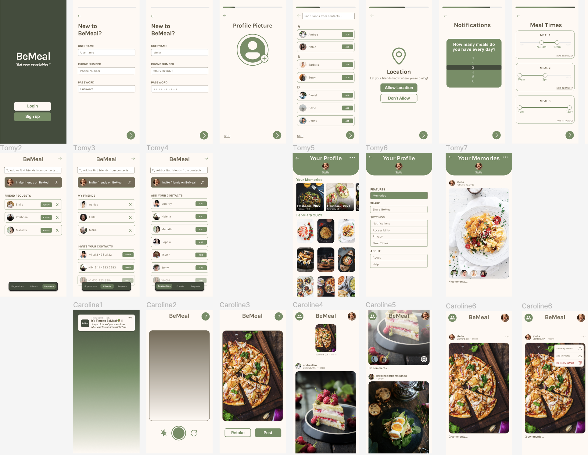
The BeMeal app (clickable prototype) focuses on socialization as a motivator and tool for accountability in order to encourage young adults to eat more vegetables. We opted for a simplistic design, where a user sets their approximate meal times, and then is randomly notified 5 times a week to upload a picture of their meal(s). All of this is explained to a user during a user’s onboarding. After uploading their own photo, a user is then given access to their feed, where they can see their friends’ posts, react with selfies, and leave comments. This way, users can bounce ideas off each other to gather tips for where to get accessible and fun-to-eat vegetables. If a user misses their meal time window and forgets to upload their meal photo, they don’t get to see their feed, but they do receive a fun fact about vegetable nutrition to remind them of the importance of eating vegetables! As a user builds the habit of uploading randomized meal pictures, they will also be encouraged to look through their Memories, where they can see what they were eating a week, a month, or even a year prior. We hope this app brings joy into eating vegetables through social accountability and friendly encouragement.
Note: The multiple entry paths into the BeMeal app are shown / can be navigated via the tabs on the clickable prototype page on the left.
Usability Script
THE INSTRUCTIONS
[Ensure mobile device is open to something “neutral,” like the device’s Home screen]
Hi, ___________. My name is ___________, and I’m going to be walking you through this session today. Before we begin, I have some information for you, and I’m going to read it to make sure that I cover everything. You probably already have a good idea of why we asked you here, but let me go over it again briefly. We’re asking people to try using a mobile app that we’re working on to evaluate its user experience.
The session should take about an hour. The first thing I want to make clear right away is that we’re testing the app, not you. You can’t do anything wrong here. In fact, this is probably the one place today where you don’t have to worry about making mistakes.
As you use the app, I’m going to ask you as much as possible to try to think out loud: to say what you’re looking at, what you’re trying to do, and what you’re thinking. This will be a big help to us. Also, please don’t worry that you’re going to hurt our feelings. We’re doing this to improve it, so we need to hear your honest reactions.
If you have any questions as we go along, just ask them! I may not be able to answer them right away, since we’re interested in how people do when they don’t have someone sitting next to them to help. But if you still have any questions when we’re done I’ll try to answer them then. And if you need to take a break at any point, just let me know.
With your permission, we’re going to record what happens on the screen and our conversation. The recording will only be used to help us figure out how to improve the app, and it won’t be seen by anyone except the people working on this project. And it helps me, because I don’t have to take as many notes. If you would, I’m going to ask you to sign a simple permission form for us. It just says that we have your permission to record you, and that the recording will only be seen by the people working on the project.
[Give them a recording permission form and a pen; while they sign it, start recording]
Do you have any questions so far?
THE QUESTIONS
Before we look at anything, I’d like to ask you just a few quick questions.
- First, are you a student? If not, what’s your occupation? How do you spend your days?
- What kind of mobile device (or devices) do you use, like smartphones or a tablet?
- What kinds of things do you spend time doing on your mobile devices?
- Do you have any favorite mobile apps?
- Have you used BeReal before? What are your opinions about its user experience?
THE FIRST SCREEN TOUR
Now let’s start looking at things.
First, I’m going to ask you to open up the app called BeMeal.
Now, before you start doing anything, just look at the first screen and tell me what you make of it: what strikes you about it, what you think you can do with it, and what it’s for. Just look around and do a little narrative. You can scroll if you want, but please don’t “click” (or tap) on anything yet.
[2-3 minutes – continue on to next section after 3 minutes]
THE TASKS
Thanks. Now I’m going to ask you to try doing some specific tasks. It will help us if you can try to think out loud as you go along.
Task 1: Creating and setting up an account
Task 2: Posting a meal picture
Task 3: Interacting with other users (reacting and commenting to someone else’s post)
[For each task, allow the user to proceed until you don’t feel like it’s producing any value or the user becomes very frustrated]
Questions after task 1:
- How did you feel about the account creation process? Was it what you expected?
- How did you feel about the ‘add friends’ screen?
- How did you feel about the meal time selection process? Were the sliders intuitive?
- How did you feel about the app asking for your location? Did you understand why it was asking for it?
- How did you feel about the onboarding process overall?
Questions after task 2:
- After tapping on the notification to open the app, did you understand why it opened to the camera page?
- How did you feel about the picture taking process?
- How did you feel about seeing your feed after you took the picture?
- Tap on the picture you just took. What do you think tapping on the three dots above the picture will do? (After tapping) Does it match your expectations?
- Tap on your profile picture in the upper left corner. What do you think the next screen will be? (After tapping) Does it match your expectations? How do you feel about this screen?
Questions after task 3:
- What did you think about the smiley face button at the bottom left of users’ posts? Did you understand that it was a button? How did you react to the next screen?
- What did you think of the reaction process overall and being able to see other users’ reactions to the same post?
- Was it easy to understand that you could tap the “4 comments…” below the picture to view all of the post’s comments?
- Was it easy to start and post your own comment?
WRAPPING UP
Do you have any questions for me, now that we’re done?
[Stop recording; thank the participant(s)]


