
Team 9: Carolina Borbon, Tomy Di Felice, Caroline Gao, Andrea Liao, Annie Ma
Usability Report
Summary:
The most severe issues identified were the late onboarding flow, which caused confusion about location requests, and the confusing Reaction task flow that hindered users’ understanding of the smiley face button at the bottom of someone else’s post. To address these issues, we will present the onboarding flow earlier in the user experience and lead to a different screen or section after it concludes. Additionally, introducing a “posting your first Reaction” onboarding mini flow will help familiarize users with the Reaction mechanism.
Moderate issues included a distracting share button in the friend’s tab, which diverted attention from adding friends. Another issue was the absence of a feedback button, making it unclear for users how to view reactions and comments on their own posts. To address the first issue, the button color will be changed, moved down the screen, and the display of friends to add will be prioritized. For the second issue, a preview of the number of reactions and comments on a user’s post will be added, allowing users to click for more details.
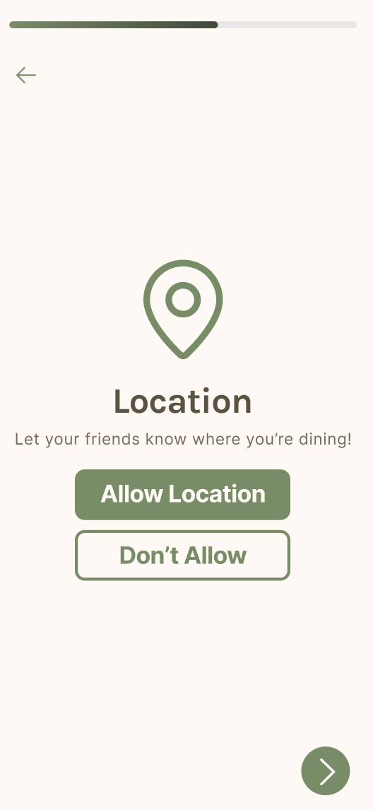
Lastly, a trivial issue arose from an unnecessary “Next” arrow in the Share Location screen during onboarding. The arrow button was repetitive and implied declining location usage for the app. To fix this, the arrow button will be removed, leaving users with the choice to either accept or decline the use of their location.
Testers:
- 5 CS247B classmates
Tasks:
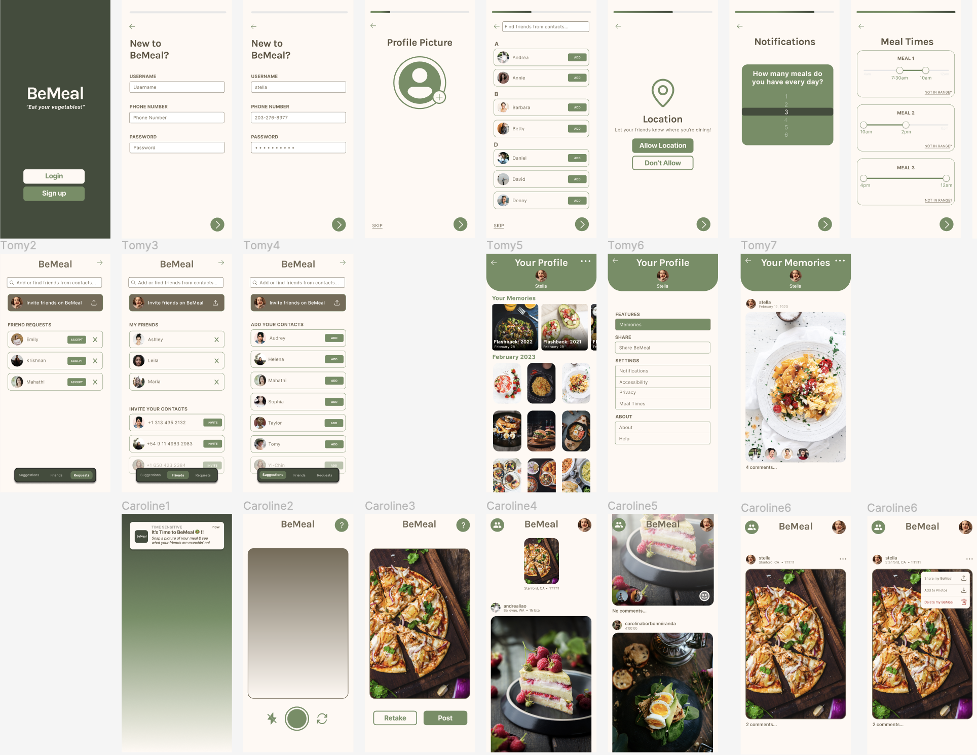
- Task 1: Creating and setting up an account
- Task 2: Posting a meal picture
- Task 3: Interacting with other users (reacting and commenting to someone else’s post
Severe Issues:
- The onboarding flow feels too late, and users are confused as to why the app is asking for location before they have seen the onboarding. This caused some confusion as users were asking “what is location for?” Furthermore, the end of the onboarding flow is too abrupt, with the user saying they probably wouldn’t have anything to post anyway. To address this issue, we should ensure that the onboarding flow is presented earlier, and that the end of the onboarding flow leads to a different screen/section of the flow, rather than the camera!
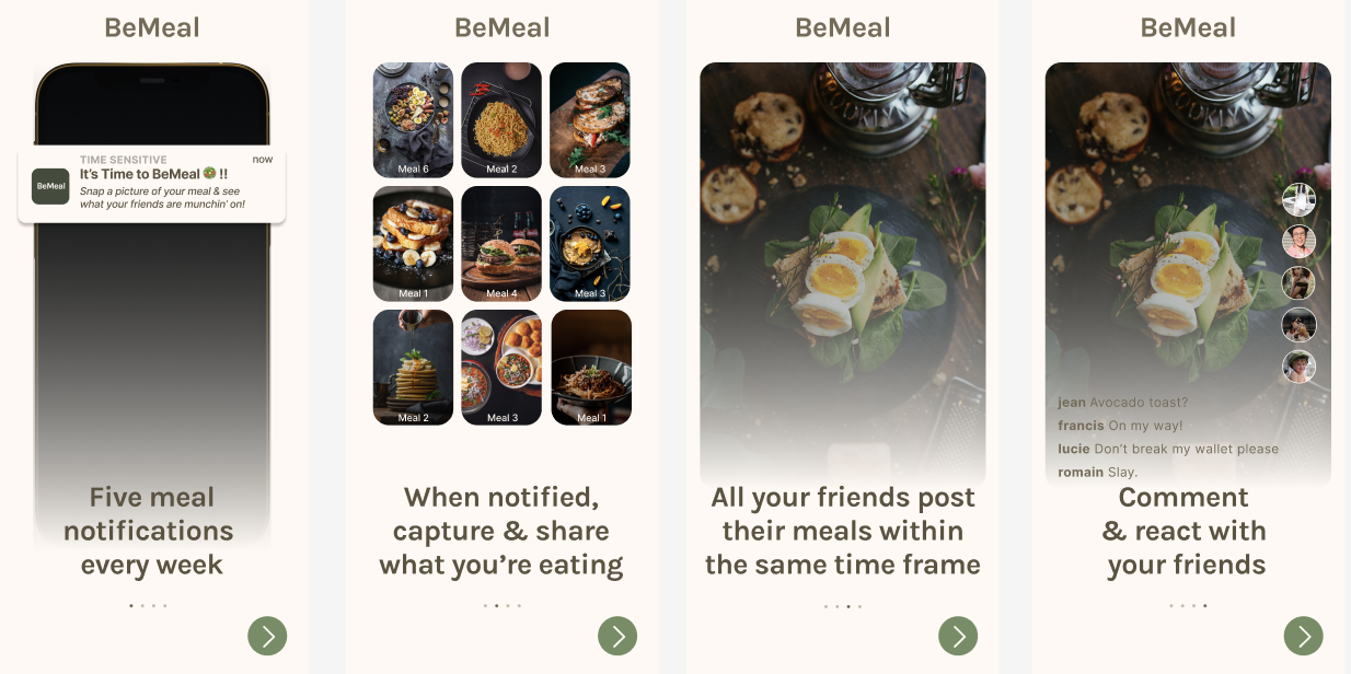
- “The Reaction task flow was confusing” – one of the ways to interact with someone else’s post is a Reaction, where the user takes a selfie in reaction to their friend’s post. However, it is unintuitive to assume this from the smiley face button at the bottom of someone else’s post. To avoid confusion, we’ll add a “posting your first Reaction” onboarding mini flow to get the user used to the Reaction mechanism.

Moderate Issues:
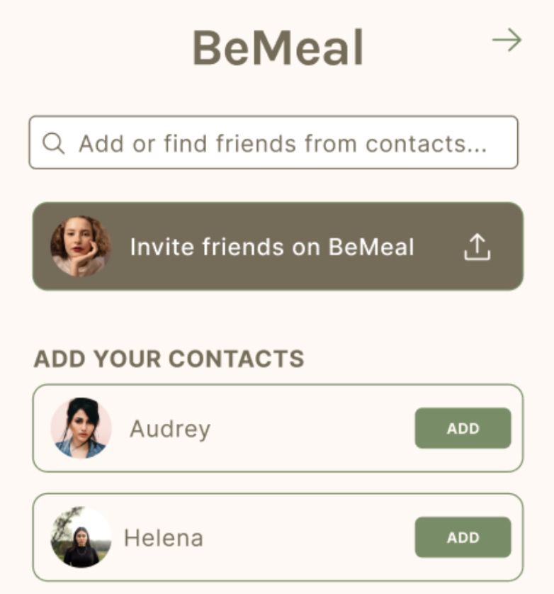
- “Share button is distracting in the friend’s tab” – when trying to add friends, users felt that the “Invite friends on BeMeal” was too prominent and drew their attention to that instead of adding friends. This was made even worse by the fact that the button was at the top for all three of the friend tabs. To address this issue, we will first change the color of the button to make it stand out less. We will keep it consistent with the other rows of friend profiles. We will also move it down the screen and show friends to add first as that is the primary purpose of the tab.
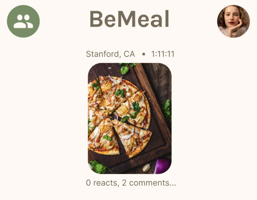
- “Missing feedback button” – when scrolling through the main feed, users were able to understand / successfully react to and comment on friends’ posts. However, it was not clear to users how to view reactions and comments on their own posts – users didn’t know to click on their own post to get an expanded view (that includes reactions and comments). Users didn’t like how there was a barrier (a click) to know how many reactions and comments they’ve received. To mitigate this, we’ve decided to include a preview of how many reactions and comments a user received on their post. Users then know to click on the preview to expand / see what the reactions and comments are, too.
Trivial Issues:
- During onboarding, users noticed “there is an unnecessary Next arrow in the Share Location screen” – the screen already has two buttons, one to allow the app to have access to the user’s location, and the other to decline. The arrow button is repetitive and implies declining location usage for the app. To fix this, we will get rid of the arrow button and just leave the user with the choice to either accept or decline using their location.


Comments
Comments are closed.