Introduction
Project Name: BeMeal
Project Date: 01.09.23 – 03.24.23
Team Members:

This quarter, our goal was to address the issue of low vegetable intake among students and new graduates, with the aim of enhancing their physical and mental health.
To achieve this goal, we developed BeMeal, an innovative smartphone app that incentivizes users to share pictures of their meals with their social circle. By promoting spontaneous and casual social interactions around meal pictures, BeMeal aims to inspire users to incorporate more vegetables into their diets and encourages them to inspire and learn from their friends.
Problem Finding
Justification for choosing the problem
As a team, we were very excited about this problem space because we want to increase students’ overall physical and mental health (something our Measuring Me’s revealed we weren’t too good about). For example, our Measuring Me’s showed some unhappiness with overall well-being which sometimes stemmed from eating habits. From this, we decided to tackle a specific subside, vegetables, as we felt we had personal connections and experiences with trying to improve, but ultimately failed, ourselves.
Exploring the problem space
To explore what was known about the problem, we first looked to compare a few different existing solutions in this space (as well as a few solutions outside of this space that we think can inform our approach to vegetable intake). Some of them were picked because of their clear similarity to our project (increasing vegetable intake), while others diverged from this idea but were picked because we thought they had creative, holistic approaches to health that involved food.
We analyzed the strengths and weaknesses of ten different competitors, as well as their target audiences, and what made them unique. Please refer to our 4A blog post for details on each competitor.
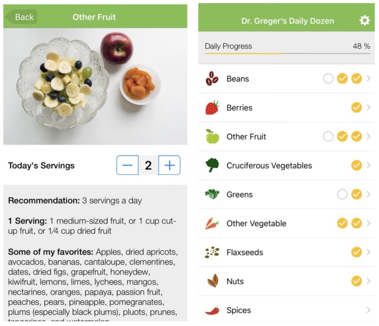
In terms of strengths, some apps were great at creating non-toxic environments to encourage a healthy relationship with vegetables, thus decreasing the activation needed from the user. For example, Dr. Greger’s Daily Dozen did this by suggesting 11 different food groups instead of tracking or limiting calories. This is something we want to keep taking into account given the potential mental health repercussions of tracking.
Some of the greatest weaknesses demonstrated by these apps were the low level of the feedback given. Except for MyFitnessPal, which instantly provides the user with knowledge of the food they are eating, most apps were simply food diaries and lacked a feedback system that would help the user change their habits. We saw this with the Food Diary app which just allowed the user to upload photos of their meals to keep a diary.

After looking at these various solutions, we mapped them on a comparative matrix where we measured activation (the level of effort users must put into tracking and/or changing their vegetable intake) and feedback (the amount of feedback given by the solution).

Key Insights: We found that solutions that required high activation provided more feedback, and to no surprise, solutions that were low activation provided less feedback.
From this matrix, we’ve found ourselves interested in tackling the open market: developing a solution in the low activation and more feedback space, a solution that makes vegetable intake explicit and natural, and encourages users, via feedback, to build a healthy relationship with eating vegetables. As mentioned above, our product would be distinct by including a socialization aspect to make it more fun, too.
Literature Review
At this point, we dove deeper into the vegetable intake world with a literature review. We learned that this is an important challenge because loading up on vegetables is associated with many health benefits: fiber intake, improved mental health, improved eyesight, and general physical health.
Our key insights from the papers were:
- Higher nutrition knowledge was associated with healthy eating.
- Budgetary cost of increasing fruit and vegetable consumption may be a barrier to healthy eating.
- Research suggests that repeated exposure can help with an increased vegetable intake for 2 to 5-year-olds, but it is crucial to distinguish between repeated exposure and forced eating.
- Self-affirmations can have a positive effect on people’s motivation to eat more vegetables.
- The shape and size of carrots, as well as the addition of condiments, can affect eating behavior.
- This review found that social context influences eating through identity signaling and self-presentation concerns. It proposes that social factors are influential on nutrition because we see the behavior of others as a ‘behavioral guide.’
- This review examines which subgroups of university students are associated with the highest vs. lowest vegetable intake. Being female was the most frequent predictor of higher intake. Other factors identified as influential included living at home, perceived importance of healthy eating, socioeconomic status, breakfast consumption, sleep patterns, nutrition knowledge, activity level, alcohol usage, and energy intake.
For more details and insights on each reading, click here!
Baseline Study & Synthesis
Audience: The target audience of our baseline study were students and recent graduates who want to eat more vegetables in their day-to-day lives in order to improve their physical and mental healths. Some obstacles that stood in their way were (1) not having enough time to think about eating healthy, (2) having an aversion to vegetables, and (3) not being able to procure good vegetable dishes due to inconvenience or price. The main way we screened participants (screener linked here) prior to study enrollments were people who have tried to eat healthier in the past, people “kind of” or “not satisfied” with their mental and physical health, and people whose typical meals were 40% or less vegetables. Prior to the baseline study, we interviewed participants to get a better understanding of their current relationship with vegetables (interview questions linked here).
Protocol: For the baseline study, we intended to study how many vegetables participants consume (as a % of the total amount of food consumed) and the various factors that may affect how many vegetables are consumed. Our protocol was to to collect both logistical data (time, location, # people), and content data (hunger level, meal satisfaction, visuals of the actual meal): each participant was sent an empty diary template at the beginning of each day during the week-long diary study and was required to fill out one row / meal or snack. Participants sent over the completed table at the end of each day.
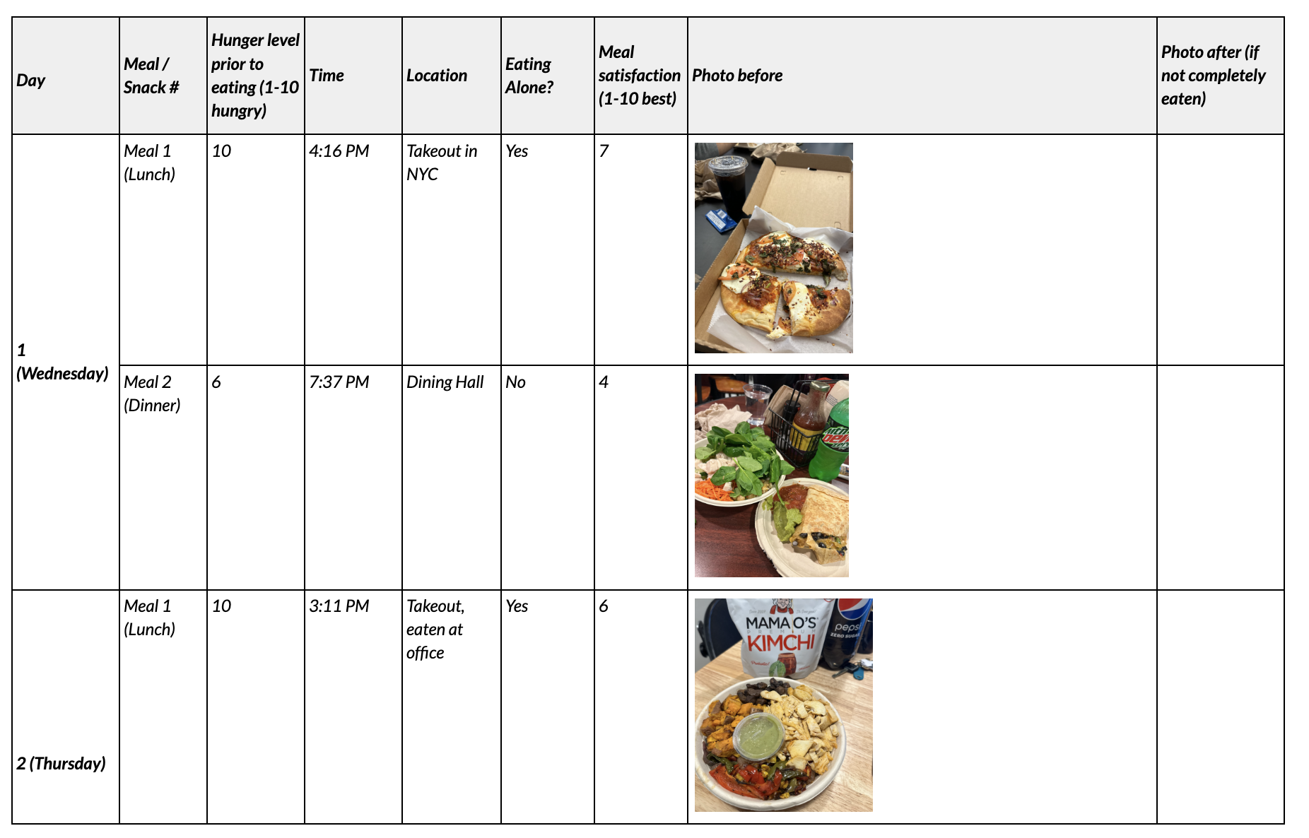
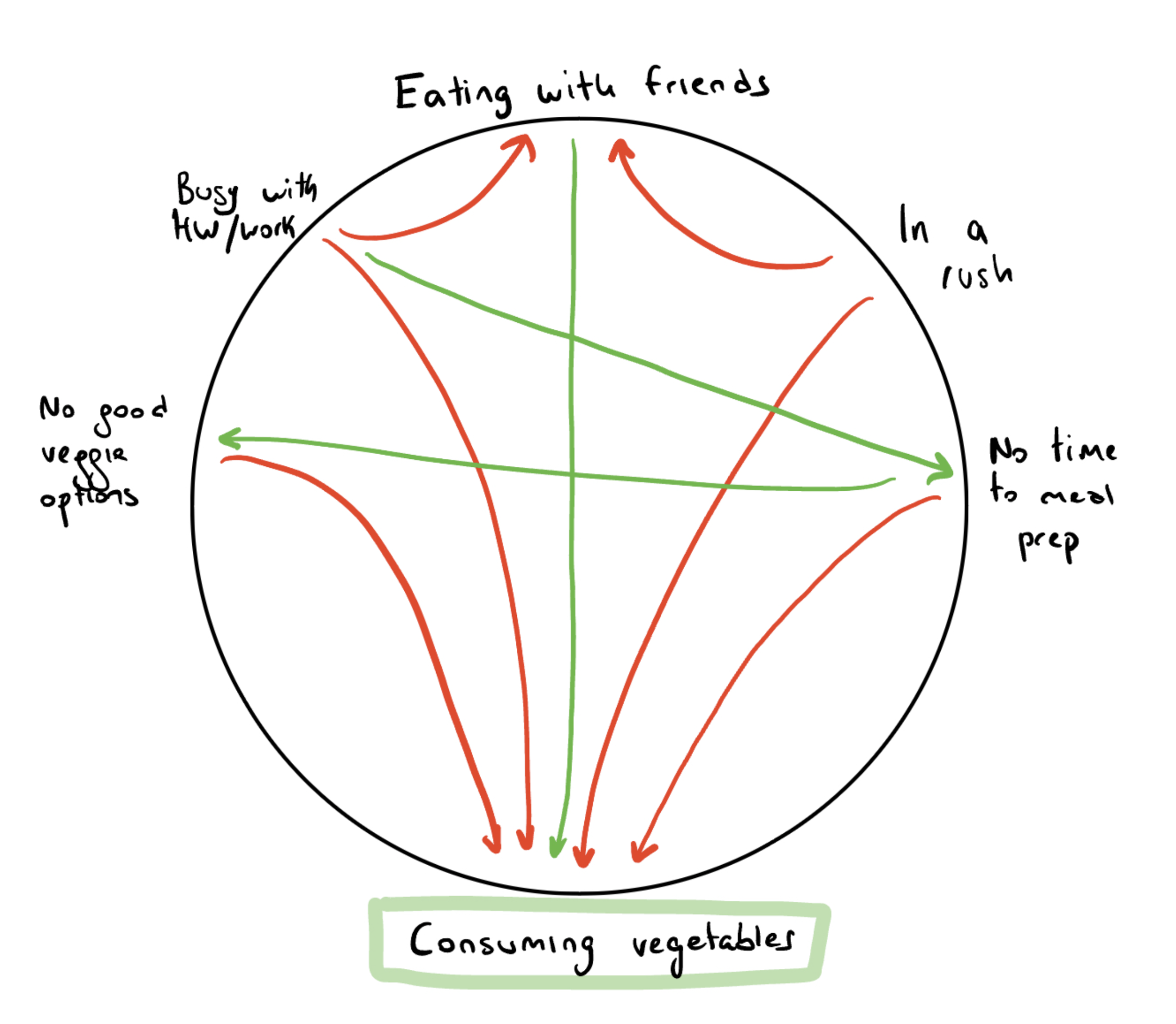
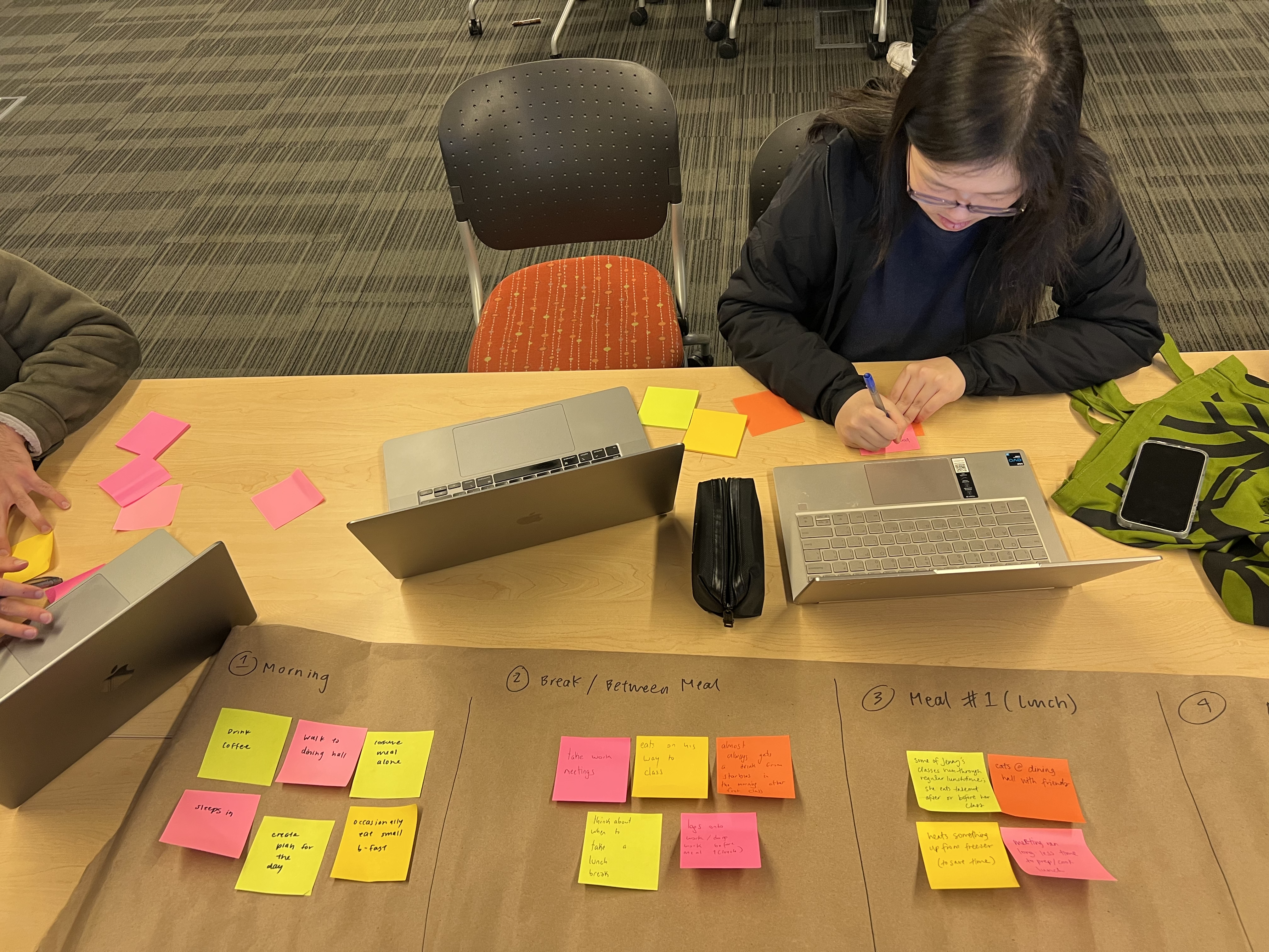
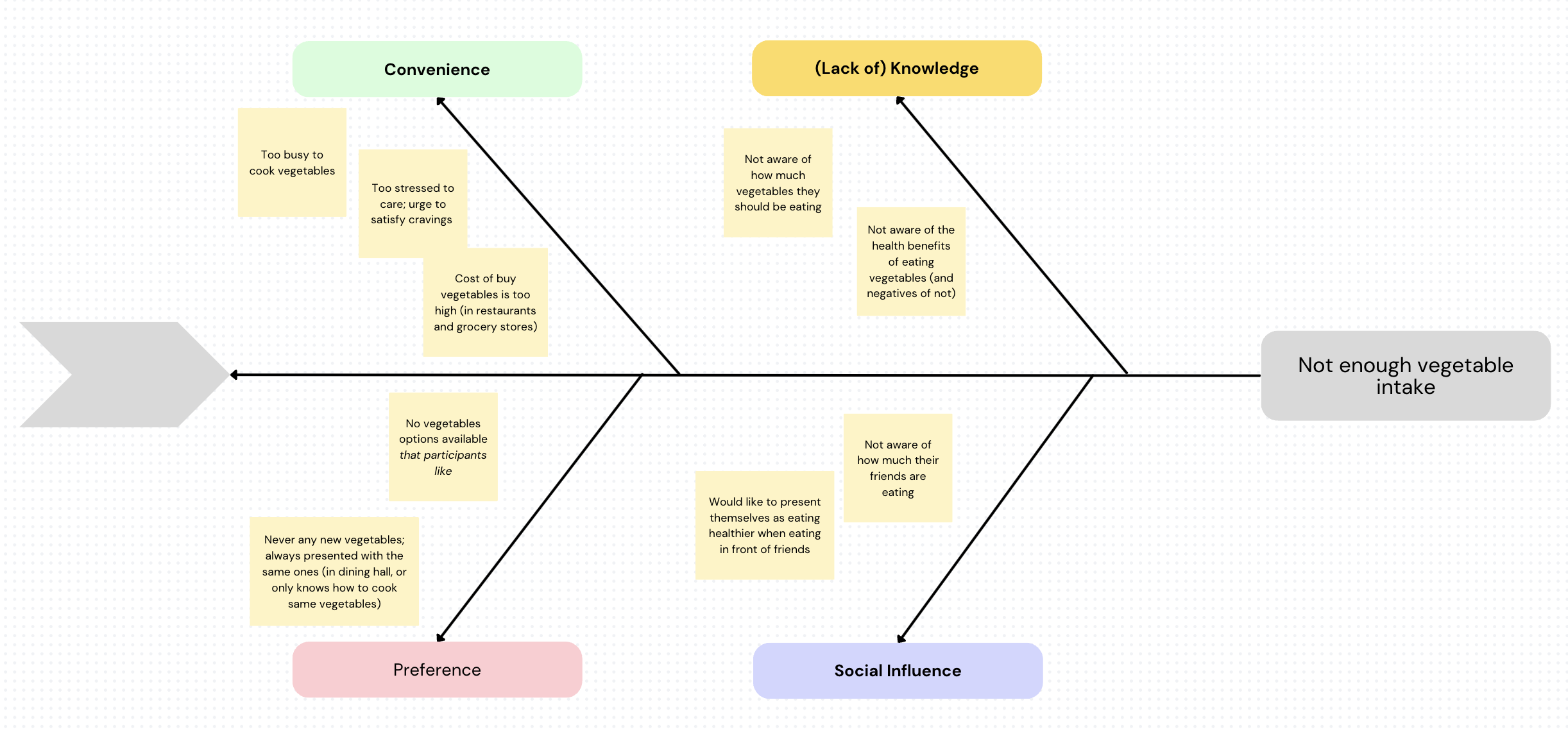
Synthesis: Synthesizing our secondary research and baseline study data (raw data linked here) gave our team a stronger understanding of our various users, what their needs are, what’s working / what’s not, and a plan for intervention. We used a variety of techniques to synthesize our data:
(1) Mind-mapping

(2) Affinity Grouping (Frequency, Timeline)

(3) Connection Circle
(4) Story Mapping
(5) Fishtail Diagram
Key Insights: Please refer to our 5A blog post for detailed insights from each specific technique / model. Key insights across all 6 mapping techniques / models include:
- Participants receive feedback in various ways – by direct knowledge (knowing they should be eating 2-3 cups of vegetables each day) and by observing others (noticing that friends are consuming more vegetables than they are)
- The six main categories that affect vegetable intake are: convenience, preference, social influence, price, lack of nutritional knowledge, and well-being
- Participants feel there are certain contexts where it isn’t the “right” place or time to consume vegetables – for example, it’s a super busy day so there’s no time to cook vegetables; the only option is to heat available, quick frozen food. Or, after 1-2 meals without eating vegetables, participants felt the need to compensate and eat extra amounts of vegetables. The biggest attitudes / feelings preventing vegetable intake were stress / inconvenience.
Noticeably and consistently, the blockers that participants face when trying to eat more vegetables always feel out of their control(s).
How we moved forward: From the above insights, we decided to get creative to combat convenience (because participants’ day-to-day schedules and situations are, as mentioned, not in designers’ control(s) – if only we had the power to cancel meetings and add 2 hours to everyone’s day to meal prep / cook)! We plan to leverage increasing knowledge about health benefits of consuming vegetables and feedback (via close friends) to convince participants eating vegetables is worth the inconvenience (their bodies already tell them so when they subconsciously or consciously try to compensate).
Personas & Journey Maps
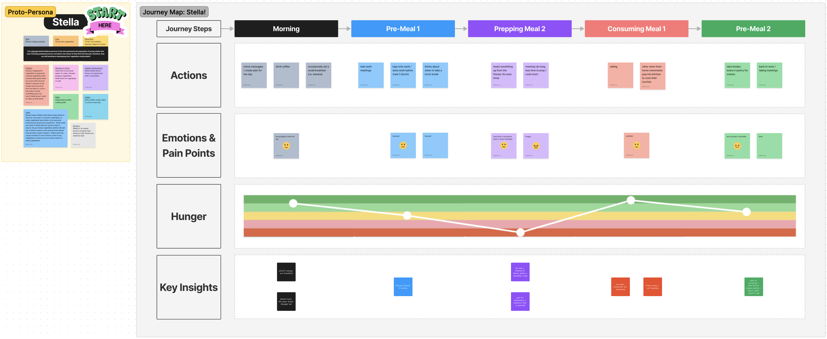
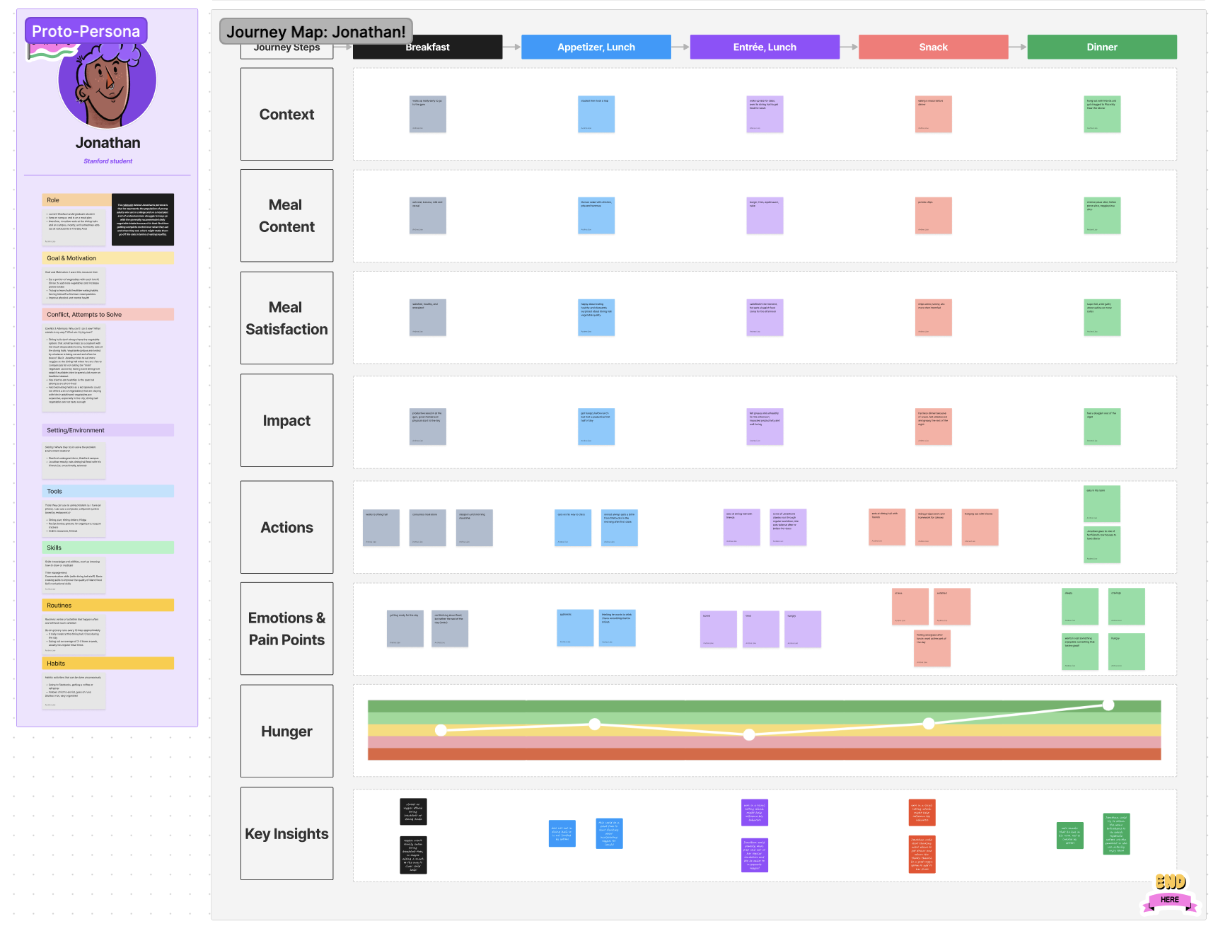
Please refer to our 5A blog post for more details.
Solution Finding
Intervention Study
For a detailed description of our three intervention ideas and each of the idea’s pros and cons, and why we chose the one we did, click here.
Group accountability and encouragement (chosen intervention): Our chosen intervention idea was to create group chats of two to three participants in each group. We then instructed them to send a photo to the group for every meal. We came to this decision based on research from our dairy study: participants who felt a sense of comradery with other people on the same journey were more likely to stick to their goals. Additionally, participants noted that just by virtue of having to take a picture of every meal, they were more conscientious about their eating and more likely to want to put vegetables on their plate. Social accountability was a recurring theme during our research and synthesis processes, which is why we included it into our intervention.
Goals: Test (and hopefully confirm) hypothesis & find a method that can successfully help target audience increase vegetable intake.
Hypothesis: People eat more vegetables if they’re placed in a small group that will encourage them, but also hold them accountable.
Methodology: Number of participants (2-3 per research person).
Target audience: Participants are a mix between old participants (from the baseline study) and new participants who filled out the pre-screener survey but did not take part in the baseline study. General characteristics of our target audience are college students / new graduates who are not satisfied with their current vegetable intake and want to increase it. Participants should have some diversity in demographics, access to vegetables, and lifestyle (how busy they are, how they obtain food, etc.).
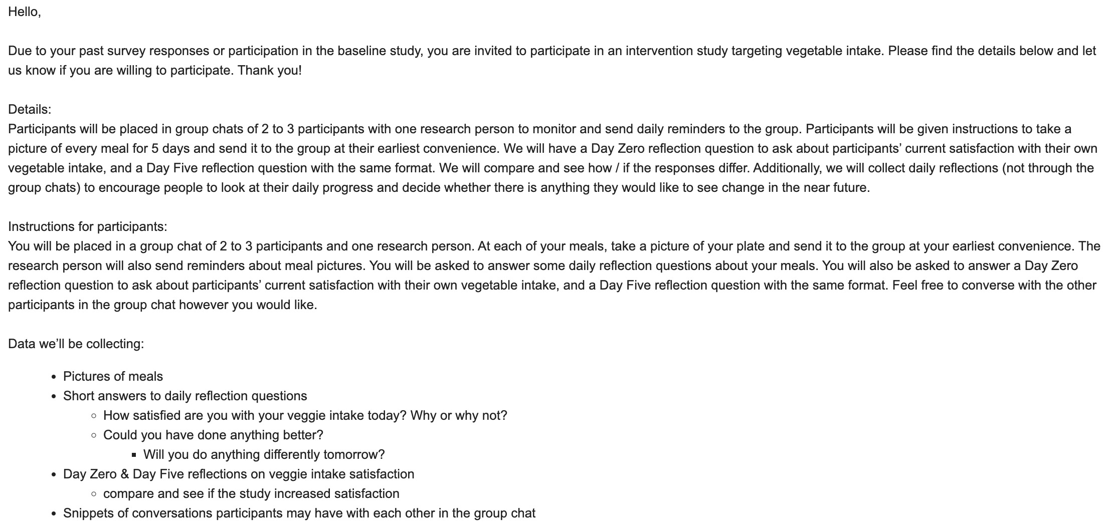

What this meant for our project: The insights and trends gathered from the study highlight the potential of group accountability, daily self-reflection, and visual cues to increase vegetable intake and satisfaction with one’s diet. These findings support the implementation of these strategies in the project aimed at increasing people’s vegetable intake. Additionally, the role of group chat conversations in increasing vegetable intake can provide valuable social support and motivation for participants to eat healthier.
Design Architecture
Story Mapping:
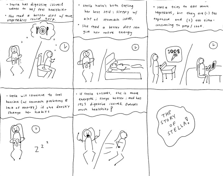

Our team has been looking at two types of participants – ones who grocery shop / cook for themselves and ones have food provided for them (i.e. eat at a dining hall). In both storyboards, Stella and Dan want to eat more vegetables to be / feel healthier (to resolve digestive issues or for better mental health). From storyboarding, however, we learned that both face inconveniences almost always out of our controls (expensive groceries, or bad dining hall options). Instead of fixating on those inconveniences, since they are out of our controls, our app tries to convince participants those inconveniences are worth it (via socialization and knowledge).
Bubble Map:

For our bubble map, we focused on three large areas of “Feedback,” “Building your network,” and “onboarding.” These areas reflect the most important aspects of our user experience and are the highest priorities for our wireflows and UX design.
Feedback: Feedback is extremely important for us to facilitate behavior change and encourage users to improve their vegetable eating habits over time. We give feedback by enabling users to give and receive feedback from friends through meal pictures or direct dialogue (comments) and giving fun facts when users miss a post.
Building your network: Building a community and network of like-minded individuals can be a powerful tool in promoting behavior change and providing support. By creating a social aspect to the platform, users can share their experiences, recipes, and tips with others, as well as receive encouragement and motivation from their peers. Our app allows users to add friends, invite friends, and interact with them through giving/receiving feedback and meal posts.
Onboarding: A good onboarding experience can help users understand how BeMeal works, what it has to offer, and how it can benefit them. We allow users to set up meal times, create a profile, and add and invite friends.
For a more detailed analysis on our bubble map, click here.
System Path:
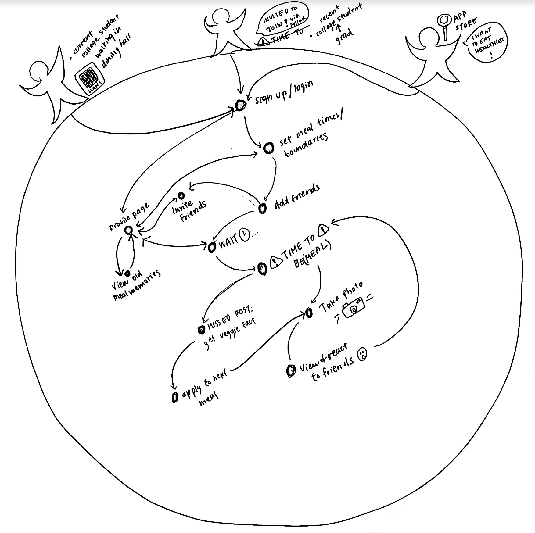
For our system path, we decided on three “starting points” or ways to find our app for the first time:
- A recent college grad student who was invited to join the app via a text from a friend (add friend feature on the app)
- Current college student walking into the dining hall saw a QR code to learn more about eating vegetables
- A user who wants to eat healthier and searched on the app store
All three starting points lead to the same “sign-up page” flow where the user would set meal time ranges. After that, they would be offered to add friends and then post a photo of their meal after receiving a notification from the app. At this point, if they successfully posted a photo, they would be able to react to their friend’s posts, or if they missed a post, receive nutritional knowledge.
For a more detailed analysis on our system path, click here.
Assumption Mapping & Testing

For a more detailed analysis on how we chose our assumption tests, click here.
The top 2 assumptions that our team needed to test:
(1) That our team is uniquely positioned to win because we combined the best of both worlds: the spontaneity and virality of BeReal and the intimacy and support of close friends
(2) That providing users with relevant nutritional knowledge will increase their motivation to eat more vegetables
To test our first assumption / test our app’s unique position, we texted participants at a random (meal) point during the day to snap and send photos of their meal(s). We want to know how spontaneity will affect users’ response rates / times and meal choices (as compared to when they have to record or send a picture of every meal).
To test our second assumption / test whether participants will stop using their current solutions (note: most participants don’t have a current solution, so rather we’ll test whether participants will start using our solution) by sending participants relevant knowledge (nutritional facts) to assess if it motivates them / lowers the barrier enough for users to more directly achieve their goals.
For a more detailed analysis on our assumption testing synthesis and results, click here.
Key Insights from 1st test:
- Having to be socially accountable for (i.e. take a picture of) your meal does affect whether a user wants to include vegetables in their meal or not; spontaneity, thus, plays a role because users won’t know when they will have to be socially accountable.
- Getting “caught” doing the “right” thing (i.e. in this case, eating vegetables), feels good. Spontaneity, thus, plays a role because it’s rewarding for users to be eating vegetables when the BeMeal notification does come on.
- It is important to consider how we implement notifications and accurately capture meal time range. I sent the message at a time I would consider “early” for lunch, but this time might not be the same for all users; users don’t always eat at specific times.
So we did this:
- Decided to include spontaneity in our solution. However, previously, we discussed the spontaneity being 1 spontaneous meal / day, but there’s not much flexibility with that given there are usually only 2 full meals / day. To be truly spontaneous, we chose 5 random meals throughout a week (vs 1 meal / day). This could allow for two meals to be socially accounted for in the same day.
- Make the meal time range very clear and easily editable in case users want to go back and adjust. Missing meal notifications might be an issue so we have to consider including multiple notifications at different time intervals before the assignment time range to see if this engages and reminds the users to take pictures.
Key Insights from 2nd test:
- We learned that vegetable trivia can be a good tool for improving overall mental attitudes towards vegetables, but that nutritional knowledge alone isn’t enough to motivate change; the barriers that young people face in consuming vegetables are much greater than lack of awareness or lack of access to information.
- Learning more about certain vegetables, when made fun, can encourage people to eat those vegetables.
- Access to quality vegetables that people enjoy is important in encouraging them to increase their intake.
So we did this:
- Therefore, we will incorporate fun, accessible nutritional knowledge when users forget to post to our app to improve their mental attitudes and encourage them to think about those vegetables for their next meal(s). This type of nutritional knowledge also avoids creating a toxic environment when a user forgets to post.
Something to consider in future assumption tests are inconvenient vegetables. In our tests, it worked out that the veggie fact provided was also a vegetable that users had easy / convenient access to. But what if there were a fact of a vegetable that wasn’t as easy to attain or not in the user’s fridge? Or perhaps a vegetable that’s on the more expensive side that a user isn’t willing to buy? We would test for these more inconvenient vegetables and be able to learn how to account for these cases.
A big assumption that remains after assumption testing is a classic start-up problem: the cold start problem! The socialization aspect of our app only works if you and your close friends are using the app. We’re assuming our users will refer us to new users, as everyone needs their closest friends to join the vegetable-eating journey to make the most of our solution’s features! We’re also assuming that users want to achieve a lifestyle change (vs a quick fix).
Building a Solution
From wire-flows to sketchy screens
For a concise explanation of each mapping strategy as well as key findings from each, check out our architectural design of the solution!
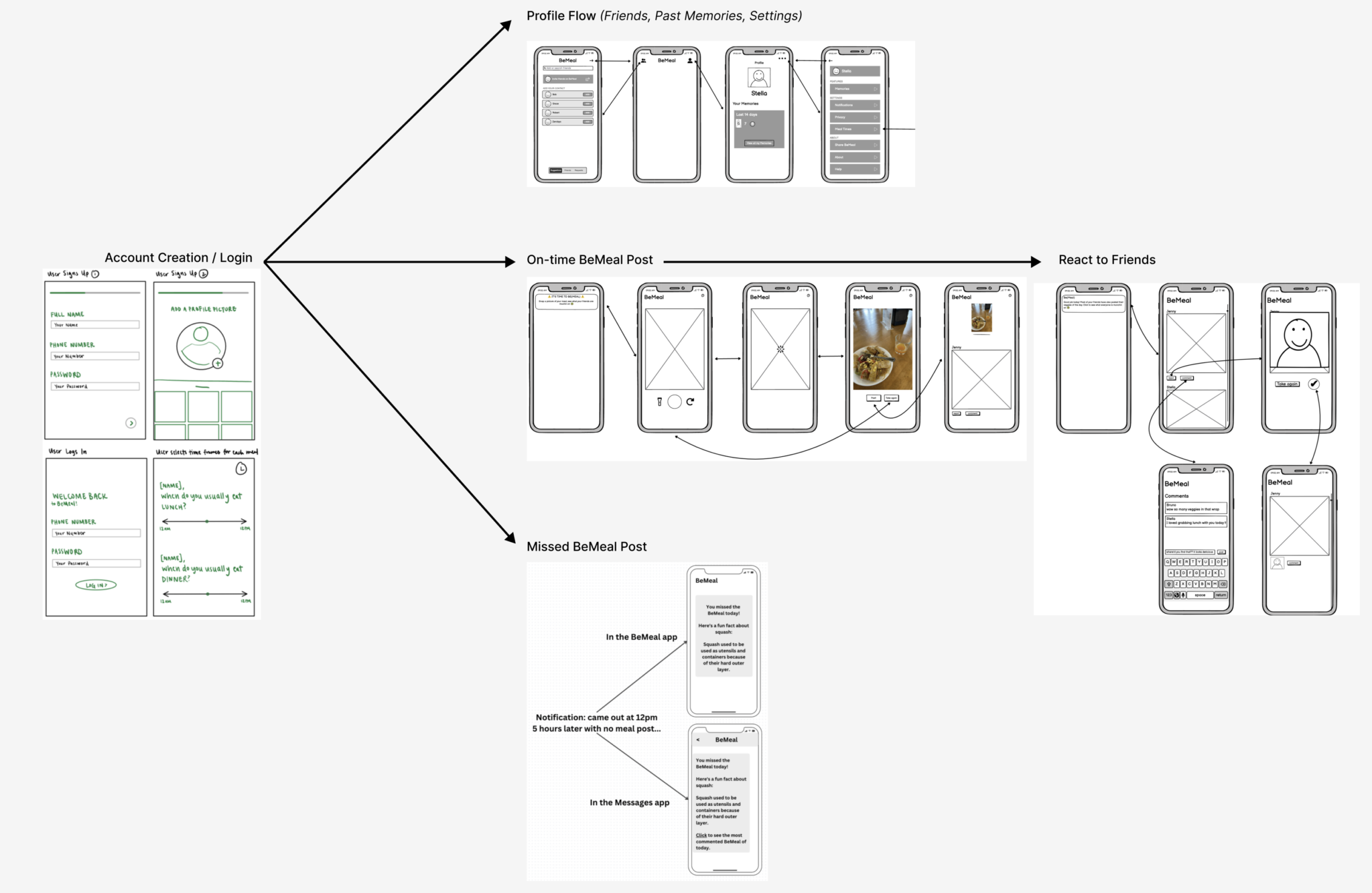
After synthesizing the information from our bubble maps and system paths, we came up with the wireflows above, aiming for a happy path that focuses on socialization without a gamification aspect. We want users to feel a sense of community and identity without competing against one another. We did so by allowing users to add their “friends” who they can share their own veggie intake with, or react to these friends’ own plates. There is no long-term tracking to avoid the toxicity of competition, but the MVP of the product is a Memories function that allows users to reminisce on their posts from a month, or even a year, prior. This feature will most directly address the problem space as it will hopefully inspire self-reflection and a sense of accomplishment for the changes in a given time frame.
For more features that directly address our problem space, justifications for our decisions, and considerations of potential challenges for our users, check out our sketchy screens!
Branding: Mood Boards & Style Tiles
We imagine the product as a modern, sleek, and inviting app that emphasizes the deliciousness of incorporating vegetables into meals. Similarly, we want our product to exude a modern, fun, and inviting personality: we want users to feel inspired to make healthier decisions, and to feel excited to explore and experiment with new recipes and ingredients; we want to encourage users to feel confident in their cooking abilities and to feel empowered to try new things; we want to make sure that users feel comfortable exploring the app and that they are never judged for their choices; we want users to feel the joy of creating delicious meals with vegetables and to get excited to eat healthy and nutritious meals. The colors chosen, the wide range of colors in the mood board, and the sleek font all communicate a sense of fun and modernity, as well as emphasize the nutritional benefits of eating vegetables. The app should evoke feelings of health, wellness, and satisfaction in its users, as well as inspire them to create attractive and tasty meals.
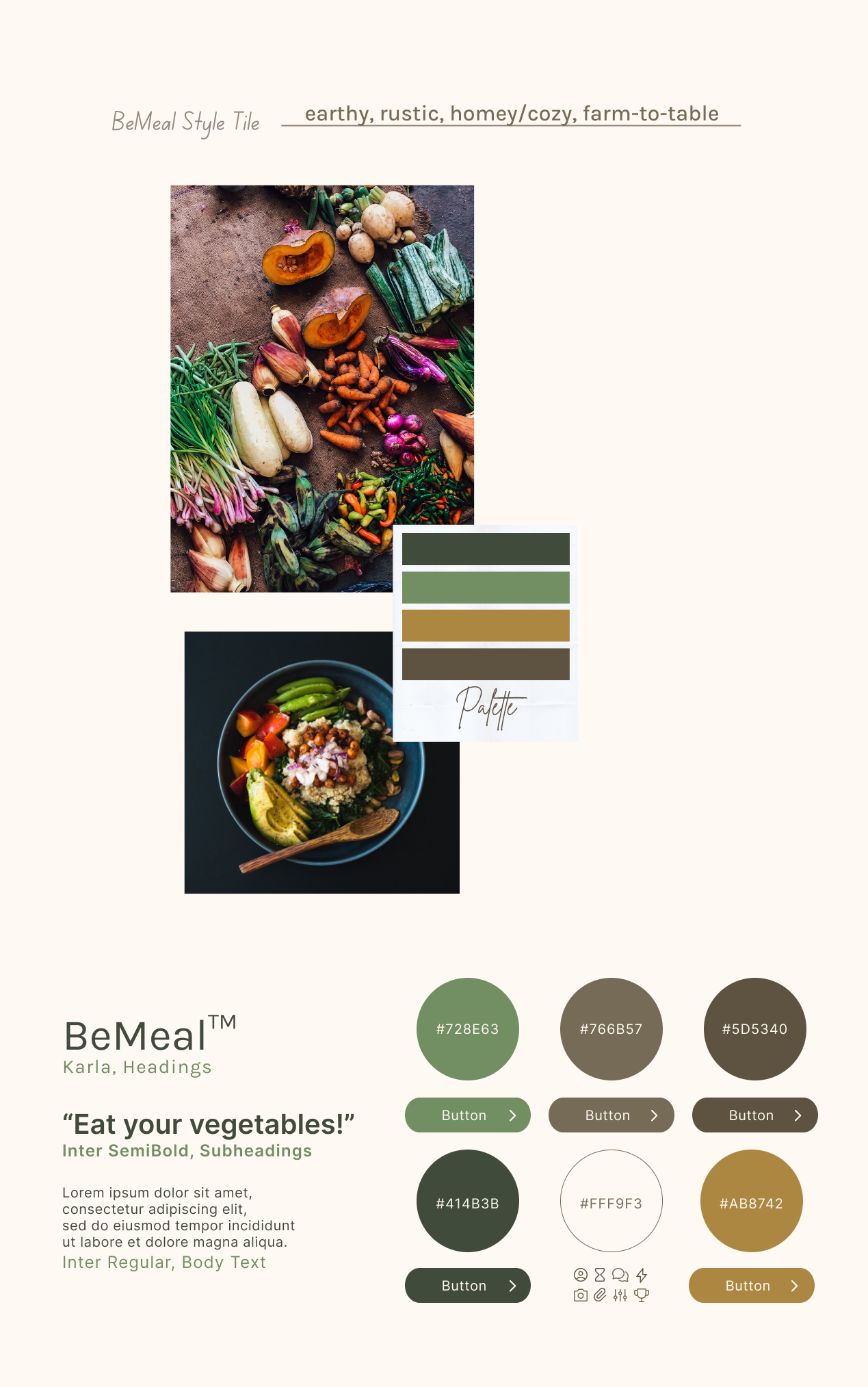
For our mood board, we wanted to focus on pictures that emphasized meals (vs direct / raw vegetables) to remind users of how they can incorporate veggies into meals and show users how appetizing / delicious vegetables can be! We chose pictures with wide color ranges to elicit fun, too. For our style tile colors, we decided to go with a more consistent set of colors (to avoid too many color choices that would lead to our app appearing more childish); the green tones remind users of vegetables, and we have the neutral browns / earthy tones to accent and support. We wanted a more modern look with our font, so we decided on a sleek sans serif font (to elicit how “clean” or “sleek” one may feel after eating more vegetables).
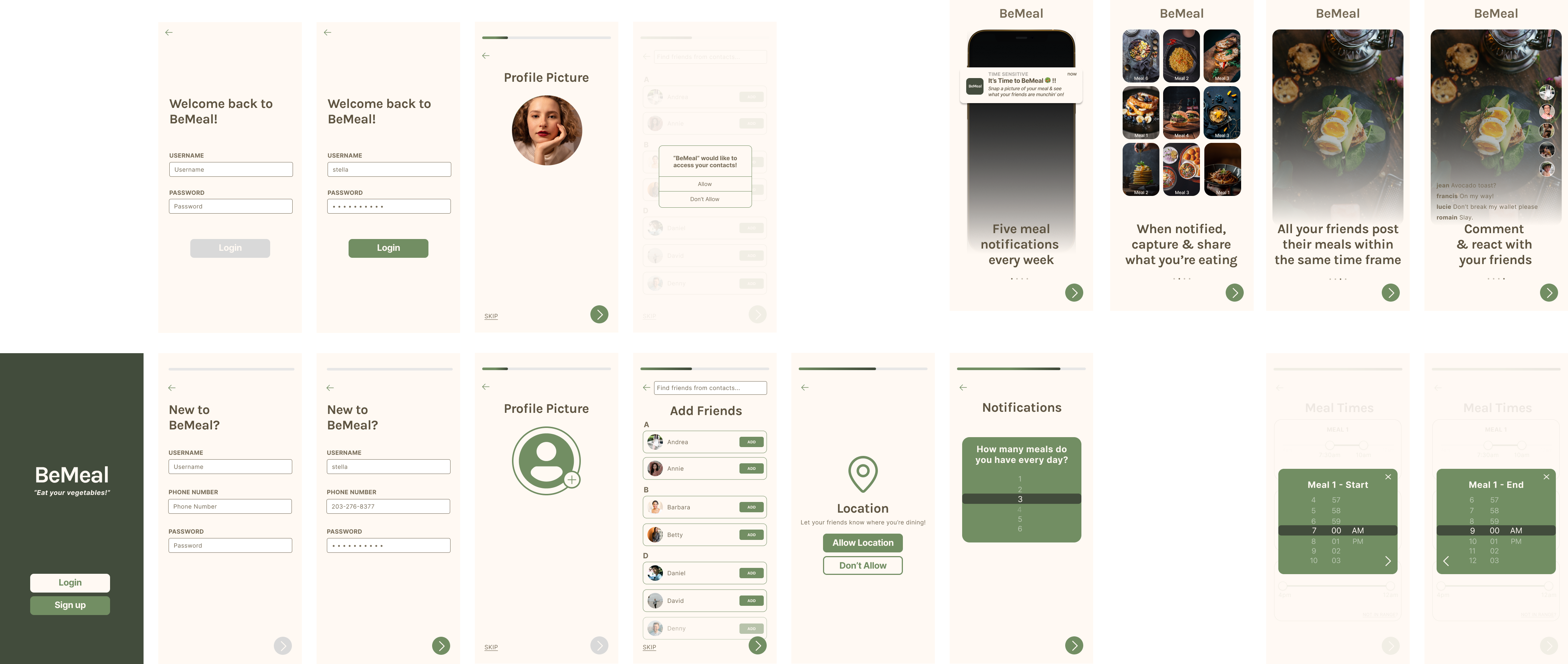


The BeMeal app focuses on socialization as a motivator and tool for accountability in order to encourage young adults to eat more vegetables. We opted for a simplistic design, where a user sets their approximate meal times, and then is randomly notified 5 times a week to upload a picture of their meal(s). All of this is explained to a user during a user’s onboarding. After uploading their own photo, a user is then given access to their feed, where they can see their friends’ posts, react with selfies, and leave comments. This way, users can bounce ideas off each other to gather tips for where to get accessible and fun-to-eat vegetables. If a user misses their meal time window and forgets to upload their meal photo, they don’t get to see their feed, but they do receive a fun fact about vegetable nutrition to remind them of the importance of eating vegetables! As a user builds the habit of uploading randomized meal pictures, they will also be encouraged to look through their Memories, where they can see what they were eating a week, a month, or even a year prior. We hope this app brings joy into eating vegetables through social accountability and friendly encouragement. Note: The multiple entry paths into the BeMeal app are shown / can be navigated via the tabs on the clickable prototype page on the left.
Usability Testing
The tasks that we wanted our user to accomplish during our usability test were:
Task 1: Creating and setting up an account
Task 2: Posting a meal picture
Task 3: Interacting with other users
Our three biggest issues were the late onboarding flow, which caused confusion about location requests, the confusing Reaction task flow that hindered users’ understanding of the smiley face button at the bottom of someone else’s post, and the absence of a feedback button, making it unclear for users how to view reactions and comments on their own posts! To address these issues, we updated them in the final prototype by presenting the onboarding flow earlier in the user experience. It was important to update because it should lead to a different screen or section after it concludes. Additionally, introducing a “posting your first Reaction” onboarding mini flow helped familiarize users with the Reaction mechanism. Last but not least, a preview of the number of reactions and comments on a user’s post was added, allowing users to click for more details.
An additional future direction / something we would take into consideration if we were to move forward would be to employ computer vision to analyze how much percentage of a particular plate picture is vegetables versus non-vegetables!
Prototype
We implemented four flows: Onboarding, Time to BeMeal, Friend Posted, and Missed BeMeal. There are some auxiliary screens, including but not limited to transition screens, settings, add friends, and profile page, that we also implemented but are not explicitly part of these flows.
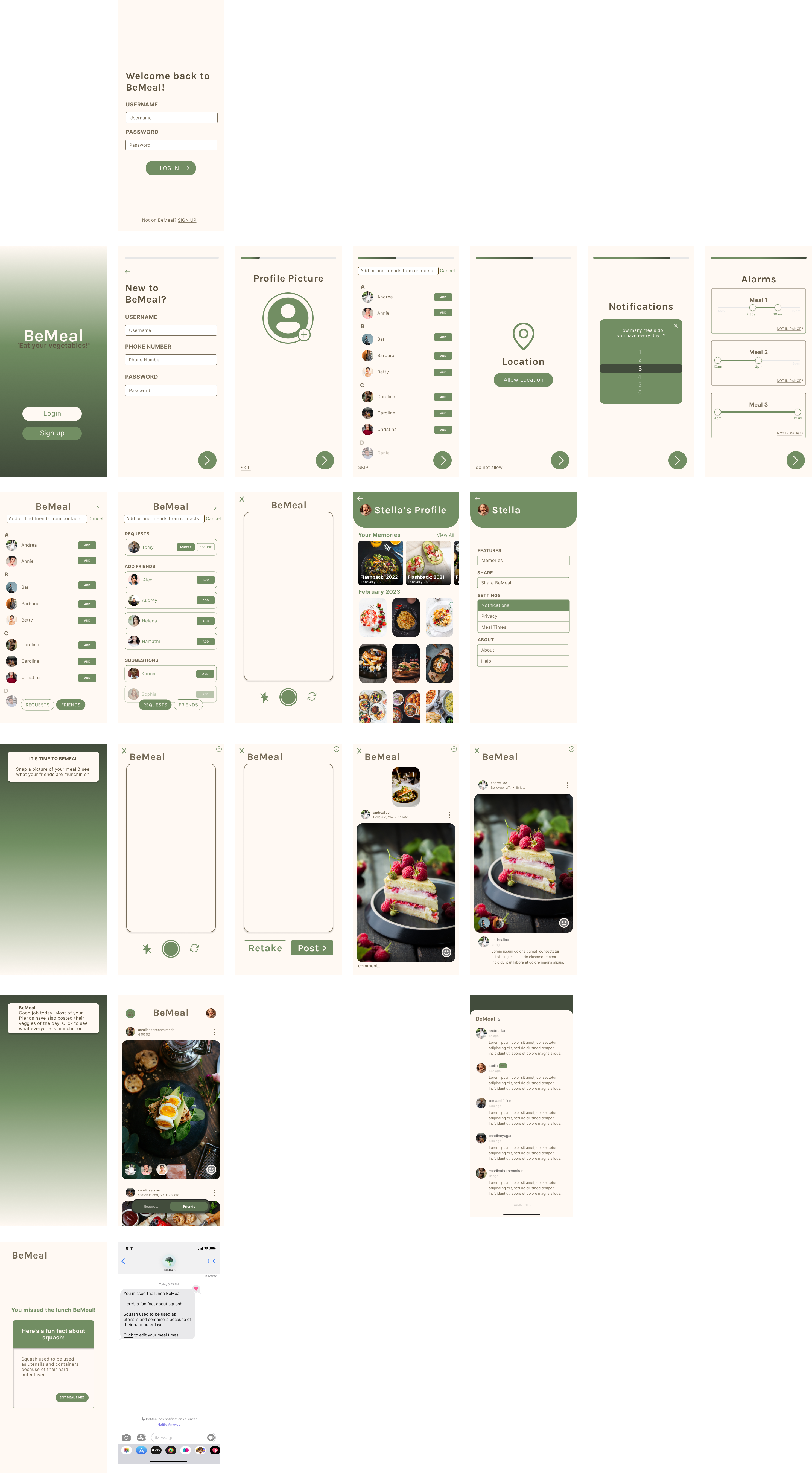
Onboarding (draft): When the user first opens the app, they will be taken through the onboarding process, which on a high level consists of creating an account, adding a profile picture, adding friends, setting meal times, and tapping through an overview of BeMeal’s features. This process was designed to set up all necessary aspects of the user’s account while being as simple and intuitive as possible.
Time to BeMeal (draft): When it comes time for a user’s meal, they will receive a notification prompting them to post a picture of it. When they tap on the notification or open the app, they will be directed to a camera screen, where they can take a picture of their meal and post it. Once they post it, they will be able to see meal pictures that their friends have already posted that day. The notification and the app opening on the camera allows the user to make a post with the minimum amount of activation or taps possible.
Friend Posted (draft): When a user’s friend has posted, they will receive a notification about it. When they tap on the notification or open the app, they will be shown their feed page where they can view their friends’ posts. From there, they can choose to react to and/or comment on any post. The “react” feature promotes spontaneous and casual social interaction, and the “comment” feature allows for more expressive interaction.
Missed BeMeal (draft): For example, let’s say the user’s set lunchtime is 12pm and their set dinnertime is 6pm. When the lunch notification comes out at 12pm prompting the user to post their meal, the user has until 30min before their next set mealtime to post. In this example, it is 5:30pm and the user still has not posted their lunch meal. Thus, the user has officially missed a BeMeal. They will get a notification from the app prompting them to open for a fun fact, and also receive a text about it. The separate text notification is intended to add a layer of presence for BeMeal in case the user hasn’t been using the app recently.
After we finished our draft clickable prototype, we developed a usability test and conducted it with five different users. Please refer to our usability test report for more details.
The top 3 issues we found from the tests were:
- Onboarding flow order – The onboarding flow felt too late, and users were confused as to why the app was asking for location before they had seen the onboarding. This caused some confusion as users were asking “what is ‘location’ for?” Furthermore, the end of the onboarding flow was too abrupt, with the user saying they probably wouldn’t have anything to post anyway. To address this issue, we ensured that the onboarding flow was presented earlier, and that the end of the onboarding flow led to a different screen/section of the flow, rather than the camera!
- “The Reaction task flow was confusing” – One of the ways to interact with someone else’s post is a Reaction, where the user takes a selfie in reaction to their friend’s post. However, it is unintuitive to assume this from the smiley face button at the bottom of someone else’s post. To avoid confusion, we added a “posting your first Reaction” onboarding mini flow to get the user used to the Reaction mechanism.
- “Missing feedback button” – when scrolling through the main feed, users were able to understand / successfully react to and comment on friends’ posts. However, it was not clear to users how to view reactions and comments on their own posts – users didn’t know to click on their own post to get an expanded view (that includes reactions and comments). Users didn’t like how there was a barrier (a click) to know how many reactions and comments they’ve received. To mitigate this, we decided to include a preview of how many reactions and comments a user received on their post. Users then know to click on the preview to expand / see what the reactions and comments are, too.
LINK TO FINAL PROTOTYPE 🙂
Ethics
Nudging and Manipulation
Through our discussion of the article “Nudging and Manipulation” by T.M. Wilkinson, we talked about how manipulation violates the principle of autonomy. Manipulation can be tricky to spot, since unlike coercion, it does not constrain an individual’s options, but rather it perverts their decision-making process. The question is then, what ways can we avoid our solution being manipulative, while still prompting the behavior change? We talked about our goal to get users to increase their vegetable intake. In this case, manipulation looks like telling the user to eat vegetables in the following ways: eat a specific kind, or a specific amount, or vegetables prepared in a specific way. We instead ideated a solution that leaves a lot of room for autonomy in decision-making. We nudge our users to post their meal approximately once a day, but if they don’t, they are not penalized, instead they are provided with a fun nutritional fact about vegetables. Additionally, users are given autonomy over the time windows during which they will receive their randomized notifications by selecting their approximate meal time windows during onboarding. When they do post after a randomized notification, there is no judgment on whether the meal meets a vegetable-standard. Instead, users are invited to look through their Memories and determine for themselves how much progress they have made during their usage of the app. This is how we aimed to steer away from manipulation and towards autonomy.
Rewards
After reading the Rewards chapter in “Good Habits Bad Habits” and the article “The dark side of gamifying work,” our team talked about removing any sort of scoring notion from our solution. As the Rewards chapter from GHBH details, rewards make us feel good. We talked about dopamine systems in the brain and how if used improperly, rewards systems can contribute to a decline in mental health due to an imbalance of dopamine when we fail to get rewards after having grown accustomed to it. Previously, we had brainstormed the idea of scoring users based on how often they uploaded a picture of their meal and the meal contained vegetables. Scoring could also vary depending on how big the portion of vegetables was according to a visual estimate recorded by the user themselves. However, not only does this gamify the goal of eating vegetables, it also plays dangerously close to imitating diet culture, where people are encouraged to quantify calories and measure their success based on these quantities. Scoring users would have also risked opening the door for comparing oneself to other users. Comparison is of course still a possibility even without a scoring system, but we hope that instead users build on each other’s knowledge and tips on how to get accessible yet appetizing meals with vegetables included. In lieu of any scoring or ranking system, we decided to implement rewards in the shape of reacting to other people’s posts. Seeing friends notice one’s own post and react to it increases the user’s sense of community and unifies users towards a shared goal within the app, but avoids toxicity in the form of quantifying vegetable intake as a standardized measure of success (since everyone’s journey and therefore progress is unique).
Accessibility
After talking through our takeaways from the paper, “The Invisible Work of Accessibility: How Blind Employees Manage Accessibility in Mixed-Ability Workplaces,” we began wondering the small ways in which we may have excluded users with disabilities or given them more invisible work just for them to be on the same page with other users in the app. Since our solution is heavily reliant on pictures as the main mode of engagement, we anticipated that our main oversight was accommodating blind users. Although this is not implemented in our prototype, we discussed our future steps in accessibility work to incorporate captions for every post that loosely estimate the size of a vegetable (and other food groups) portion in the picture being posted. We would onboard every user to learn how to visually estimate their own portions. For example, the following graphic can help people know the size of their vegetable portions:

During our class discussion of ethics in accessibility, we noted how work in accessibility often has unintended yet positive consequences for individuals without disabilities as well. For example, the incorporation of ramps intended for people with wheelchairs also helps mothers pushing strollers, or people carrying grocery store carts or bicycles they use to get to work. Similarly, the incorporation of captions that estimate portions is helpful not only for blind users to understand what is going on in each post, but it is also helpful for every user, as this is information that can then be used to loosely track one’s progress. As users go through their Memories and look at their posts from a week, a month, or even six months prior, they can see the variability in their vegetable portions throughout time.
With captions, blind users would then be able to scroll through their feed and still understand what is going on in each post. In lieu of reactions, they can leave written comments for their friends. A future direction from there could also be to have friends be able to suggest captions for each others’ posts, in order to have the most robust captioned feed as possible!
Future Steps in Ethics and Broader Impact
Behavior change surrounding eating habits is complex, and in the greater context of modern media and society, has the danger of encouraging a toxic diet culture or even eating disorders. If this solution were to be rolled out to the general public, a necessary step before said rollout would be to bring on nutritionists and mental health consultants to ensure we have steps to prevent toxicity from developing on the platform. Some initial ideas are to have reporting mechanisms for any post, reaction, or comment that cause harm or perpetuate diet culture ideals. But again, these are topics that cannot be comprehensively understood by engineers and designers, and should probably be tackled by a diverse team, with members specifically having expertise in healthy eating behavior changes and how food habits impact mental health.
Conclusion
Through building BeMeal, our team learned that designing for behavior change is more complicated than it seems. Change is hard, and effective solutions have to not only provide meaningful incentives for users to change but also recognize the line between ethical and unethical methods. We learned how to conduct behavioral and intervention studies and interpret the outcomes, which were extremely useful in informing our overall direction that eventually led us to create BeMeal. We learned how to prototype with usability guidelines in mind and iterate on the prototypes based on feedback.
If we had more time to continue working on BeMeal, we would love to develop it into a working application as well as flesh out more social interactions in the app that can keep users coming back day after day. We would also like to investigate other incentives for increasing vegetable intake that we can work seamlessly into the app. Given all that we have learned this quarter, we will definitely have a very informed approach to our next behavior design effort, which will be based on getting real users’ experiences through studies and interviews, synthesizing data, drawing visuals to determine design architecture and flow, and usability-focused design.


