
Before this class
Prior to this class, I had taken one HCI class: Designing for Accessibility (CS 377Q). I thought CS 377Q was an amazing class and it definitely made me curious to take other HCI classes. I knew some things about the design process from CS 377Q and from mechanical engineering classes I’ve taken. However, I had a completely different idea about the design process than my teammates who have taken CS 147.
Class experience
This class was completely unique to any other class I’ve taken at Stanford. Strangely enough, it felt more collaborative than my senior capstone project. I loved seeing my teammates twice a week; although I thought the class was too long and too early, the 2.5 hour block helped me become comfortable with my teammates. I thought our team communicated very well and it felt like everyone was proactive.
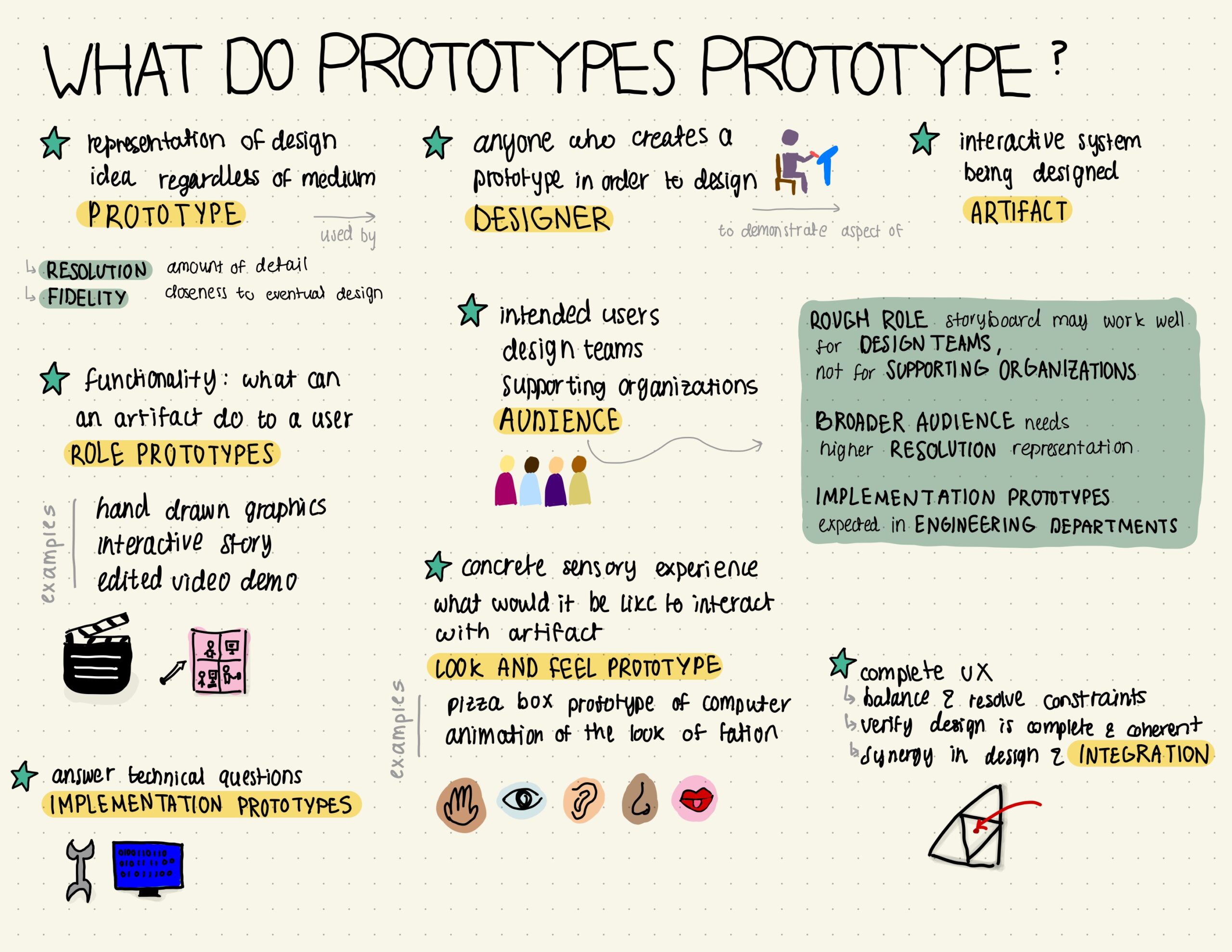
One thing I liked about the class was the sketchnotes. Although each one took me a long time, I felt like I remembered the readings very well. I also found them strangely therapeutic to make. Another thing I loved is the Tiny Prompts reading. I think the idea of using an anchor is embedded in me now! I have become more aware of prompts such as text message notifications since then. I also found the “Measuring Me” exercise at the beginning of the quarter extremely useful. Since then, I have started timing how long it takes me to get ready everyday. I started setting 3-5 minute timers and I would repeat the timer a few times to subdivide the task of getting ready into multiple tasks that need to be completed within 3-5 minutes. I have started taking significantly less time to get ready in the morning!
One thing I didn’t like was the sketchy screens. I thought the wireflows were similar to the sketchy screens. In retrospect, I now understand the difference between the two. I wish we were given more examples of wireflows at the time so that both wireflows and sketchy screens would’ve been useful.
One thing I think I’ll remember from the class is the importance of visual hierarchy in notes. I already started practicing making my notes for other classes more sketchnote-like, though I think it will take me time to master making sketchnotes in a timely manner.
Ethical considerations
Interface Design & Design Justice: In creating the prototype and our solution idea, I was questioning how our solution would work for someone who is blind or has low vision. Our solution heavily relies on visuals since our whole premise is to keep a collection of pictures from the outdoors. Our digital sketchbook does allow the user to input written entries, but the user is currently required to add a picture input. How can the user use Tulip to hold themselves accountable without visual aspects? Some solutions I can think of is inputting location information about the outdoor location they chose for the day instead of an image. Of course, that leads to privacy issues.
Privacy: our project uses the user’s location to keep track of locations visited. Since our app has no social aspect, this location will not be shared. All the user’s location data can be encrypted and the development team does not need to use it. One privacy issue that could come up is if the user ever chooses to print their scrapbook. The scrapbook includes different locations where different entries were made. If the scrapbook ends up in the wrong hands, it could pose danger to the user by exposing their location information. One way this could be addressed is requiring a signature and an ID of the user or whoever they assign to pick up their scrapbook.
After this class
I have definitely learned to communicate better and be more proactive from being in such a collaborative class. I also learned to let go of old designs and to utilize feedback to improve future designs. In future projects, I think I will be much less afraid of imperfect prototypes and testing something that’s not completely polished.


