
Assumption Maps
Our assumption map revealed key emotional and motivational conflicts in how users interact socially. While people value long-term relationship maintenance, we saw that their actions often prioritize low-effort, short-term digital interactions over meaningful outreach.
One key insight from our brainstorming sessions and previous competitive analysis was that there is a lack of apps designed for long-term relationship maintenance—most existing platforms facilitate either low-effort digital engagement (e.g., Instagram) or structured communication (e.g., Locket, BeReal), but not sustained personal outreach. This issue ties into the challenge of scaling social interactions without losing intentionality.
To investigate how to encourage more intentional communication, we mapped out key behavioral assumptions and ran targeted assumption tests to validate or challenge them.
Creating our Assumption Map
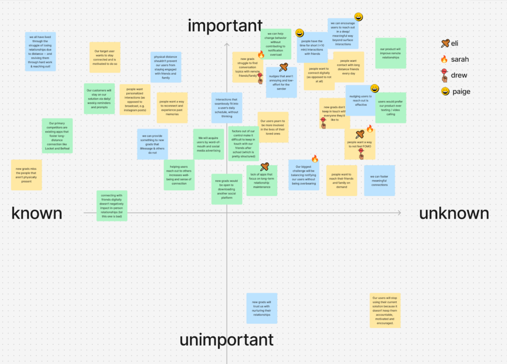
After placing our assumptions in the quadrants and reviewing them together, we had each team member to indicate their top three unknown but important assumptions. From this process, we identified the following four key assumptions to test.
- New grads want to avoid feeling FOMO (Fear of Missing Out).
-
-
- Test: Track whether deleting social media increases or decreases direct communication with friends.
- Rationale: Unlike nudging or prompting, this assumption tests how participants naturally adapt when a low-barrier engagement tool (social media) is removed.
- Key questions: Do participants compensate for missing social media with real-life or more meaningful interactions? Is FOMO truly a driver of social engagement, or do people find alternative digital distractions?
-
- New grads would reach out more to friends and family if they had conversation topics.
-
-
- Test: Providing structured conversation topics and observing whether participants engage more with friends.
- Rationale: We wonder if friction in social interaction is due to not knowing what to talk about, rather than a lack of motivation.
- Key questions: Do content-driven interventions perform better than pure external nudging alone? Do participants feel more confident initiating conversations when given a topic?
-
- Nudging users to reach out is effective.
- Test: Comparing the effectiveness of regular nudges (reminders) in increasing direct communication.
- Rationale: Unlike the first assumption (which tests types of nudges), this one tests whether nudges work at all.
- Key questions: Can reminders sustain behavior change over time? Do participants become more likely to initiate contact when prompted consistently?
- We can nudge users in subtle but meaningful ways.
-
- Test: We have two groups of participants. While group 1 receives more personal notifications, group 2 receives less personal, more direct notifications. Each participant in each group receives two daily texts – the morning text prompts them to reach out to family/friends, and the evening text reminds them to respond to any pending messages.
- Rationale: We wanted to test if outreach can be triggered externally.
- Key question: Which approach leads to higher engagement and sustained outreach?
Observations from our Assumption Tests
We conducted these assumption tests virtually with new grads or students that stated they struggled to keep in touch. We ended up reaching out to six different participants.
Assumption Test #1: New grads want to avoid feeling FOMO (Fear of Missing Out).
Context:
- Two new grads were recruited for this assumption test, both working full time.
- We got mixed outcomes, as new grads found workarounds to supplement their scrolling, and people found other ways to stay in touch.
- One participant did engage in more direct outreach – making plans for coffee after texting a friend, which aligns with our hypothesis.
- However, we found that participants didn’t proactively replace social media time with intentional communication.
- This raises the question of whether this behavior change would be truly sustainable over time. Would results look different over the course of a week or longer, rather than a couple days?
- This also suggests that more structured nudges might be necessary to encourage real change in reaching out to friends.
Images:
Participant 1:
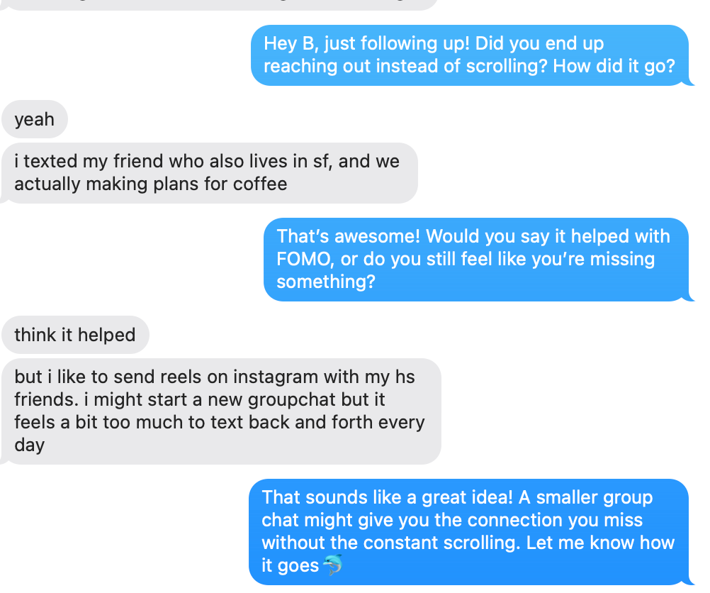
Participant 2:
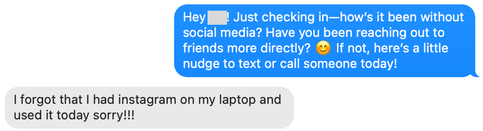

Learnings: One participant reached out more directly, but only for one-off interactions (e.g., making plans for coffee). The other participant substituted social media with alternative apps (e.g., Pinterest, Reddit) instead of increasing meaningful outreach.
Assumption Test #2: New grads would reach out more to friends and family if they had conversation topics.
Context:
- Four new graduates/graduate student participants were given a conversation topic to discuss with a specific friend of theirs.
- Topics ranged from the Super Bowl to an upcoming visit, and were methodically selected based on my knowledge of each participant’s interests and relationships.
- We then observed participant behavior, and whether or not they reached out after being given a concrete conversation topic
Images:

- Two new grads and two graduate students were recruited for this assumption test. Our project is centered around young adults adapting to new environments, and we wanted to have some combination of these two user groups.

Learnings: Having a concrete topic helped some participants initiate conversations, but they still require timely context cues to translate intention into action.
Assumption Test #3: Nudges are effective in facilitating conversation
Context:
- Four college students sent names of three friends they wanted to keep in touch with
- I pinged them over 24 hours, reminding them to reach out to specific friends
- At the end, I asked them who they actually reached out to

Learnings: Nudging increased outreach, but effectiveness depended on context.


Assumption Test 4: Nudging users in subtle but meaningful ways
- Two groups. Group 1 receives more intrusive, less personal notification to reach out to loved ones. Test group 2 receives less intrusive, more personal notifications alerting the user to reach out to loved ones.
- I chose to send notifications to people I had mutual friends with so I could know how frequently they were reaching out to our mutual friend and so I could confirm if they reached out or not (by asking the mutual friend).
- Send each participant in each group 2 texts a day, one in the morning prompting them to reach out to family/friends, one at night reminding them to respond to any received texts from family/friends.
- Group 1 texts:
- “Hey! Make sure to call [insert mutual friend] at some point today! It’s been a while!”
- “You should probably respond to [insert mutual friend]’s texts! Don’t ghost them!”
- Group 2 texts:
- “Hey [participant name]! When’s the last time you spoke to [mutual friend]? It could be worth checking in!”
- [participant name]! Before bed is always a good time to respond to any unread messages. It always feels nice to keep the conversation going and let them know how you’re doing!”
Images:


Learnings: The tone and delivery of a nudge matter.
Insights from our Assumption Tests
Our assumptions tests provided valuable insights for designing an effective intervention:
- Removing social media alone isn’t enough: People need visible, ongoing social presence to feel connected and motivated to reach out. Users sought alternative channels (which may not always lead to fulfilling or meaningful interaction). How might we create a system that naturally encourages intentional engagement and keeps relationships top of mind?
- People may want to engage but lack the right cues: Conversation prompts may help with this issue but are not a silver bullet. They also tend to work best when timed with timely contextual nudges rather than just a simple nudge.
- Striking a balance between reflection and intentional nudging is key: Even the act of being more aware of who to reach out to can be encouraging and effective. However, overuse of nudging can lead to notification fatigue, making them less effective over time.
- Direct nudges can be effective but must feel natural and unobtrusive: People respond best when the cues feel personally relevant and emotionally engaging rather than generic.
Takeaways from our Assumption Tests
We ultimately found that sustainable long-term behavior may in fact require a combination of nudges. While nudges can spark outreach, maintaining long-term change requires a combination of strategies:
- Contextual awareness prompts to keep relationships visible without being intrusive
- Periodic personalized nudges to encourage sustainable habit-building without overwhelming users
- Opportunities for reflection, allowing users to track and monitor their engagement over time (whether that’s leveling up or customizing their display)
Given these insights, we believe an ambient display can reduce FOMO and combine the best elements of all of these nudging techniques.
Intervention Study
🗺️Overview
We recruited seven participants for our four day intervention study that centered around encouraging users to maintain physically-distanced social relationships through avatars and an ambient display. At the start of the study, we sent the following information to our participants:
Thank you for your interest in participating in this study. Below, you will find all the necessary information about the purpose of this study, how to participate, and what will be expected of you throughout the week.
Purpose:
This study aims to understand how students and new grads stay connected with loved ones who are not physically present. Specifically, we are interested in the tools, frequency, challenges, and emotional experiences involved in maintaining long-distance relationships. Your input will help us gather valuable insights to improve tools and strategies for fostering meaningful connections.
Specifically, we will be asking you for a group of three friends or family members that are physically distant from you that you wish to communicate more with. When selecting this group of three, please try to select:
- One person you’re already in regular contact with (contact almost every day)
- One person with whom you interact with semi-regularly (about once a week)
- One person who you are rarely in contact with but would like to get closer to
For four days (i.e. the duration of your study) your study coordinator will send you a picture of a cartoon fish bowl with fish that represents your “social ecosystem.” This fish bowl will contain one fish for each of your three friends, as well as an additional fish that represents you. Based on the quality of your communication and the frequency with which you reach out, the fish bowl (and the fish inside the bowl, including your own) will either thrive or languish.
We will be sending you a picture of your custom ecosystem 1-3 times a day, based on your communication with your “ecosystem.”
Participation Guidelines:
Daily Diary Entries: For each of 4 consecutive days, record the following using the google sheet your study coordinator gave you:
- At the end of each day, log any text, call, or facetime communication
- Log the emotion you felt before seeing the ecosystem
- Log the emotion after you saw the ecosystem
- Each entry should only take between 2-5 minutes to complete
Expectations:
Respond to each of the aforementioned questions each of the four days, sending an update to your interviewer at the end of the day. Your interviewer will send you updates of your virtual ecosystem throughout the day.
🐟 Results
Our intervention study was partially successful, as five of our seven participants had an entirely healthy tank at the end of the four-day study period. For these participants, providing a visual of the fish’s status was able to successfully facilitate conversations, as all five participants sought out interactions soon after seeing the unhealthy status of their fish.
Below you can find insights for each particular type of relationship we encouraged participants to maintain:
Category A Relationships (contact almost every day)
- Only one of our participants struggled to maintain these types of relationships, with six of the seven total participants successfully reaching out for each day of the study.
Category B Relationships (weekly contact)
- Five participants reached out multiple times, one participant reached out only once, and one did not reach out at all
Category C Relationships (rare contact)
- Participants tended to view this group as their lowest priority. Of our seven participants, only five reached out to this type of recipient. The total number of interactions across all our participants is depicted below.
After analyzing our key insights, we will consider modifying our solution design to treat relationships of different categories differently. For example, users might need more intentional nudges to nurture Category C relationships than they would for Category A relationships.
Below are some example photos we would send to participants to give them updates on their fish’s health status. Each fish with an “X” for an eye represents a relationship that has not been sufficiently attended to, and should prompt the participant to reach out to the corresponding person.

Users expressed a liking for these fish images, with some explicitly saying that they believe an ambient display would serve as a useful reminder to contact their friends in the future. 

🐟 Learnings & Insights from our Intervention Study
In post-study interviews, participants expressed confusion regarding which fish corresponds to which of their relationships. We mainly wanted to determine whether or not users care about maintaining their collective fish bowl. However, we know from Fogg’s behavior model, a lack of clarity reduces users’ ability to act on a cue. As a result, in the future we will make sure to clearly label which fish corresponds to which person. On the topic of mapping fish to people, only one of our seven participants expressed a strong desire to customize the visual appearance of their fish, supporting our decision to leave fish and bowl customization out of the MVP.
Participants also expressed an interest in automatically syncing one’s texts and calls with our application, so they do not have to manually update their fish status. We will look to implement this functionality in future versions, but Apple’s privacy policies prevent an easy extraction of text and call histories. For now, we will allow users to manually log interactions, and provide easy links to iPhone’s Messages and Phone apps, to minimize the friction associated with reaching out to people.
Two participants also expressed frustration related to the means through which they received updates on their fish bowls. For example, one recent graduate was not able to reach out to friends and update their fish when they received updates during the work day. By the time the work day had concluded, this participant had forgotten about the waning health of the particular fish.
To round up more of our insights, we found that visual cues are highly motivating. Seeing a fish with an “X” for eyes (indicating neglected relationships) prompted three participants to reach out almost immediately. We wonder if we could make this display playful yet engaging – which fed into our moodboard. This was also something that came up in our discussions around ethical concerns, as we would not want to trigger our users with graphic content. One user suggested simply changing the facial expressions of the fish; rather than representing unhealthy fish with an “X” for eyes, we could simply incorporate health bars.
🐟 Changes to our Solution Design
Based on the feedback we received, we remain confident in our MVP’s focus on core features:
- Registration/login: removing friction at onboarding
- Creating/assigning fish to bowls: enabling quick setup of valuable relationships
- Updating fish health status: allowing immediate feedback on relationship “health”
Fish customization, while nice, is not critical to our initial launch at this time. In addition, we plan to add clear, visual labels for each fish so participants can see at a glance which relationship is “suffering.”
Rather than relying on frequent push notifications, we hope that our widget can work itself more naturally to a user’s virtual environment – i.e. Apple widgets – so users can get timely notifications at a glance right from their home or lock screen. We hope this nudges users more effectively than one-time, generic reminders, which we also found in our assumption tests. This intervention study affirmed that participants respond better to personalized, unobtrusive nudges.
We aim to explore third-party or OS integration that can track calls/texts or can connect to social media apps. We hope by adding this automatic integration while remaining mindful of privacy concerns so that we can reduce the friction for users instead of individually logging who they’re reaching out to.
In future updates, we hope to integrate fish personalization and more empathetic, content-aware messaging. This also ties into the fact that different relationship categories may require different strategies. We saw in our intervention study Contact C (rare contact) may require stronger or more frequent reminders to spur genuine connection. We plan to experiment with our degradation rates or the visuals for rarer contacts so they stand out more, aligning with the insight of relationships that need extra encouragement.
By focusing on a multifaceted system of ambient displays, meaningful visual prompts, and minimal friction, we aim to effectively promote more consistent outreach for participants’ important but distanced relationships. Our intervention study validated our initial assumptions and showed us that engaging visualizations can indeed inspire action, yet sustaining these behaviors requires thoughtful timing, clear labeling, and personalization. We will continue iterating to balance helpful nudges against user fatigue, prioritizing clarity, empathy, and convenience in future updates.
System Paths


Process:
To create our system paths, we thought about the ways users might enter the app and what goals they would try to achieve. We have been working with two personas, but we hypothesized that they would act similarly within our system. Therefore, their paths are relatively similar.
Key Insights:
- Users will enter the system after seeing fish that need attention in the widget or to update a fish status
- Users remain in the system to view statistics about their fish or to continue updating the status
- We can keep users coming back to the system by keeping the widget up-to-date and making sure our nudges our strong enough for users to reach out to their friends
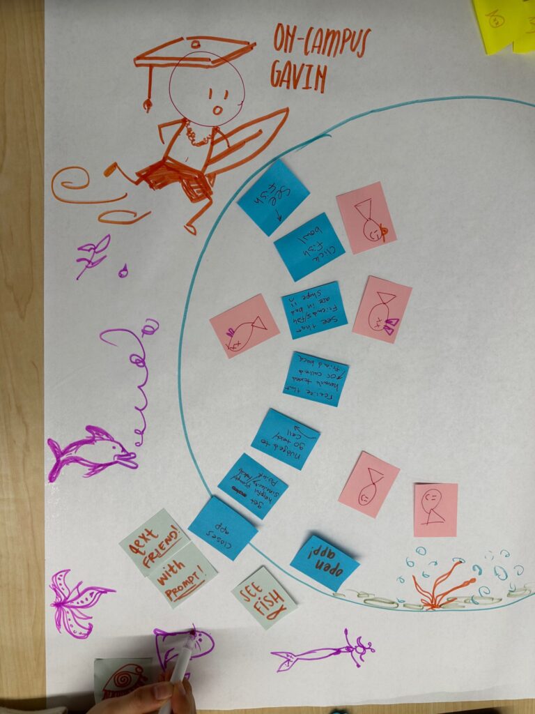
Story Maps
After reflecting on the key insights from our system paths, a few things became clear. While we initially thought we had two main personas (current students, like On-Campus Gavin, and new grads, like Corporate Cole), it seemed that our app would be conducive to one, all encompassing persona: a motivated user who wants to be better connected. This is because our app’s main system is passive. So no matter the type of user, the system always operates and responds in the same way. Similarly, our app accomplishes its goal if we can encourage our users to reach out outside of our solution, so while interactions outside the system may differ, everything within our environment is the same, regardless of the user. Now that it was clear we had one main persona, we needed a way to formalize our solution and ensure that we were covering all the goals that we want our persona to be able to accomplish. Story mapping forced us to view our solution from a different perspective; it became clear how the different components of the app came together as a whole to support the user in improving their distanced connections. There are several critical moments that stood out to us. First, signing up for the app is a task that all users must complete initially. Once signed in, users can receive notifications/act on the passive widget, create fish bowls, and reflect on their connections.
Activities and Steps Overview:
- Sign up
- Steps: Registration, Connect platforms to the app
- Function: This ensures that users can enter the app smoothly. Our registration process includes basic details like name and contacts, authentication, and syncing other apps (like iMessage) for improved app ability.
- Create fish bowls/Updating fish status
- Steps: Selects contacts for a bowl, add fish to a bowl, select fish in a bowl, toggle frequency expectations
- Function: Our solution has users organize their relationships into groups (fish bowls), providing a palpable visual representation of their relationship health. The fish status (i.e. that relationship’s status) is represented visually through the fish’s health. The stronger a user’s connection is, the healthier the fish.
- Notice passive display/widget
- Steps: Text/call a friend
- Function: users can choose to set one bowl as their homescreen widget, providing passive nudges through the fish health status. Through the app, users can be sent directly to call or text to reach out to a contact. Our goal is to provide seamless integration with a user’s natural communication ecosystem, making the process of reaching out seamless.
- Reflect on connections
- Steps: Update fish status by selecting a fish within a certain bowl
- Function: Our solution offers not only means of communication, but also opportunities for users to reflect on their connections, chart goals, and log progress over time. This will offer another way for users to visualize growth over time and be more encouraged to reach out to others.
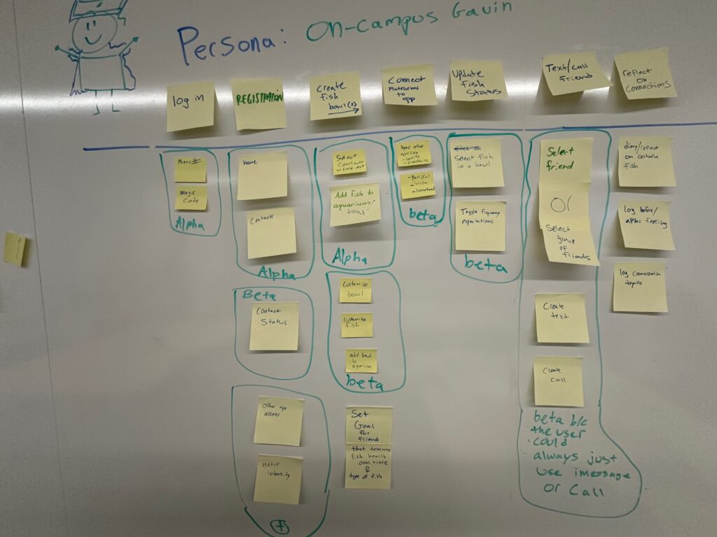
After reflecting on our app, it’s key features, and the insights from our story map, we finalized a list of alpha (MVP), beta, and beta+ features.
Alpha, Beta, Beta+ Justification:
Alpha (MVP):
- Features: Registration/login/sign out, create new fish, create new fish bowl, and updating fish status
- Justification: These are essential to the core functionality of our app. These features ensure that users can start using our app, organize basic connections, and leave our app.
Beta:
- Features: syncing 3rd party apps, contact statuses, fish customization and texting/calling from our app
- Justification: These features enhance the experience of the app mostly through personalization. None of these aspects would be required for a MVP, although they would truly enhance the user experience and make the app more welcoming and user-specific
Beta+:
- Features: notification settings, bowl customization
- Justification: These features add personalization through purely aesthetic changes to the UI, as well as providing different notification preferences.
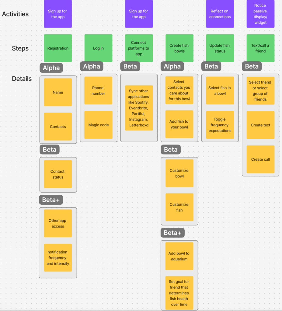
MVP Features
Below are the features that are needed for our minimum viable product, divided into task groups:
Registration / Login / Sign out:
- Enter name and phone number
- Send magic code for phone number verification
- Login with phone number with magic code verification
- Session management after initial login
- Sign out in settings
- Delete account functionality
Create new fish
- Select specific contacts from imported list
- Create default fish designs
- Assign fish to a certain fish bowl upon creation
- Select desired frequency of interactions
- Store contact information and desired frequency of interactions for each fish in database
Create new fish bowl
- Select fish that have been created from contacts
- Add certain fish to bowl
- Create default fish bowl designs
- Store fish bowl name and fish assigned in database
Updating fish status
- Select a certain fish
- Update date of last contact
- Store changes in backend
- Update UI to reflect new fish health status
Creating widget
- Create walkthrough / tutorial on creating an iPhone widget
- Link widget with fish health stored in database
There are a variety of additional features that we plan on adding in later iterations of the app. These include:
- Customizing fish UI
- Customizing fish bowl UI
- Assigning fish bowls to aquariums, which consist of several fish bowls
- Enabling calling and texting through our platform, rather than requiring users to leave the app to do so
- Allowing for widget addition on Android
- Connect platform with other apps like Spotify, Partiful, Letterboxd, and Instagram to create fish bowls based on other apps
- Calendar view that shows fish bowl progress over time using color
While these features will certainly enhance our product, they are not absolutely necessary to achieve the app’s core goal, and can be implemented in later versions.
Bubble Maps


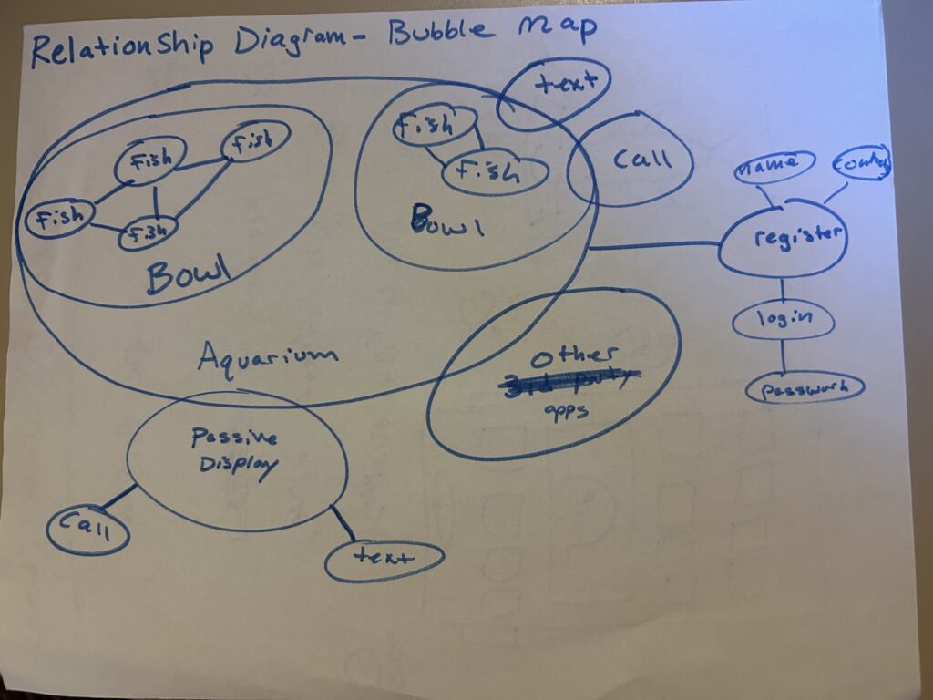
Process of Creating our Bubble Maps
We began the bubble maps with a team brainstorm by listing out our main features as shown above and visually grouping them in bubbles. Next, we connected these bubbles to show how each element in our system relates to each other. For example, fish are grouped in bowls , which in turn belong in an aquarium.
After generating our bubble maps together as a team, we were able to better understand how certain features flow into others. For example, our initial most important priority related to generating a fish for each user, and considered bowls to be a lower priority, but still an MVP-relevant feature. However, our bubble diagrams reminded us that every user interaction with a fish must stem from whichever bowl the fish resides in. We also considered adding aquariums, which contain multiple fish bowls, to our MVP. Our bubble maps suggest that a user must be in an aquarium in order to navigate to a certain fish bowl. Our team decided to take a slightly different approach, choosing to create a simple swipe view of all the fish bowls in a certain user’s ecosystem, rather than a more elaborate aquarium view. Following the release of our MVP, we will revisit the addition of aquariums into our platform.
Key Insights From our Bubble Maps
-
- Keep Settings separate: Our bubble maps also suggest that the account information flows (login, registration, updating settings) can be entirely separate from our core flows related to creating fish bowls and updating fish health statuses. To respect this separation, we will ensure that our settings tab so they don’t clutter any core functionality, such as checking the status of a certain fish or updating contact frequency.
- Limit information overlap between widget and main app: Our bubble maps also help highlight the relationship between our application and the ambient display we have on a widget. While not perfectly captured in the bubble maps, the main idea of having a small overlap between our two main app components is still prevalent. Showcasing this overlap in our map serves as a reminder to include some, but not all data in both components of our platform, ensuring that we are meticulously selecting which information we want to display in the widget. With this insight in mind, when we move forward with implementing our intervention we will try to minimize the amount of information we include in the widget. Doing so will increase the likelihood that the user does not get overwhelmed by our ambient display, as well as nudge them to actually open up the app to learn more about their fish health.
- Prioritizing MVP vs. future features: The bubble maps helped us spot which components are essential for the initial release (e.g., fish creation and bowl setup) versus which features could wait, like the aquarium.
Why these Maps Matter
By seeing possible points of friction (like having to navigate an aquarium before finding a fish), we could simplify our MVP. Completing these maps also gave us some additional context to keep in mind when constructing our assumption map, and later carrying out our assumption tests.


