
Wire flows: These wire flows outline key interactions within our app to help users meet their reading goals.
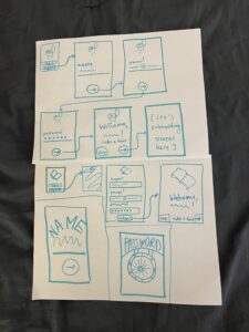
Wire flow 1: Sign up/Log in

Justification: We want to implement as simple and intuitive as a flow as possible so there are no extraneous screens or buttons that might confuse a user. This entails a page for registration, a log in page, and a mechanism for checking whether the log in is correct. If so, the flow continues to the homescreen, if not, an error message will occur.
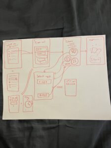
Wire flow 2: Progress

Justification: There are two main features to be outline here. One is an overall progress display that will likely take the form of a graph but with some customizable features so that users can control how they view and interpret their own reading progress over time. We also included a feature that is inspired by “spotify wrapped” in that, if users want, they can view their reading statistics for the last month. Once they choose to do so, they will click or swipe through the following screens until the recap is complete.
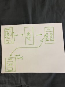
Wire flow 3: App Switch

Justification: It is important to note that the first screen in this wire flow represents a user on another app. At some point, the user will enter a cycle triggered by our app. Our app time’s a user when they are using some social media platform or app and will alert them when they have spent too much time on the app when such time could have been spent reading. Once this timer goes off and alert is viewed, the reader is compelled to set their phone down and read. If they choose to ignore this and switch back to their original social media/entertainment app, our app will continue to set off its timer and alarm so that is impossible for a user to peruse social media without interruption. When the timer goes off and the user is taken back to our app, they can choose from a customizable list of reading applications to switch to (i.e. NYT, the New Yorker) or they can opt to press a button that indicates some non-digital form of reading. After a set number of minutes has past (as set by the user), they may return to using social media if they so choose.
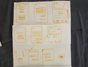
Sketchy Screens + Critiques
Ingrid:

Aggregated Critiques:
- Unclear what ? button indicates or where it leads
- Is the pie chart the most interesting visual element to have on the display screen
- Is this like a year end/month end wrap? Do people want to have to tap through that many screens?
- Is the first screen the home screen?
- Assuming the long screen is a scrolling one but no scroll bar used to indicate this
Suggested Changes:
- Fewer tap throughs on the “wrapped” section
- Come up with a screen following a tap of the ? button and ensure that this is the best indicator of the page that will follow it → will likely have to iterate on more intuitive button schemes
- We really like the use of white space and will try to adhere to this in our aesthetic design (because white space tends not to distract and ultimately we don’t want our app to be a distraction from reading!)
Andreea:
Aggregated Critiques:
- Everyone prefers the more streamlined experience of having “name”, “email”, and “password” on the same page so there is less resistance to registering
- We like the “take a tour” button to efficiently lay out all the features of the app at the outset
- There is no back button to navigate back
Suggested Changes:
- Use the design with all inputs on the same page because, once users start clicking through separate pages, they don’t know how many inputs they have left to fill and can feel annoyed (unless there’s a status indicator). This may lead them to abandon registration
- Add a back button to the screen to allow users more control
Jen:
Aggregated Critiques:
- The arrows are a bit chaotic and confusing (difficult to follow the path) but that is likely inherent when drawing the “app switcher” methodology of our app
- Unclear what the user is clicking in the first screen
- We like the simplicity of the buttons as circles with nested icons inside
- A curiosity: where would the timer be displayed within the app? The homescreen? Would there be an icon in the toolbar of the home screen to navigate to it?
Suggested Changes:
- We will need to decide whether we want the timer to land on the homescreen (leaning towards this as it is less distracting that having a progress tracker on the homescreen) or having the home screen open up with the progress tracker
- Add back buttons
- Clarify where we navigate from to get here → will likely be from the settings/preferences page
- Keep the simple layout that takes advantage of the whitespace
Riley:
Aggregated Critiques:
- Will the “Time’s Up!” screen navigate to the following one on its own (i.e. after 5 seconds) or should we add a button so that the user can navigate to the next screen
- How will we customize what reading “media” we can display here? In settings/preferences likely
- Love the simple design/layout
- Very intuitive
Suggested Changes:
- We will likely include a button on the middle screen of the top row to allow users more control of their actions (which will work to minimize friction)
- Will add scroll feature to the Your Media page
- Add navigation bar to the Your Media page
Izzy:
Aggregated Critiques:
- Unclear what the box with a plus sign button indicates on the home page
- Nice, clear navigation bar but what is the button on the right? A settings button?
- What are the bullet points meant to indicate on the home screen? Are users allowed to have the capacity to journal? What would a user choose or want to put here
- Unclear what the logo is or why there is both a book and a pair of eyes
- We like the use of white space
Suggested Changes:
- Remember to include the forgot password button
- The check your email screen seems unnecessary (or at least we should add an exit button or go back home button to give users control)


