
CS 247B: Design for Behavior Change
Team 15: Mindful Movements
Amantina Rossi, Uma Phatak, Nadia Wan Rosli, Melody Fuentes, Rui Ying
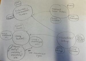
System Paths
We thought of the different paths/flows our persona would take during the use of our app and sketched a simple version of the system paths for it, showing the enter and exit nodes as well as important steps between them. The entry points are getting reminder notifications or opening the app directly; the exits are when the user finishes mindful movements.

 The longer path (choosing mindful movements, starting timers, celebrating and reflecting) demonstrates the essential flow of our intervention idea and will be prioritized and emphasized in our wireflow designs. The shorter paths (responding to or dismissing notifications) are of lower importance and will be added to the wireflows afterwards as supplements.
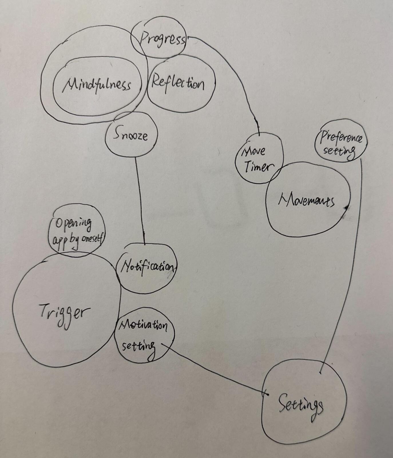
Bubble Maps
The bubble maps that we worked on in class were created to help visualize the different screens that would be important parts of the app and how those parts would interact with each other. Although some of us had different interpretations of how the app could be laid out and how to visualize the components on the bubble map, there were several similarities that later influenced our story maps and final wireflows. For example, the larger bubbles emphasized the more important screens, such as the Home screen, Movement screen, Settings screen, and Confirmation screen. These larger bubbles are connected in similar ways to demonstrate potential flows. For example, the movement screen takes you to a confirmation screen. The smaller bubbles represent more detailed actions the users can take on the screens and these bubbles differed slightly, but we ultimately agreed on what those actions would be and are shown in our wireframes.


Wireflows
Onboarding
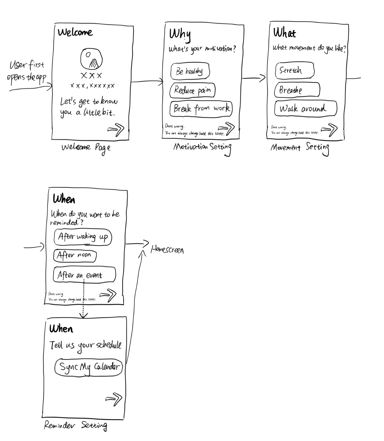 As an app that advocates mindfulness, we don’t want to overwhelm users with too many decisions. We ask the most important questions essential to the app’s functionalities by providing presets of answers to choose from; users can always go to a dedicated settings page to customize their preferences at length. The motivation setting is relevant to the affirmation language we want to use; the movement setting decides what movement will be recommended in a reminder; the reminder setting controls when the app will typically send the movement reminders.
Home Screen
 This wireflow shows the home screen flow. It ended up being only one screen that led into many other flows, but was still a very important screen to model out separately, because it made us think: what is the core functionality of this app, and how should it be modeled?
From our MVP, we knew that we wanted the ability to start/log a new movement on this screen. We also extended other insights to add some affirming language. Like the onboarding flow, we did not want to overwhelm users, so we kept it very simple.
This screen went through many iterations – the final home screen included in our cohesive wireflow has changed buttons and is more minimal. We ultimately decided against a Nav Bar to align with our MVP.
Settings


In this version of the Settings wireflow, we thought about which parts of the app the user would need the ability to change. We include a Settings screen in case users’ preferences regarding their scheduled reminders change. Here it is broken up into Schedule, Notifications, Goals/Diary, and Account/Data.
The Schedule section is so users can view and edit their schedule of events and reminders. They can either sync or manually enter their calendar of events. We define events as anything in their schedule that is not a mindful movement reminder. They would also be able to view, edit, and add/remove scheduled reminders. Here their calendar of events and reminders is editable and able to be viewed in different formats.
The Notifications section also allows users to view and edit their scheduled reminders. It would allow users to either view an editable list of upcoming reminders without having to also see their other events, or bring users to the calendar page that is also seen in the Schedule section. The Notifications section also allows users to customize the sound properties of their reminders, like ringtone, volume, or vibration.
The Goals/Diary section is where the users would list their goals for using the app and be able to log other diary entries related to their motivation. The reason we might want this is so users can remind themselves and reinforce why they are using this app and what they hope to get out of building better mindful movement habits.
The Account/Data section is where the user’s data is stored. Our current imagining of this app does not require user registration and simply does local storage. The reason is we want to minimize data collection and inspire more trust, since our ultimate goal is to help people improve their wellbeing. In order to maintain users’ privacy, the user can clear their data from the app. This section is also where users can transfer their data to a new device.
However, for our MVP, we remove most of these features in order to focus on the core functions that are most important with regards to reminder preferences. For more information, see the Cohesive Wireflow section.
Completing a Movement

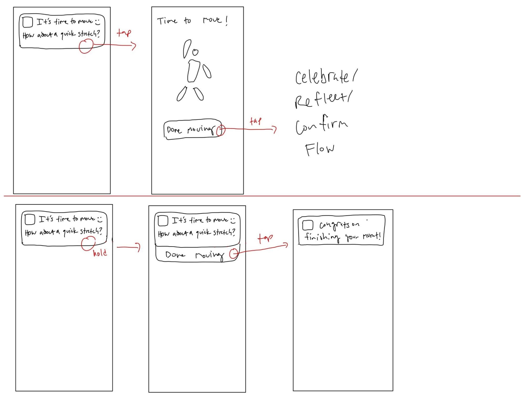
Completing a movement should be a very simple flow that the user can decide to what extent they engage in on our app. They can either enter the app by tapping the movement push notification to then do the movement, mark it as done, then get taken into the celebration and confirmation flow. Otherwise they can hold down on the notification and press done from there, then get another celebration notification, all without having to enter the app. This will be useful for users who don’t want to spend too much time on the app and mostly want to just be reminded when to have a mindful movement. By keeping it simple, we are really focusing on the most critical aspect of our intervention which is the smart movement reminders.
Celebration/Reflection

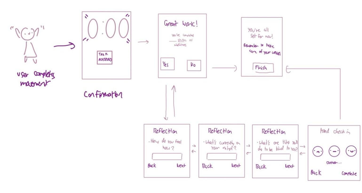
This wireflow arrives after the user completes a movement. Although not a part of our MVP, we’re interested in including a “timer” space to guide the user through the time it would take to complete the movement. Once the movement is confirmed to be completed, they would be led to a celebration page, where the tone would be very encouraging and affirming. Although also not a part of our MVP, we were interested in exploring a reflection section after each movement. So, the user could choose to either end their session, or to take a few extra seconds to reflect on what they completed. If they click “no”, they’re directed to the completion page. If they click yes, they’re given three short prompts to reflect on, along with a quick mood check in. Once done with the reflection, they’re directed to the completion page as well.
Without the additional features we would be interested in applying, the MVP for this section would just be the celebratory slide (second box), with the affirming message, the stats of the day, and a “finish” button that would take the user back to the home screen, all in just one page. We decided that the timer and the reflection are not a part of our MVP because these are assumptions that need to be tested before implemented to see their effect on the cultivation of the habit, and really all we need for the bare-bones concept of a post-movement interaction would be the aforementioned single page (seen in our final, combined wireflow).
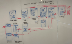
Cohesive Wireflow

 Our finalized MVP from 6B. The top line is the categories line, and the second line is the MVP line.
Our individual wireflows connect as follows:
Onboarding Flow -> Home Screen “Flow” -> 2 options:
- Complete a Movement Flow -> Celebration/Reflection Flow
- Edit Settings Flow (which leads back into Onboarding Screens.)
This is shown all together in the cohesive wireflow below:
 Cohesive wireflow.
After synthesis, our main design decisions were 1) cutting out screens, text, or buttons in order to align the wireflow’s functionality with that of the MVP, and 2) cutting out screens in order to rely more heavily on the Wizard of Oz aspect of this type of prototype.
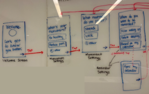
- The onboarding flow stayed mostly the same, with just the addition for people to add their own input for many questions with the “other” field.
The home screen was simplified, since we decided that the ability to log one’s movement was not part of our MVP, and some of the original icons and text were superfluous.
The completing a movement flow was kept the same.
The celebration / reflection flow was simplified, as we decided in our MVP that we would not include statistics, progress, or mood check-ins. We would want to do assumption tests on these aspects to justify including them in a prototype. So, we made this flow just one screen with affirmation and a prompt for reflection that does not require any user input. We also included the number of movements people did on that day on this screen, which would also need to be tested with an assumption test.
The edit settings flow was majorly revamped, in order to refocus on our actual intervention idea – more on this below, in the Wizard of Oz explanation.
- In the edit settings flow, we cut out most of the screens to align this flow with the initial onboarding flow, which was very simple and clean. It did not include goals/diary or account data so we removed those sections. And we decided that we do not need the user to be able to see and edit their actual calendar or a list of upcoming reminders in our app. We refocused on our initial intervention idea – using “smart reminders” to change people’s movement habits – and decided that the functionality on when reminders would be scheduled using calendar data would be abstracted away in our prototypes, meaning in most cases the app would automatically be able to tell when the user needs to be reminded based on their answers in the onboarding screens. A possible explanation for how this would be possible could be syncing with other apps, like calendar and sleeping apps, to track the user’s activity throughout the day. The important part of our prototype is how users can interact with our notifications in a way that makes them more active, so we focus on what would make our solution easy to use.
These specific design decisions can be seen in the zoomed-in images below:
 Zoom in on onboarding screens.
 Zoom in on the home screen and edit settings screen.
 Zoom-in on onboarding -> home screen -> edit settings flow (top set of images).
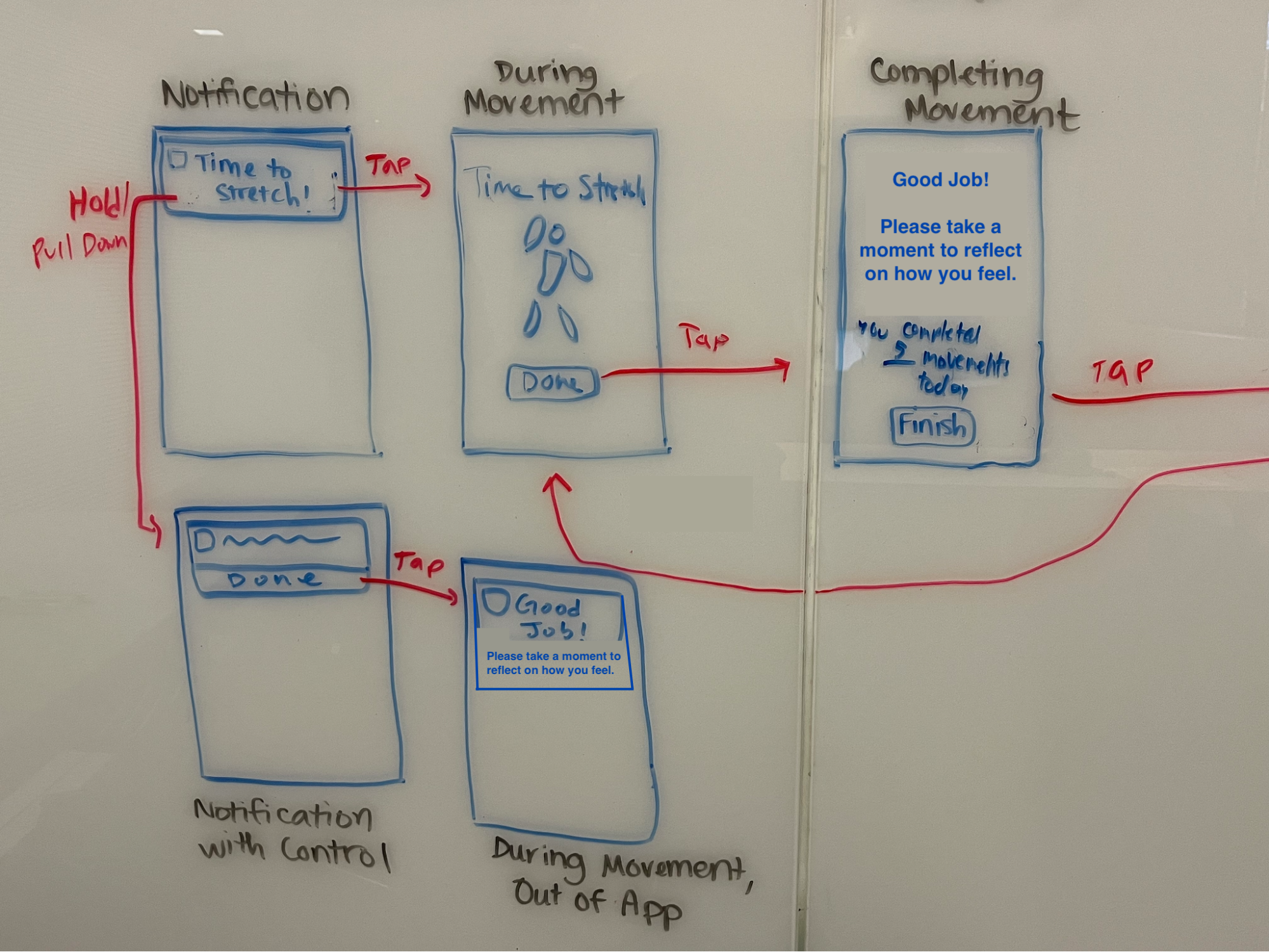
 Zoom in on completing movement flow -> celebration / reflection flow. The top flow is for when users want to enter the app, while going to the bottom flow is for only going through the push notification in order to complete the rest of the flow.


