
CS 247B: Design for Behavior Change
Team 15: Mindful Movements
Amantina Rossi, Uma Phatak, Nadia Wan Rosli, Melody Fuentes, Rui Ying
Mood Boards
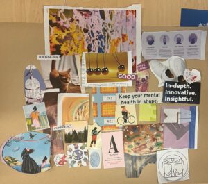
We cut pictures and words out of magazines and put them together to express the moods the users would feel from our product.
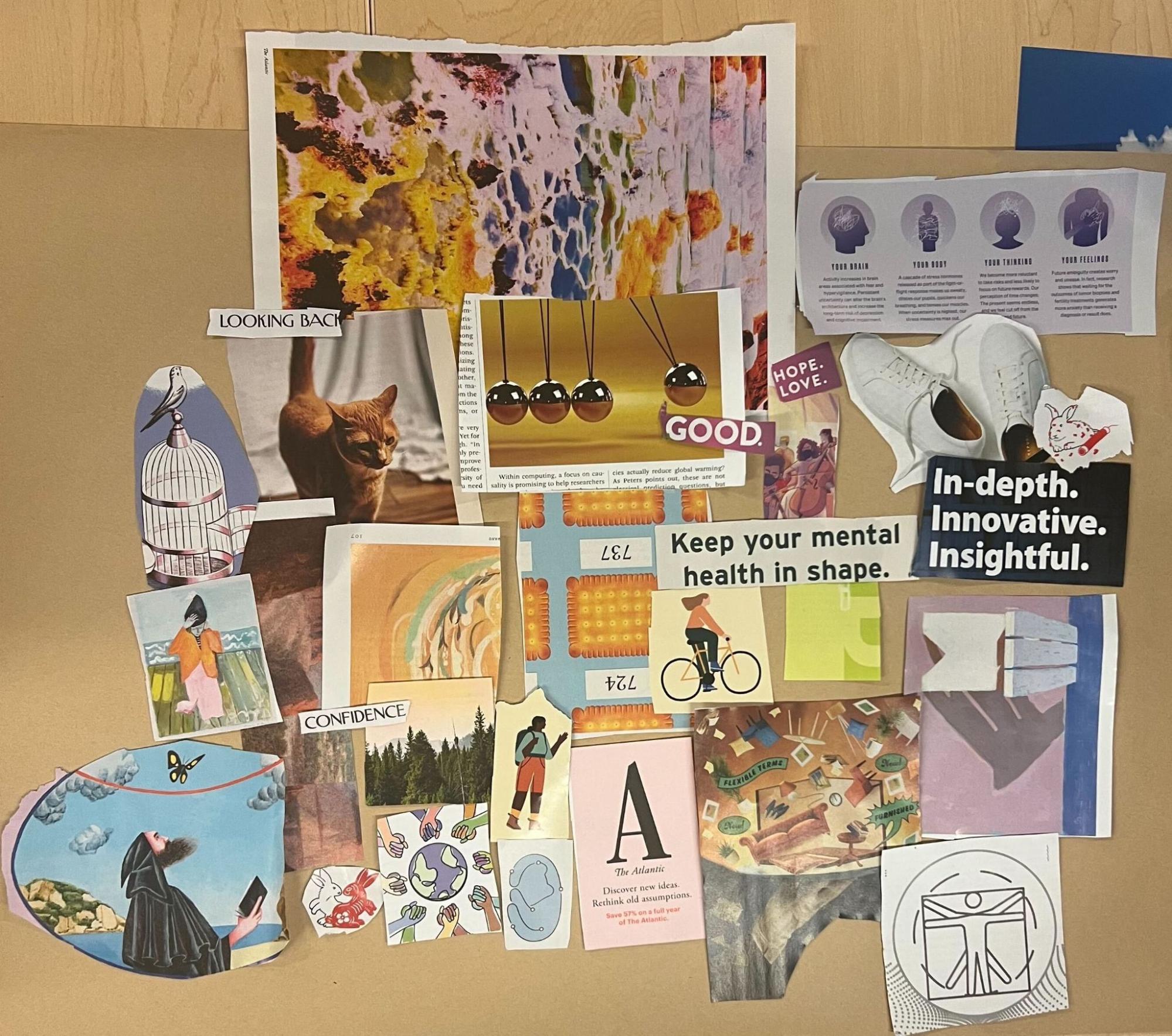
Rui
I emphasized more on the experience of our brand: move and stay active after some work to feel beautiful inside and light and free outside. I also used some brain and body images to showcase the connection and coordination between mind and body. The “Innovative” and “Insightful” words signify the high-tech/intelligent presence of our brand.
Pros: Many images related to mind and body.
Cons: Lack of expressions on colors.
Amantina

I tried to capture the colors and feelings that I envisioned our app embodying: warmth, personability, and positivity. I included colors that were warm and energized but still comforting and supportive in a way. I also included affirming and mindful phrases like “Hope. Love”, “Confidence”, “Good.”, and “Looking Back”. I also included images that portrayed movement like biking, hiking, and a “cat stretch”.
Pros: Very cohesive vibe, words and images and colors.
Cons: Less explicit images of movement than others.
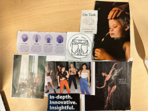
Uma

I included images that captured the vibe of our brand: enjoyable and intentional activity, calm and natural spaces that might spur movement, and the idea of building daily movement as a cause and effect, cumulative process (via the pendulum, which I really liked). I did not think to include any words, but loved the ones that did!
Pros: Lots of relevant pictures.
Cons: No cohesive vibe.
Nadia

My mood board is focused more on discovering potential colors and feelings, rather than text and imagery that describes the function of the app. This is because I felt that the former is a bigger challenge, so given the amount of time we had in class, I wanted to fully explore that aspect of our brand. I started off with blues and greens because those were the first colors I associated with mindfulness, then I decided to break out of that mentality by adding in other more fun colors to give more energy (that were still more desaturated, so as to not be too vivid or jarring). I tried to go for joyful but chill vibes, to make the app a pleasure to experience without being overstimulating. I was thinking our brand could be relaxed and friendly without being too demanding. Because our main feature is reminders, which I often associate negatively with alarms, I was hoping this mood board would communicate our app to be seen as a helpful tool or companion that people would be happy to use, not something to dread.
Pros: Sense of cohesion & aesthetic despite many colors.
Cons: Probably too many colors, no relevant text or imagery.
Melody


When I first started gathering images for my vision board, instinctively my mind pictures greens and blues for the color palette, because these are the colors most associated with calm and peace. But as I continued, I started to focus more on the content of the images rather than the color palette. I tried to find images that embodied what I imagined our app to be like, invoking feelings of balance, connection, and a type of liberation, like the feeling of letting go of a breath you hadn’t realized you’d been holding, all while trying to stay within the green/blue color palette. I appreciated the human-centric images to visualize the app, especially those involving connection and activity, along with words that had to do with cultivating positive emotions and mental health.
Though, as I look at the mood board, I realize that this is not quite the right fit for the app I envision. I thought that it looked a little too..cold for what I see as a warm and friendly motivator, which was great to catch sooner rather than later. I love the pastels in the bottom right corner, and so in later color iterations will look into more pastel, warm hues.
Pros: Lots of metaphorical images, images involving connection and activity, relevant words, interesting visuals.
Cons: At some points colors lack cohesion, some images may seem like they lack relevance, looks a little too chaotic for a mindfulness app.
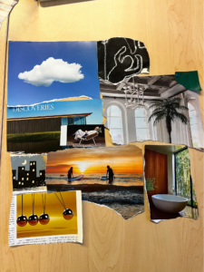
Final Mood Board
For our synthesized mood board, we decided to include 1) images that fit our desired color scheme (muted, energetic colors like light orange, light blue, light pink / purple, and beige), 2) images that have depictions of action (shoes, body, cat), and 3) words that captured the vibe of our brand.
We thus cut out images that had more ambiguous representations of movement, or had incongruous colors. We like that this moodboard is very pretty and uplifting to look at, as opposed to just calm and reflective. Since our app focuses on mindful movements, we think this is an important distinction to capture.
Style Tiles
We then designed the style guides/tiles we intend for our app, based on the overall vibe from the mood boards.
Rui

Based on our combined mood board, the main theme color is yellow/orange. I chose the color mixed with orange and brown as the primary color to provide the feeling of warmth; the similarity to wood in color is also very inviting and welcoming. I chose green as the tertiary color to contrast with the primary color, which displays renewal and freshness, symbolizing the form of a new habit.
I prefer to use system default fonts for our app, such as Roboto on Android (or San Francisco on iOS), to provide a clean and simple interface without overwhelming users with styling, which I believe is consistent with the mindfulness goal we are trying to achieve.
Amantina

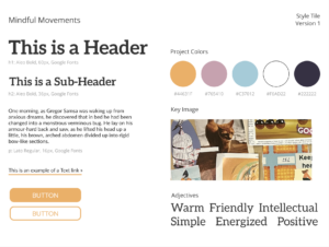
For my iteration of the style tile, I focused in on the muted, yet still colorful and energetic orange, pink, and blue that I saw represented in our final mood board. I went with a serif header font called Aleo and a simpler sans serif font called Lato for the body. I think this mix of serif and sans serif combines intellect and simplicity and both are very easy to read. I used the words warm, friendly, energized, and positive to describe our app and that is reflected in the brightness of the colors, especially the orange. I found that blue and the white and rich black reflect the words intellectual and simple. I think the combined style tile creates an inviting app environment.
Uma

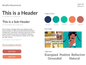
Since we are all making style tiles, I decided to go with a slightly different color scheme from our synthesized moodboard, just to see what it might look like. We had discussed using muted, energetic colors in our app (like peach) – I ran with this idea and made the focus color of my style tile a slightly brighter orange, with complementary reds and greens. I liked the green/blue colors because they seem both energetic (bright) and calming (cool-toned) to me. The adjectives I wrote reflect this slightly different color scheme – they are more energetic and nature-focused.
I liked the simplicity and standardization of a sans serif font – I chose Lato because it is slightly different from the system defaults.
Nadia


Because we talked about bringing warm energy and (desaturated) colorfulness into our brand in our group discussion, I decided to make a style tile that has a different energy from that so we can consider another option for/way of looking at our brand. I tried to choose cooler colors that still evoke some warmth when put together, like seen in the reference image (taken from our mood board). The palette is more limited in order to have contrast between the primary and lower priority colors. This is to help maintain a focused and clean aesthetic, which is meant to serve the functionality of our app. I chose Roboto, which is Android’s default font, also for its simplicity (and familiarity), plus I know it works in a mobile setting. Because our app’s features are fairly straightforward, the goal of my style tile is to let users easily do whatever they need to do in the app (focus on the function), while still having a little color that makes it enjoyable to navigate.
Preview site template using these colors:


Melody


Through group discussion on mood boarding, the overall consensus seemed to prefer warmer, desaturated hues. With the key words “warm,” “motivating,” and “energizing,” in mind, I looked for inspo on pastel color palettes that evoke these feelings within others naturally. It just so happens, Stanford hosts some of the most gorgeous sunsets, and I can’t help feeling that “everything will be okay” rush of hope whenever it hits 6pm. It evokes the feeling of a new day and the motivation that comes with it, which is what I hope our app embodies.
Other palettes toyed around with:


*The first highlighted style tile seemed more closely aligned with the group consensus, which is why I chose to highlight it over the other two.
Final Style Tile

We decided on this style tile because we felt like it best embodies the combined qualities of our individual and final mood boards, as well as aspects of our individual style tiles.


Comments
Comments are closed.