CS 247B: Design for Behavior Change
Team 15: Mindful Movements

Momentum
Build momentum towards a better you with mindful movements.
Jan, 2023 – Mar, 2023
Our Team


Amantina Rossi Uma Phatak Nadia Wan Rosli Melody Fuentes Rui Ying
Project Overview
Do you ever experience fatigue or stiffness after a long day at work? Do you find yourself wishing you had taken more time to stretch and move your body throughout the day? Perhaps you’ve even tried taking short breaks to clear your mind and relieve stress, but struggle to make it a consistent habit.
Team Momentum is dedicated to promoting physical health and reducing stress by encouraging individuals to move mindfully throughout the day. We have conducted research through tools including an intervention study and user testing, and have consistently received positive feedback: interested participants found that the problem we were trying to address was a significant one, and the solution we developed was helpful and motivational for staying active and mindful about movement.
After much design iteration, we are excited to present Momentum – an intelligent reminder system that is customized to fit your unique schedule. With Momentum, you can easily incorporate mindful movements into your daily routine, and build momentum towards a healthier, more vibrant you.
Problem Finding
Problem Space


We were drawn to the problem space of mindful movements because we recognize that people from all walks of life struggle to maintain habits around intentional movement. Whether you are a physical laborer or a work-from-home parent, finding time and motivation to move your body throughout the day can be a challenge. As a team, we were excited to tackle this issue because we believe that small, intentional movements can have a big impact on physical health, mental wellbeing, and overall quality of life. By designing an intelligent reminder system that is customized to fit individual schedules, we aim to empower people to make movement a consistent part of their daily routine and ultimately improve their overall health and happiness.
Related Work


To address this problem, we first conducted comparative research and analysis to understand how our competitors approach the problem space. We examined both fitness/health apps as well as mindfulness apps to identify strengths and weaknesses in their approaches. We found that while many competitors implemented tracking and habit-forming, they would focus on either physical fitness, or mindfulness/mental health – but not both. Our app is designed to be “smart” in its intervention level and “flexible” in its activation level, providing enough nudges to encourage behavior change without being too intrusive. For more detailed app walk-throughs and analysis, check out this blog post.

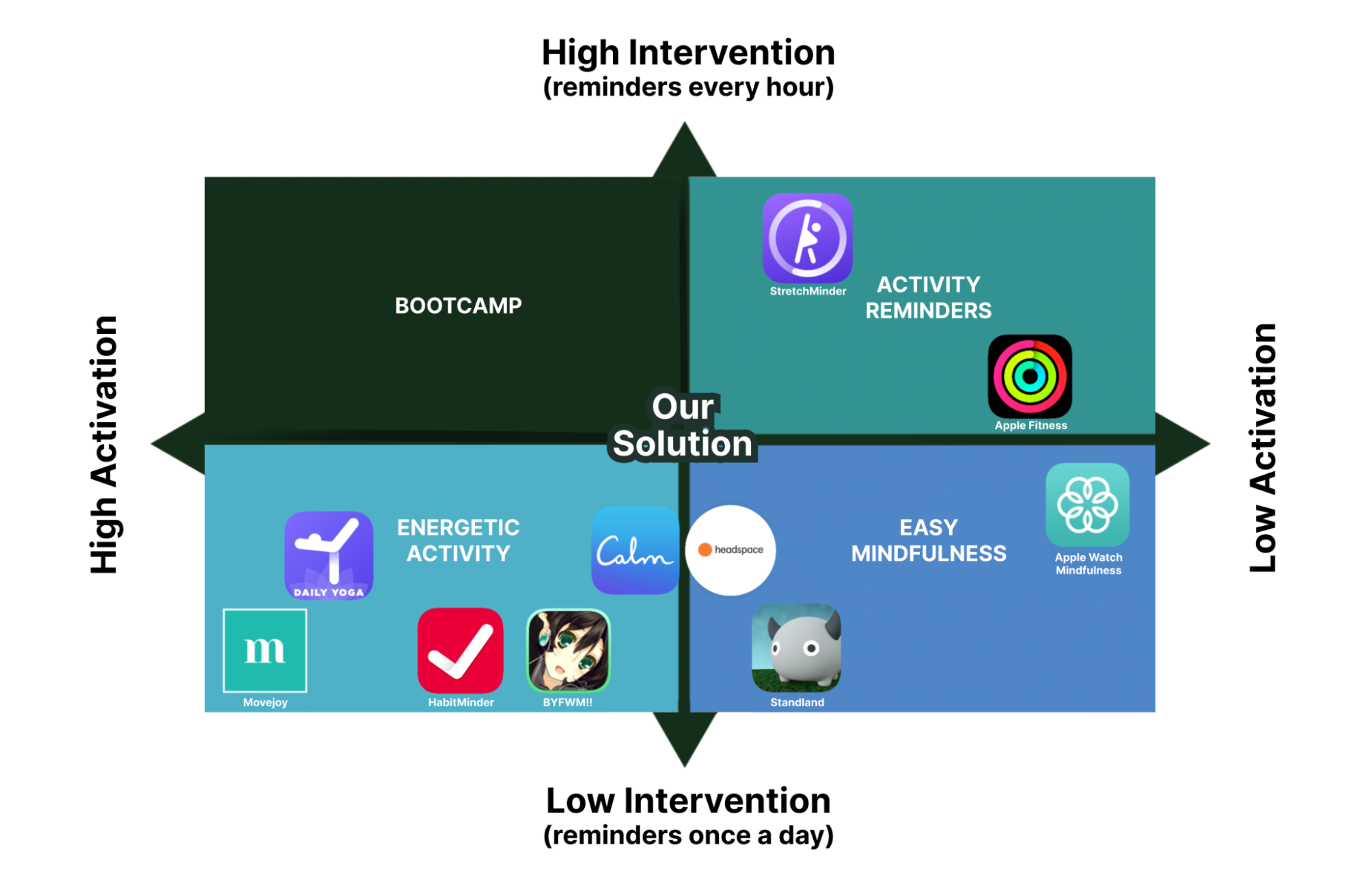
To support our design decisions with scientific reasoning, we conducted a literature review on the effects of movement and mindfulness on physical and mental well-being. Our review revealed that mindful movements can help reduce chronic pain, stress, and even improve work efficiency. We also found that scheduling and reminders are essential for mindfulness to take effect on attention, stress, and efficiency. Additionally, we noted the importance of ethical considerations in the design of our intervention. Our product must prioritize users’ well-being and avoid manipulative nudges. For the full literature review, see this document.
Baseline Study
After selecting our problem space and ensuring that there was a gap to fill, we needed to first conduct a baseline study to study the un-altered behavior of our target audience – people interested in mindfully moving more. This would help us eventually ideate a solution.
Target Audience
Our target demographic consists of individuals who spend extended periods of time engaged in non-mindful activities, and wish to develop habits centered around mindful movements. To identify suitable participants, we screened applicants through a Google form and looked for those who worked for prolonged, uninterrupted intervals and expressed interest in mindful movements.
Protocol
In our pre-study interviews, we delved into whether mindful movements were a habit that participants had tried to cultivate in the past. If so, we inquired about what did and did not work in their experience. We sought to understand what mindful practices meant to each participant, both in connotation and personal experience, as well as their reasons for wanting to establish this habit.
During the baseline study, participants self-logged their activities related to mindful movements, such as stretching and meditation, every waking hour for five days. Every hour, they noted the time, any mindful movement they took, if any, and how long that movement lasted. The information we sought revolved around questions such as: when does the participant normally active? When and how often does the participant engage in mindful movement? What kind of movement does the participant do? This data provided us insights into our participants’ regular habits and helped us identify areas where we could intervene.
For a more detailed description of the design of the baseline study, please refer to this document.
Synthesis

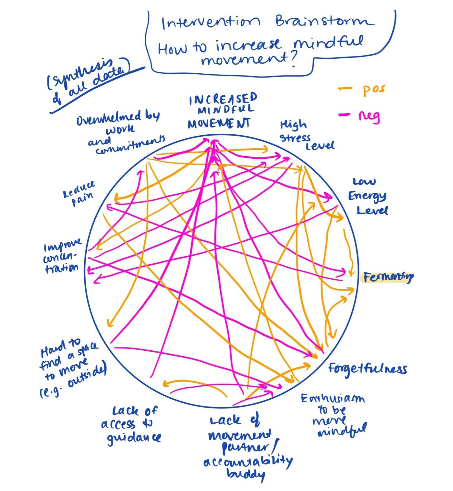
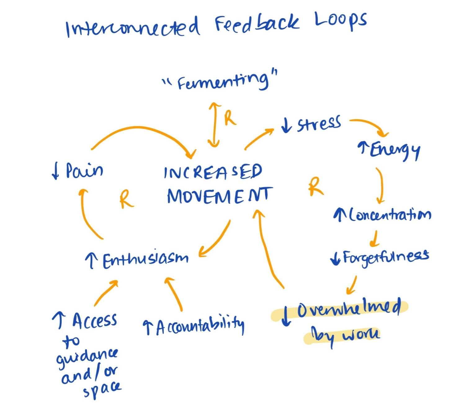

After collecting all the data, we needed to synthesize it intelligently. So, as illustrated above, we developed a connection circle and an interconnected feedback loop model, to gain insight into how various factors influence mindful movements. We identified the most significant hindrances to habit creation– forgetfulness and busyness– and used this knowledge as a starting point for brainstorming ways to increase the positive behavior we sought. We also generated ideas for making “mindful movements” an enthusiastic, intrinsic experience through positive feedback loops. For detailed synthesis results, see this blog post.
As a result, we expanded our problem statement to include that “People from all walks of life – from physical laborers to work-from-home parents – struggle to maintain habits around intentional movement and seek external support for forgetfulness and motivation.”
Personas & Journey Maps
Before starting to ideate a solution, the last step was to finalize personas and journey maps, to make more sense of the baseline study data through the lens of categories of target users.
We found that the most distinguishing factor among our participants’ activity level, habits, and routines was their occupation. We thus divided our personas into three categories: university student, physical labor employee, and work-from-home employee, covering a wide range of occupations and schedules for working adults (ages 18-60’s). Our choice of occupation as the defining factor allowed us to be as inclusive as possible, as we believe that the habit of moving more mindfully can benefit most people. While we recognize that some groups such as minors, retired people, and unemployed people are not represented in our data, our intervention idea is aimed at working adults (including students) who have access to phones.
After creating personas, we created a journey map (a typical day in the life) per persona. This was to identify commonalities between persona’s daily routines, which could lead to intervention study ideas. We used our baseline study data to create these journey maps. Our journey map analysis revealed that people generally feel more positive and energetic in the beginning of their days, but they lose energy and become fatigued as the day progresses. Based on our findings, we developed intervention ideas that act as an external push, including convenience and intrusiveness, social pressure and accountability, incentive and reward, and fun/enthusiasm. We narrowed our ideas down to three for further exploration, which are detailed in the next section and in this blog post.
Here is our university student persona and their journey map:

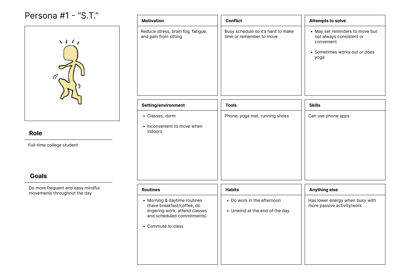


For the other two personas and their journey maps, check out this blog post.
Solution Finding
Intervention Study
Ideation
After running our diary study and narrowing down our target audience, we were ready to try to actually get people to change their behavior, instead of just monitoring it.
We first thought of three interventions, using our synthesis findings: sending conditional, convenient movement notifications, facilitating accountability partners, and gamifying the issue with points and badges. Guided by our personas, we decided to implement the best one: sending conditional, convenient movement notifications. This was because through our baseline study, we saw that our participants wanted to engage in more mindful movements throughout the day, but either their schedules were too busy, they lacked motivation, or they forgot. By crafting a notification schedule that aligned with a participant’s schedule as well as desired times and movements, we hoped that the nudges could be more successful in implementing the habit. This was superior to adding more moving parts via friends or gamification, which the other two ideas utilized.
Protocol
Our participants were a combination of participants from the previous study, and new participants who fit our personas. Our research questions were: 1) how will convenient reminders impact a participant’s movement level? and 2) how does the pressure of requiring participants to respond to each reminder impact their motivation level?
To answer these questions, our protocol was as follows: We asked users for their calendar schedules for the week of 2/6 – 2/10, asked them when they wanted to be prompted to move and what types of movements they wanted to be doing, and then texted them at the preferred times. We collected their feelings and movement levels via an end-of-day and end-of-study survey. Then, we synthesized this data. Some participants were required to respond to our reminder, and others were not.
We were most interested in when the reminders were successful, and how much they increased everyone’s baseline movement level. This protocol was developed using data from our baseline study (what did target users want?) and comparative analysis (how do other apps do this?). For more information on how we ideated and chose the intervention study, and the protocol, check out the end of this blog post.
Synthesis
After data collection, we synthesized using system maps. Using a connection circle, we found that while the effect of mindful movement was standardized across the board – people always felt more calm – the factors that increased movement were not. Factors like how busy users were when receiving the prompt, how stressed they were when receiving the prompt, and the level of social accountability could either help or hurt affected people’s movement levels, depending on the person. This indicated the need for customizability in our solution. Specifically, we decided to allow for customization of the timing, frequency, and language, repetition of the prompts. For more detailed synthesis, check out this Google Doc and this blog post (in that order!).
Design Architecture
Next, it was time to start designing a solution using what worked, and what didn’t work, from the intervention study. We implemented different mappings to imagine what a potential solution might look like: system path diagrams and bubble mapping.
System Path Diagrams
First, we did a system path diagram to map out the paths that different users, or personas, might take through our app. We tried to think of many possible paths that a user might take. The longer path (choosing mindful movements, starting timers, celebrating and reflecting) demonstrates the essential flow of our intervention idea. The shorter paths (responding to or dismissing notifications or changing settings) were of lower importance and were treated as supplements. We highlighted all mandatory events in yellow, with closed circles – this helped us figure out our MVP, which will be detailed in the next section.
Bubble Mapping
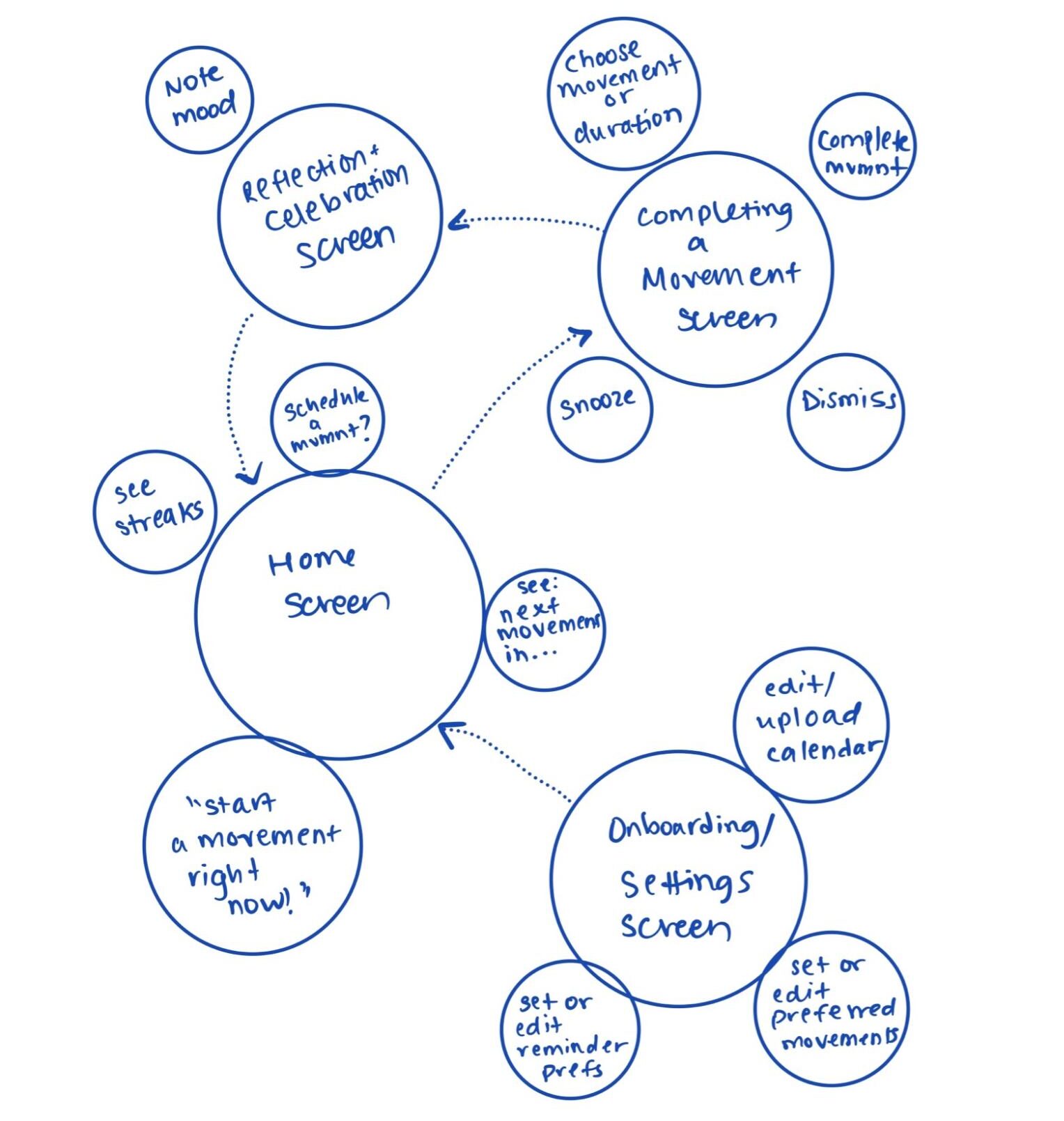
Next, we did bubble mapping to figure out what screens and their functionality might actually look like. We all had very similar initial bubble maps, so we were able to combine them into the one cohesive map shown above. Screens were given priority through bubble size. We all agreed that we needed four different screens (the big bubbles), and discussed which smaller features to implement. We agreed on the ones shown above.
Analysis of Mapping Techniques
System path mapping was most useful to start building out our MVP: by imagining many possible use cases and paths through our app, we were able to start thinking about what was– and wasn’t– strictly necessary. From this technique, we learned about the core functionality of our app.
Bubble mapping was a helpful follow-up to this. After we had a good idea of our desired core functionality, we could start quickly iterating on what app flows might look like, without drawing out full screens or buttons. From this technique, we learned how functionality should be segmented across the app. For more detailed analysis and more rough mapping diagrams, go to this blog post.
Assumption Testing
Before starting to develop a prototype, we wanted to test the assumptions underlying our initial ideas first. To do this, we completed assumption mapping, ran studies to test the three most important assumptions, and synthesized our results to guide our final solution.
Assumption Maps
We looked through our solutions, came up with assumptions based on what is feasible, desirable, and viable, and then placed those assumptions on a 2×2 matrix, with the y-axis being important to unimportant and the x-axis being known to unknown. It is shown below:


We focused on the top right quadrant of assumptions for testing, since they represent assumptions that are important but unknown. We highlighted the three assumptions most relevant to our solution idea of a reminder app:
- Streaks: Users are more likely to complete their mindful movements if they see their progress.
- Snooze: Users can benefit from being re-prompted to complete a movement, if they are not able to complete it immediately the first time they receive a reminder.
- Timer: Users can benefit from extra guidance, in addition to receiving a reminder, in order to successfully complete a mindful movement, via a timer.
We made tests for each of these assumptions.
Assumption Tests
The test participants were a mix of old and new people, who fit our target audience (3 participants per test). Our tests were as follows for each of the assumptions.
Streaks: We asked participants to do mindful movements three times during one day. We told them how much progress they’d made via text-based affirmation and a visual. We measured people’s desire to continue with the movement with an end-of-study survey. We wanted to see if their desire was higher due to the progress visuals.
Snooze: We sent participants an initial reminder to do a mindful movement; if they did not respond within 15 minutes, we sent them another reminder every 15 minutes, until they responded, up to 3 additional times (4 reminders in one hour). We measured people’s rate of completion of the mindful movement, as well as how long it took them after receiving the reminder to do the movement. We wanted to see if people had a higher rate of completion if they received follow-ups.
Timer: We sent participants a 15-30 second timer to guide them through a short, mindful movement. We measured whether participants were more likely to act on a mindful movement as a result, the amount of time they did the movement for, and how stressed the timer made them. We wanted to see if the number of movements completed increased.
For detailed experiment protocols and data collection methods, please refer to this document.
Synthesis
Synthesis did not require system diagrams since the amount of data collected was much smaller than in other studies. By reading through the data, we came to the following conclusions:
Streaks: showing progress such as streaks kept users more motivated.
Snooze: while the snooze option was useful, it necessitated extra reminders so users didn;t forget to do the movement after snoozing.
Timer: the timer contributed to some users’ stress level around moving, but also helped guide others. So, we learned that more guidance in general (e.g. telling users what types of movement to do) would be helpful.
Thus, we decided to incorporate streaks, an optional snooze button, and an optional movement timer. For more detailed synthesis, refer to this blog post.
Changes to Make
If we were to do these experiments again, we would change our protocols to reflect the feedback we got from users.
Streaks: we would also vary the content of the prompt–length, language–to see how this impacts stress and motivation levels. This was something we were trying to investigate in many different ways but never concretely existed. It would be an easy thing to incorporate into the existing protocol, and would guide our solution greatly.
Snooze: we would vary the interval at which users were re-prompted, since our use of 15 minutes was already as assumption. We could allow users to pick when they wanted to be re-prompted to see how this changes based on person, time of day, stress level, and more.
Timer: we would send users the same movement (e.g. stand up and stretch your whole body) for the whole test, instead of letting them choose. This is because different movements take different amounts of time to complete, so we got slightly varied results from not standardizing. We would also make it more clear in our documentation how exactly we were sending a timer over.
Remaining Assumptions
There were many assumptions we did not have the time to test, some of which made their way into our final solution. Some of the important ones were:
- We believe that users want a quick celebration / reflection – nothing too drawn out – after their movement.
- We believe that users want quick prompts that include the type of movement (as said above, we attempted to test this along with various other studies, but never tested this assumption exactly. This led to some difficulty when designing the prompts.)
Building a Solution
Once we had an idea of the app we were trying to create and the intervention we wanted to implement, it was time to build the solution: Momentum!
Wireflows & Sketchy Screens
With such a big project ahead of us, we knew we had to establish the bare essentials, the Most Valuable Product (MVP) of our app, for our starting point.
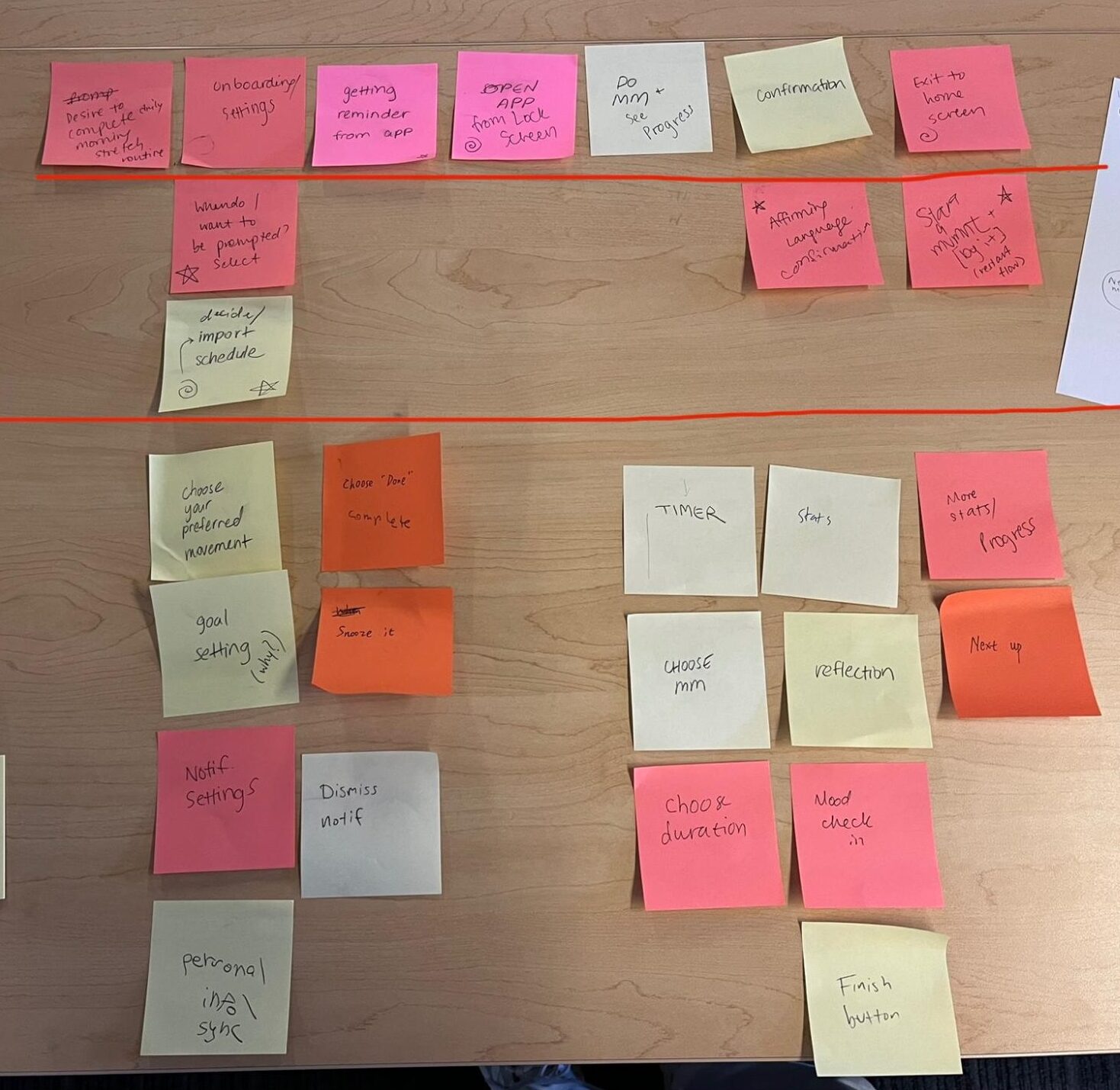 The top line is the categories line; the bottom line is the MVP line.
Through discussing what are the simplest components that would make Momentum, an effective movement reminder app, we decided on these three main components: the schedule of times that the user would be prompted, logging a movement, and affirming language.
Schedule: Our intervention that users would be prompted at times that would be convenient and possible for them to complete an action without other responsibilities in the way that would prevent them from doing so.
Logging a Movement: Whether a user completes a movement using the app or not, it is integral that there is a system to log these movements so that the user could keep track of their progress.
Affirmative Language: It is critical that users feel empowered and motivated to continue to complete their daily movements. Without that extra push, users may feel discouraged and/or indifferent to their actions.
These three components directed the main aspects to focus on in our wireflow: Onboarding (with an importance on schedule creation/importing), a home screen (logging movement), settings (schedule alteration), movement completion (logging a movement), and a celebration flow (affirmative language), shown below.

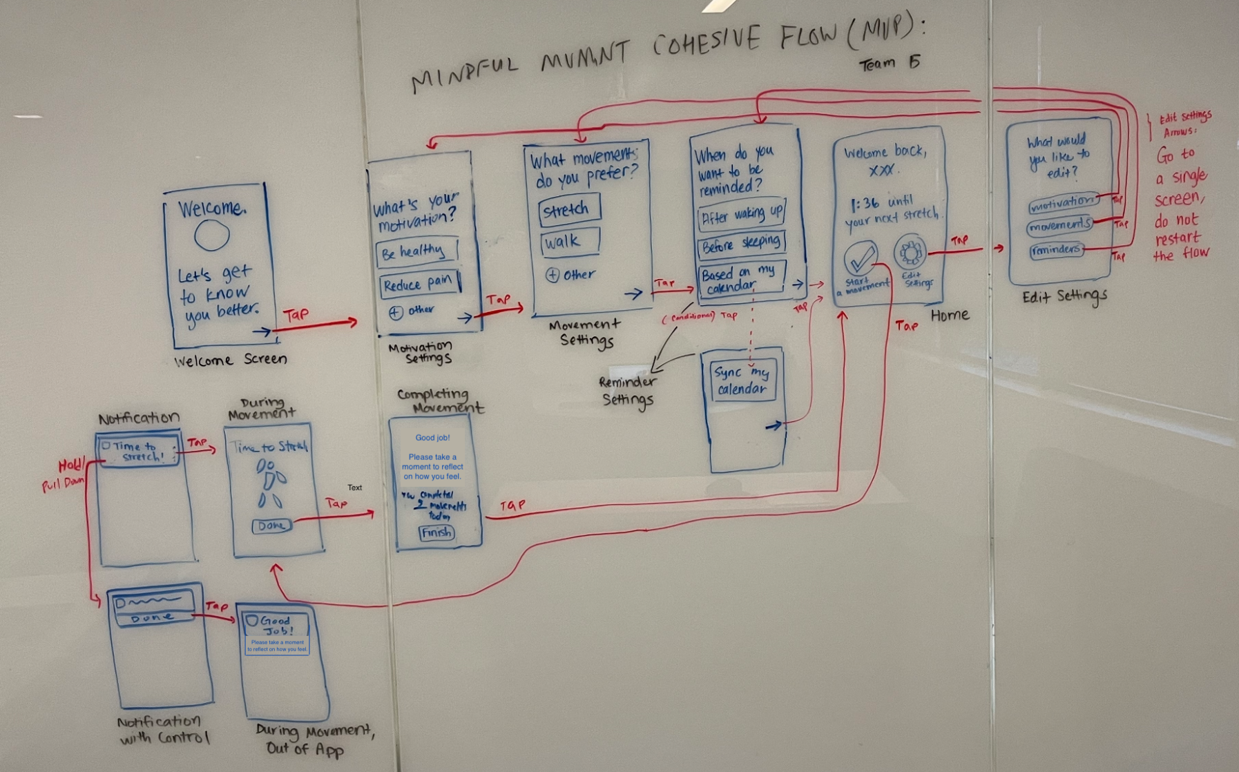 Finalized wireflow.
The planned, happy path we hope for a user is: completion of onboarding (establishing best schedule and motivations) -> home screen (where they can start a movement) -> movement flow (space where they can do their activity) -> celebration (confirmation they completed the movement, affirmative language) -> back to home.
Alternate happy paths available include starting the movement from a notification (once they are an established user), and going to the settings page to edit configurations they set in the onboarding process.
Once we had the idea of what our user interactions would look like, we spent time ideating different various of our screens through sketchy screens to see what UI we wanted to implement for each flow.

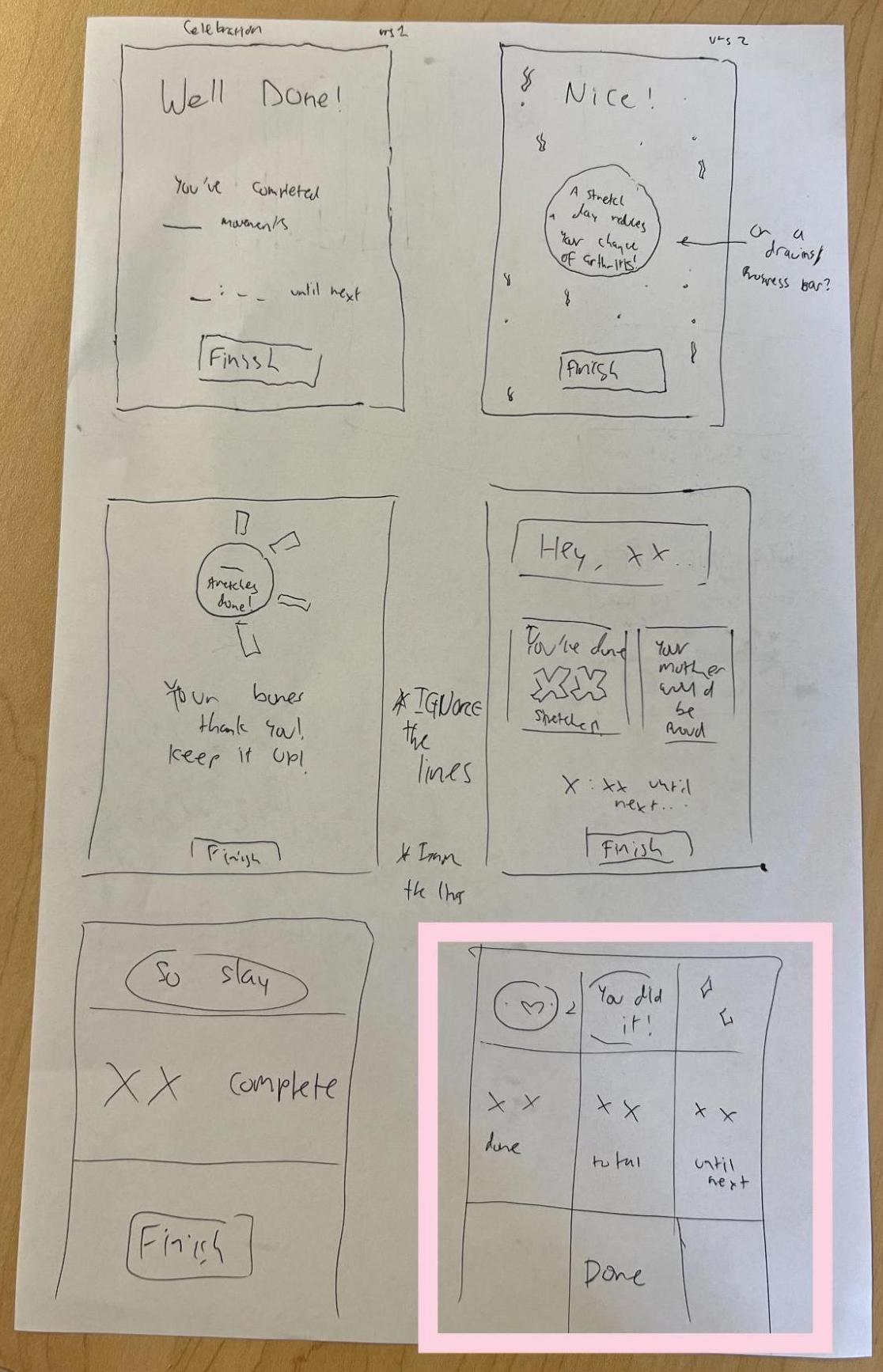
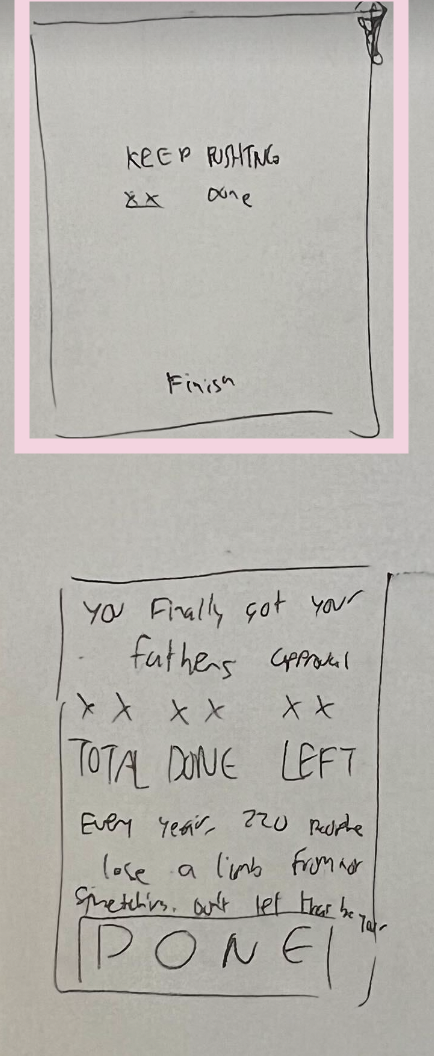
For all five main flows in our wireframe (Onboarding, a home screen, settings, movement completion , and a celebration flow), we played around with different UI choices, such as with grids, whitespace, visuals/graphics versus text. From all of our iterations, we decided minimalism looked best and would be less overwhelming for the user.
A clean, warm, minimalistic design with a low amount of text on each screen would best achieve the mission we are hoping for in our app involving user comfort. With this in mind, we then explored other UI choices through moodboarding.
Note for what we would do differently:
The wireflows are meant to look like a possible UI, (which is why they are substantially cleaner) whereas the sketchy screens are meant to be more raw to quickly explore different iterations of the wireflows. If we were to do this again, we would flip this in terms of making the wireframes more raw and “sketchy” (as the focus should be the user interaction flows rather than the UI), and make the sketchy screen variations much cleaner. Lesson learned for the next app venture!
For an in-depth explanation of all our UI choices for each flow’s sketchy screens, please refer to this blog post. For an in-depth explanation on the wireflows and implementation of the MVP, please refer to another blog post.
Mood Boards & Style Tiles

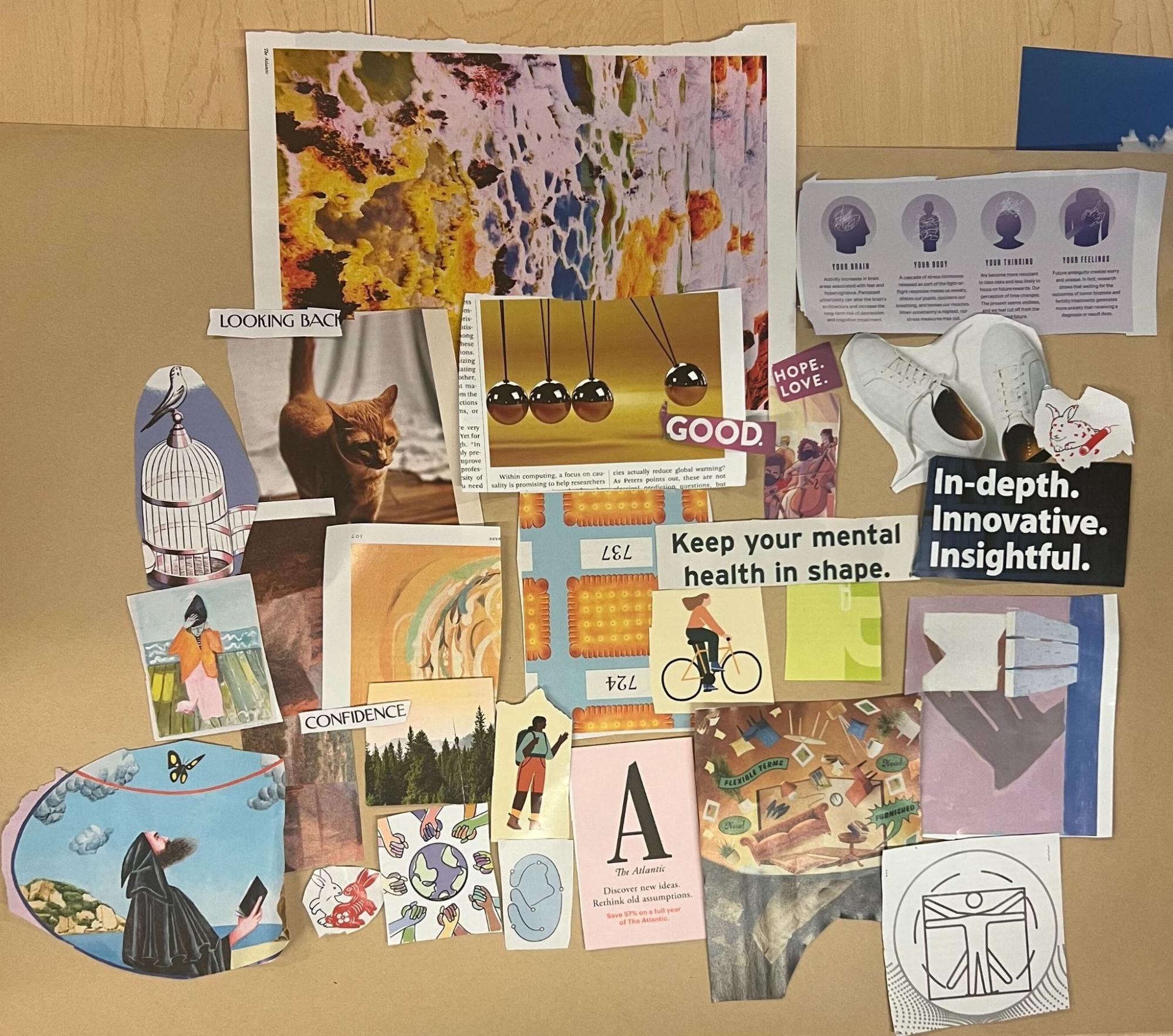
After making our individual moodboards for how we personally imaged the vibe of our app, we came together to create a synthesized moodboard that best fit the tone of our app: warm, motivating, uplifting. To accomplish this, we decided to include 1) images that fit our desired color scheme (muted, energetic colors like light orange, light blue, light pink / purple, and beige), 2) images that have depictions of action (shoes, body, cat), and 3) words that captured the vibe of our brand.
We took heavy inspiration from the colors in our finalized style tile, and we liked that this moodboard is very pretty and uplifting to look at, as opposed to just calm and reflective. Since our app focuses on mindful movements, we thought this is an important distinction to capture.
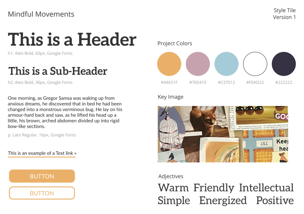

Voila! Our final style tile! Through group consensus, we agreed that we were looking for warmer, more destaurated and muted hues that still evoked feelings of positivity and warmth. We decided on this style tile because we felt like it best embodies the combined qualities of our individual and final mood boards, as well as aspects of our individual style tiles.
For a more in-depth exploration of our individual mood board, style-tile, and how both were synthesized, please refer to this blog post.
Usability Testing
To get the most out of our user testing, we sought to test objectives that were in line with our MVP, as these are the features that 1) make up the majority of our app 2) are the most important for user experience and the app’s functionality.
Our main goal for usability testing were to see:
- The simplicity of our app.
- Motivation to continue using the app.
- Whether a movement flow can intuitively be completed.
- Whether reminders can intuitively be completed.
We also sought out target users that have an interest in improving their frequency in movement, regardless of whether or not they have a schedule. It’s a very broad demographic, as we do not intend our app to exclude anyone since mindfulness is a practice that can be used by all (busy or non-busy people) as long as there is an intrinsic want to do so to begin with.
During our usability test, we identified some issues with the prototype. We labeled them with severity ratings and discussed if and how we will address them. Examples of how we did so are below.
Task 1: Onboarding


Issue: On the “When” screen, the two buttons that say “Sync My Calendar” and “Let Me Decide” are confusingly labeled: it is not clear what “syncing” the calendar actually does, and how it is different from “Let Me Decide” (both buttons denote user decisions.)
Severity: Severe
Will we address: Yes
How: We will rename the buttons on this screen and/or add little “tooltips” so that users know how the smart reminders work. We may add text to the entire screen, or a new page. Also, we will have a screen that shows users the calendar that the smart reminders created for them (a confirmation screen after syncing.)
Task 2: Movement Flow


Issue: On the “Complete a Movement” screen, it is not clear what “All Done” means, because we never specified to the user what stretch is being done, and how long it should be done for. More structure is desired.
Severity: Moderate
Will we address: Maybe
How: We will consider adding more explicit movement suggestions to the page, and adding a suggestion to how long the movement should be. However, in our intervention study, we found that some users enjoy the flexibility of no suggestions. So, we may not address this.
Task 3: Editing Reminder Settings

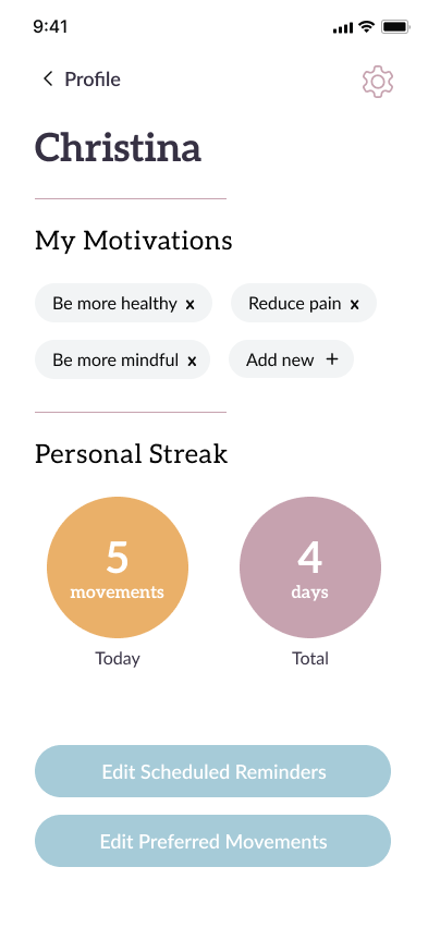
Issue: On the Account page, it is confusing why there are three different edit buttons.
Severity: Moderate
Will we address: Yes
How: We will separate the settings page from the profile page.
For all tasks, other problems that arose had to do with confusing UI, not understanding the meaning/difference of two functions (i.e. difference between “time me” and “snooze me”), and trivial issues like specification on time measurements.
Taking all of this feedback into consideration, all of our feedback was fixed through more explicit information (through an info guide on our prototype), creating better names for buttons and screens, and overall cleaner and more condensed designs.
For a full explanation of our Usability testing, please refer to this blog post. To view our script and objectives, see another blog post.
Prototype
You can view our final Figma clickable prototype at https://bit.ly/momentum-proto. (Use this link if the bitly link fails.)


Onboarding flow gives users customization of their reminders for what types and when the reminders will be. We included options for users to sync a calendar or manually input their schedule. Tooltips are included for clarification.


The Complete a Movement flow allows users to get a reminder for a mindful movement, then complete it, start a countdown, or snooze the reminder. Users can swap the movement they do as well. The tooltip describes each of these actions.


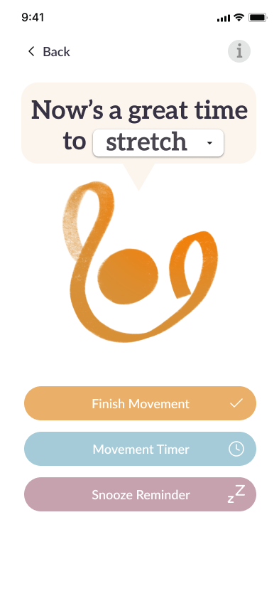

From the Home screen, users can view the time until their next scheduled reminder, as well as press a button to start a new movement. Starting a new movement, which users might want to do if they want to add and log a new instance of movement to their personal streak, will bring them into the Complete a Movement flow.


The Profile screen allows users to view their name, motivations, types of movements they prefer doing, and personal streak of how many consecutive movements they have completed uninterrupted. Users can edit their name, motivations, and preferred movements here.


From the Reminders screen, users can view and edit their scheduled reminders for the week. Like in onboarding, they can choose whether to sync their calendar or manually enter times.
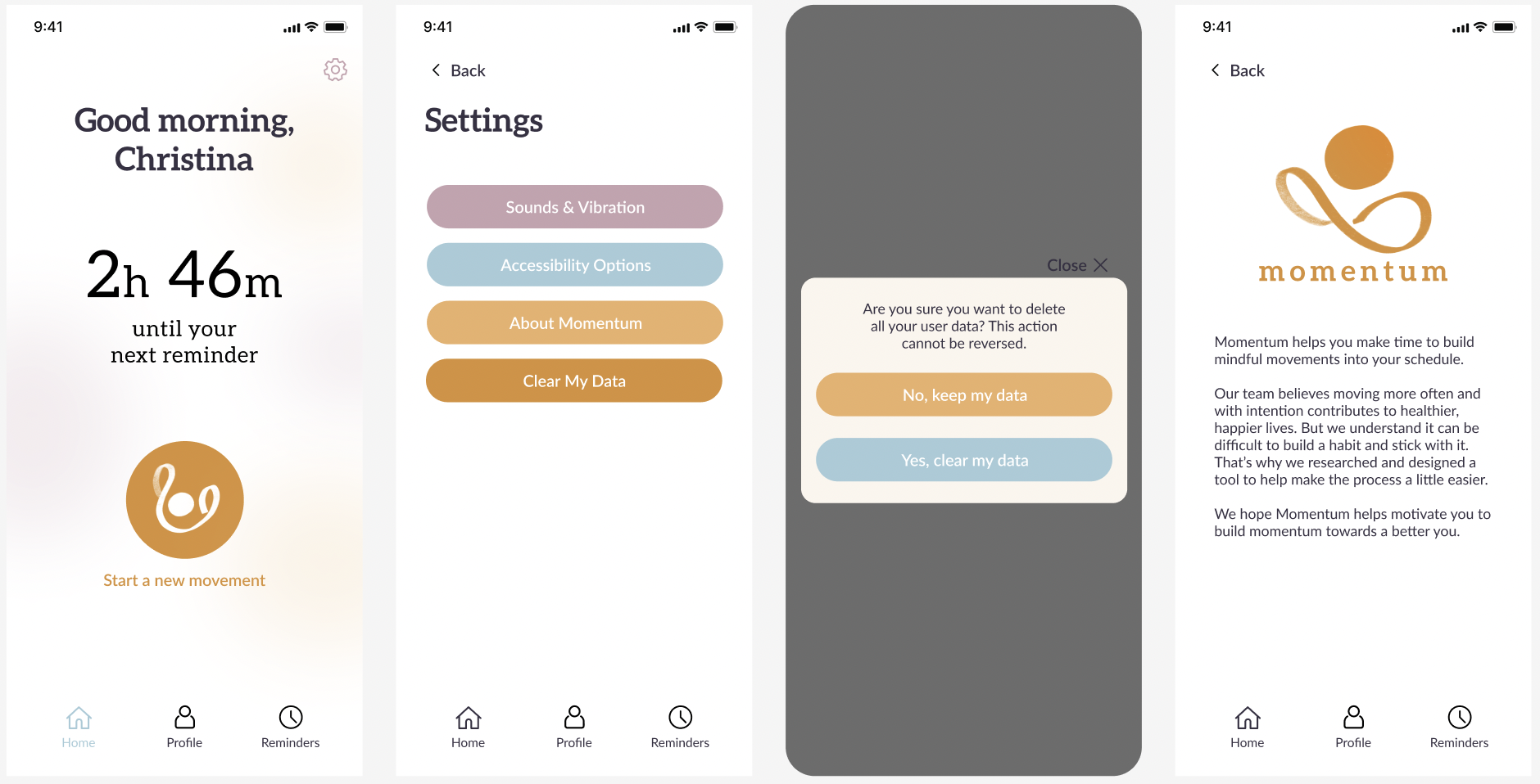
 Bonus: From the Home screen, there is a screen for miscellaneous Settings. Hypothetically this is where users can find notification sound and vibration settings, accessibility options, and the ability to delete their user data.
Ethics
Our design for mindful movements has ethical implications that need to be carefully considered. The following are some of the most significant ethical implications.
Nudging & Manipulation
As our app relies heavily on nudging users to move more, using notifications as reminders, it is important to consider the potential risks of such nudging becoming manipulative and coercive, undermining users’ autonomy.
Our Solution
To address this concern, we prioritize respecting users’ own choices and providing enough “escape clauses” in case they feel pressured or manipulated.
- Users can customize almost everything, from their motivations for mindful movements to their preferred movement types and when they want to be reminded. By giving users more control, we hope to empower them to make choices that align with their own values and goals.
- During the app onboarding process, we provide skip buttons to allow users to bypass any content that they are not interested in.
- We allow users to snooze movement reminders, giving them the flexibility to postpone their mindful movements when they are not able or willing to perform them.
Accessibility
We acknowledge that not everyone likes the same movement and not everyone has the same physical ability to complete movements, so we strive to consider different physical capabilities and range of motions from different users in our app. Additionally, we understand that not all users may be comfortable with technology and may have difficulty using personal calendars.
Our Solution
We focus on the mindfulness of intentional movements and avoid hard-defining what is considered movements.
- We let users customize their preferred movements and use them in reminder notifications.
- We allow users to change the timer for how long they want to move, accommodating their physical ability and schedule.
- We allow users to manually edit their reminder schedules to accommodate non-calendar users.
- We use abstract visuals and icons that are more inclusive and considerate of people with disabilities.
Privacy
Fitness data, or health data in general, is considered highly sensitive. Ensuring correct handling of user data is not only ethically, but also practically required.
Our Solution
We respect the principle of minimum data to get our app started.
- We let users use their preferred name.
- All data is processed on-device and locally.
- We allow users to delete all data from the app.
Rewards
Although we initially considered implementing a reward system to motivate users, we ultimately decided against it due to potential ethical concerns. Rewards can easily lead to manipulative nudging and peer pressure, which would contradict the mindfulness principles we are promoting. Therefore, we have opted not to include rewards in our app, and instead focus on encouraging users to develop intrinsic motivation for mindful movement.
Above and Beyond
In a society where sedentary lifestyles and chronic health conditions are increasingly prevalent, promoting physical activity and mindfulness can have a significant positive impact on public health. Additionally, by prioritizing ethics and user autonomy, our solution sets a positive example for responsible and respectful technology development.
Conclusion
The amount of information that we were able to gain in the span of 10 weeks is astounding. Of course, as is the gist of the class, we learned how to materialize an app from just an idea into a functional prototype. More granularly, we took away the importance of design processes (such as sketchy screens, branding, ethics of design choices), storytelling (journey maps, personas), user incorporation (diary studies, user-testing, assumption testing), and post-it notes (mappings, comparative research).
Working with five people, we all had different ideas on what this app could look like. We learned how to effectively communicate our visions, compromise on contradicting perspectives, and distribute the workload week-by-week to make Momentum a reality. We also gained some pretty great friends in the process. 🙂
If we had more time to work on this project, we would like to further investigate how effective our solution truly is by having another diary-study of sorts, but this time with our final prototype (would also be a great full-circle moment).
We would like to investigate further the ethics of our idea, and do more introspection on who is not being accounted for, and what we could do to address this (for example, is the color scheme of our app difficult for a colorblind person to view? It’s not something that we previously considered).
Finally, we would like to add more instruction in Momentum, with guided meditations, stretches, and activities that the users could partake in if they don’t have an idea of what to do.
Overall, we would like to further explore the user impact and user interaction.
For our next behavior design escapades, we will be sure to be more cognizant on model-creation, UI variation, and especially user-centrism. There are many social and ethical dynamics that we were not aware of before entering this class (i.e. the ethics of gamification), and now that we are aware of how small design choices can impact entire demographics of people, to be more reflective of the products that we put out into the world and how they contribute towards the future we wish to build.
Thank you for an amazing quarter.
We came, we saw, we moved,
Team 15


