CS 247B: Design for Behavior Change
Team 15: Mindful Movements
Amantina Rossi, Uma Phatak, Melody Fuentes, Nadia Wan Rosli, Rui Ying
We drew sketchy screens based on our previous wireflows to lay the groundwork for the final design. There are 5 major screens in our app: onboarding, home, completing a movement, celebration and settings.
Detailed sketches are shown below, with their respective reasoning.
Onboarding
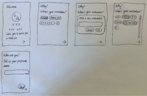
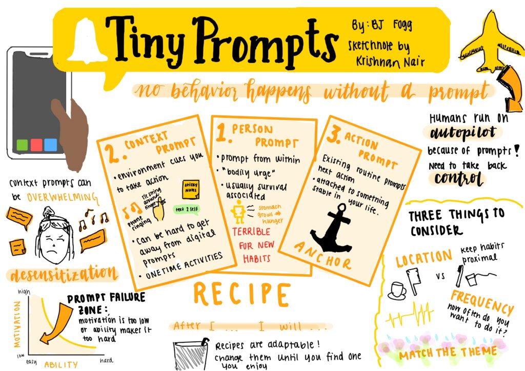
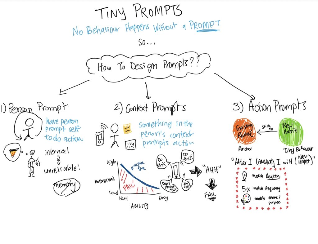
For the onboarding screens, we not only want the user to provide us with their info, but also want them to express their motivations, preferences, etc. explicitly, which is part of the mindfulness process. The info will later be used in other screens for things like affirmation languages and our core functionality: reminders.
The final onboarding process will include “why” (motivations), “what” (movement types) and “when” (reminder settings). The sketches above showcase the design of “why”, which applies to the other two screens.
As a mindfulness app, we don’t want to overwhelm users with choices. Therefore, to give users both mental space and agency, we provide a preset of options, together with the ability to add/remove customized ones. The user can click on the “chips” to select them and click them again to deselect; they can use the “plus” button to add more motivations and use the “x” button to delete them if they wish; the container of chips is scrollable in case the user is inspired.
Other variants of the screens were also explored.

As shown above, we tried sketching different versions of the motivation selection, with emphasis on verticality, grids, and whitespace. However, these versions can’t handle too many options well.
Home

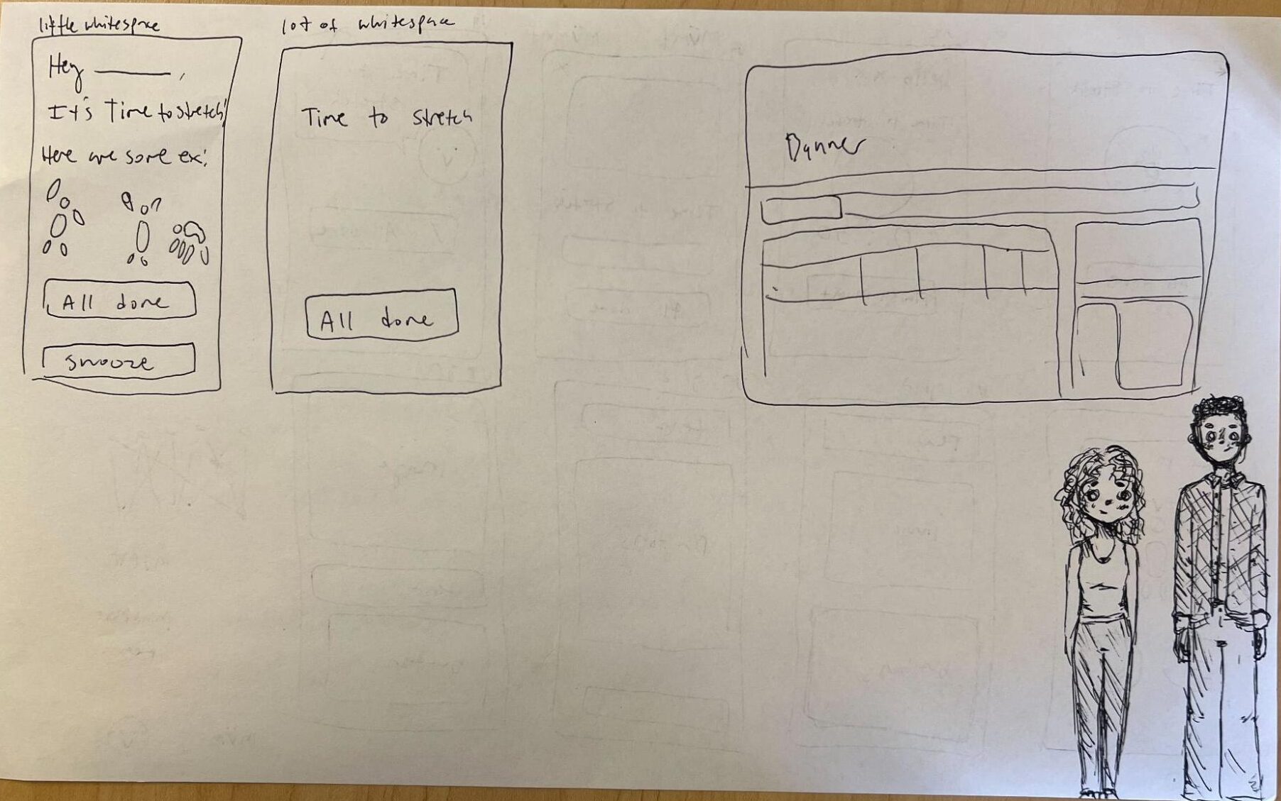
We wanted the home screen to be especially simple and minimal since it sets the vibe of the rest of the app. I started with the screen we used in our wireflow, but quickly realized that it can be simplified even more – we don’t need “Welcome back” and we can get rid of the labels on buttons if we make the icons more clear. The whitespace exercise helped me realize that the start and settings buttons can be differentiated in size and screen placement – I finally resolved to put the start button as a big button below the “Next up” timer, and to put the settings as a small button in the upper right hand corner. We have opted not to have a nav bar or hamburger style menu, for the sake of simplicity.
The final home screen we decided on is outlined in red (it’s messy but has the right layout!)
Completing a movement
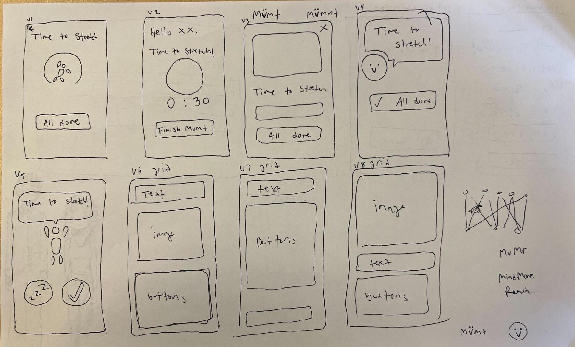
The above sketchy screen iterations are all possible layouts for the same “completing a movement” screen/task. In each iteration I tried to include various components like icons, back buttons, a timer, and a snooze button to help visualize a variety of options that we can choose from to create the final screen. I also played around with different shapes of images and buttons. Finally, I was curious about personification and the social influences of an encouraging character, so versions 4 and 5 show that above.
When creating the above sketches, I tried to keep in mind the purpose of the app, which is to encourage movement and improve the wellbeing of the users. Therefore, I was intentional about creating a calming and friendly environment in the user interface by refraining from crowding the screen. Completing a movement should be hassle free in order to help users continue to establish the habit in a seamless way. I think our final iteration of the screen will keep an encouraging message and an all done button.
Celebration
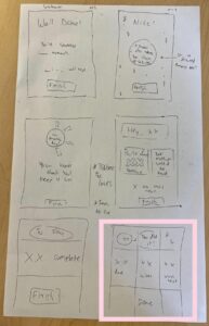

Starting with the original celebration screen from our wireflow, I initially played around with different placements and “looks” of different components that we may want our wireflow to have. Specifically, the focus being an affirming message, some sort of statistic (whether that may be the total time/amount of movements done in that session or day, or time left until the next reminder), and an “end” button.
Using the exercises from class, I tried a variety of placements using grids and playing with whitespace in the last two iterations (intentionally making the ugliest layout possible at the end there). The grid exercise was especially helpful at finding ways to organize components.
In the end, the group consensus preferred these two iterations (boxed in pink), as we wanted a minimalist design that wouldn’t overwhelm the user and simply celebrate them for what they accomplished. The affirming message would still be highlighted, and the stat is intended to keep the user motivated and provide an immediate visual of their progress.
Settings
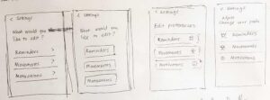
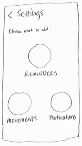
When we made our MVP, our settings screen had only three functions that lead to other screens, mainly those shown in the onboarding flow, so I only made a few sketches that vary based on style and language. The first four screens are inspired by settings screens that I’ve seen and think work well and have the order of functions arranged in order of importance. The fifth one in the second image is another possible arrangement, but I favor it less because I think it’s less straightforward than the other iterations. A version with icons might give the app a more fun vibe, while a version without could be cleaner. We will decide on what works best later when we make more decisions on branding and develop a higher-fidelity prototype.