
Individual Mood Boards
Elijah
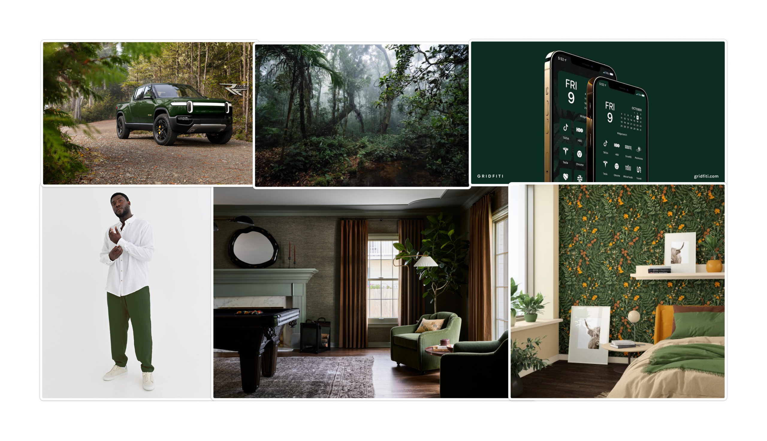
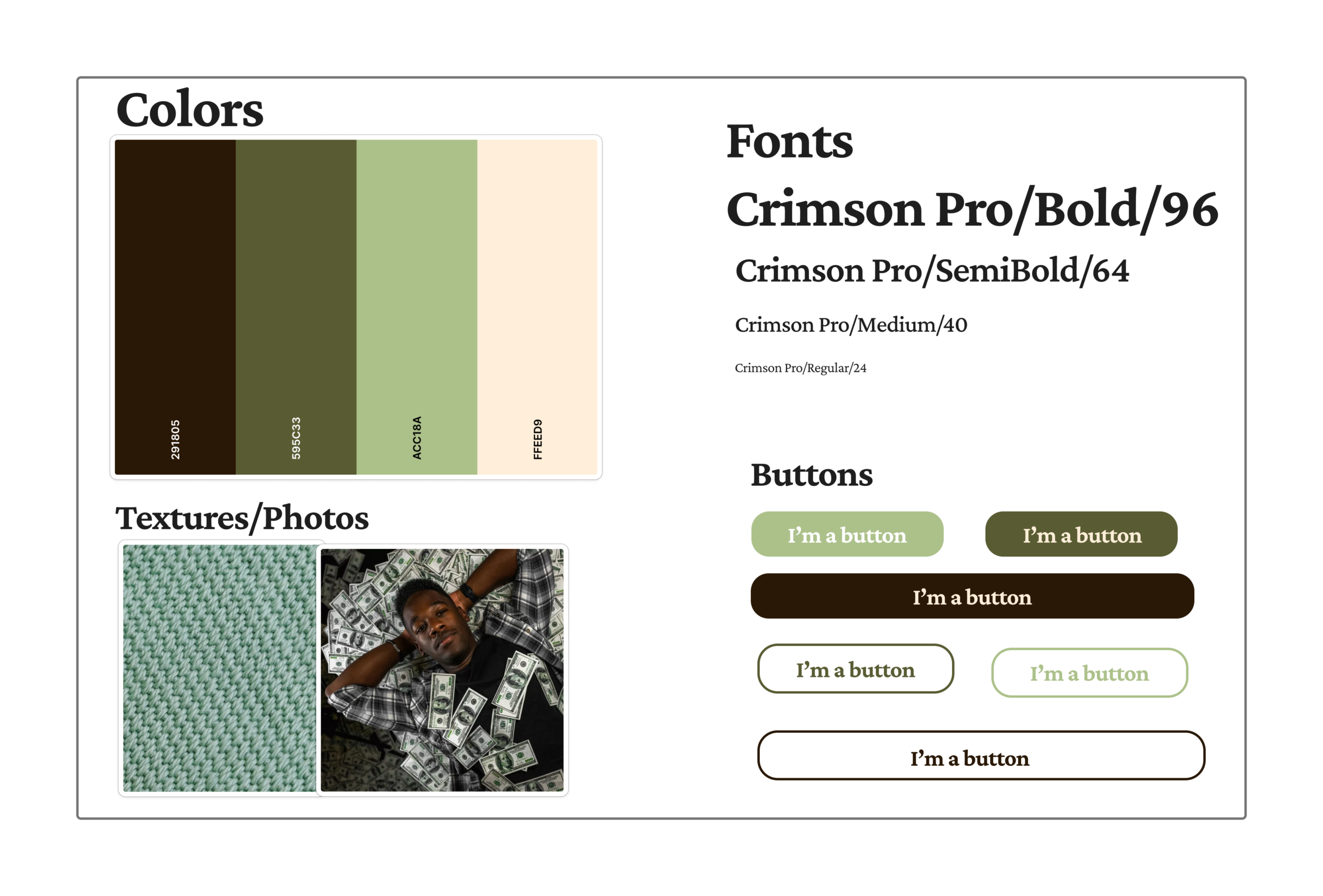
For my mood board, I tried to curate images that have strong dark green accents. My reasoning for this was the prevalence of money within our app. I want users of our app to see green and instantly think of our app. Another reason why I chose these images was to curate images that also give the message of modernity and desire. The images are sleek and modern, but still set a practical reachable vision for the future. I wanted users to think about how every step they take in the app can lead to a future where everything they imagined could be theirs. Wealth is often associated with sleekness which is what I tried to communicate with my images.
Jasmine
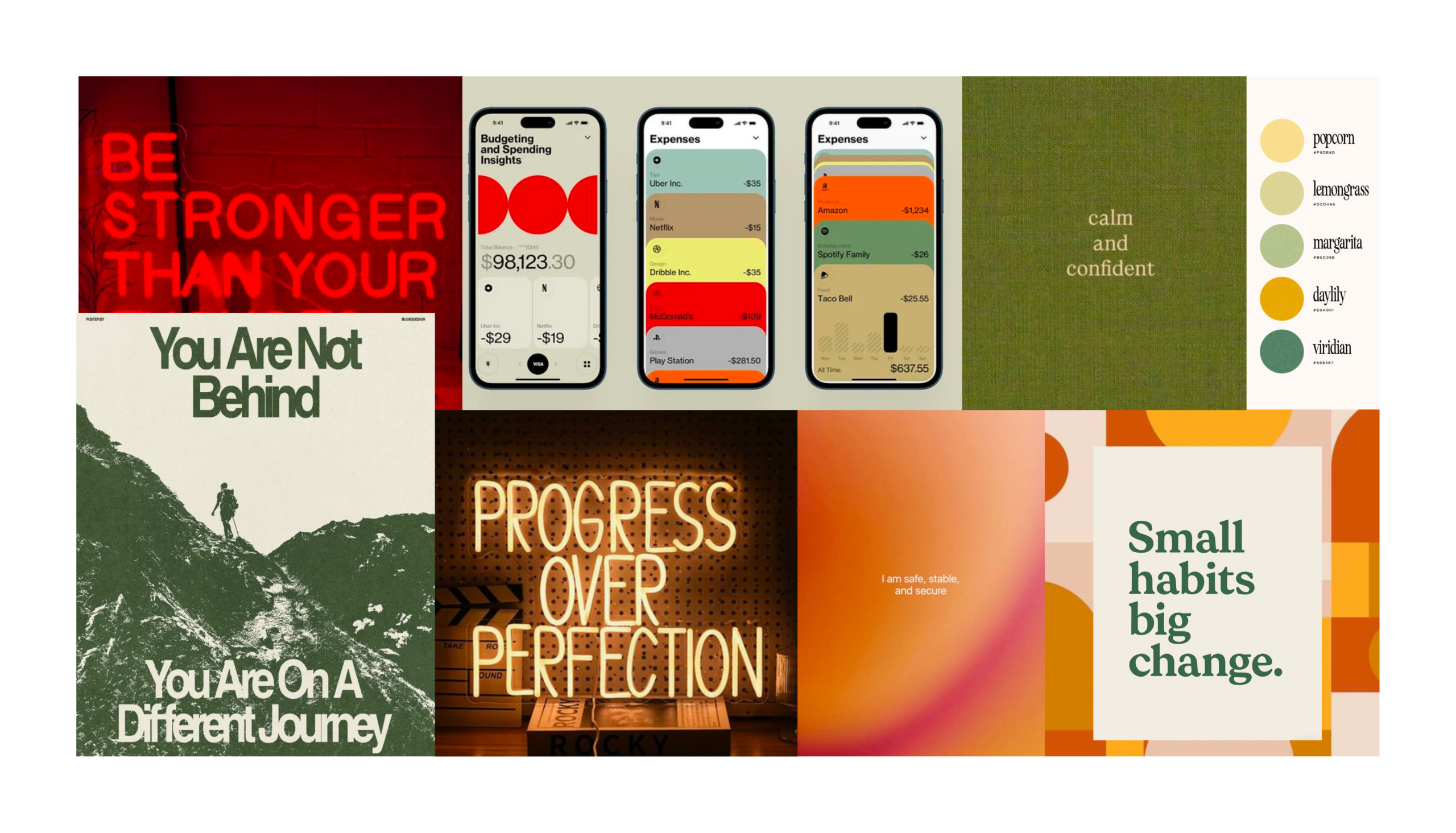
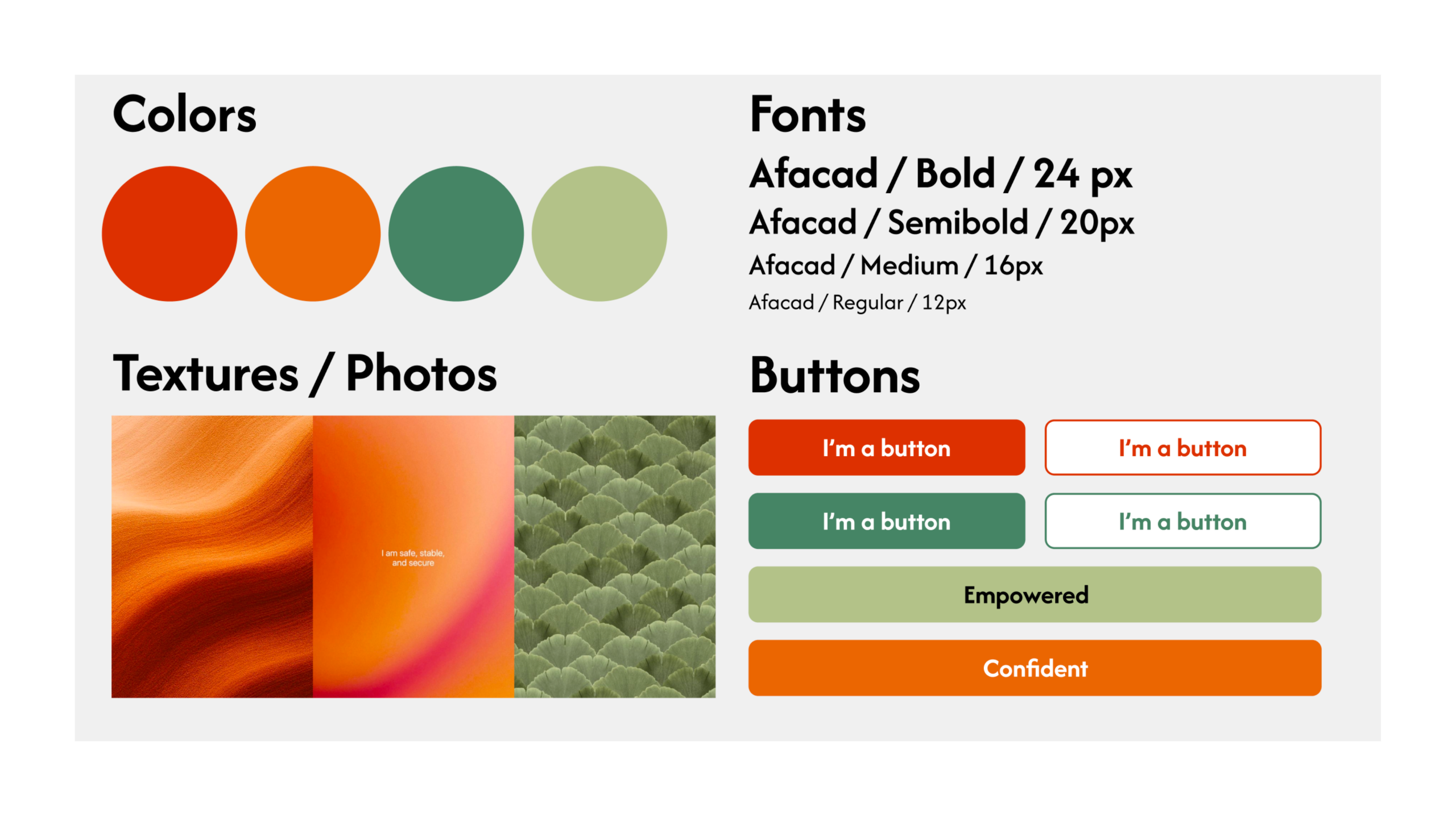
For my mood board, I relied on images that provided both the visual and verbal support our app seeks to provide. For images specifically, I chose words that would make users feel empowered and good about themselves, opting for short but relevant phrases that reflected how we want users to feel. In terms of color, I chose bold colors that contradicted yet complemented each other. This echoed the idea that our AI agent communicates with users in a bold, confrontational capacity (contradiction) while also supporting them through their journey and cheering them on along the way (complement). Our platform’s goal is to help users feel confident and empower them to realize that the power to overcome financial habits that they want to change is inside of them.
Bennie
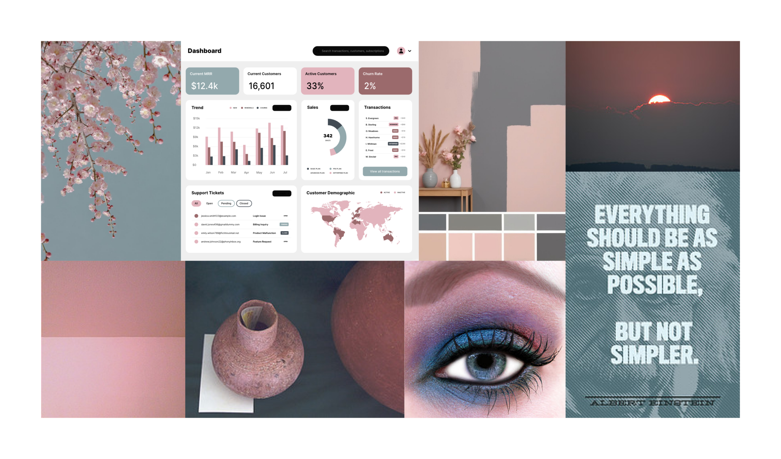


For my mood board, I wanted to explore a wistful vibe in order to evoke feelings of nostalgia, reflection, and simplicity for users on our platform. I chose to use complementary colors, blue and red, to create a soft yet strong contrast between primary, secondary, and accent colors. For pictures, I chose images that aligned with simplicity and the beauty that comes with it: a cherry blossom tree against the sky, fresh paint and clay, an eye look that blends seamlessly, an inspirational quote about optimizing simplicity. I also included a sample analytics dashboard that I made with coolors.co to help visual what the product would look like and how we could maintain the desired simplicity while still providing a large volume of information (hence the choice to visualize a busy dashboard over a simpler screen like our chat feature or settings). Additionally, I wanted to focus on muted colors to better detract from the intensity of impulse spending and financial awareness and emulate a calm, reserved, again, simple, approach to financial wellness. As far as textures and typeface, I figured elegance would be an interesting vibe to explore, and because our platform is planning to be very quantitative data heavy, I believed geometric, rigid textures would be a strong, non-overwhelming approach to the shapes and structures of our visual design language.
Cyan
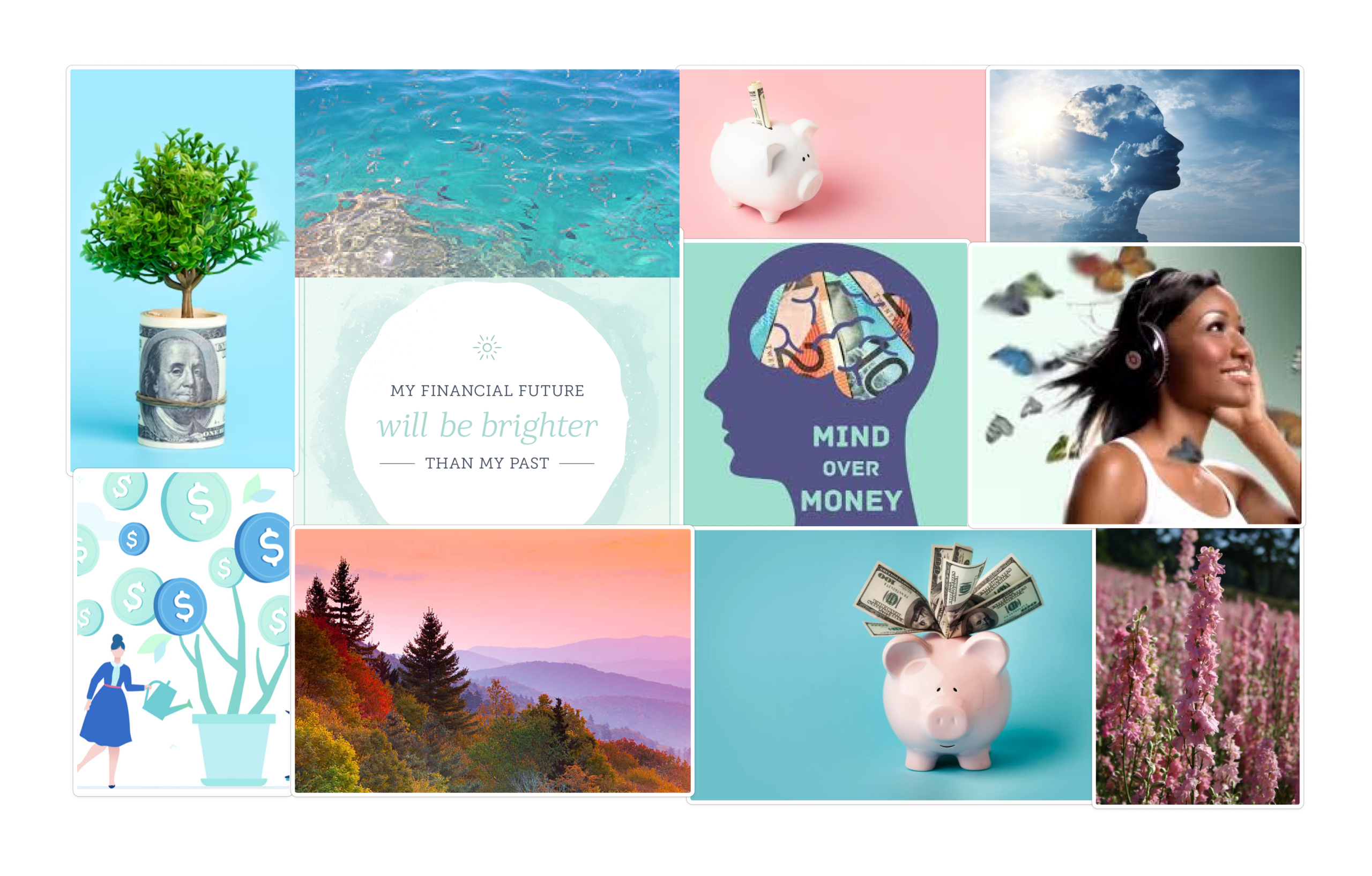
The goal of this mood board was to highlight the optimism that comes with taking control of one’s financial journey. Using our application, the future is looking up. As a result, I chose bright colors like blues and pinks to give it a positive feel. I chose images that evoked nature to highlight feelings of financial wellness. The quotes “My financial future will be brighter than my past” and “Mind over money” were chosen as an affirmation related to the goals of our application. I also included money-oriented imagery such as piggy banks and dollars to connect back to the financial use case of our application. Finally, I tried to include images that felt positive, such as the butterflies and flowers, to connect to the hope we would like users to feel while taking agency of their financial journey.
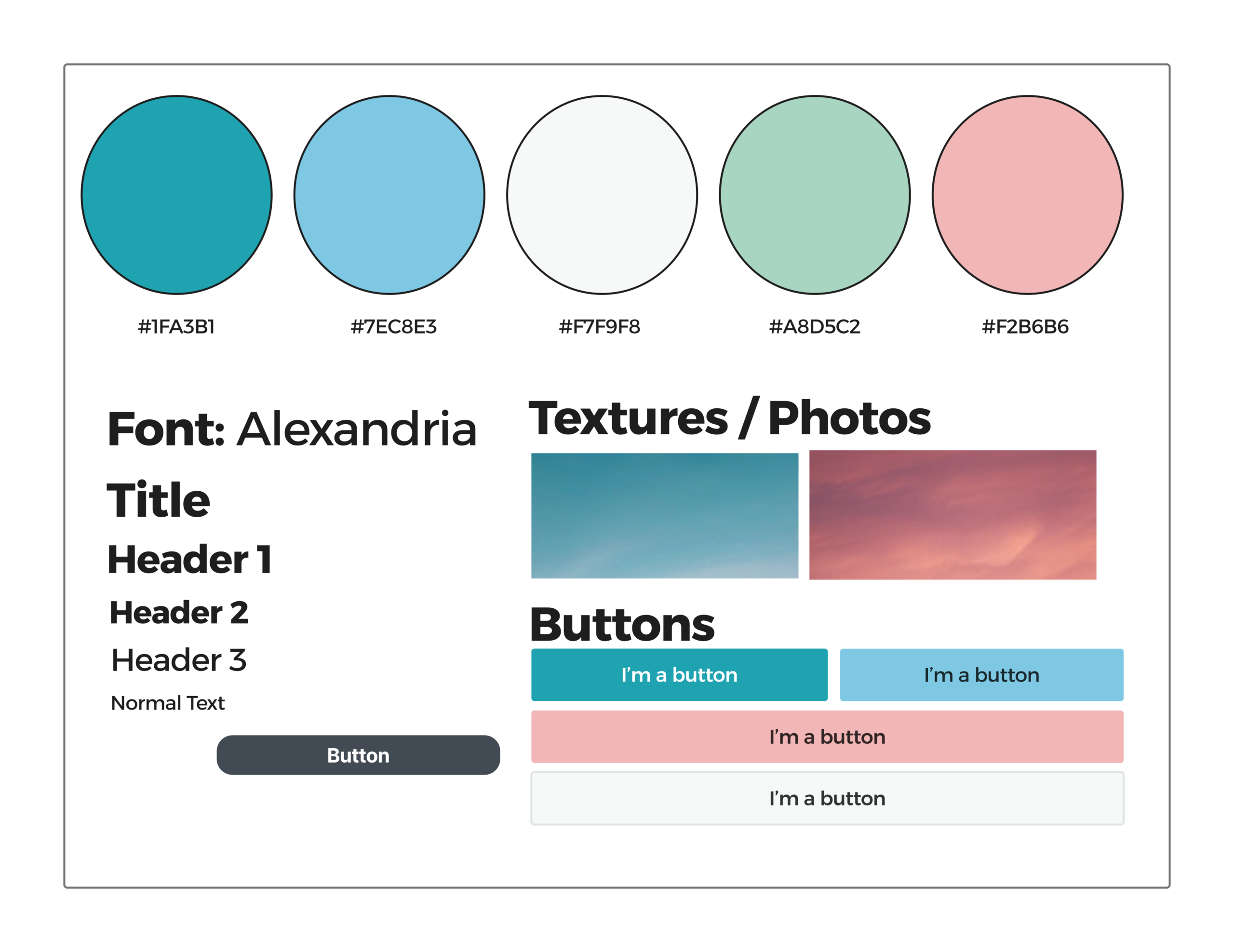
Synthesized Mood Board and Style Tile
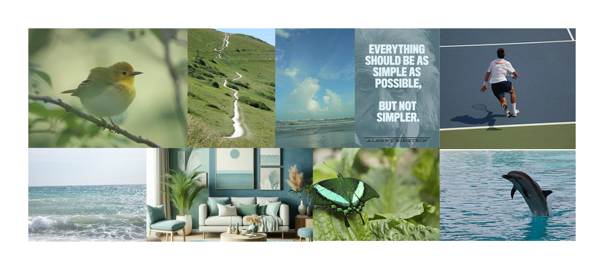
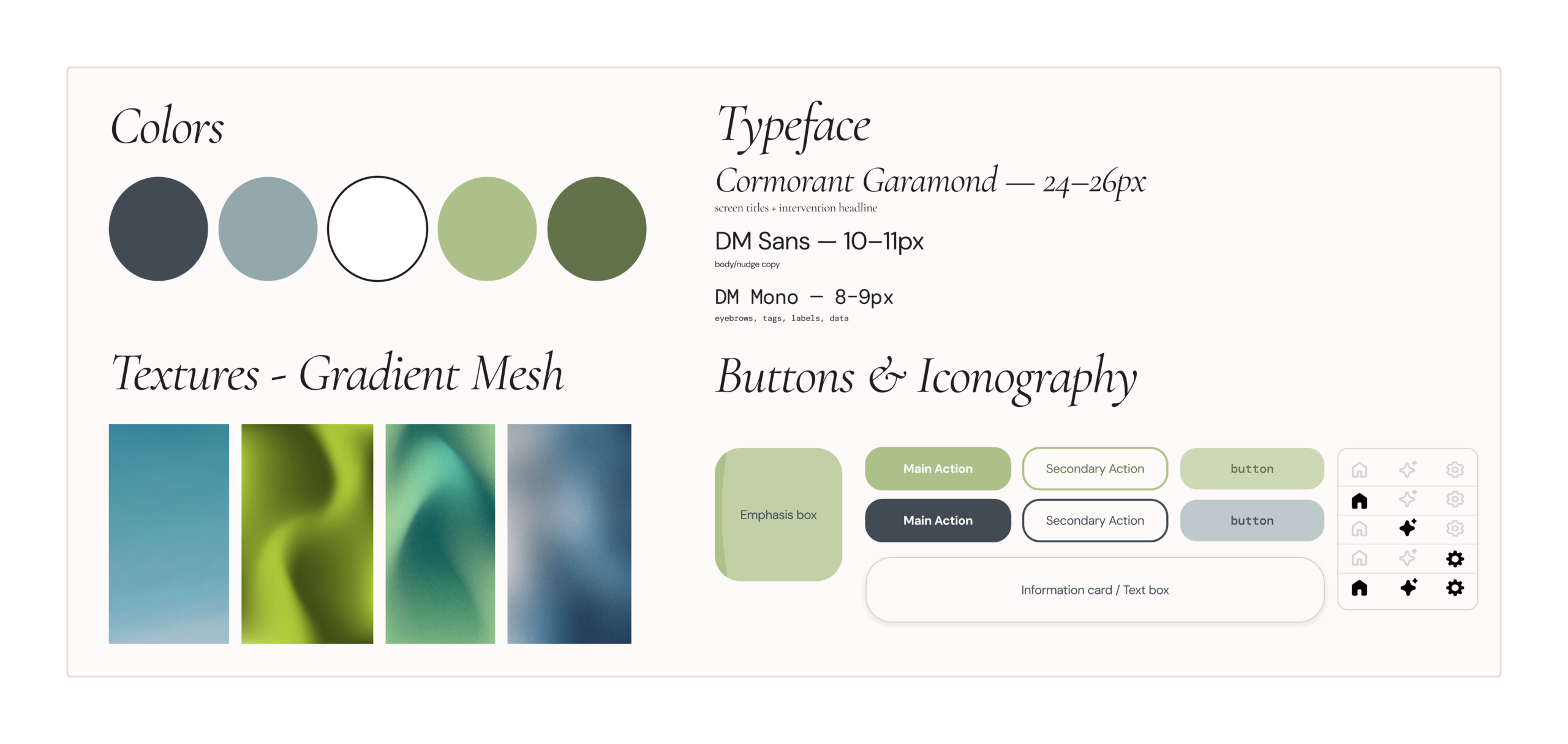
For the group mood board and style tile, we decided to combine aspects of each teammate’s approach. We used the gradient textures from Jasmine, the iconography, typeface, and blue color sequence from Bennie, the green color story and nature orientation from Elijah, and the hopeful tone and optimism captured by Cyan. When considering our product’s identity and purpose, it wsa important to us that we kept the platform warm, reflective, and hopeful, providing a space where we were not only helping users overcoming their impulse spending habits, but also helping them to feel supported through their journey. Our primary color story is soft and guiding while our textures and action items are stronger, evoking the same sense of tough love that our users will receive through the AI coach within the platform. We also chose gradient mesh as our texture because we appreciated the way it figuratively represented transition from one stage to another and allowing yourself to be swept up in the chaos of change in order to facilitate self-improvement. Our images further support these metaphors, from birds that represent hope and nature shots that represent clarity to an active person representing the act of being proactive towards financial betterment. Overall, we combined the key aspects of our individual mood boards and style tiles that subtly supported the guided metaphor of our platform coaching users to success.


