Synthesized Mood board
This mood board is the heart of what our sleep system is about — that quiet, after-dark feeling when the world finally goes still. The deep navy night sky full of stars anchors the whole board, setting the scene for everything else. This is a product that lives in the nighttime, in the soft glow of a candle, in the hush between putting your phone down and drifting off. The warm amber and brown tones of knit pillows, wool fabric, coffee bring a sensory richness that feels grounding and familiar. Like the smell of something warm in a cozy room. A woman sits alone in soft lamplight, meditating. A child hugs a teddy bear. These images, from different boards, are telling the same story — that the need for comfort and rest is universal, whether you’re five or thirty-five. “Calm,” “Relax,” “Take It Easy,” and “Consistency” aren’t just words, they’re the four promises of the product: that it will meet you where you are, help you slow down, and keep showing up for you every night. This board doesn’t ask you to be perfect or productive, it just asks you to come back to it, night after night, and let yourself rest.
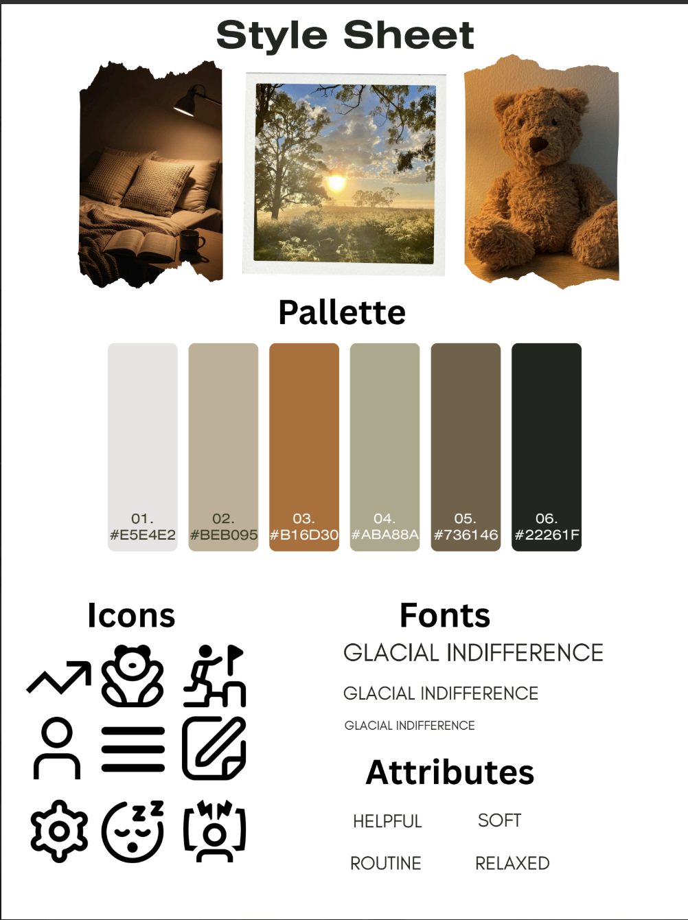
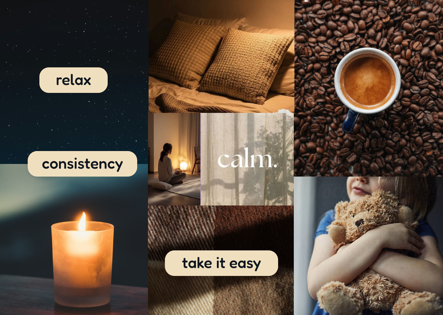
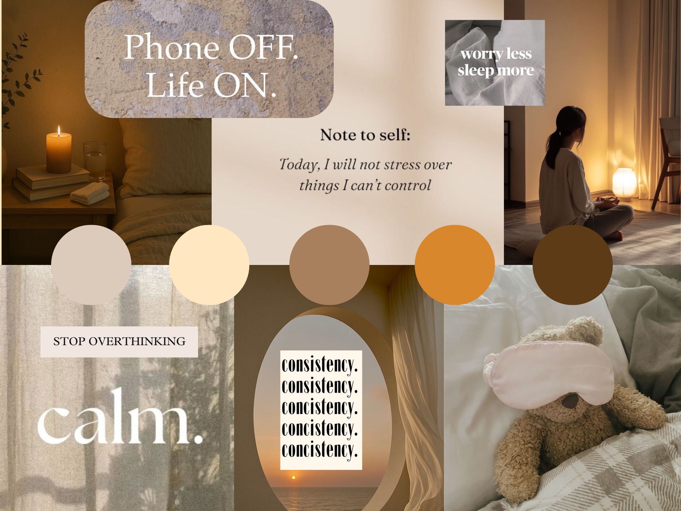
Clara L.
I wanted my mood board to evoke a feeling of calm, grounded peace — the kind you feel when you finally exhale after a long day. I chose a warm, earthy palette of creamy whites, soft tans, and amber tones to mirror the colors of candlelight and golden hour, feeling safe and unhurried in contrast to the cold blue light we’re all trying to escape before bed. The phrases tell the emotional story of the app — “Phone OFF. Life ON.,” “Stop Overthinking,” and “Today, I will not stress over things I can’t control” all speak to the mental side of sleep, because bad sleep is usually less about the body and more about the racing mind at 2am. The imagery of a woman meditating, a cozy nightstand, and a teddy bear with a sleep mask paints the lifestyle the user is working toward — not perfection, just a quiet, intentional wind-down routine. At the heart of it all are two pillars: calm, the feeling the product creates, and consistency, the habit that makes it work.
Bryant M.
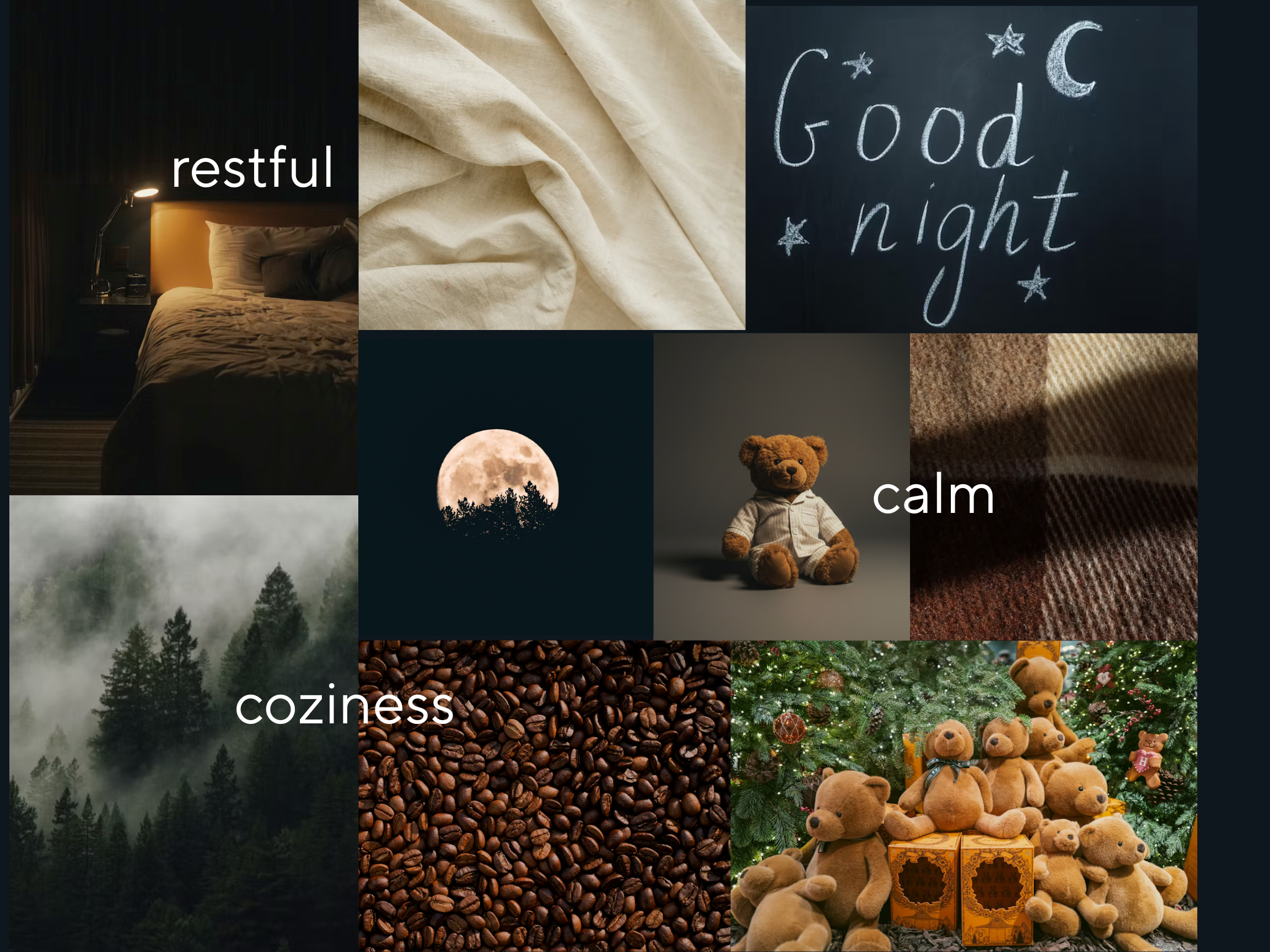
I wanted my mood board to capture the feeling of nighttime at its most peaceful. I wanted to evoke the quiet, still moment when the world slows down and rest finally feels possible. The deep navy and dark tones mirror the night sky itself, grounding everything in that after-dark atmosphere. Images like the full moon rising over a forest and the misty, fog-wrapped trees speak to nature as a source of calm — the kind of stillness you can only find outside, far from the noise. The soft linen fabric and warm wool plaid textures bring it back indoors, evoking the physical comfort of sinking into clean sheets and wrapping up in something warm. Coffee beans might seem unexpected, but for me they represent that rich, earthy sensory warmth — a smell and a feeling that’s deeply grounding. And which also is reminiscent of a productive morning. The teddy bears scattered throughout are a nod to childhood comfort and the safety of bedtime, while “Good Night” written in chalk under a crescent moon ties the whole story together.
Viviana M.
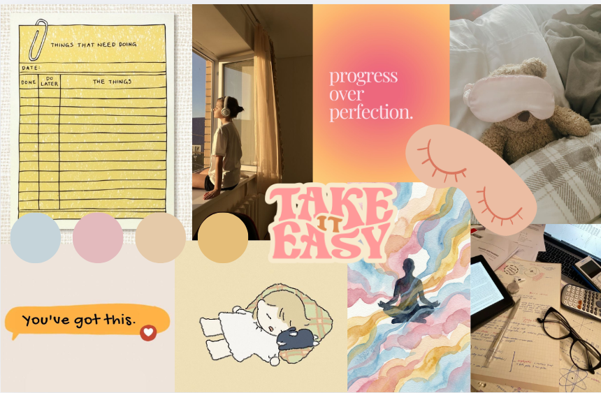
My mood board’s theme is like cotton candy mindfulness. It’s soft, sweet, and easy to digest. The dreamy pastels give everything a light, floaty quality, like your thoughts finally untangling at the end of the day. The watercolor meditating figure drifting through swirling clouds and the little cartoon character snuggled into their pillow capture that same energy — mindfulness that doesn’t take itself too seriously. “Take It Easy,” “Progress Over Perfection,” and “You’ve Got This” feel less like productivity mantras and more like something a really good friend would text you. Even the to-do list and the busy desk don’t feel stressful here — they’re softened by the palette and the playfulness around them. This board is for someone who wants to be intentional about rest without it feeling like another thing on their list. It’s mindfulness with a smile.
Reid M.
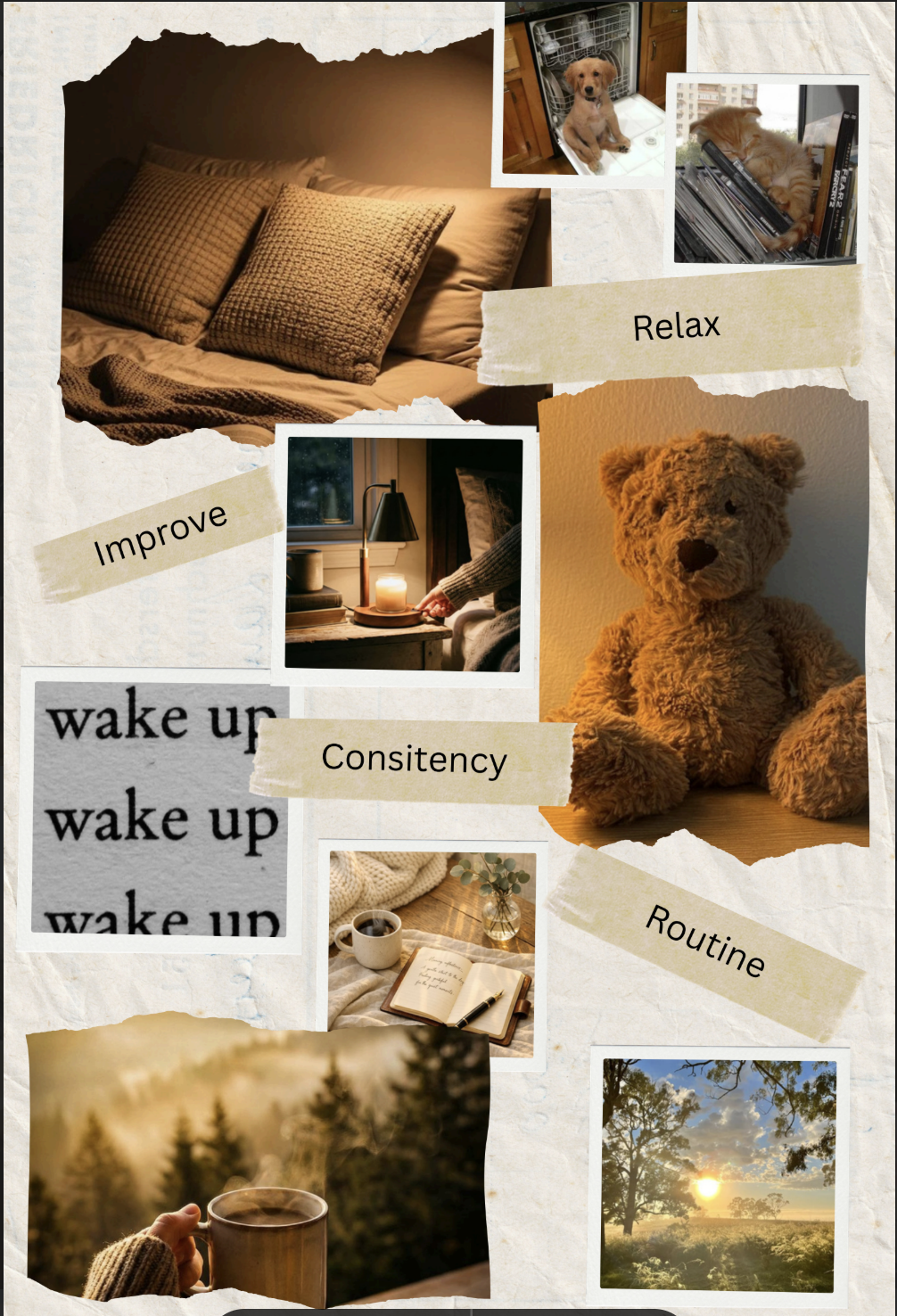
I wanted my mood board to feel like the full cycle of a good day. It covers things like winding down at night to waking up with purpose in the morning. The torn paper, polaroid-style photos, and warm amber tones give it a handmade, journal-like quality, as if someone carefully pieced together the small moments that make rest feel meaningful. The cozy pillows, the hand lighting a candle by the bedside, the teddy bear, and the open journal with a cup of tea all capture that slow, intentional evening ritual — the kind that actually prepares you for sleep. But what makes this board different is that it doesn’t stop at bedtime. The “wake up” repetition, the sunrise over the trees, and the morning coffee in the woods speak to what good sleep is really for — showing up the next day feeling like yourself. The pets sneak in a little joy and warmth, a reminder that comfort comes in small, everyday forms. This board is for someone who sees sleep as part of a bigger commitment to living well.
Synthesized Style Tile
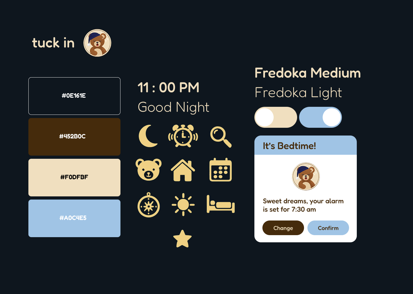
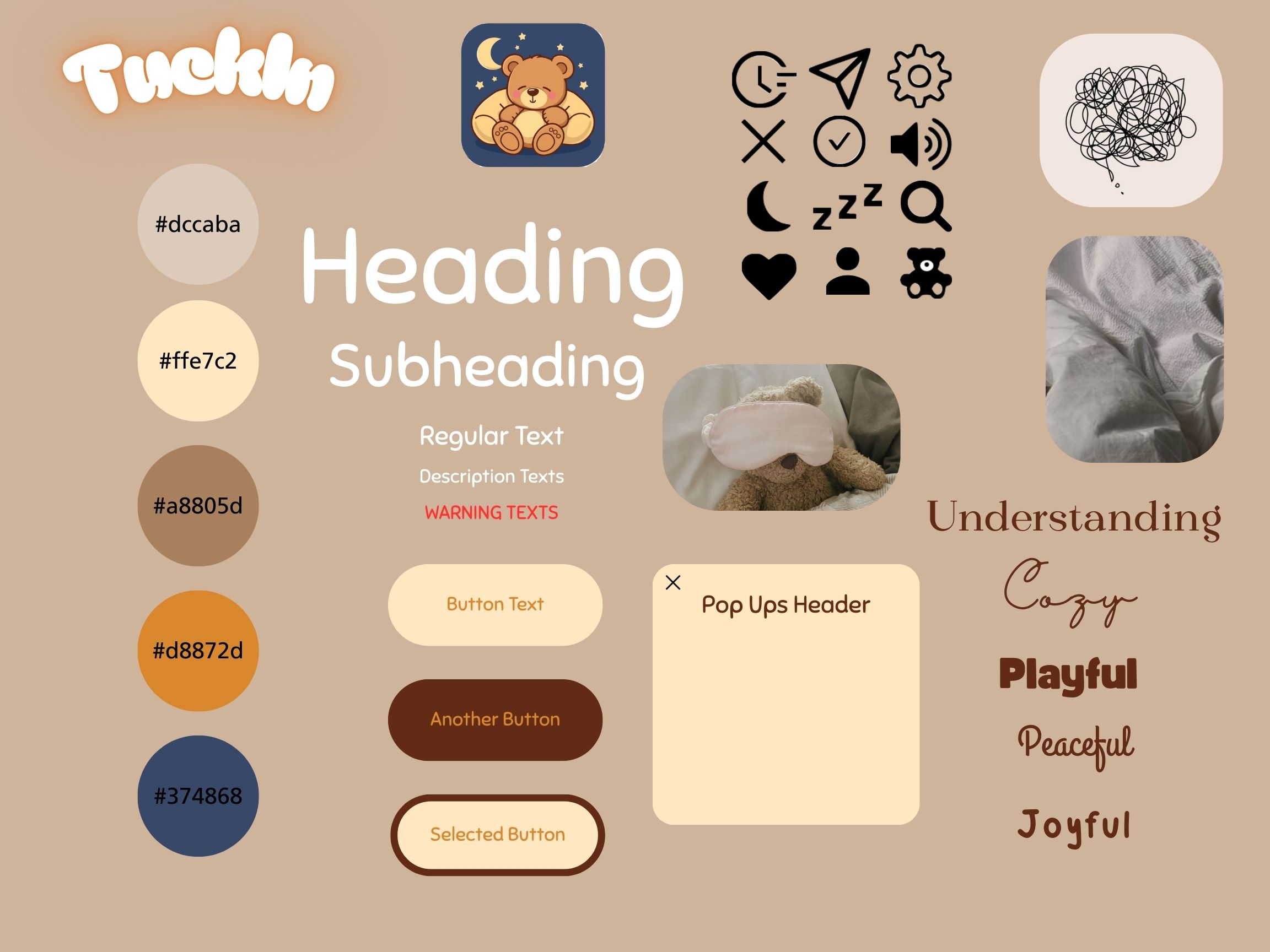
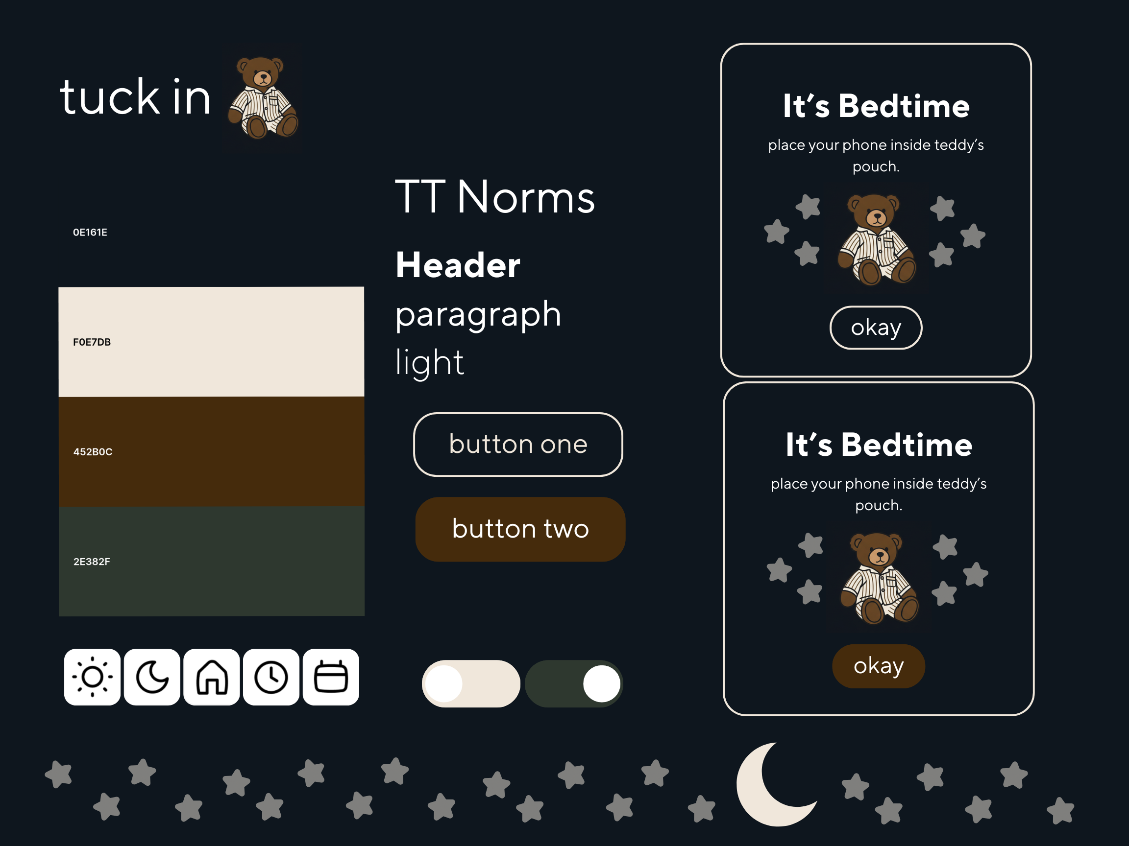
The style tile for Tuck In translates the warmth of our mood boards into a cohesive visual language that feels both calm and approachable. The deep navy background sets the after-dark atmosphere we established from the start — this is an app that lives in the nighttime. Against it, the cream and rich brown pull in the cozy, earthy and linen textures from our mood boards, while the soft sky blue adds just enough lightness to keep the experience from feeling heavy — a gentle nod to the calm, open feeling of a clear night sky. The typography, Fredoka Medium and Light, was chosen because it’s round and friendly without being too childish. It feels like a gentle whisper, not a shout, which is exactly the energy the app should carry. The icon set follows the same logic: moons, stars, a sleeping bed, a compass, an alarm clock — all rendered in that warm cream tone, simple and soft. And the bear mascot wearing a little nightcap ties it all together, giving the app a personality that feels like a trusted bedtime companion. The “It’s Bedtime!” notification card is the product in action — reassuring, warm, and utterly stress-free.
Clara
Bryant
Viviana
Reid