
Product Idea Recap
Hi! We are focusing on an app that helps people maintain relationships with their friends with photo memories, especially when they are facing life transitions such as graduation. We want to focus on mindfulness and intentionality when reaching out since we’ve seen how ingenuine interactions do not better help maintain relationships in our intervention study.
What really is our brand?
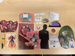
In this blog post, we created moodboards and style tiles for our product idea. First, we created a physical moodboard from magazine cutouts in class. We cut out magazine bits individually and came together as a group to put the bits together.
We agreed on certain themes + some concerns came up:
- We wanted our app to feel relaxing, grounded, and authentic.
- These brand adjectives led us to choose warm and relaxed colors such as muted pink and green.
- We wanted to center humans in our app’s visuals.
- We had discussed what our main visual for the app might look like and wanted to focus on people and relationships. This showed in our moodboard, where we picked out certain illustrations we thought would show connection, like the hand circle and human figures.
- We didn’t have a clear color palette that stood out.
- What felt relaxing color-wise was different to all of us. We explore this more as we move on to our individual-style tiles.
Team Style Tiles
After 7A’s class, each member of our team created their own style tile to represent their idea of what direction our app should go in before we met up as a group. We came together as a group to discuss the ideals behind each person’s style tiles, and what we each individually thought of our brand. We actually had very different visions of what our brand would look like!
Annabelle’s Style Tile

Creator Rationale: I was really focused on this idea of being grounded in relationships + being mindful and aware which brings up green and blue colors for me. I liked blue, but it felt slightly overused in this space and of the apps I had seen like it (Calm), I wouldn’t say I liked their vibe. I wanted something more trendy that targeted younger audiences and was what most people associated with relaxation and calming vibes.
Team Critique: We loved the grounded look, but found that this palette felt too refined for our brand. We agreed that our brand should feel calming and more casual to target younger audiences. What casual meant to us would come up again and again. This felt like an app for succulents or an ad you’d see in a plant magazine (and the team all agreed on this lol) and would we want to see our app in a plant magazine? Probably not. Seeing this style tile first helped us redefine what we all wanted to see in our app.
Jared’s Style Tile

Creator Rationale: The action of effort–care, intentionality–is a radical movement. We want our users to feel affirmed and energized by their own efforts of maintaining relationships. A bright and bold color palette fits the vibe of this action as well as how we want our users to carry themself while using the app: fondly and vividly reminiscent. I’ve observed other wellness or maintenance apps to have pastel and otherwise soft color palettes, and I think this spin would make our product stand out by injecting it with more personality!
Team Critique: This was definitely a flip on the head of what we imagined maintenance and mindfulness apps to look like. We found the top row of colors to be very refreshing and discussed other apps that used a more colorful scheme with a minimal interface which balanced out well and how we could do that for our brand. Other parts of the style tile seemed more graphic design and magazine-focused than we had hoped, like the header font and second row of colors.
Serena’s Style Tile
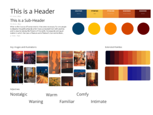
Creator Rationale: I wanted to go for this nostalgic golden hour/ blue hour vibe since it’s almost like you’re “sunsetting” the college part of your life. Also since you’re trying to stay in touch with people you met in the past, nostalgia felt like a good emotional target.
Team Critique: We loved the reference for “sunsetting” one’s life before the life transition. Nostalgia came up as a theme we all wanted to incorporate into our future product as well. However, we found the color palette slightly too warm and refined for the brand.
Carina’s Style Tile
Creator Rationale: Aimed to create a calm, relaxing, and low-effort feeling, such that nothing distracts from the “reflective” goal of our product. Keeping everything simple allows the product to feel accessible, easy and non-intimidating, so users will feel comfortable using it at any point in time and not be deterred by high-energy visuals.
Team Critique: The color palette was definitely calming for all of us, but perhaps slightly too calming. Some of the colors (mostly the pastels) felt sleep-related, reminiscent of a game called Melatonin (an audio-based tap game to help you sleep) and some maternity-related apps which we wanted to steer away from. We loved the fonts and adjective choices — “simple” and “effortless” would come back to help guide our future design directions.
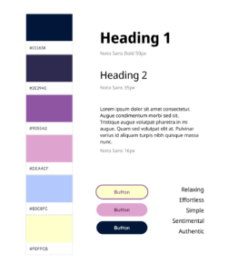
Madison’s Style Tile

Creator Rationale: I want our app to encourage reflections on relationships to encourage maintenance behaviors. In addition, reflecting on past memories feels like a calm, sentimental, and intimate experience to me. The warm pink reflects the warmth we want our users to feel, and the shades of blue and purple are supposed to bring calm feelings and the “reflecting at night” image I had in mind. The font choice is supposed to reflect our brand image of being approachable.
Team Critique: We found the color palette to be very calm and approachable, another theme we realized we wanted to keep in mind. The font choices also felt fairly casual which is a theme we wanted to keep going, but did not feel very unique. We wanted to explore more choices.
Synthesizing
We agreed with Jared that a more colorful color palette would distinguish us from other reflective memory/relationship apps. It also reminded us of apps that felt approachable and casual to us like Headspace (meditation and wellness app) without being overbearingly serious, refined, and boring. We want the photo experience to be immersive!
We also liked the retro visual style because it related well to our brand adjective “nostalgia”. We want to make our adjectives stand out, like being bold and fun as a spin on the usual wellness app. We agreed it might be fun to balance some of the loudness of retro colors with simpler design frames, utilizing more basic colors like cream and black for the bulk of our designs.
Overall, the team decided to combine some of Jared’s color choices with fonts from Madison’s style tile. We had some edits here and there— we looked around and decided to go with Neue Kabel, a san serif font commonly used in retro designs, to give our design more personality with rounded corners that still could differentiate us from other apps.
Here’s our new team moodboard!

We agreed that this style tile was still tentative, but now we had something to work with. Onto the next!
Team 18
Assignment 7B


