Notion (Productivity)
My favorite is Notion. It’s very customizable, with a collapsible sidebar but a clean default view that keeps things simple. The pre-made templates serve as clear examples for new users, showing what’s possible without requiring much setup. I also notice a repetition of the same features across templates, which helps users learn through doing. Everything is private by default, which reduces pressure and lets users experiment freely. The new Home feature resembles a mix of Docs, Featured pages, and Extensions, like Notion Emails and Notion Calendar, and when you hover over certain links, it provides quick hints that teach you how to use them
Instagram (Social)
For Instagram, I don’t think allowing the onboarding process is very hassling.I think allowing the permissions are very convenient since it also presents the permissions through a popup, which saves the users the time of visiting settings and doing it manually. I think the contact permissions as well as the suggestions features very convenient. It actually helps you grow your network faster,so that their feed isn’t completely empty when they join and doesn’t discourage to leave the platform.. Seeing familiar faces and suggested friends makes the app engaging within seconds.

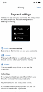
Venmo (Finance)
With Venmo, the onboarding feels heavier. You have to visit your bank app, log in, and verify your account, which can be tedious, especially when it doesn’t fully configure the first time. It’s a necessary step for security, but it delays the user from actually sending or receiving money. The business cost here is high, since many users likely drop off before reaching the point of real engagement.