Here are my comparisons between checking out on Amazon, Warby Parker, and Patagonia:
Amazon:
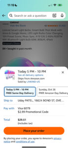
The whole experience prioritizes speed and minimal clicks. Their goal is to get you to buy before you think too hard. They offer one-click checkout, auto-filled everything, and no extra steps. It’s almost impossible to drop off during the buying process. This is honestly super impressive UX, regardless of how I feel about it. The hardest part of online shopping is checking out, but I never feel that way on Amazon.
Warby Parker:
They slow things down just enough to make you feel confident. They offer clear pricing and easy lens add-ons, and they’re also very transparent about their return policies. They try to reassure you during the buying process, which helps increase how much people are willing to spend because they really trust the vendor. This experience was largely enjoyable, but I do feel like having done the Amazon one first, this felt a little bit too hard.
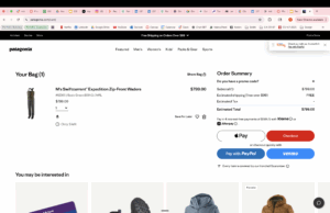
Patagonia:
Patagonia’s checkout isn’t necessarily fast or customizable, but it does keep their values at the forefront of the checkout process. It is constantly reminding you what their values are, their sustainability messaging, and how responsible their manufacturing is. This makes people feel good checking out from products like Patagonia. It builds a lot of customer loyalty. It also makes them feel like they’re contributing money to something meaningful, which also builds customer lifetime value. I personally always choose to buy outdoor wear from Patagonia because I do believe in their messaging. So it’s definitely worked, and I find that it’s super interesting that they weave it into even things like the checkout process.