Wireflow
Sketchy Screens
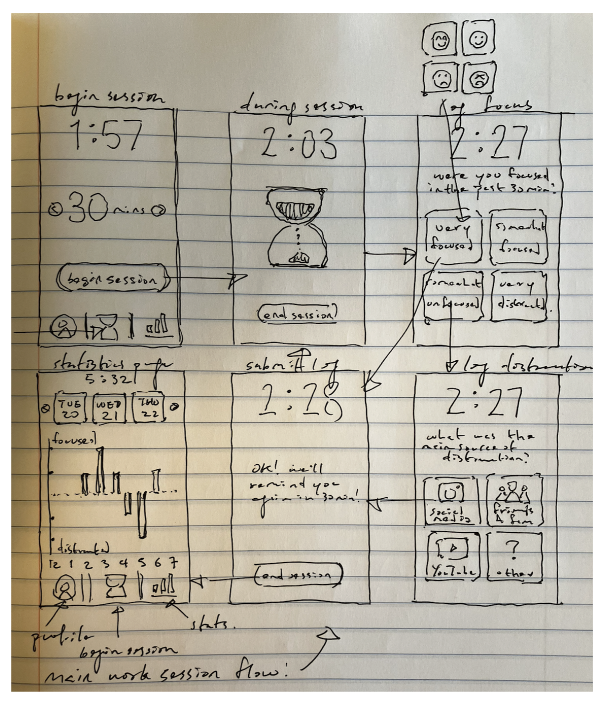
Tristan’s Initial Sketches:
This is an early version of the main task cycle. Users begin their work session on the “Begin Session” page, setting the interval time. During the session, a virtual hourglass is shown indicating the passage of time. When the interval ends, users engage with the “Log Focus” and “Log Distraction” (if they were distracted) pages, both of which feature 2 x 2 square option buttons. During any interval, users can choose to end the session by clicking the “End Session” button. The session ends on the “Statistics” page.
Many major changes were implemented upon this design.
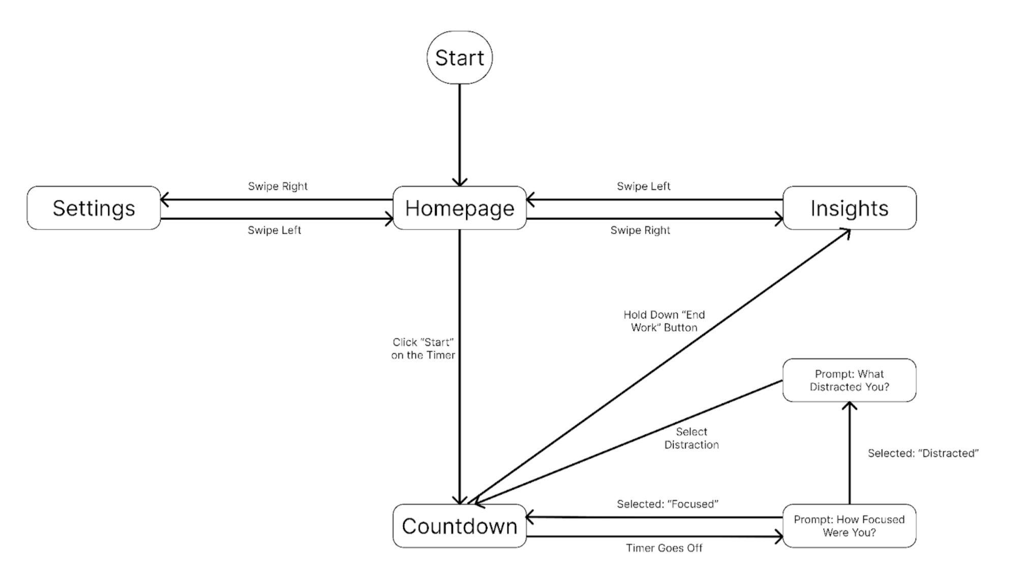
- The bottom navigation bar was replaced with a sliding design, where the user swipes between “Home”, “Settings”, and “Insights” pages. This was to reduce friction and increase simplicity.
- The hourglass on the “Countdown” page was replaced with a moving gradient, indicating the passage of time more subtly without introducing undue pressure.
- The “Begin Session” page was simplified to just have a “Start” button, with all settings moved to a separate “Settings” page. This was to make the “Begin Session” page cleaner and separate concerns.
- The “Log Focus” page was simplified to contain only 2 buttons, “Focused” and “Distracted”. This was to speed up the logging process and remove ambiguity.
Malina’s Initial Sketches:
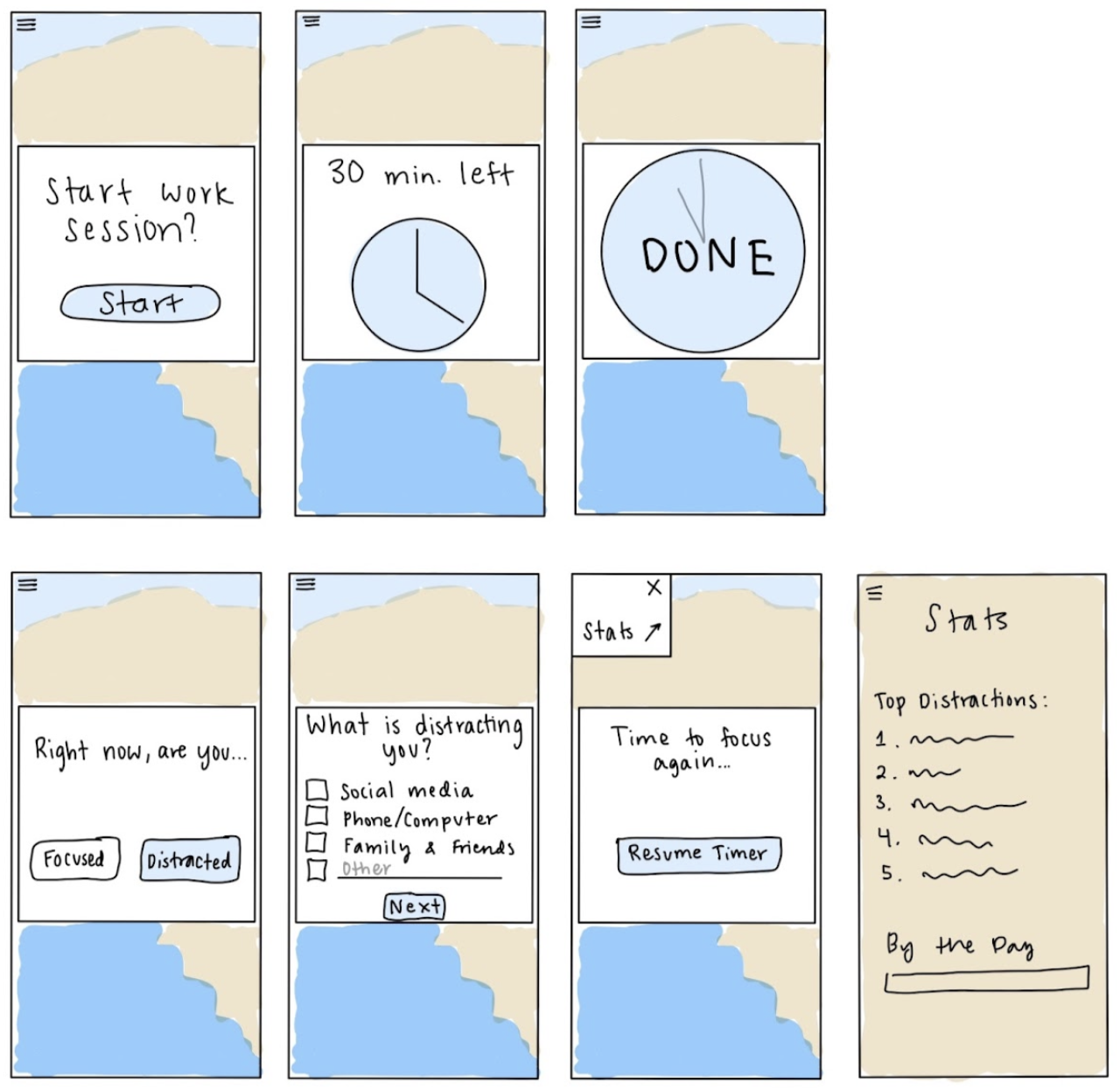
This is an initial idea for almost all of the screens in the app. The background is meant to represent a photograph of the beach—an idea we floated as a group a week ago. Users begin by starting a work session. When it is finished, they report whether or not they were focused, followed by checking the things that distracted them. Then they can restart the timer or view their stats.
We have made many changes since this design, including…
- We are no longer planning to use a photograph in the background. We want to instead play around with the colors and gradients we created in our style tile for the background.
- We have decided against the “hamburger menu” featured in my screens, and instead opted for a carousel for navigation. The hamburger menu seems tedious when it only leads to one screen.
- We have moved away from a multi-select list for distractions. The multi-select implies a user should select all the ways they were distracted in the work session, while our app is meant to capture just what was distracting them when the chime/timer goes off.
Current Sketches for Focus Prompt + Insights Screen:
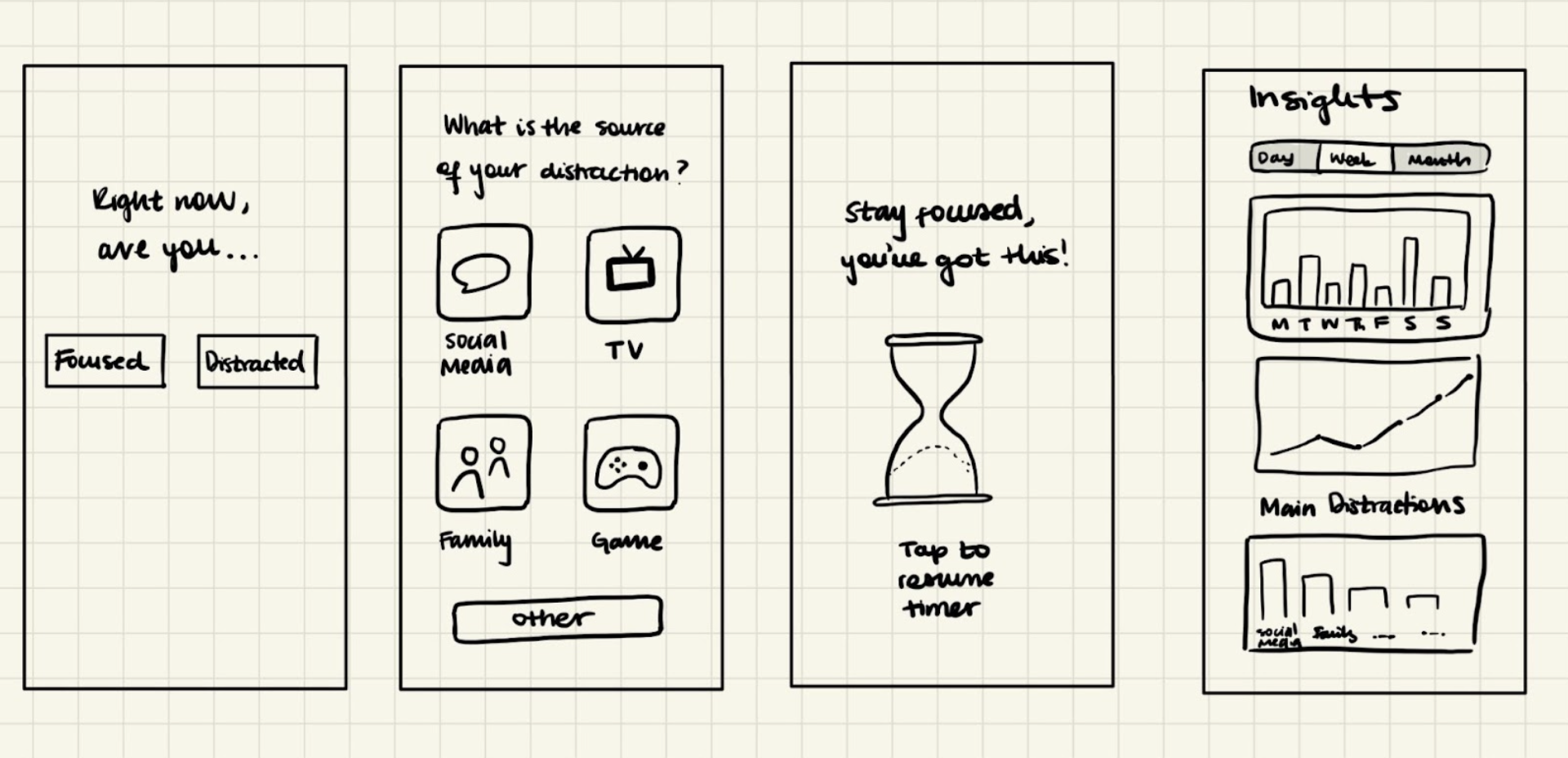
After observing and critiquing the initial sketches of each group member, we created updated sketchy screens of the “are you focused?” prompt and the insights screen. (We directly modified Francesca’s initial sketches, hence why she does not have the copy of her initial sketches anymore).
To create this current sketch, we carefully thought about the importance of UX writing and using understandable, clear words and phrases. As a group, we reworded the questions, words, and phrases found in our initial sketches to be more clear to the user. We also made sure to emphasize to users how the focus prompt is about what users are distracted by in the current moment when the chime sounds—not what they were distracted by during the whole timed period. Finally, we thought of some of the main statistics we want to be featured in the Insights page.
Nazanin’s & Frederic’s Sketches:
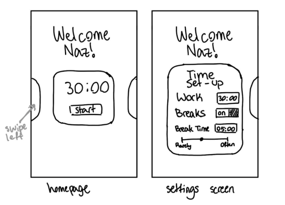
This is an early version of the task flow for setting up the timer. Users begin on the homepage, and then swipe left to view the settings, which are displayed not as a full page but rather as an expanding dynamic modal. The user can then set the duration of their work timer, enable or disable breaks, set a break duration, and set whether they would want breaks on a scale of rarely to often. When they return back to the home page by swiping right, they will see that the timer has been set with those same settings.
We made several changes throughout the design process of these workflows.
- We initially discussed having an ever-present settings wheel icon in the corner of the timer screen, but decided that this would be distracting and high friction.
- We wanted to maintain utmost simplicity, and so we decided to keep the settings features within a modal rather than expand to a full page so that the user does not feel overwhelmed by too many pages.
- It initially did not include breaks and only enabled setting up a timer, but we recognized that breaks would be an important part of a user’s work session.
- We wanted to incorporate many features such as creation of multiple timers meant for different types of work sessions, but determined that this detracts from the simplicity required to foster focus levels.
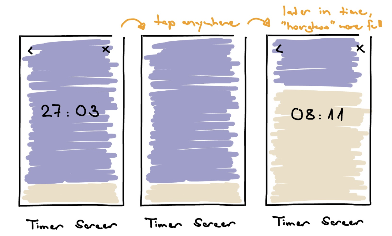
When the timer is running, it looks like this. It fills the screen, with an abstract depiction of an hourglass. By tapping on the screen, the timer and controls appears/disappears, so as not to create anxiety or tip people off when the awareness chime is going to come up, the idea is more that the abstract hourglass semi-transparently shows how time passes, without being too on the nose.