Mood Boards + Style Tiles
Each team member individually made mood boards and style tiles to reflect the experience we want our users to have. These mood boards and style tiles are below:
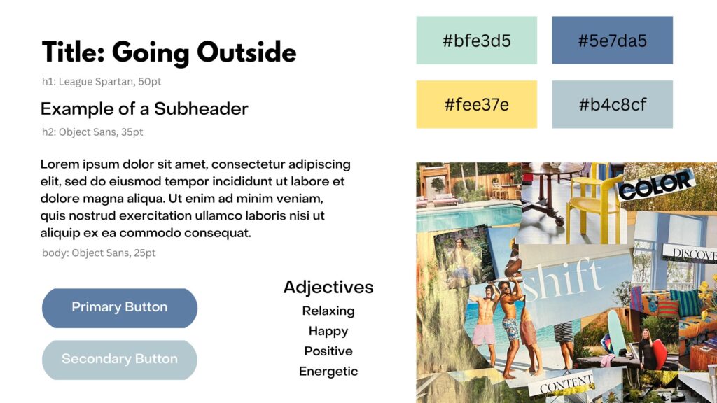
Fernanda’s Mood Board + Style Tile
This mood board includes images of people enjoying their time outside. When I think of spending time outside, I think of the sun, beach, and grass. For this reason, I chose colors like yellow, blue, and green. When using our app, people should be reminded of how enjoyable their time outside can be.
Faith’s Moodboard + Style Tile:
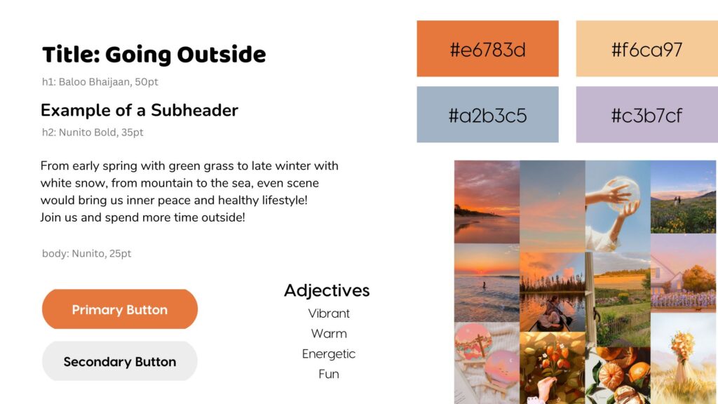
This mood board captures nature’s warm tones and highlights the ever-so-popular sunsets that many adore. When creating this mood board and thinking of how I wanted users to feel when using our app, I wanted them to associate going outdoors with feelings of fun and rejuvenation. My intention was for the app to radiate the same feelings that a sunset would bring to a user, thus harnessing a lot of warm colors in my color scheme, and I chose to use a rounded but easy-to-read font to give off a more playful, light-hearted feel.
Lisa’s Mood Board + Style Tile
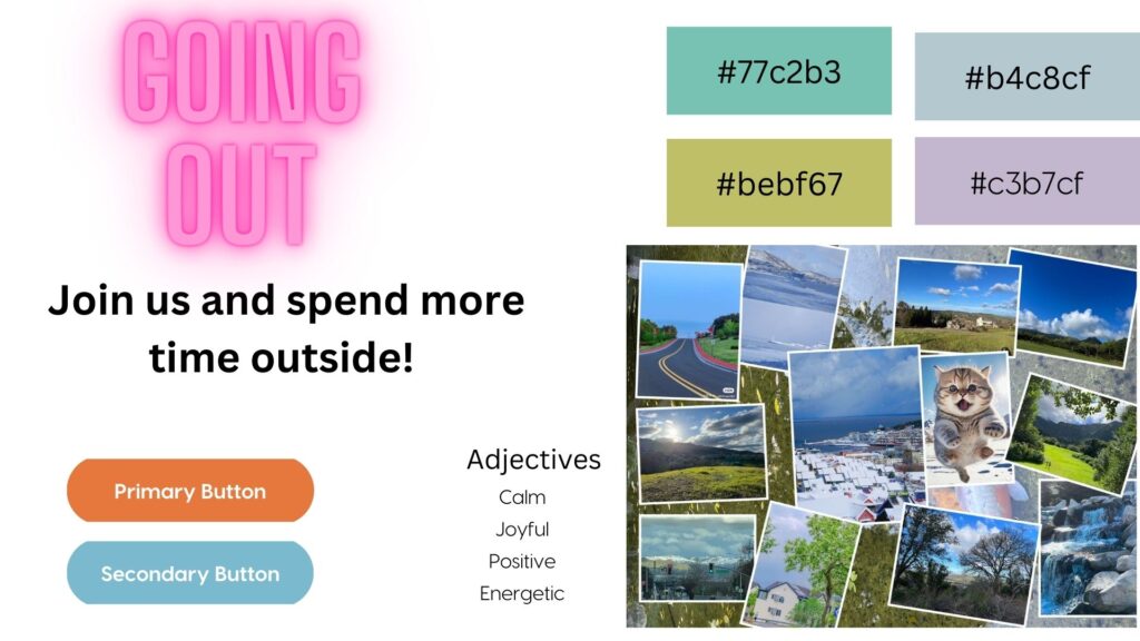
This mood board collects various scenes from nature, which vary from verdant spring to winter’s white, from mountain peaks to sea in sight. I used pictures from California and from the other side of the Pacific Ocean where my hometown is located. And the background was a pond of koi, which could bring luck. I hope those green and blue colors could remind the viewer of the beauty of nature, gain more calmness and inner peace, and live an energetic life as that lovely kitten!
Nick’s Mood Board + Style Tile:
This mood board is based primarily off of the multitude of colors present in nature. From the bright lights of the ocean on a sunny day to the dark light protruding from nature based artwork, going outside opens up a world of experiences. I tried to capture a happy bright vibe across many different scenarios and environments, in an effort to invoke emotions people may experience when outside.

Final Mood Board + Style Tile:
We narrowed down to the following mood board. Participants in our intervention study expressed that they did not enjoy feeling pressured to complete daily challenges, so we chose colors, like blue, that would make the experience feel relaxed. Participants also expressed that they found the challenges fun, and so we also chose to include fun colors like yellow and a pinkish orange. Lastly, we wanted our app experience to remain positive, so we made sure that we chose colors and fonts that reflected the positive experience we strive for.


