
Each team member created 1-2 sketchy screens for different flows in our product.
Home Screen
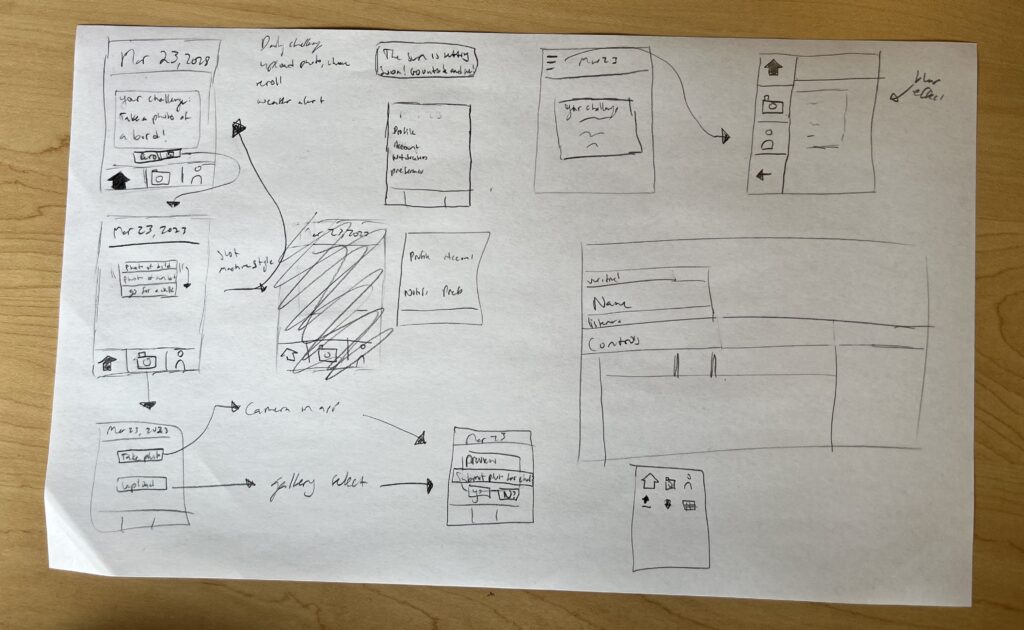
In the home screen, users are given a daily photo prompt that encourages them to go outdoors to complete the challenge. We played around with the idea of giving users the option to re-roll a prompt, designing different ways for the user to interact with the feature including a button and a slot machine visualization.
In the home screen, the user also has access to three important elements: the home screen, camera, and profile. We want to provide users the choice of using an in-app camera or uploading photos from the photo library. We also want users to easily have access to a profile that can display their past achievements, as well as decrease the barrier of changing their default setting. To figure out the best way to navigate the app, we experimented with having a bottom tab navigation as well as having a side menu navigation that would slide out upon clicking the hamburger menu icon. From our discussion, we decided that having the bottom navigation would be most convenient for a user to access.
Profile
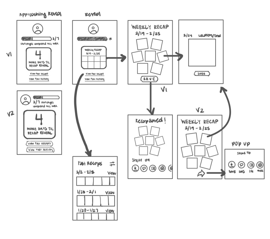
In the profile, users are able to see how many challenges they’ve completed in the week by looking at the progress bar, which updates each time the user uploads a photo for the challenge. After completing a certain number of challenges, the user is able to view their weekly recap, which displays a photo collage of all the photos they’ve taken for that challenge period. In the days leading up to when the user’s recap is revealed, there is a countdown to get the user’s excited and anticipatory.
The user opens their weekly recap and has the option to open and save individual photos, as well as save and share their overall recap. We created different variations for how the sharing screen would look, ultimately deciding that a pop up rather than navigating to a completely separate screen would be most user-friendly. From the profile page, the user also has the ability to look back at past recaps, reminding them of the outdoor moments they’ve captured and the progress they’ve made.
Settings: Input Calendar
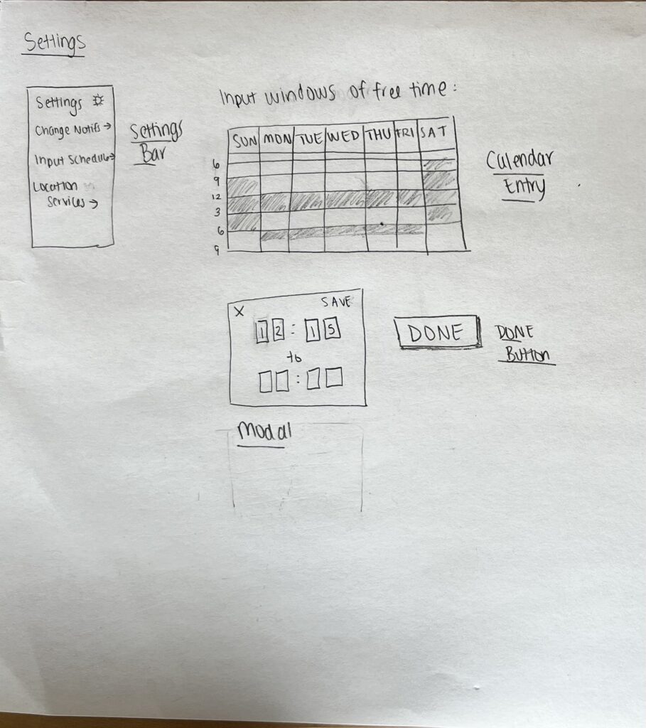
One key component of our settings feature is personalizing when notifications should be sent to remind a user to go outside. In this flow, we want to get information on the participants’ schedule. There is a permissions page which will authorize our app to access the participants’ schedule. In this page, the user has the option to sync their Apple or Google calendar with the app or manually input their free time into the calendar. Rather than having the user input their fully fleshed schedules into the app, the team decided that roughly inputting one’s free time would be sufficient enough to gauge when notifications should set off so the user is able to go outside at opportune times.
Settings: Adjust Notification Frequency
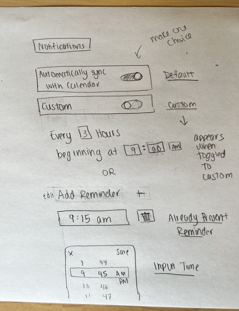
Another key component of our settings feature is personalizing the frequency of reminders to go outside. In this screen, users can set their preference for the daily reminders by syncing notifications with their calendar for a quick set up. Alternatively, the user can customize their reminder frequency by, for instance, choosing to receive reminders in 3-hour intervals. If they need a reminder within a short period of time, they can also set a customized reminder for that.
The interaction to sync or customize notifications uses a toggle, as the user can only make one choice. We also decided that using an interface for inputting time that is already familiar to users, such as Apple’s clock app, would be most intuitive and quick to complete the set up process.



