
Top issues and suggestions
- Issue: severe Missing labels on some screens made it difficult to navigate through them, and to understand what the user was supposed to do. Other UI elements like sliders often were simply placed on a page without context or explanation after the initial onboarding.
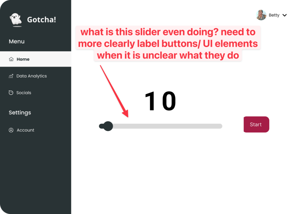
- Solution: Clearly label all buttons, screens and axes. If we need to keep the UI clean in some places, add tooltips with additional context. In an example like the above photo, even adding something like “minute work session” under the “10” could go a long way in explaining what everything does.
- Issue: severe There was some confusion around what the different blocks on the work flow timeline meant (i.e. the dark blue and light blue bars and ghosts).
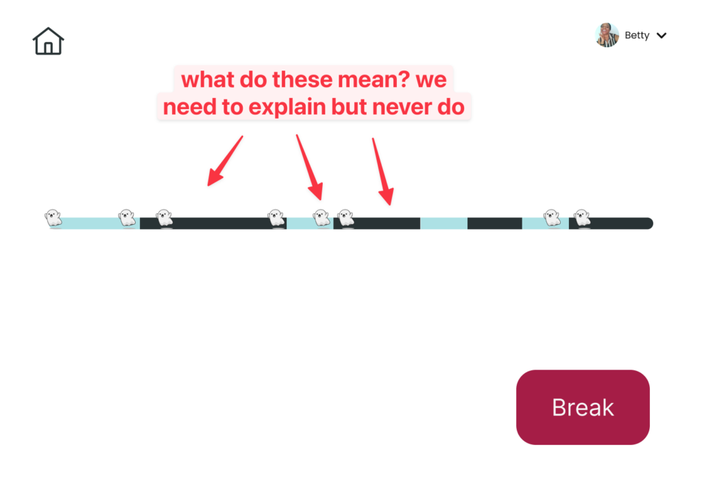
- Solution: Add labels along the timeline to show what each block means, or use a legend to signify what they each mean. Explain it during the onboarding.
- Issue: severe Users felt like they didn’t generally understand some key ideas behind the app such as why the ghost takes pictures (what the motivation behind it was for making them more productive), how they can address any privacy concerns they had, and where their pictures would be used.
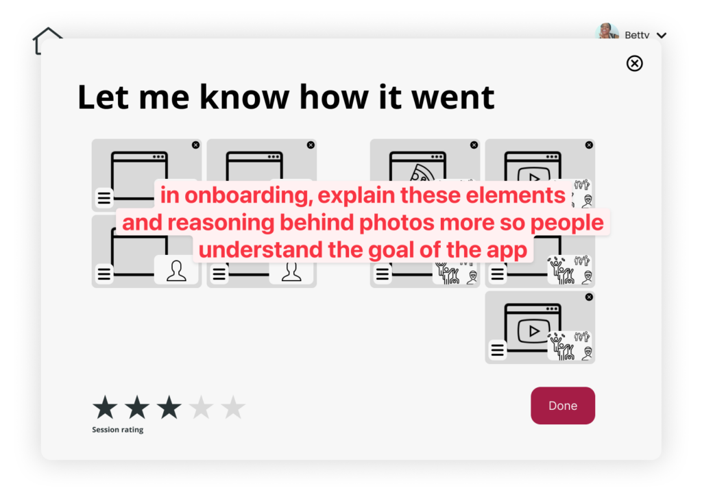
- Solution: Create an onboarding flow which the user encounters during their first session that will address the privacy issue as well as give an overview of the app. Build out the settings page to let people adjust this. Explain the intent in a picture-sharing model during the signup so that users can discover why they might want to participate in using the feature.
- Issue: moderate The pictures to review were listed randomly after a work session, making it hard to visualize when each specific picture was taken.
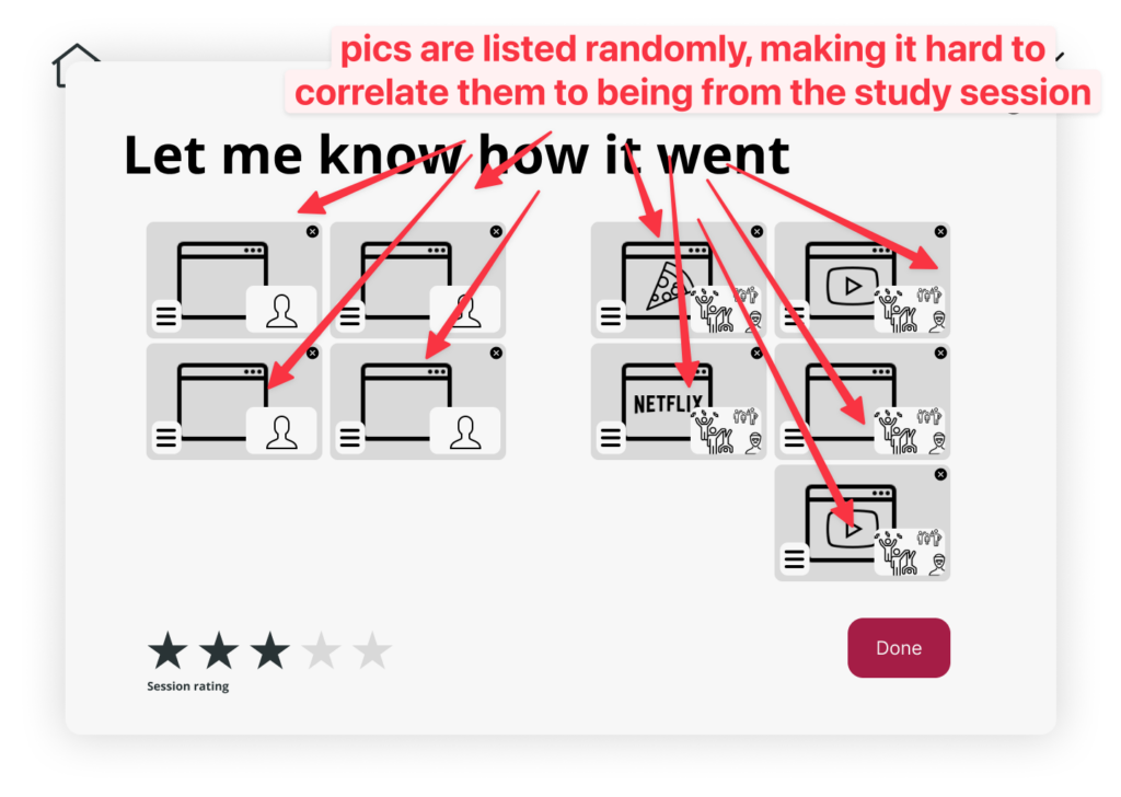
- Solution: Display the pictures to review in a timeline format. Clarify UI so that it’s clear you’re just “viewing” how your work session went, not taking action on it at this screen.
- Issue: severe Confusion around the transition activities screen, i.e. users didn’t understand what the three options (music, video, meditate) meant. Additionally, users did not understand the benefit of a transition activity.
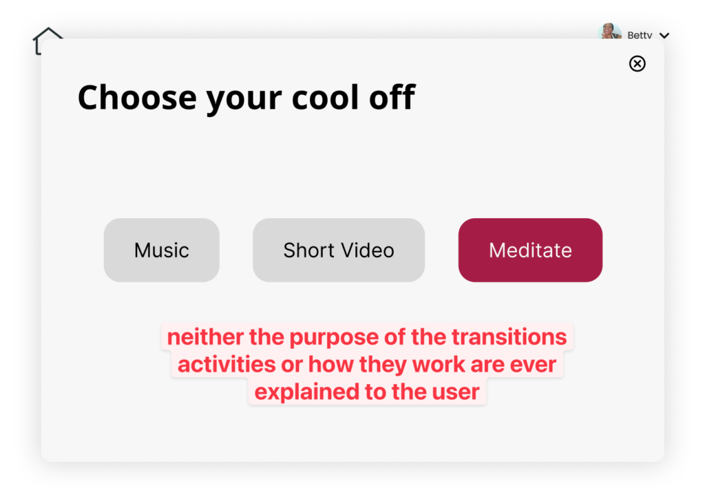
- Solution: Add a clearer transition screen that explains what the different options are and guides the user through whichever one they selected. Also elaborate on our design values for choosing these transition activities and explain in the onboarding the research-backed approach to transitioning back to work.
- Issue: trivial Confusion around use of the social feature regarding whether the streaks showed how often a user spoke to another person, or if it depicted a leaderboard (i.e. “this person has been productive for x days”).
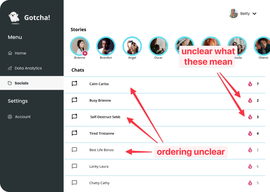
- Solution: Incorporate a leaderboard that will also act as an additional form of motivation to work (i.e. by seeing that your friend has been super productive today, once would feel motivated to work). Clarify how it works with a tooltip or in the onboarding, and label it as a leaderboard. Consider removing chats since people already have many chat apps.
- Issue: moderate The tutorial was insufficient and left users confused on the purpose of the app and key features. Also users began the tutorial by clicking the home button and were unsure where to click to advance the tutorial.
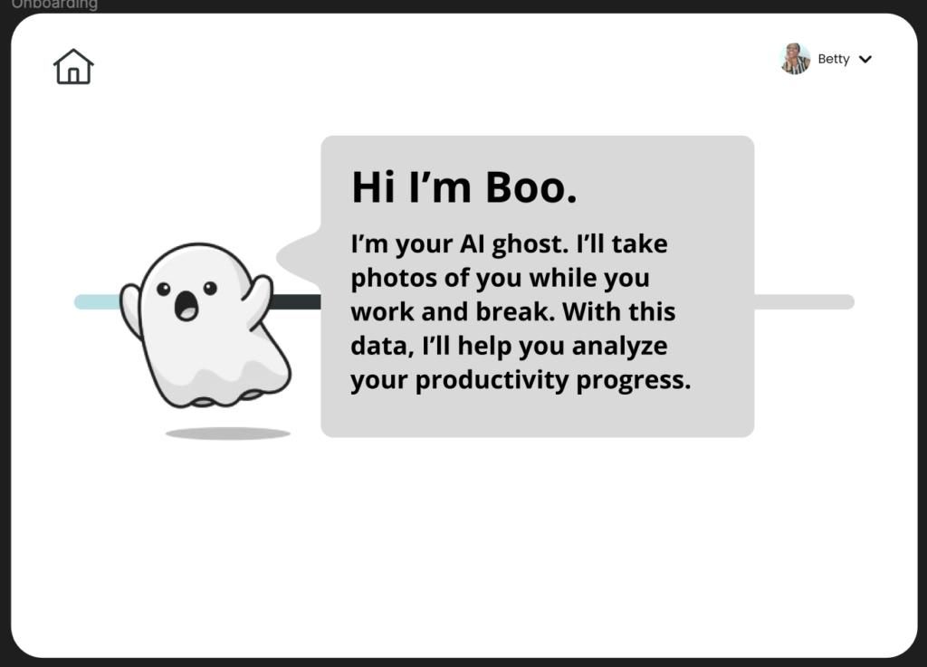
- Solution: Create comprehensive onboarding messages. Also, reveal the home button when ghost talks about it. Add message telling them they can “click anywhere to advance”.
- Issue: trivial Confused that color coding represents an average of the data within that bubble because the dark bubble without a title threw them off.
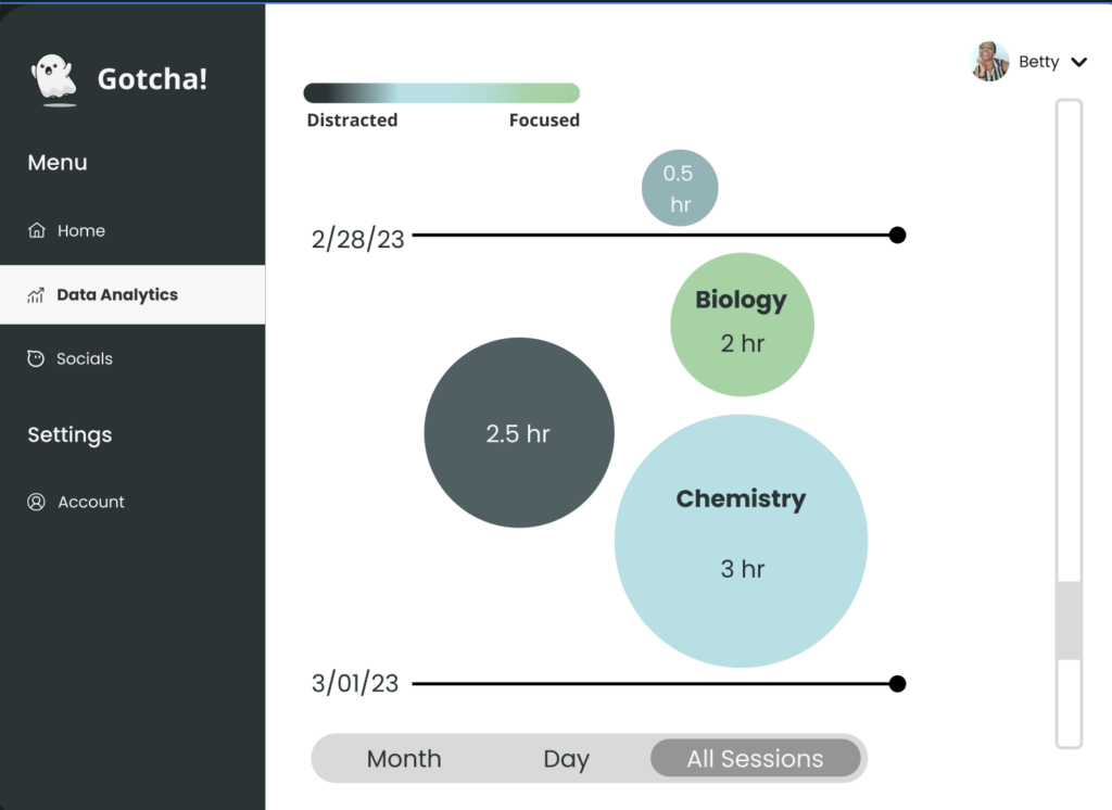
- Solution: Add an “untitled” text to bubbles to ensure people know each bubble represents a session and that some sessions may or may not be titled.



